My Initial Artist Statement
My related study was focused on portraiture and lead me to create images of single people with both hand drawn and digital illustrations layered over the image. For my personal project I would like to delve further into the meaning behind portraiture. In doing so I want to consider not only technical aspects but what the photo portrays to the viewer and what makes it so interesting.
Technically I want to explore shadows, lighting, exposure, reflections, depth of field variation, surreal editing and silhouettes. With each of these different concepts I want to explore their effect on the image, on the portrait and on the viewer.
Through this project I also want to answer questions such as:
- What is the meaning of portraiture photography?
- Why has the photographer chosen to display that photo?
- What does the image mean, what is the image portraying?
- What makes the image interesting for the viewer?
Mind Map
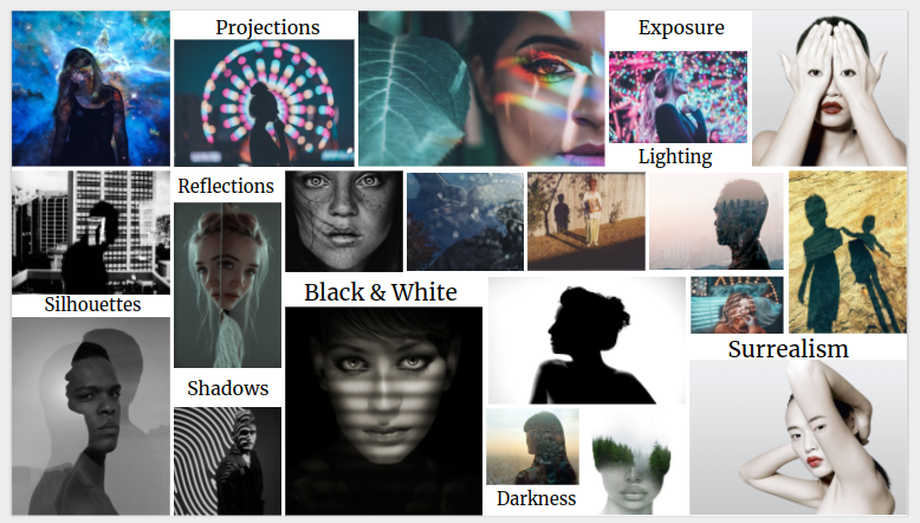
This is my mind map I produced. I included various styles of portraits, uses of light and contextual words. I took inspiration from this mind map to start my project and will bear these ideas in mind when I develop my project. Knowing that portraiture was something I wanted to look into, I didn't need to consider any other styles of photography, for example landscapes, in my mind map. Something that initially intrigues me is the use of shadows in portraiture and what that can present to the viewer. Hence why I am choosing my first artist research to be based around Glen Erler.
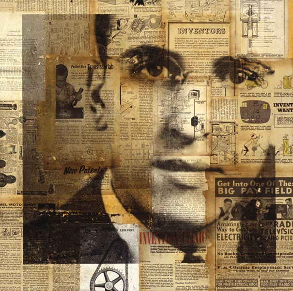
Glen Erler
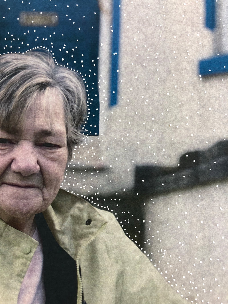
To start my personal project I am looking at London based photographer Glen Erler. Erler produced a series of images associated around his family and their past after the death of his father, called ‘Family Tree’. The set of images, not only ties an emotional link to the viewer, are technically good. The images are all composed well and use lighting as a reflection of Erler’s memories. For example, where it is darker in the images it represents where the memories lack those details. He wanted to incorporate light into his project and therefore he based light around the concept of memory. An alternative interpretation may follow suit with how the natural lighting has been used to explore his sense of physical and emotional separation from his friends and family back home. A section of his write up tells the viewer that ‘This body of work has brought me closer to my family... They have allowed me to bring them into my way of thinking. To be themselves but to also relinquish themselves in order to be who I wanted or needed them to be at that moment. ‘ This to me, is the meaning behind the series Erler has produced. He intended to create new memories with his family and that is what he has successfully achieved.
Erler shot the images on a medium format film camera. The inclusion of the warm American climate is reflected in the tones of the images as most of them are warm toned. The tone of the images was also intended to reflect elements of calmness and quietness, which the photographer associated with his photography
These are the images from Erler’s work I like best and the ones I believe have used both lighting well and incorporate a portraiture style. The photographer has used shadows to his advantage in order to enhance the images and make them more interesting for the viewer. The mood of the photos, in my opinion, sets a nostalgic feel. The series inspired from the death of the photographers father communicates his memories of his family past. In my own work, I will consider the idea of using shadows to draw more detail to the lighter aspects. The techniques Erler has used draw equal focus to both light and dark, allowing the viewer to see some detail but also allow them to be curious as to what they cannot see due to the darkness.
|
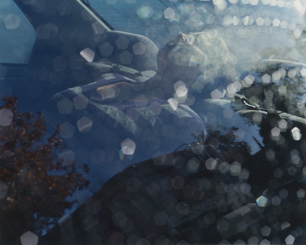
The setting being in a car has allowed Erler to shoot through glass, as shown in this image, has created a layer of distortion over the image and also a slight reflection allowing you to see both the person intended to be in the image but also the photographer as well. The framing of the image has captured the person in the top third of the image and was therefore shot at an unusual vantage point. The person also seems to be in the background of the image where the reflection is in the foreground. I believe that this image was shot using natural light hence the darkness
|
|
and shady aspect. The texture of the image seems embellished from the irregular patterns of light the reflections have caused on the image. The colours in the image seem dull and subtle but not monochromatic as there seems to be an overcast of blue tones throughout the image. The feelings portrayed from the image imply it is sentimental to the photographer and is a sad memory.
|
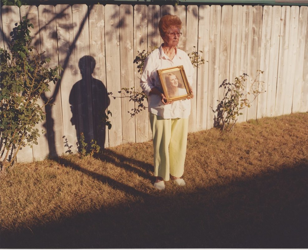
Another of his images has used a photo within a photo, I believe this was done in order to allow the viewer to see change about the person in the image and therefore allow the viewer to gain a greater understanding of the person in the image. Looking at the image, in my opinion, I view the shadow as the person in the photograph being held by the person in the photograph based on the angle the photograph was shot at and the angle that the frame is being held at. Again in this photograph, Erler seems to have captured the image from an unusual vantage point -
|
he seems to be stood higher than the subject and to the left of them. I feel the angle of the image has been used in order to capture the image with the greatest amount of shadow detailing and to make the image connote a negative outlook from being shot so distant from a family member. The lighting in this image, again seems natural but is inconsistent through how much shadow is in the frame. The gentle line of where the shadow on the floor meets the area in sunlight presents a border to the viewer between memories and current day. The memories are there, they surround the person and are included in the photo to present how everyone remembers memories but they are not tangible.
|
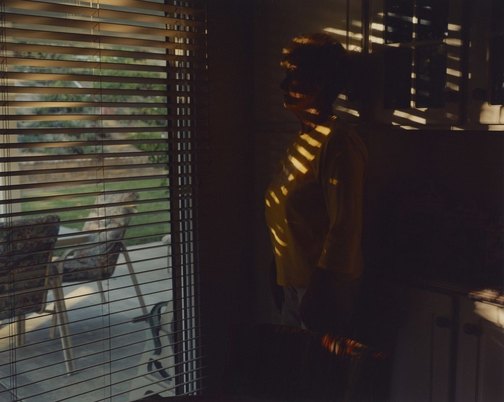
The final image I like the most from Erler’s series is one that uses window shutters to show a contrast between light and dark. Although the viewer knows the person is a member of Erler’s family, the face cannot be distinguished and therefore it shows where Erler’s memory is lacking fine details such as eye colour or face shape. Again in this image, Erler seems to have used natural light but in this image it has been broken by the shutters. The composition fits rule of thirds and shows the person stood a third into the photograph from the right. The pattern in the image,
|
|
caused by the shutters, seems to be regular and the shadows are symmetrical to the shutters themselves.
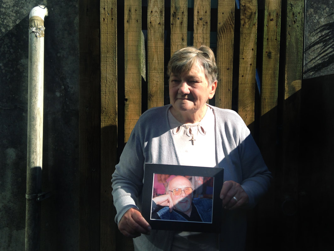
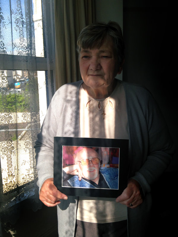
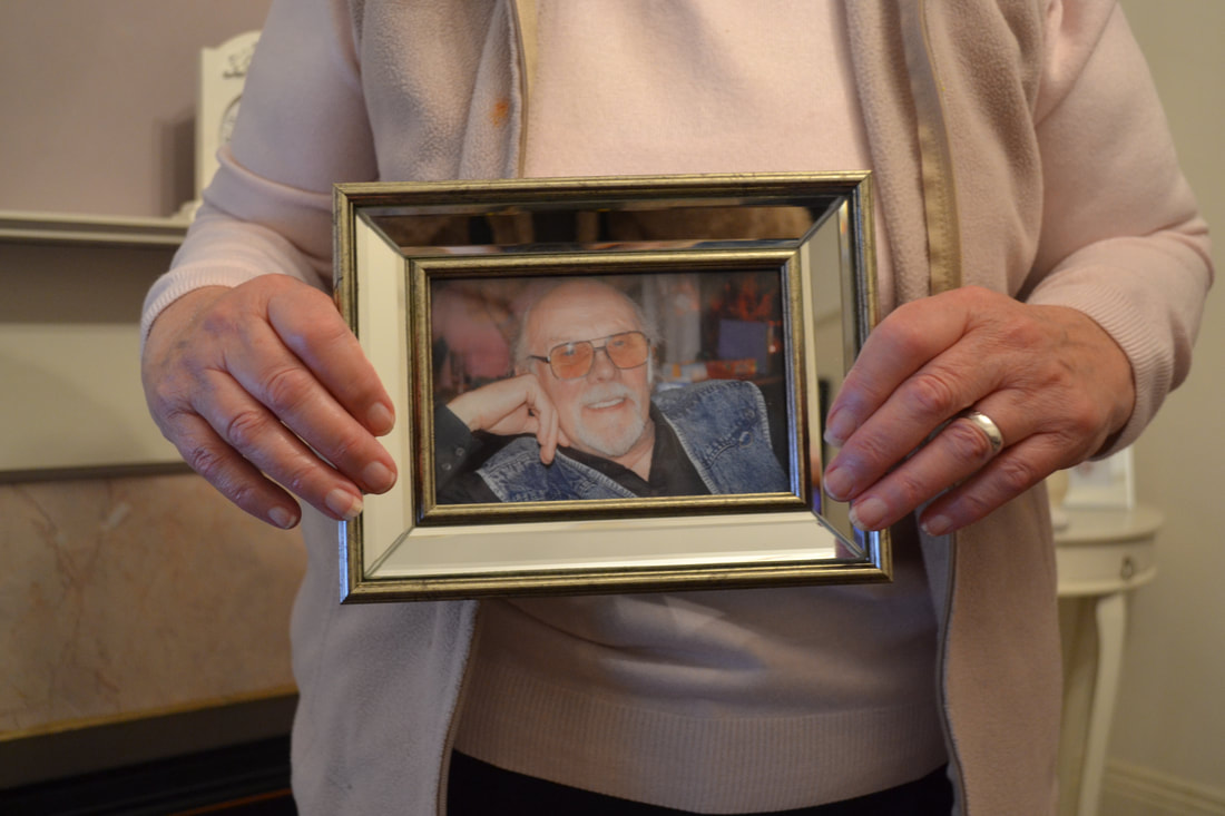
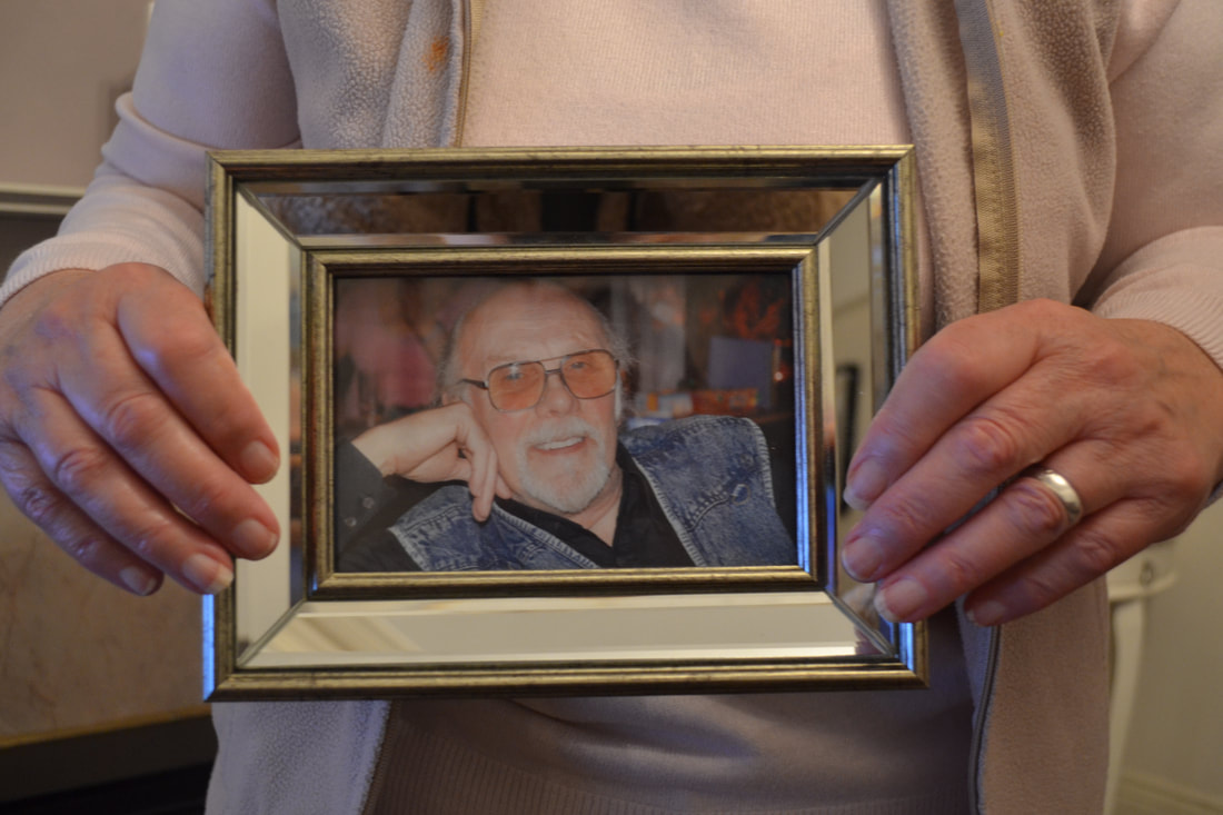
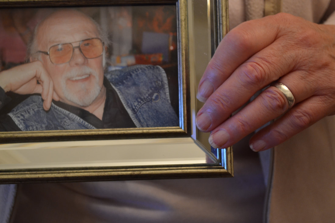
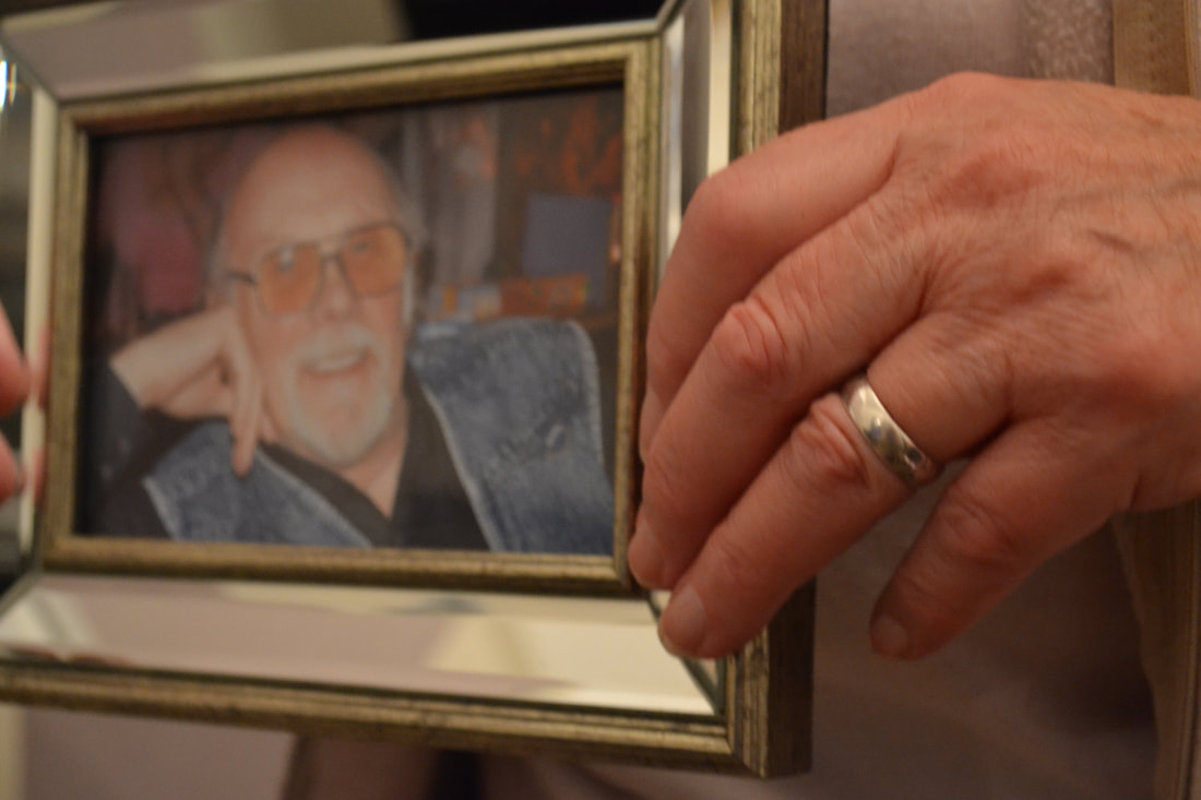
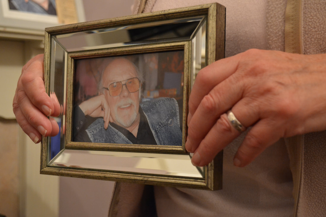
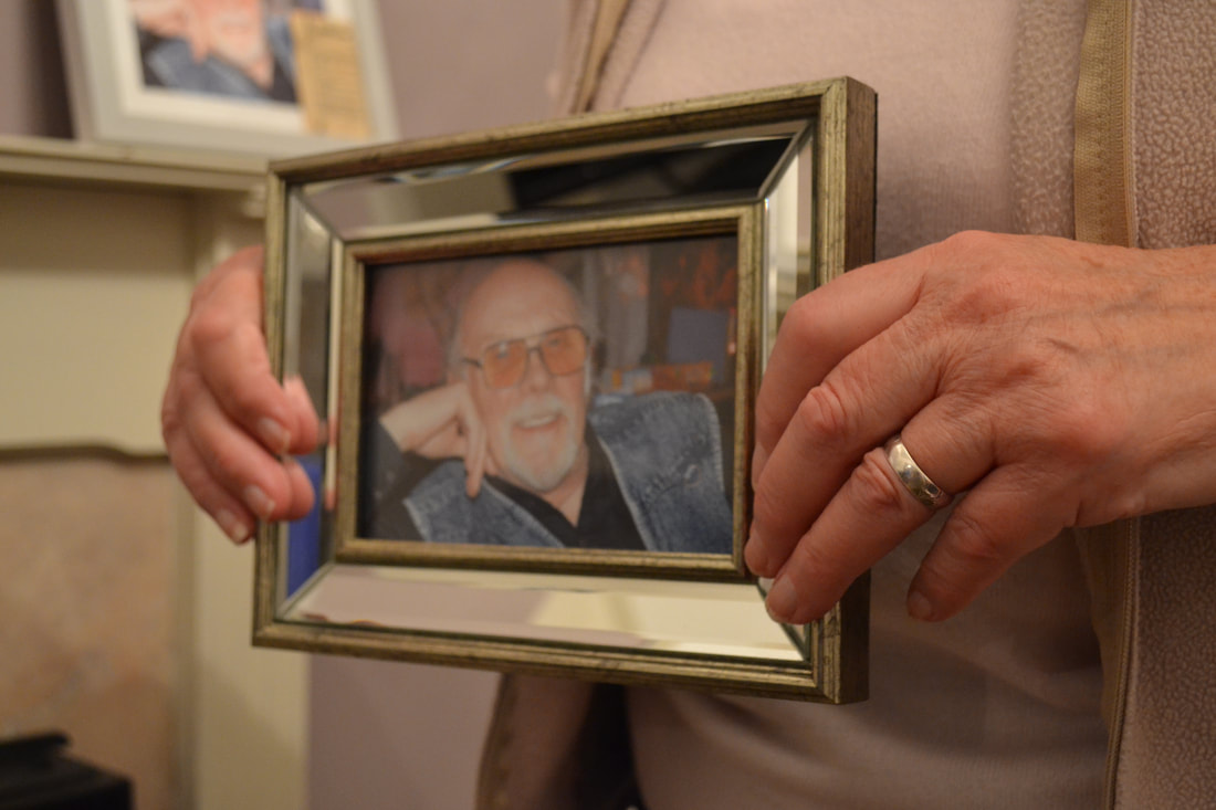
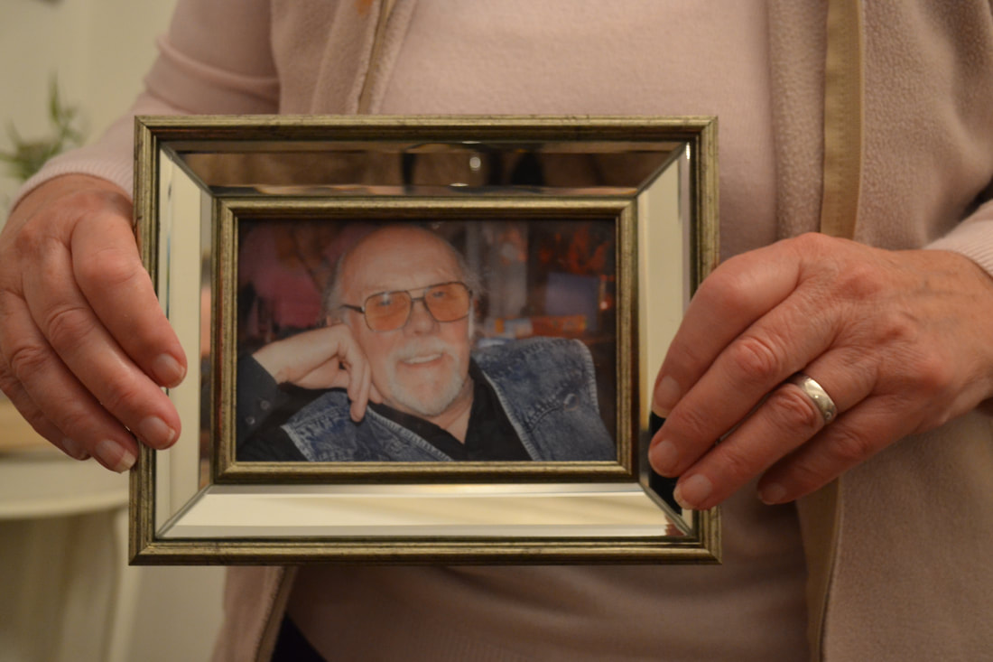
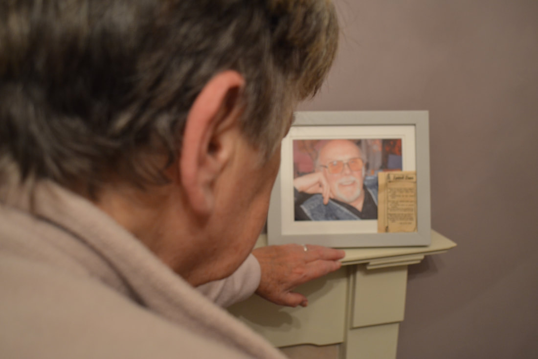
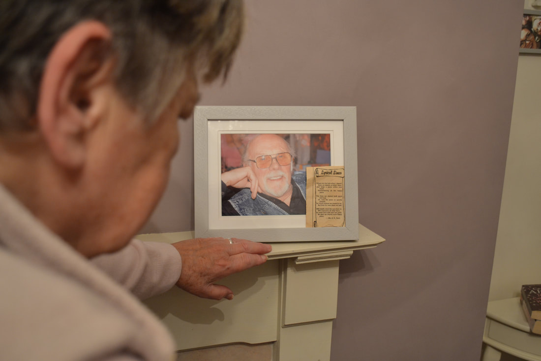
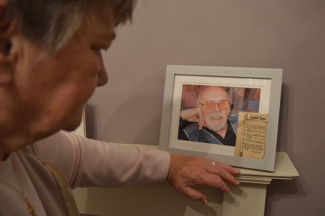
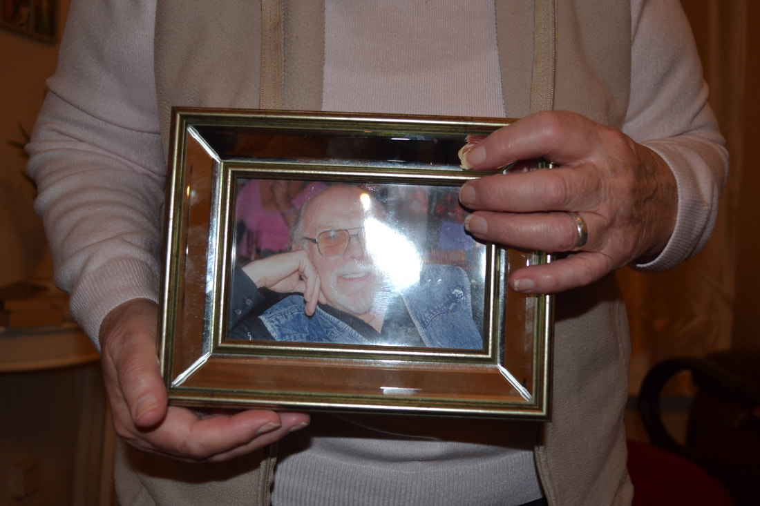
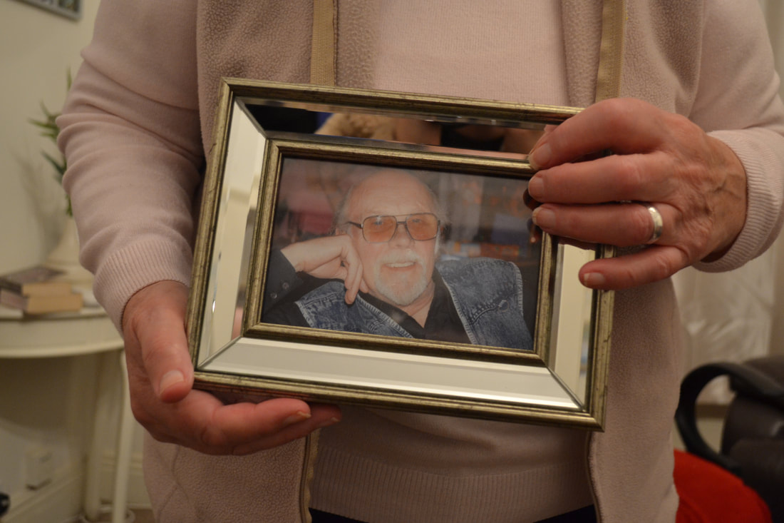
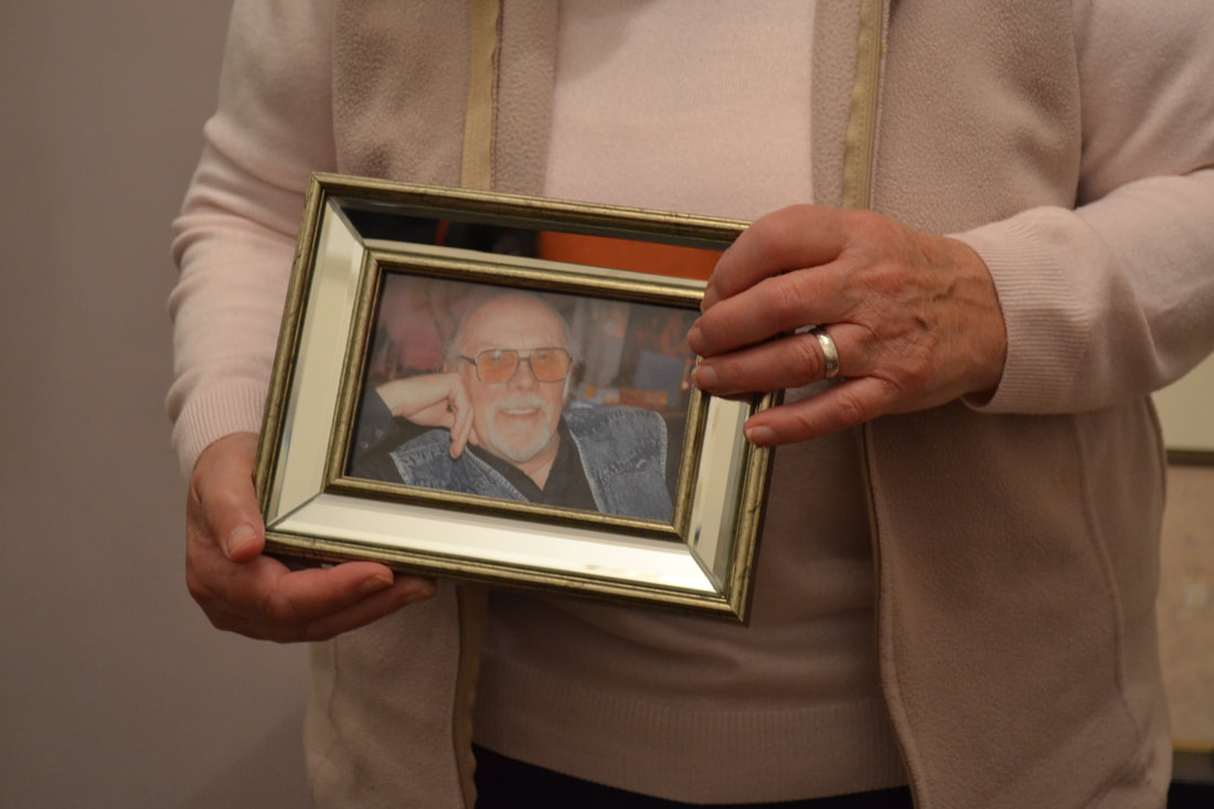
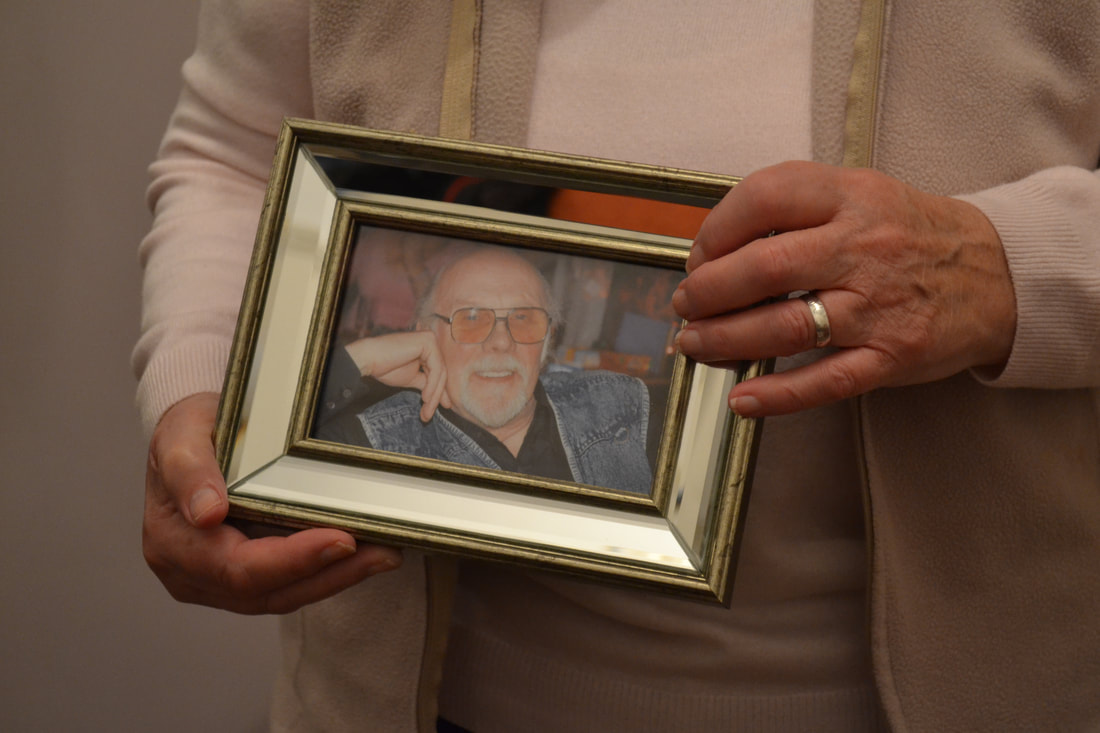
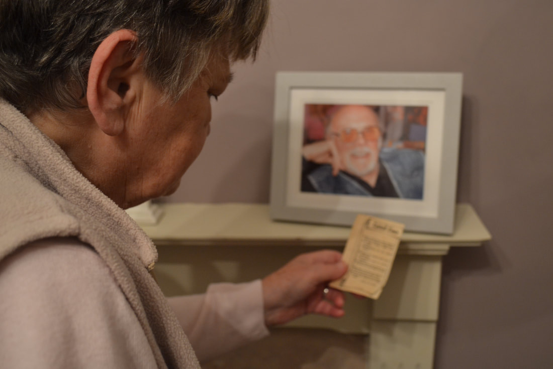
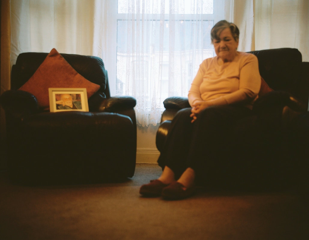
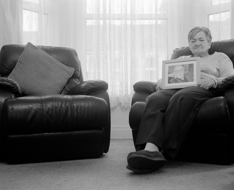
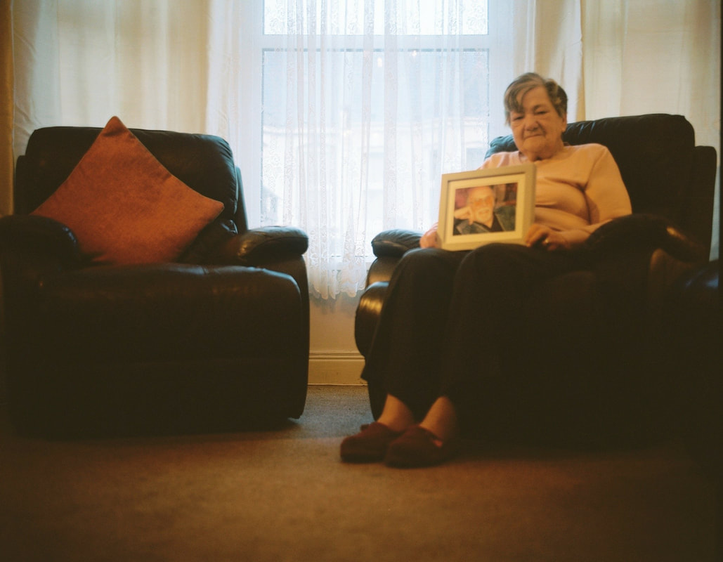
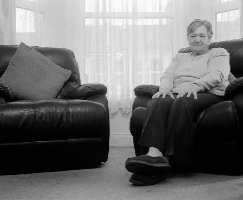
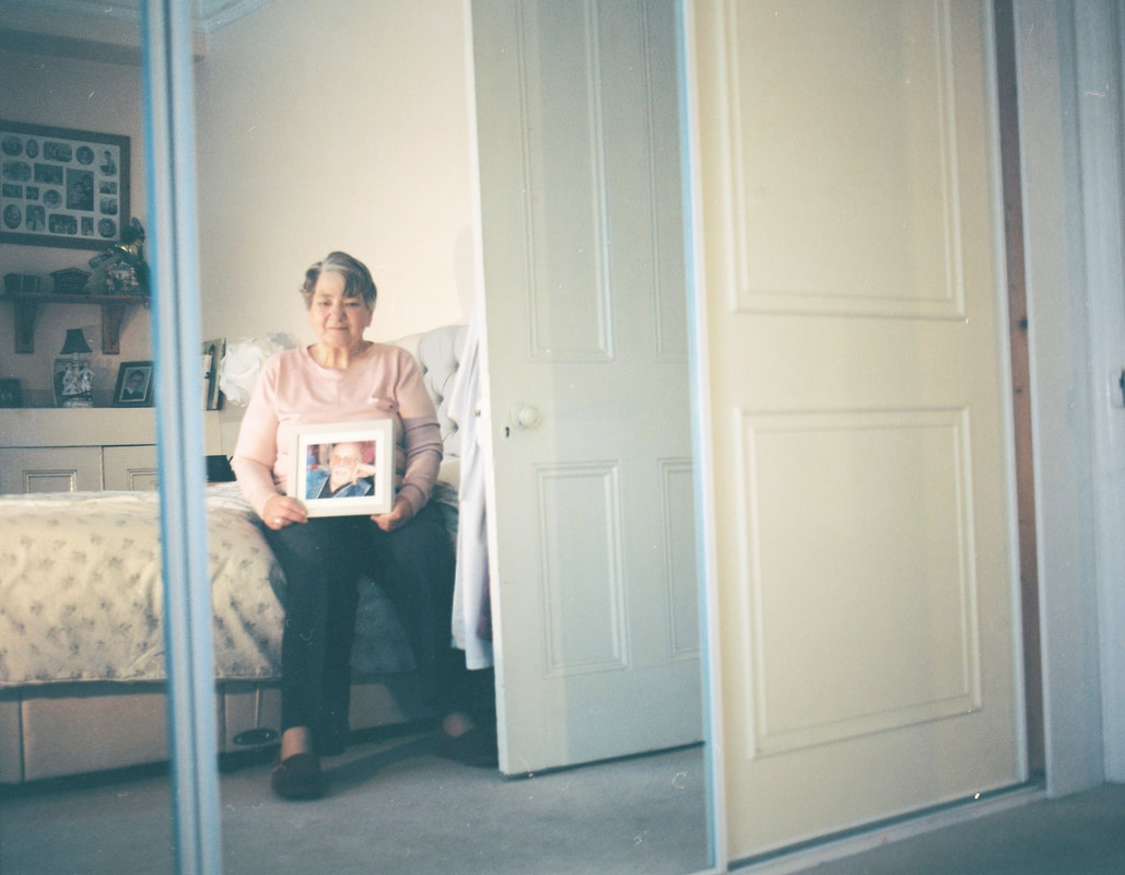
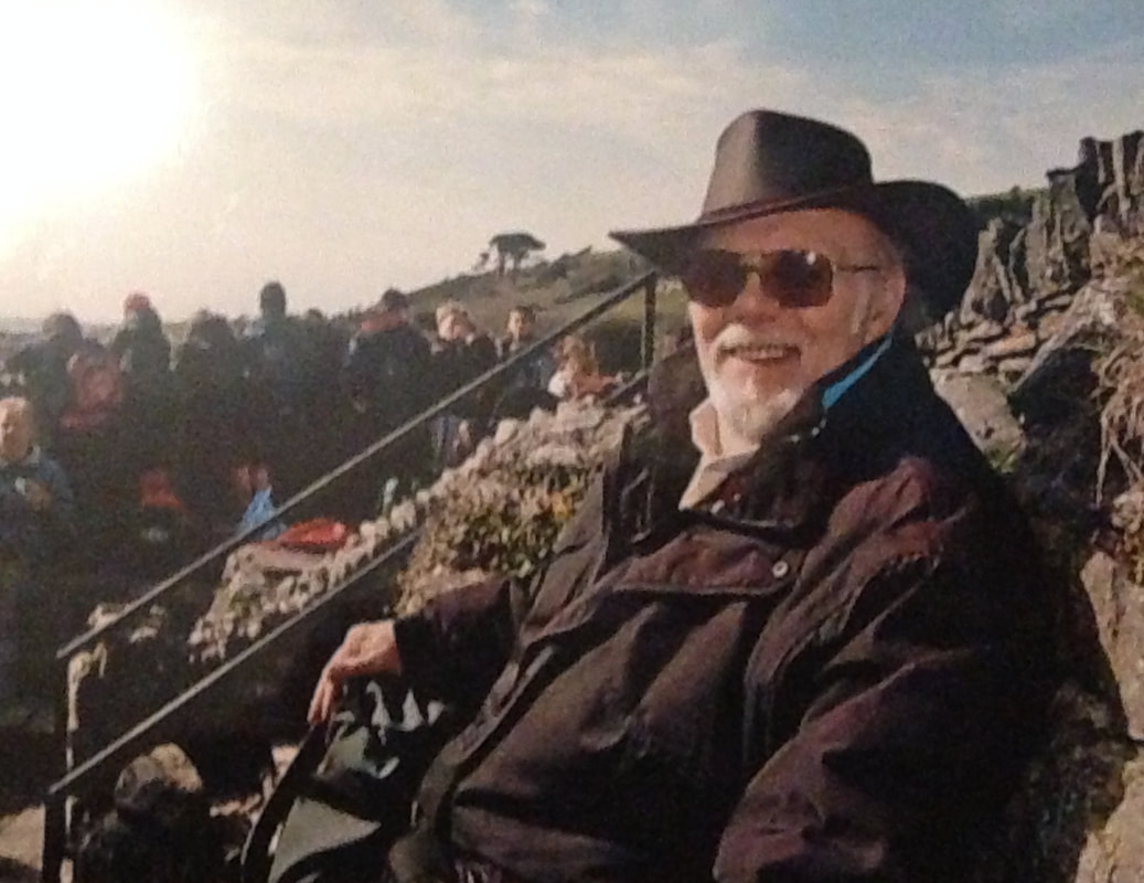
The way in which Glen Erler’s series is based around his family and his families past, has inspired me to base my first shoot around this idea. I want to capture portraits of members of my family using light and shadows to enhance the focus point of the images and make a plain portrait more interesting for the viewer. In Erler’s work where he uses shadows to portray memory, I want to accomplish something similar in my work to use shadows to enhance the memory of my Grandad. I intend on looking at the memory of my Grandad and how that affects my family today through taking photographs of the relationship between my grandparents. I hope to capture a series of images that show the strong relationship between my Nan and my Grandad through including photos of him in my photography. This idea was inspired from looking at Erler’s work where a photograph has been included in a photograph. When it comes to editing my set of images, I plan on adjusting the levels in order to darken the shadowed area, I will also use the burn tool to achieve this.
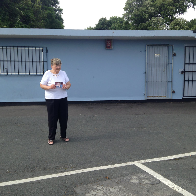
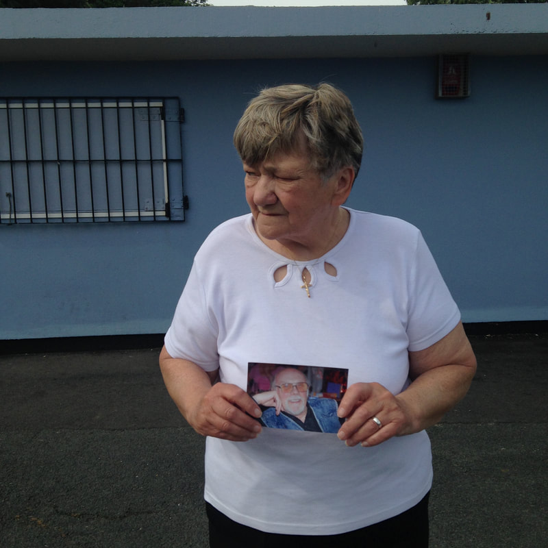
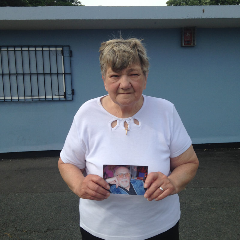
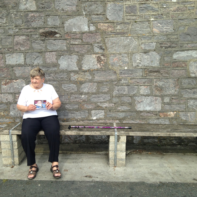
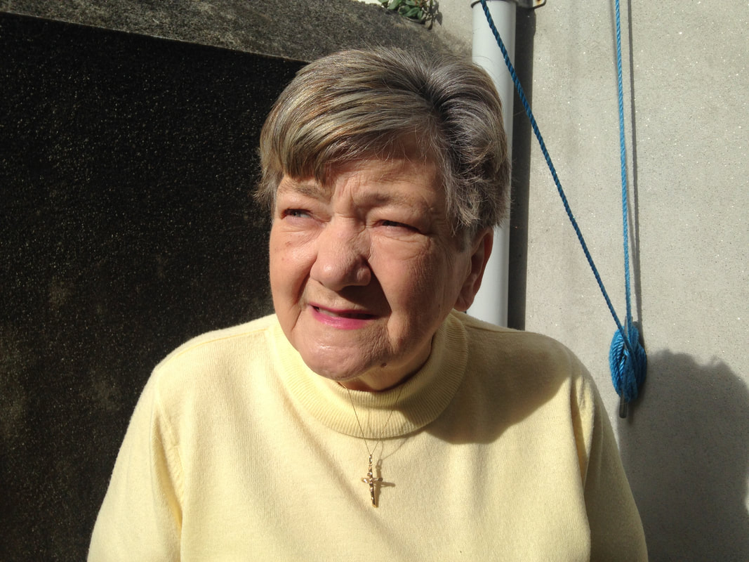
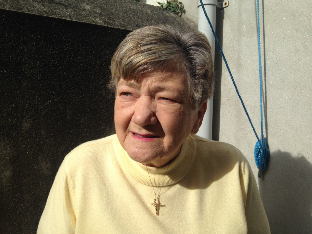
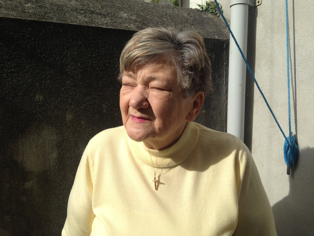
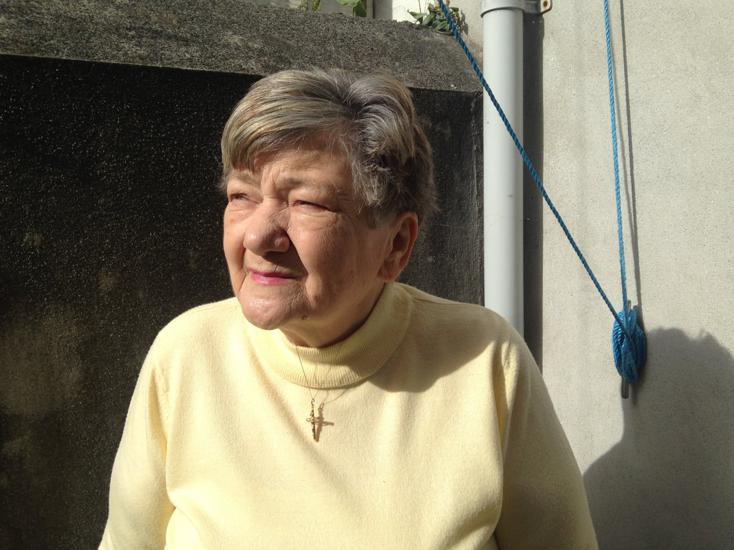
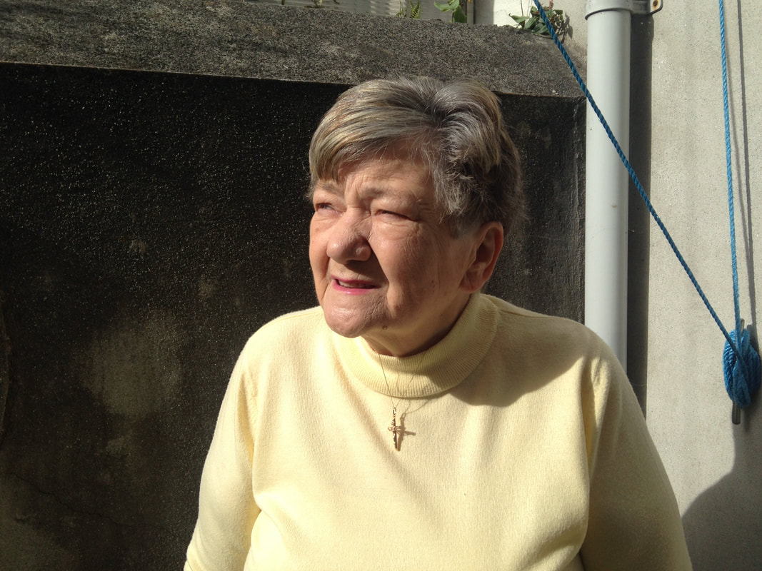
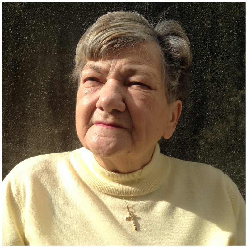
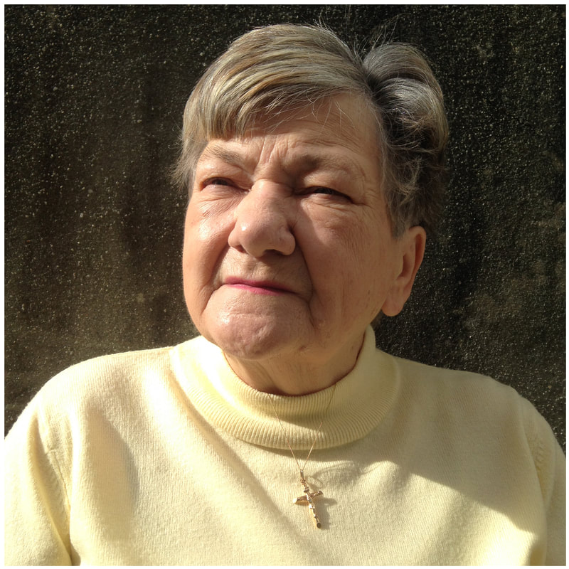
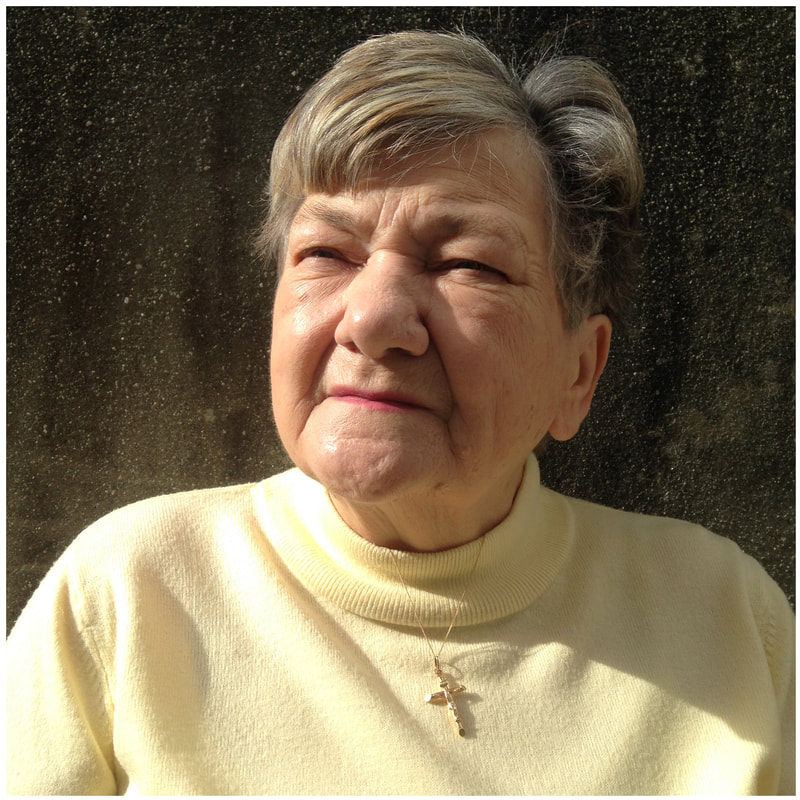
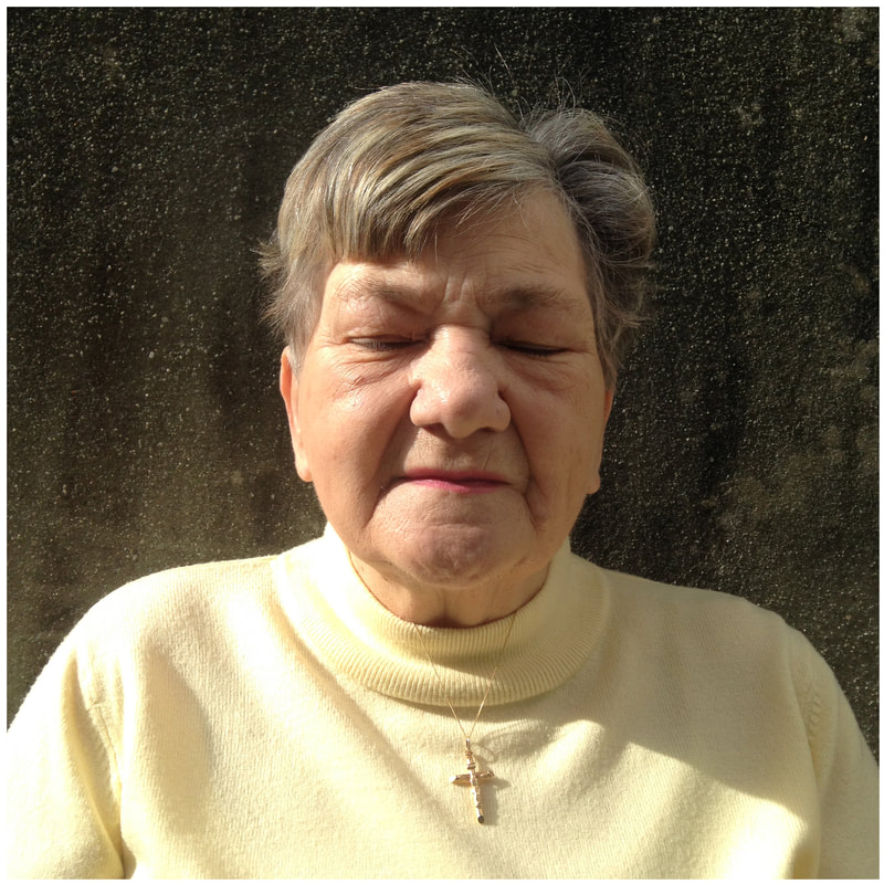
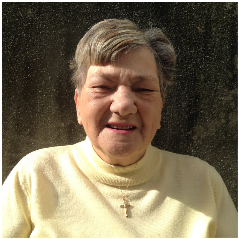
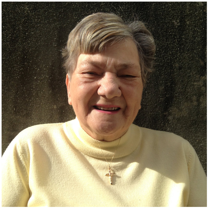
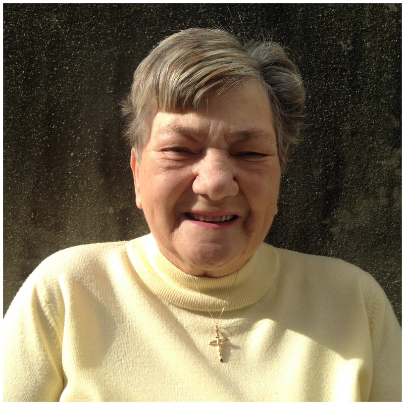
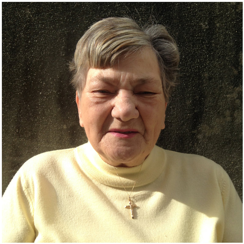
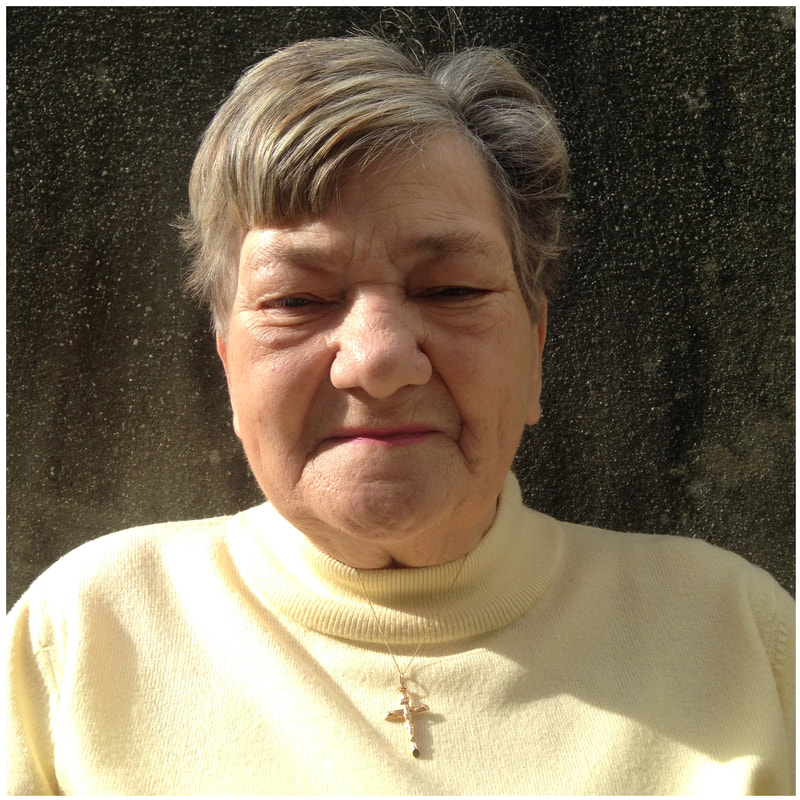
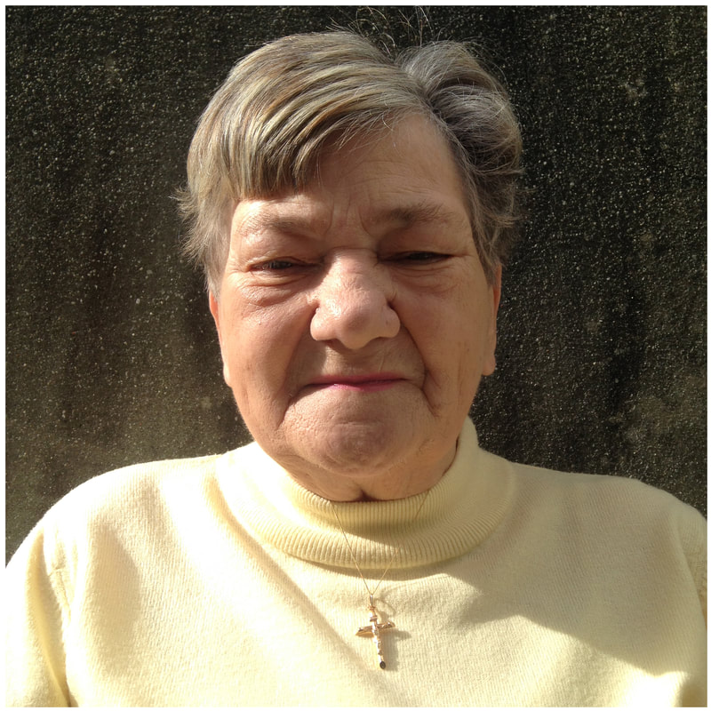
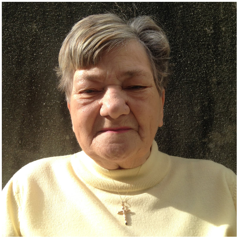
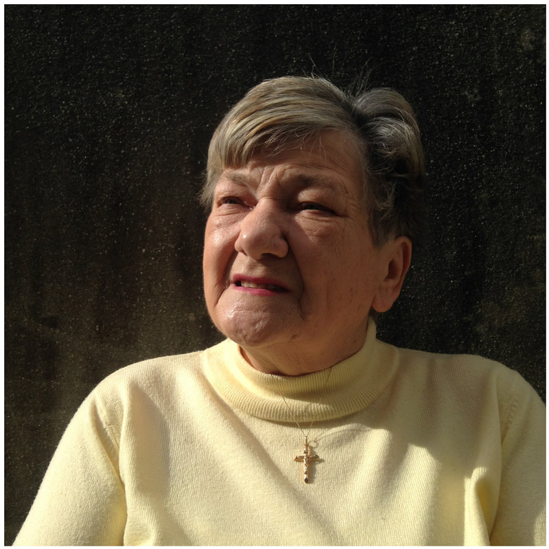
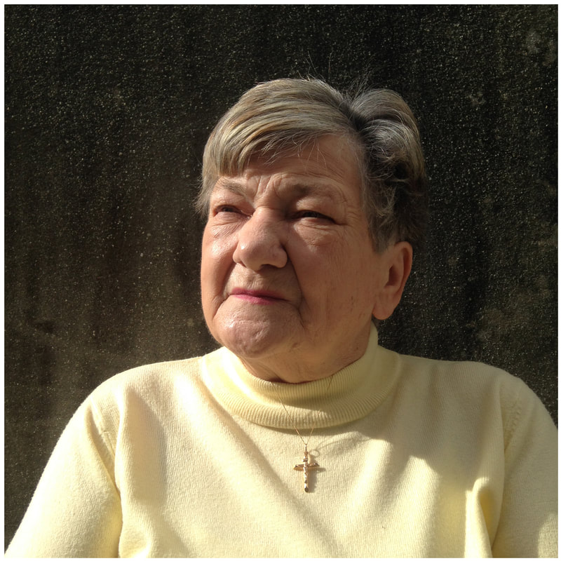
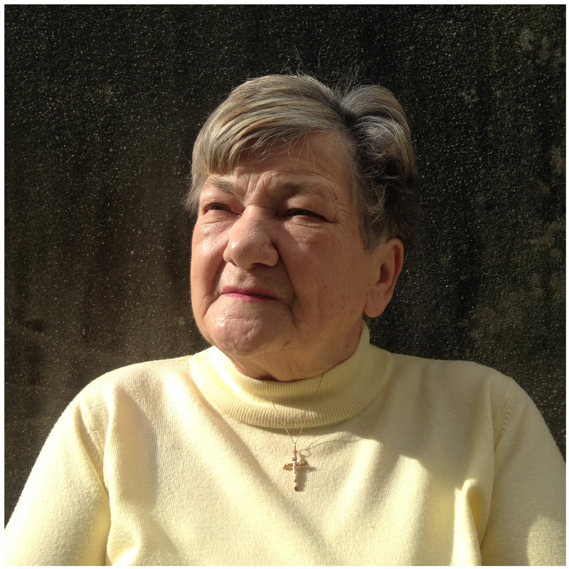
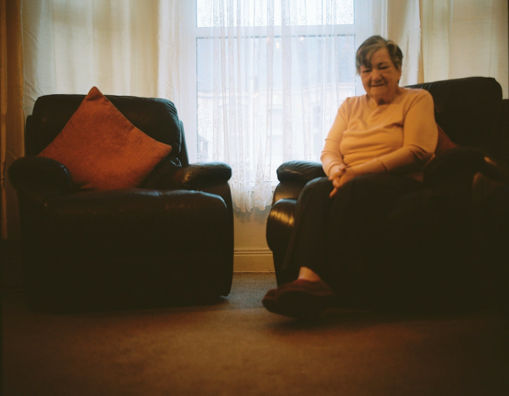
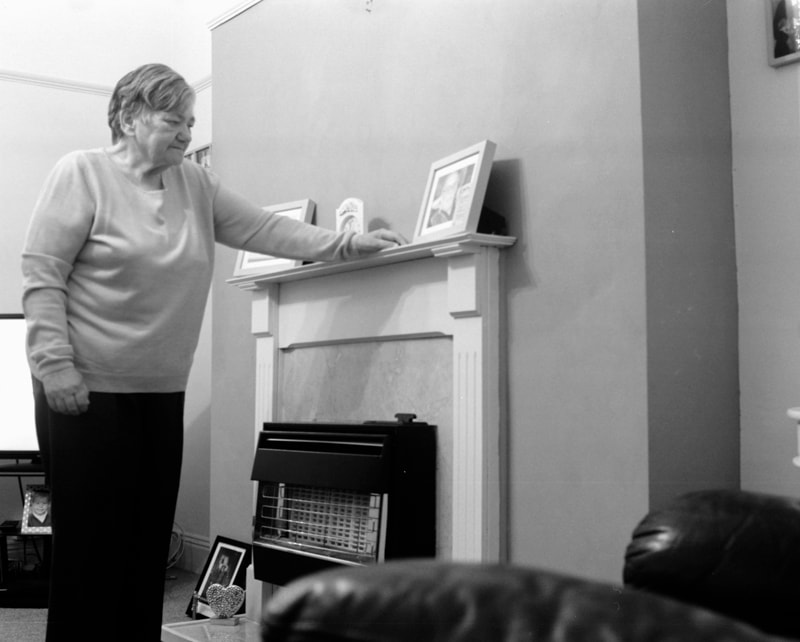
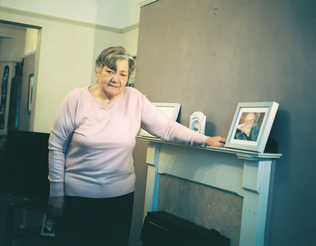
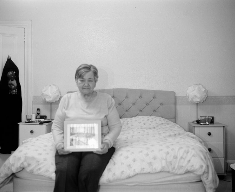
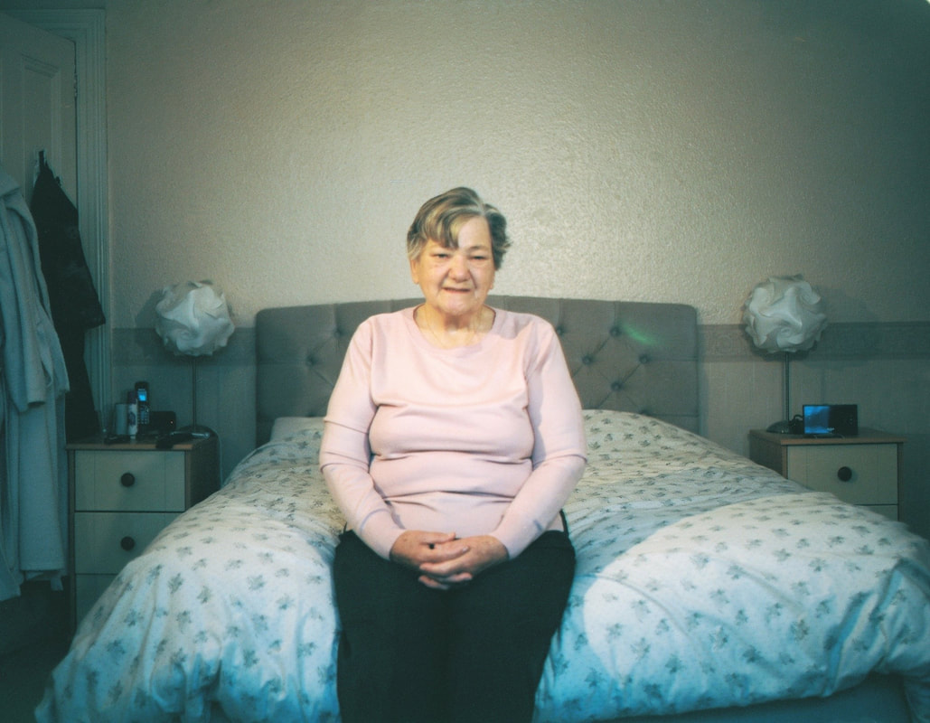
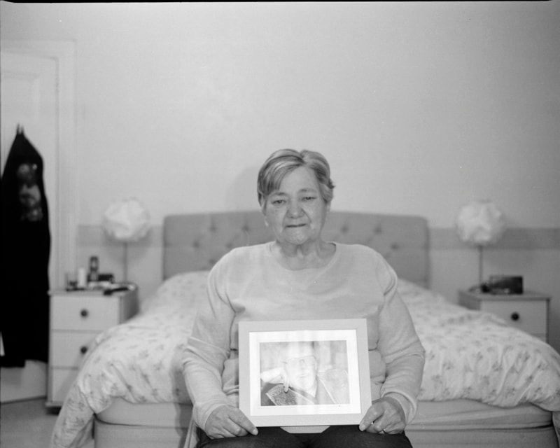
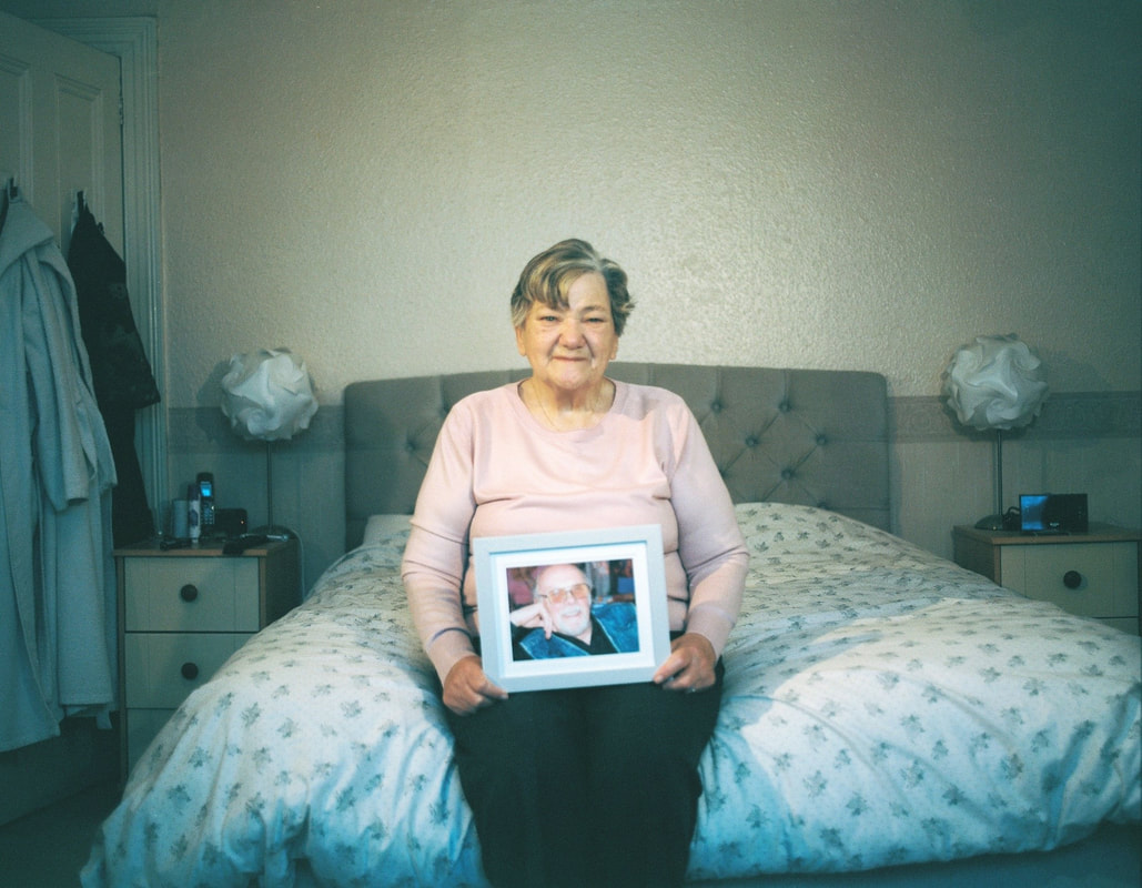
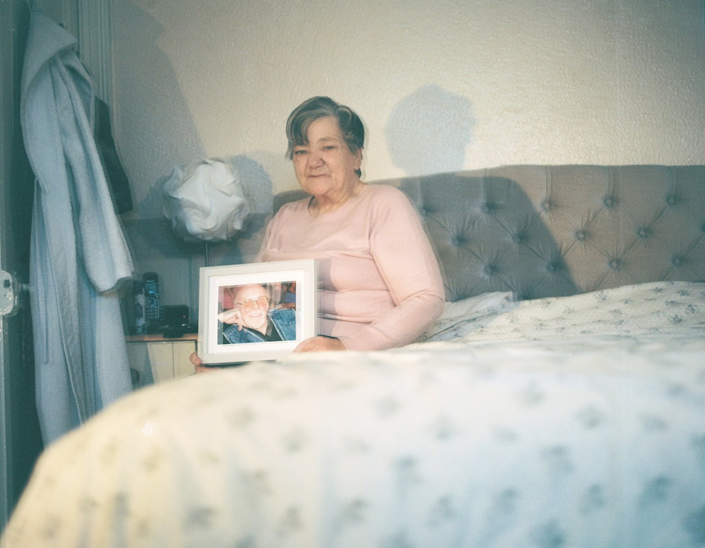
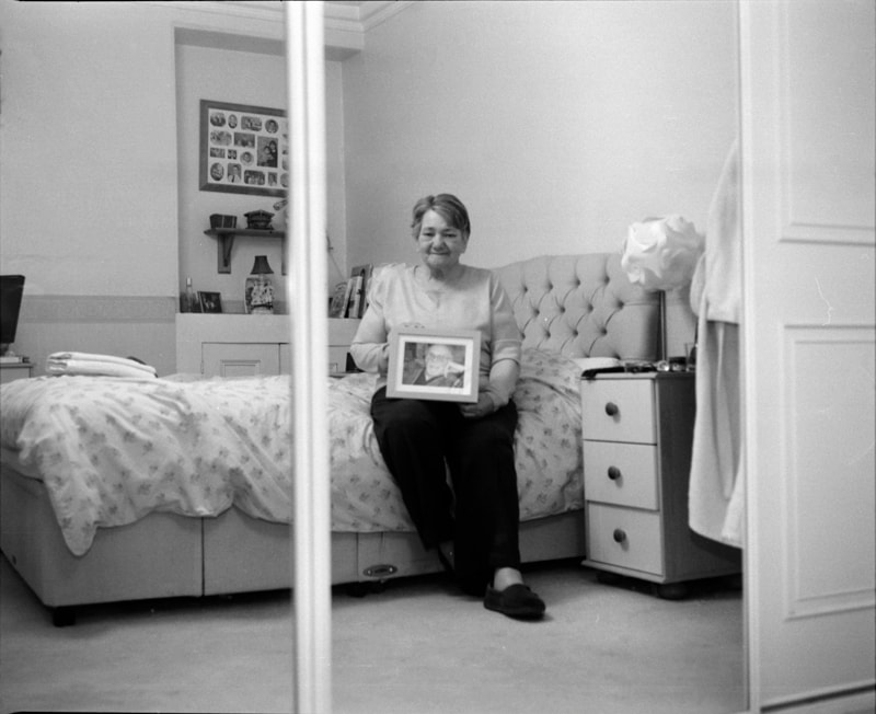
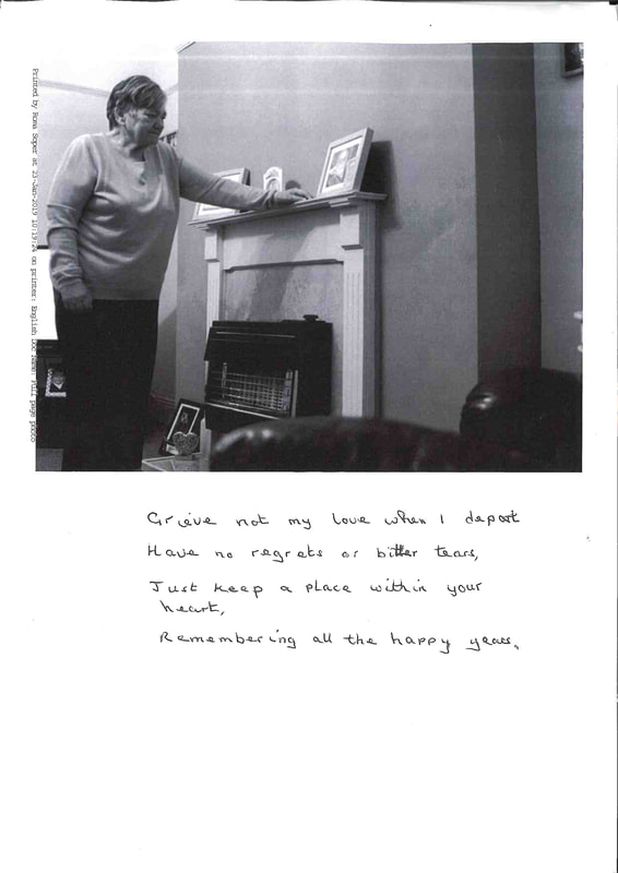
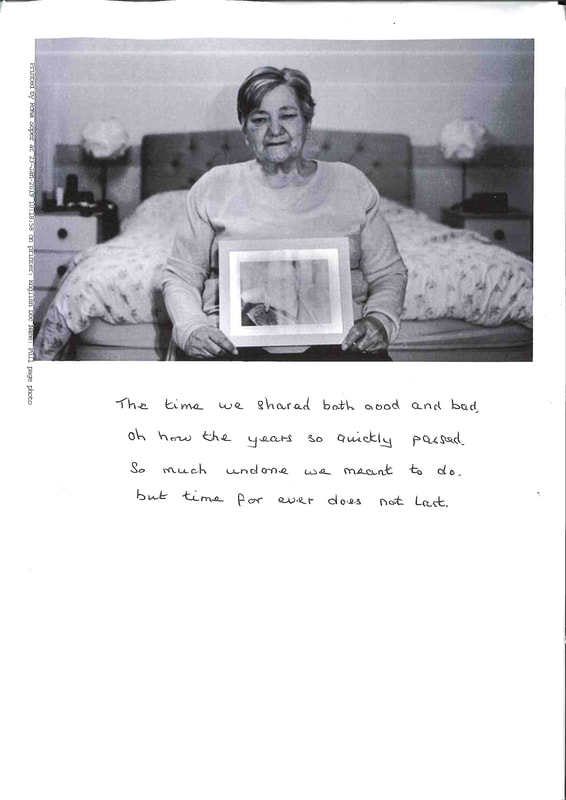
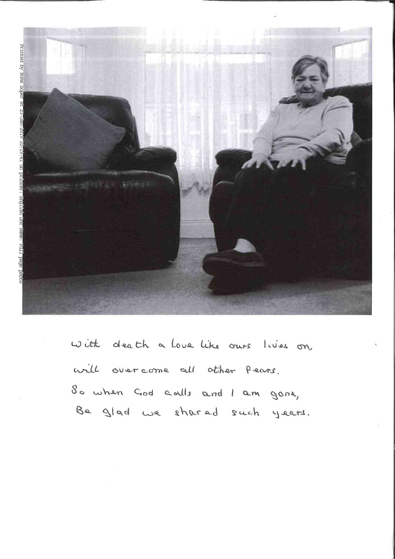
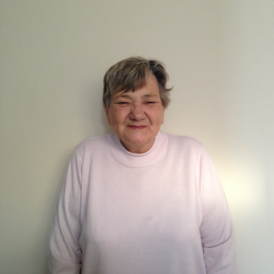
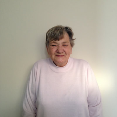
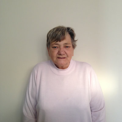
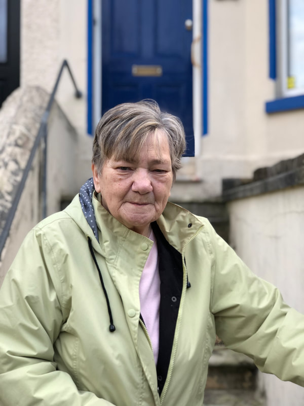
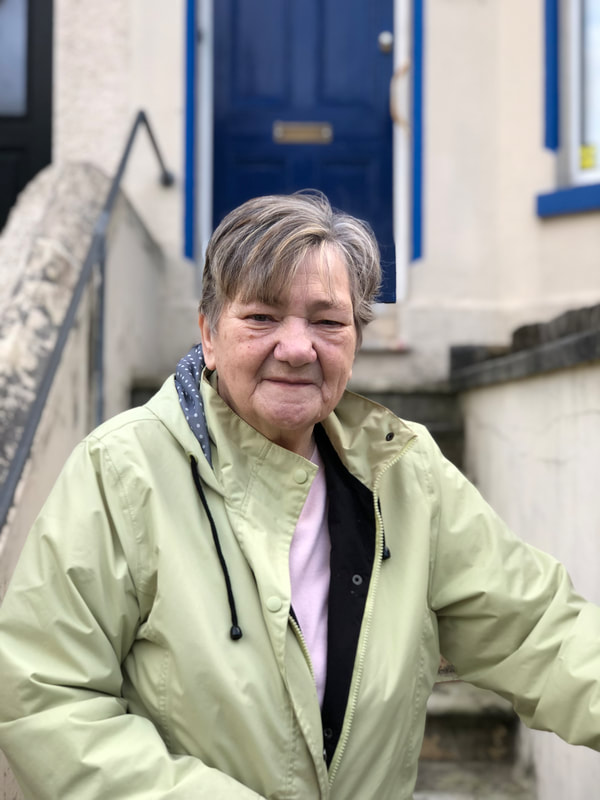
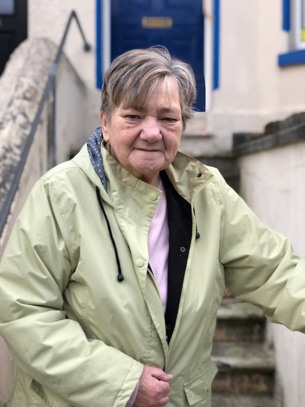
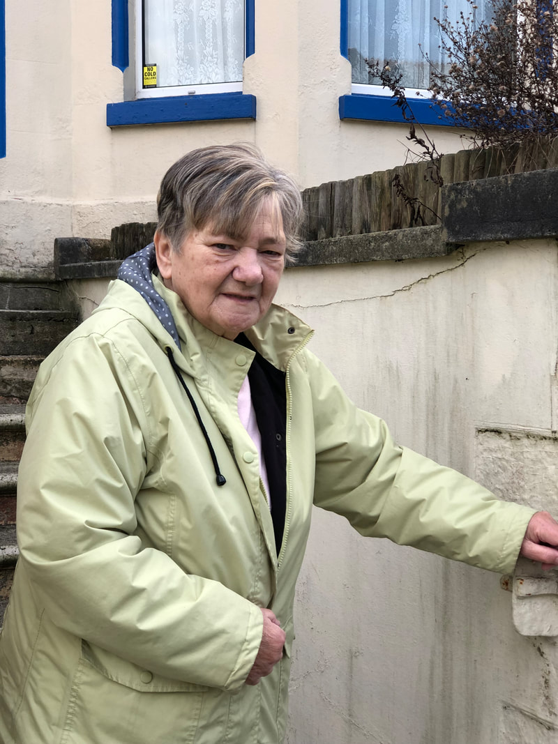
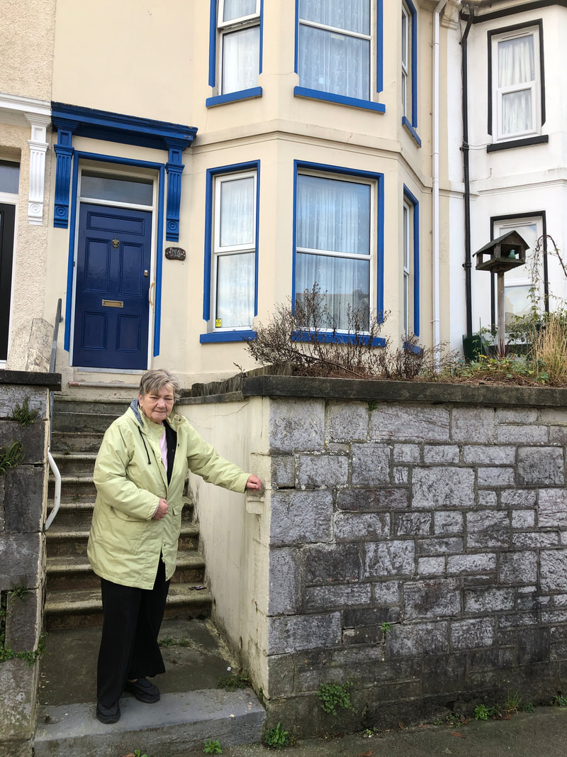
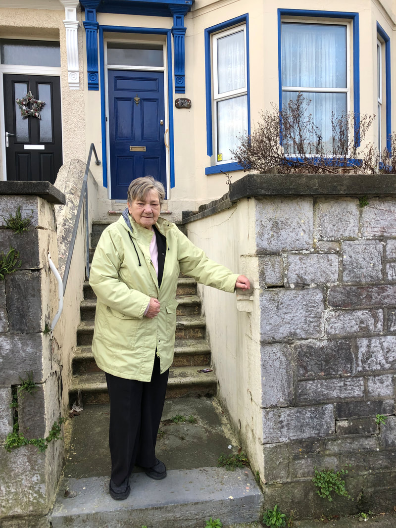
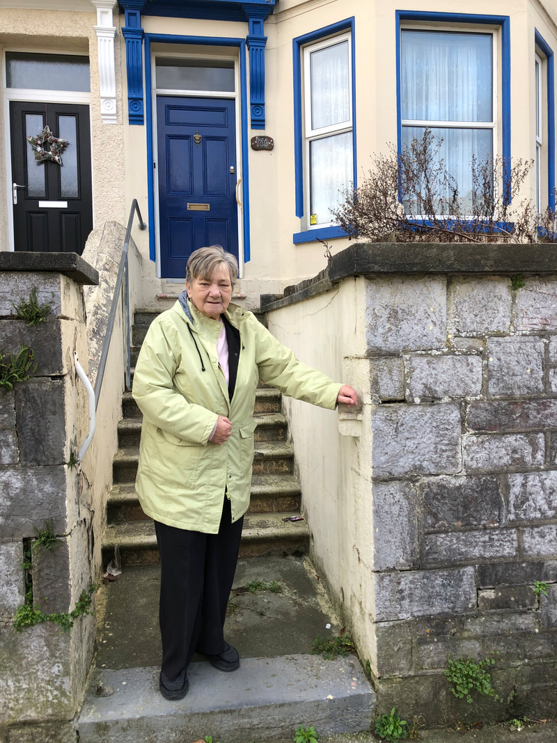
Shoot One
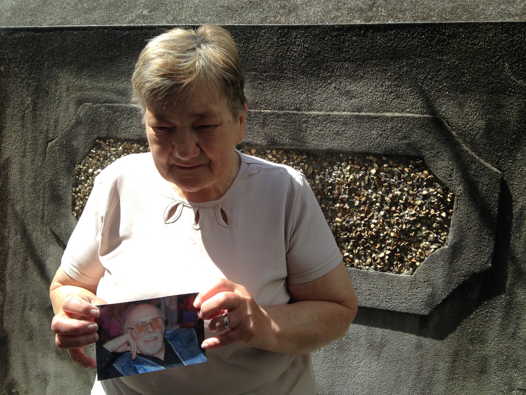
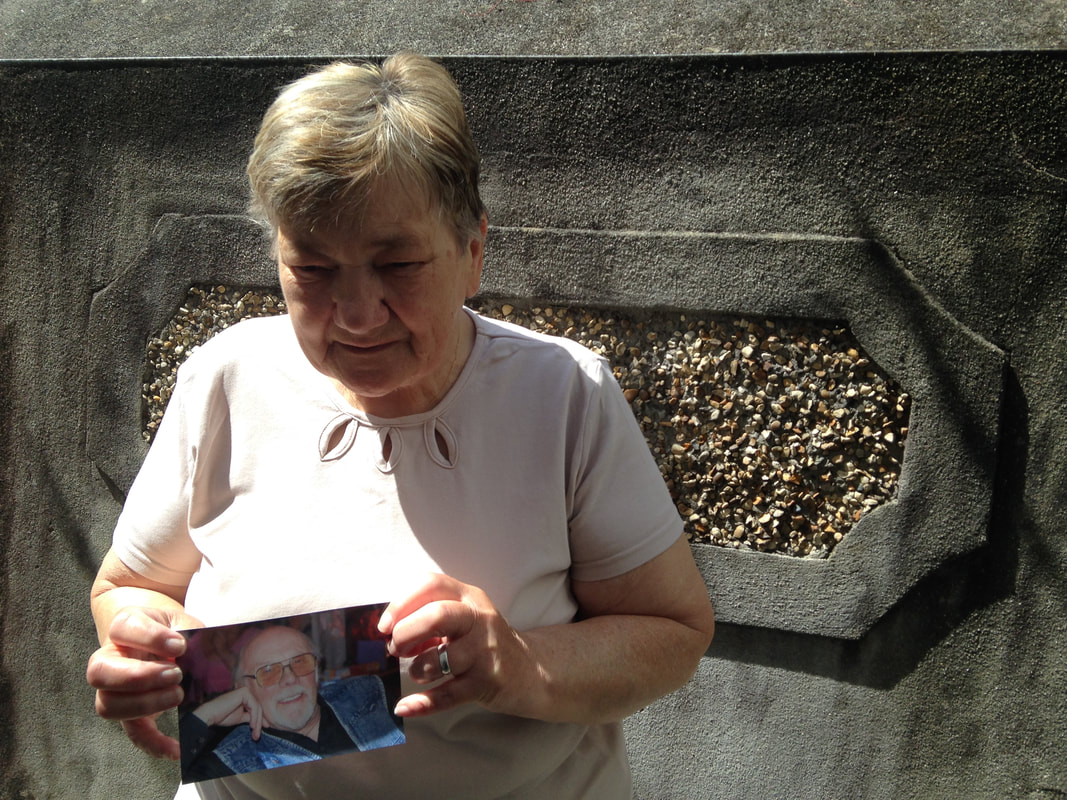
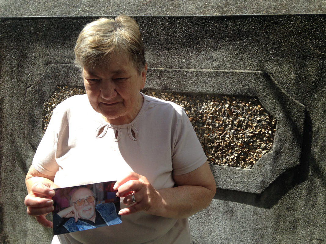

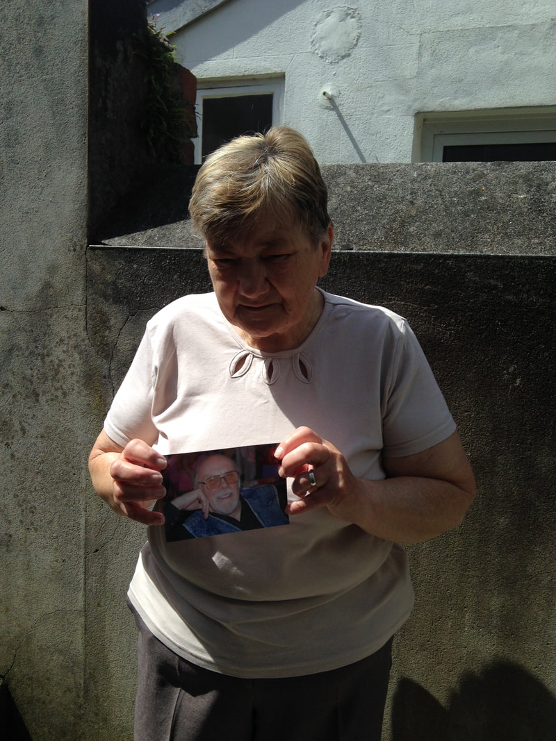
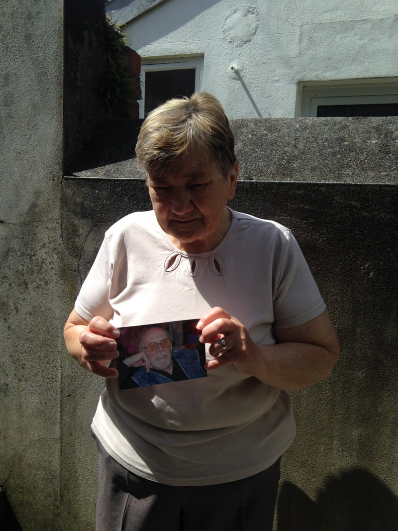
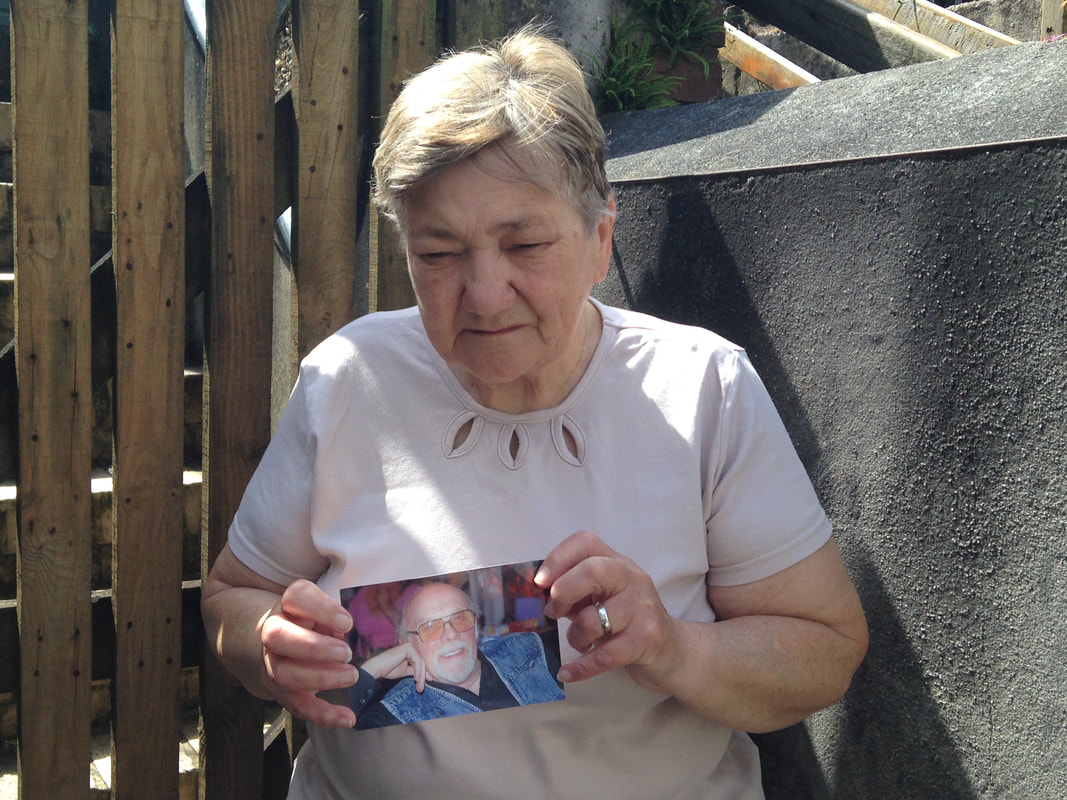
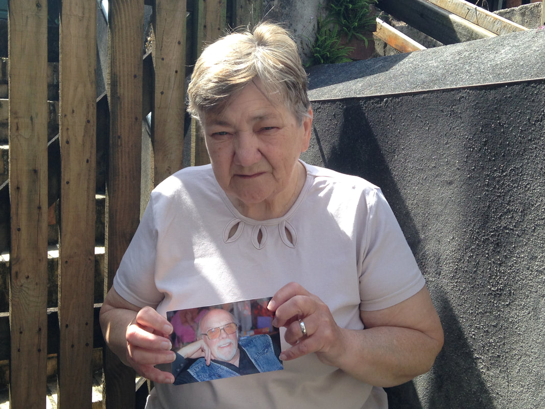
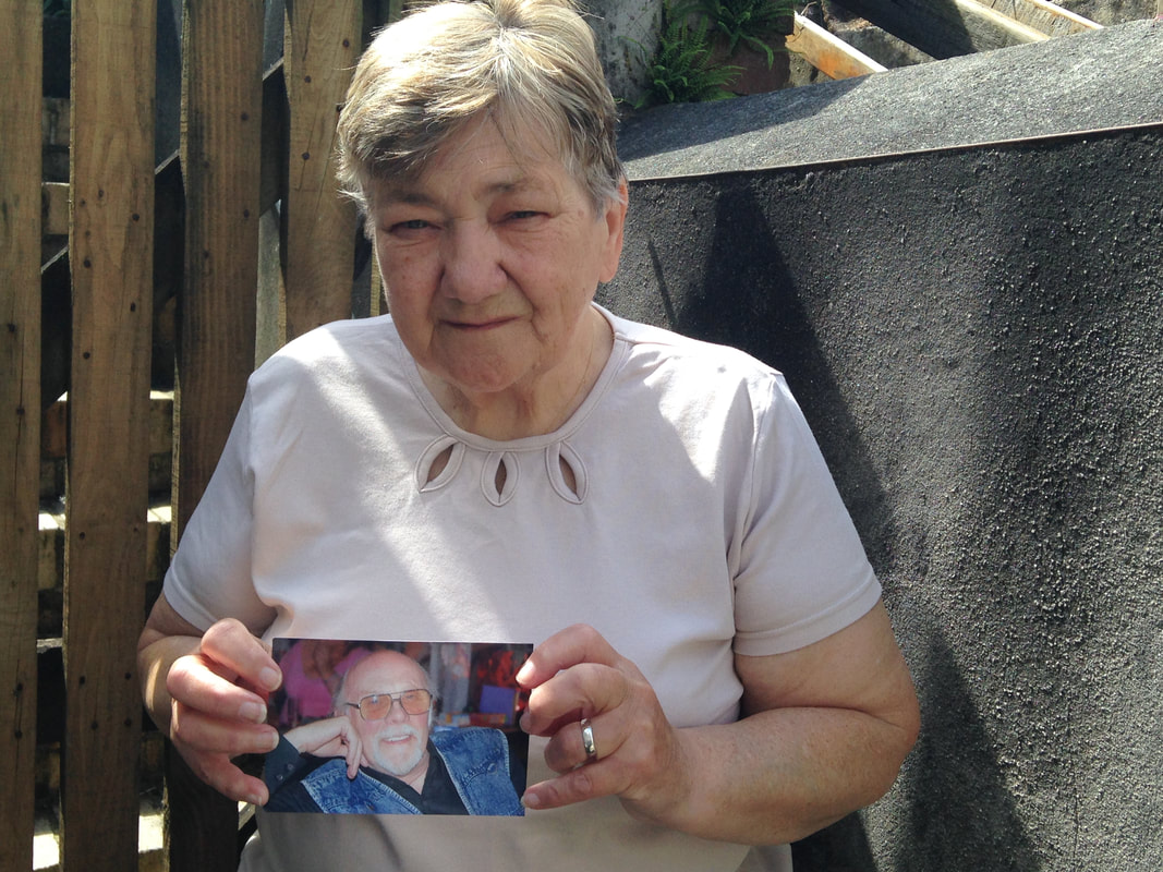
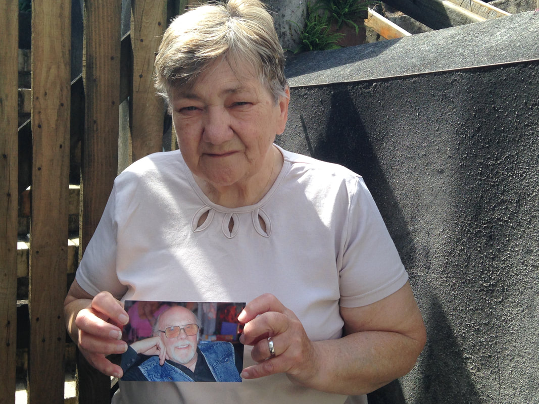
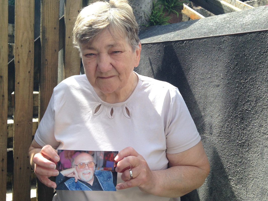
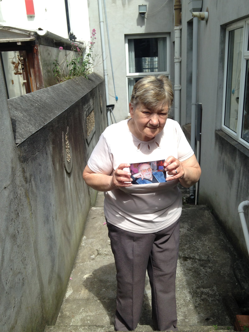
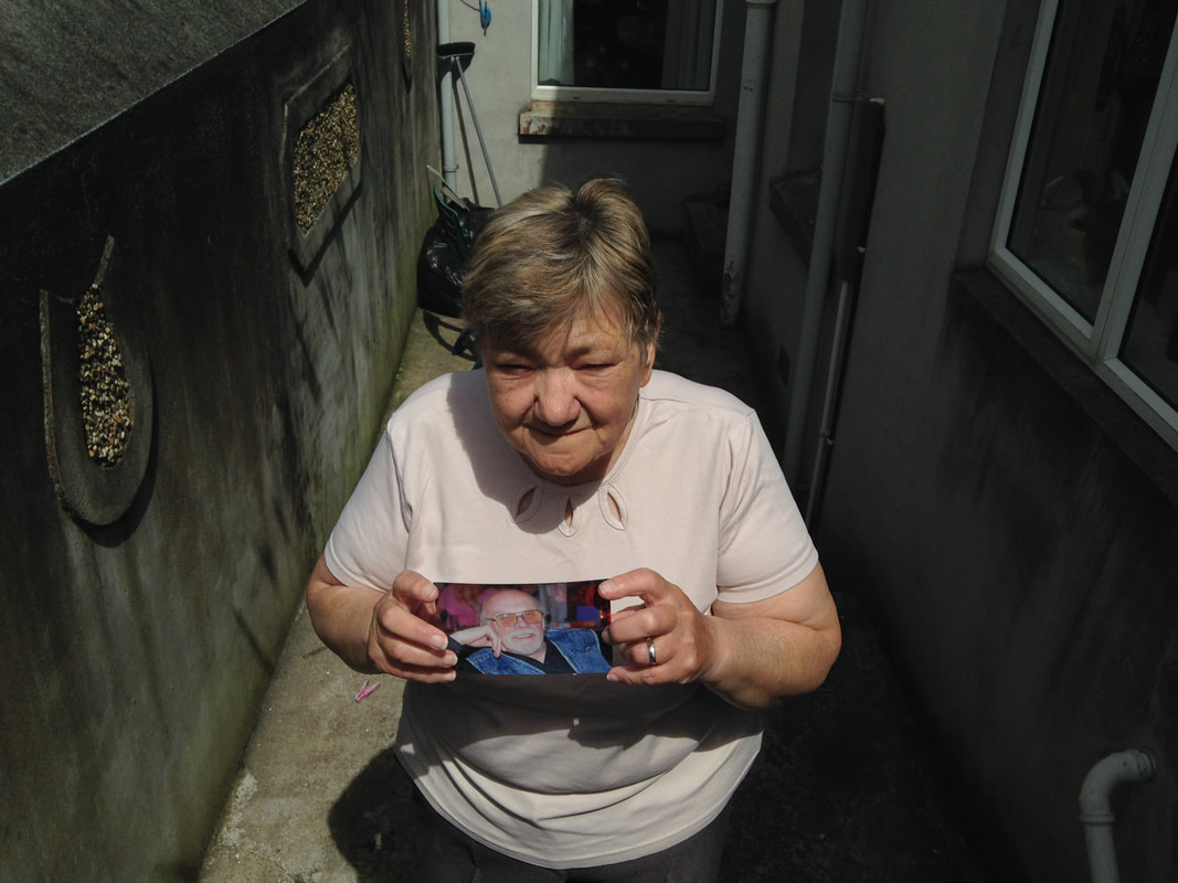
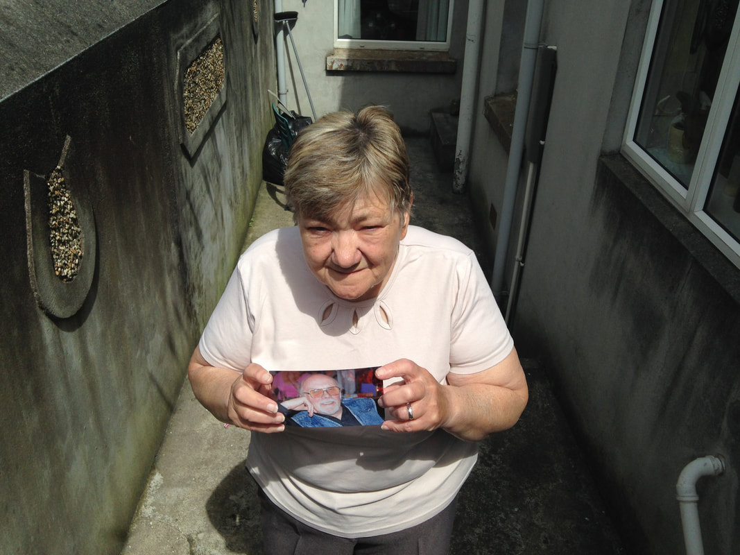
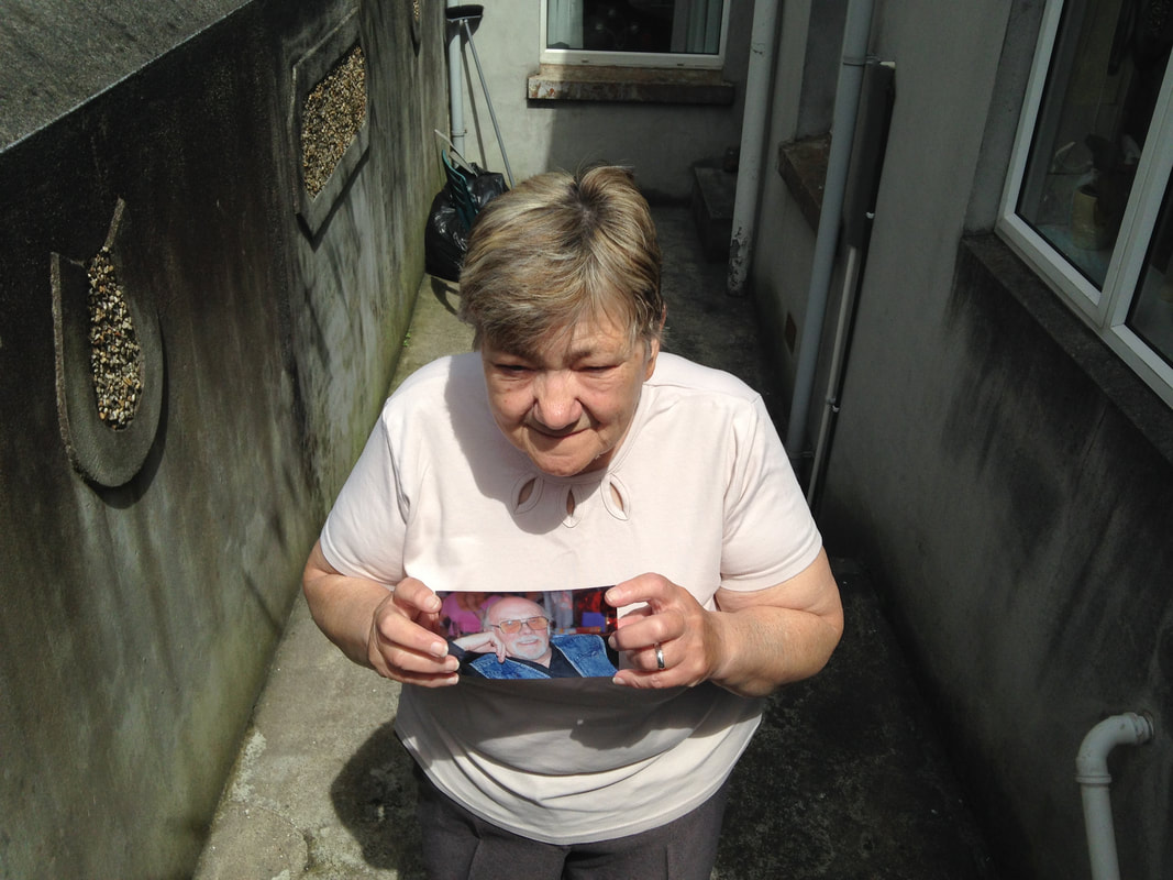
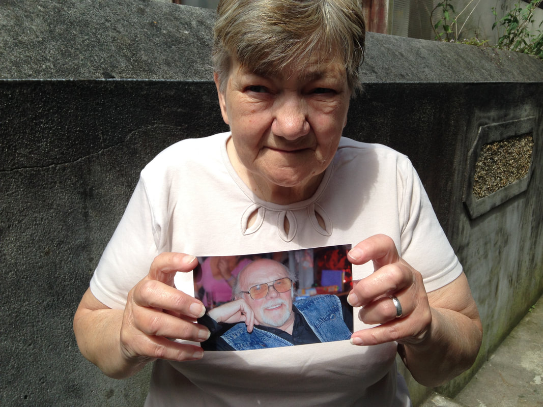
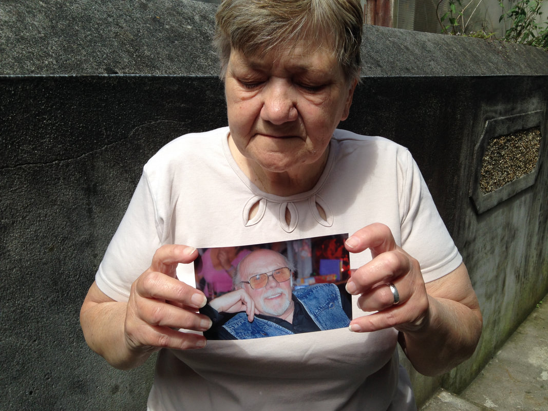
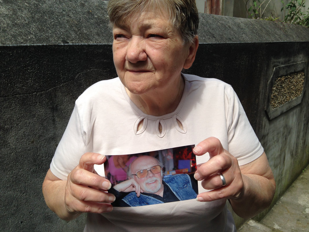

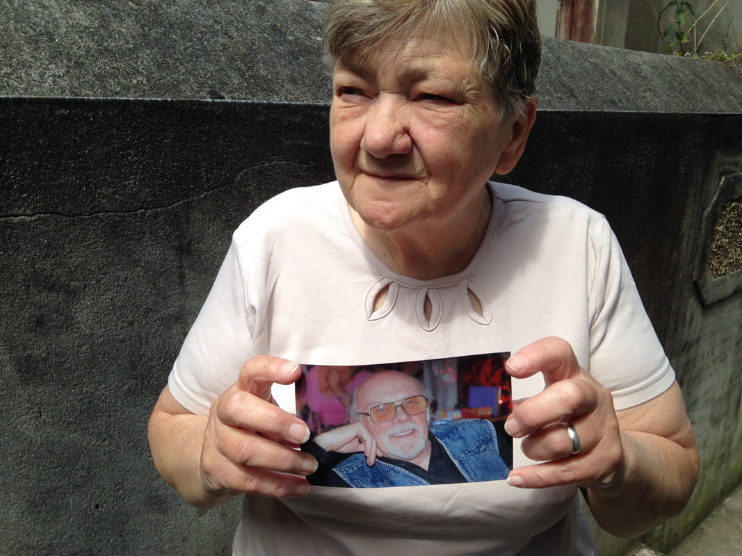
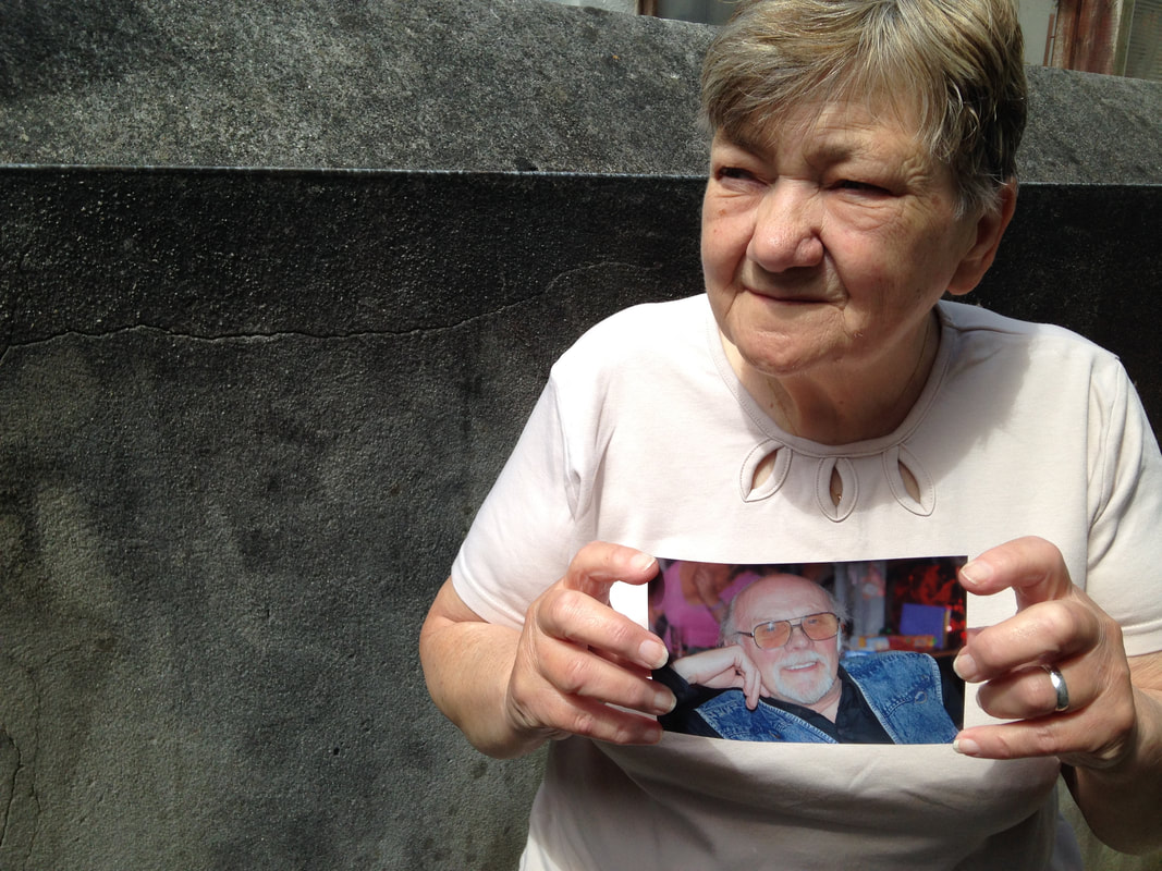
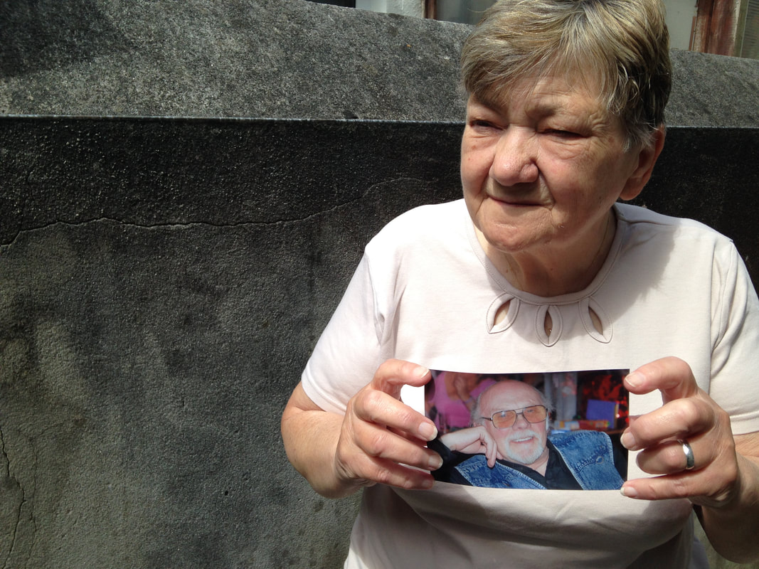
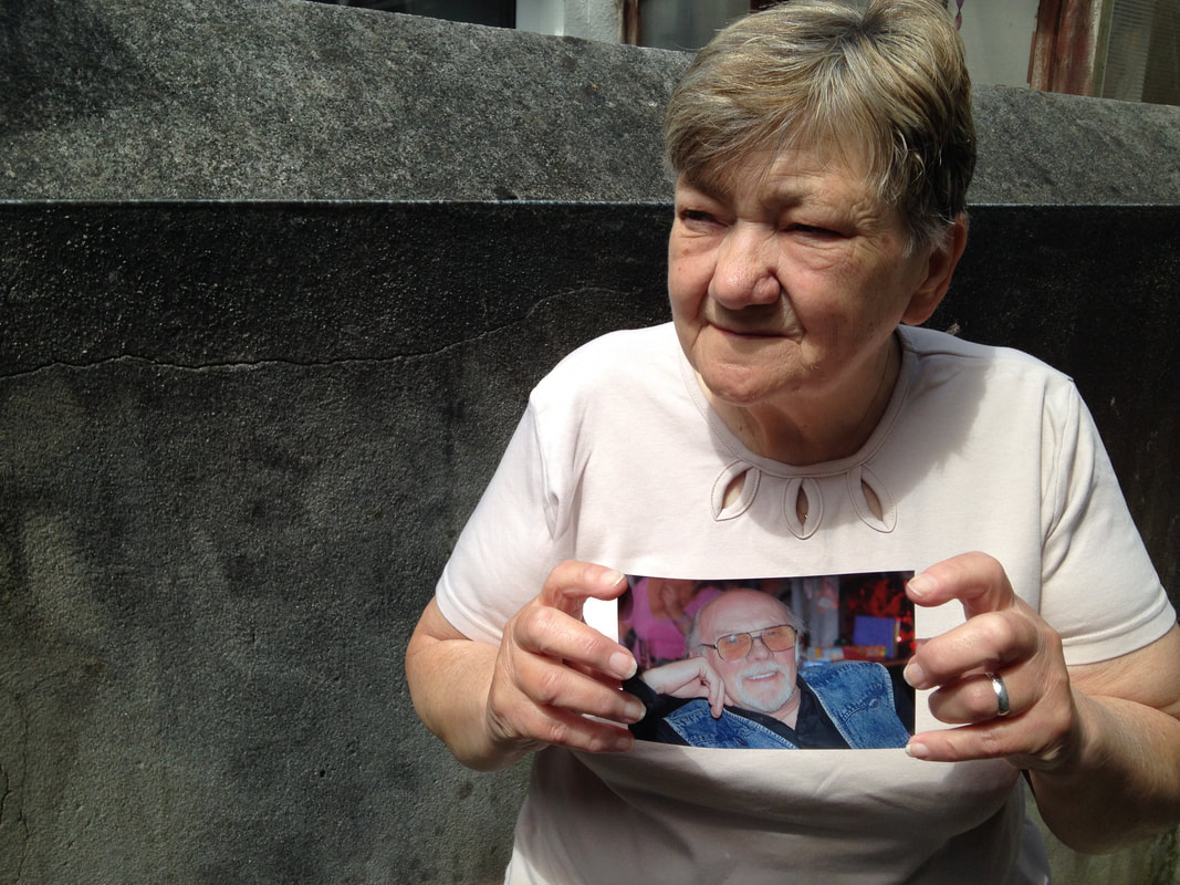
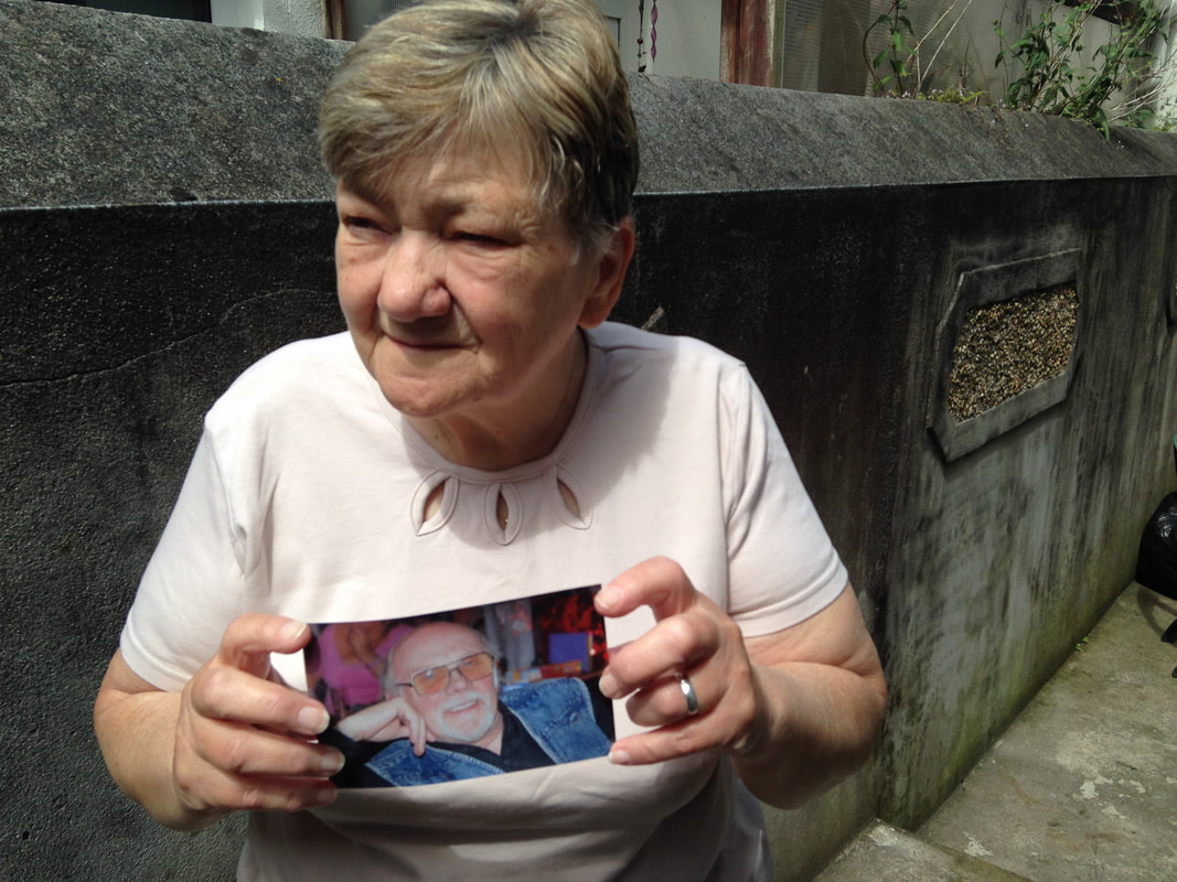
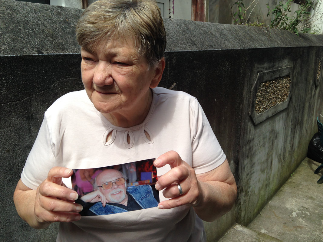
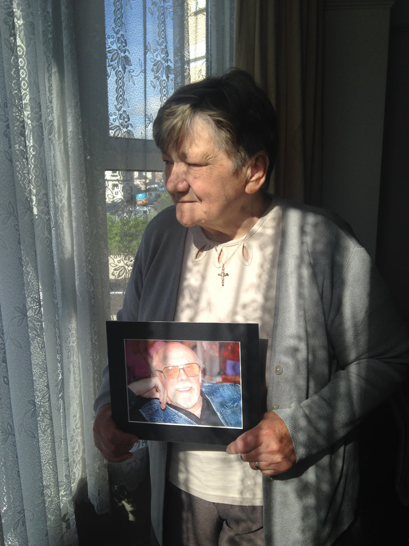
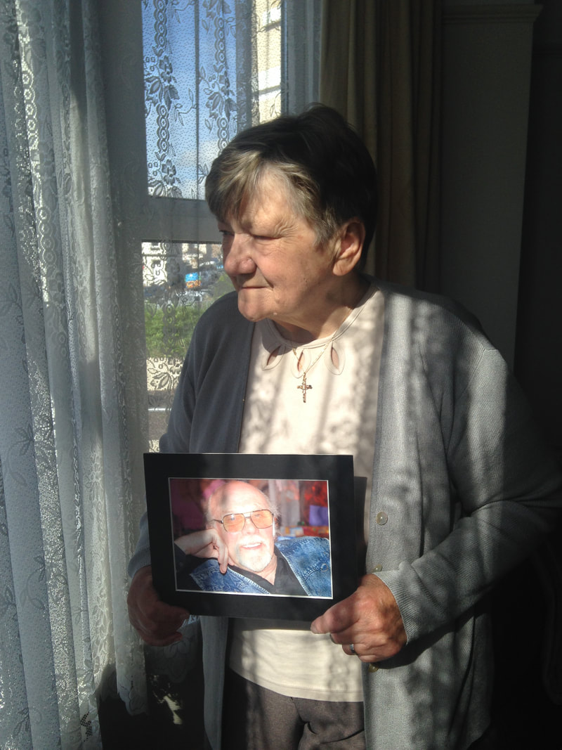
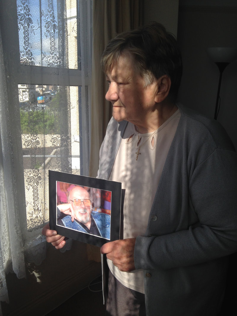
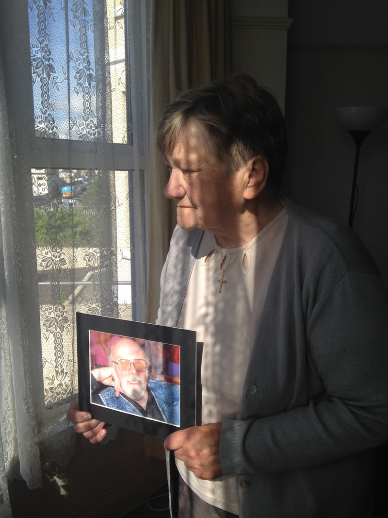
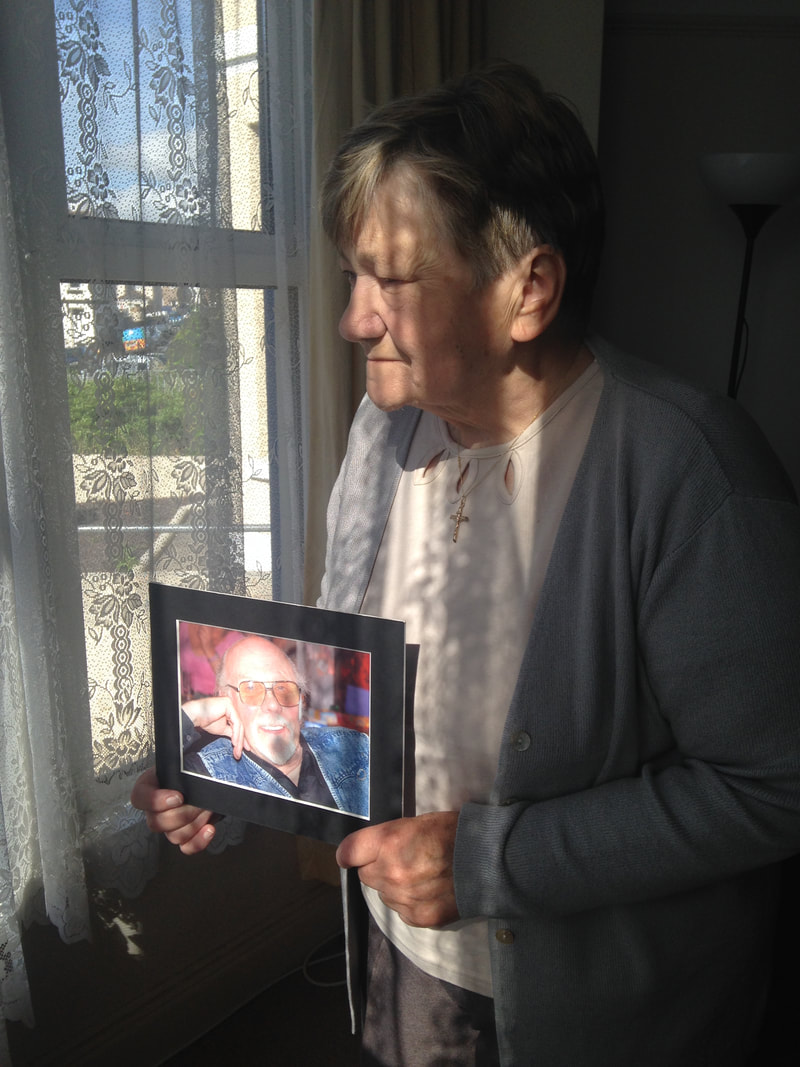
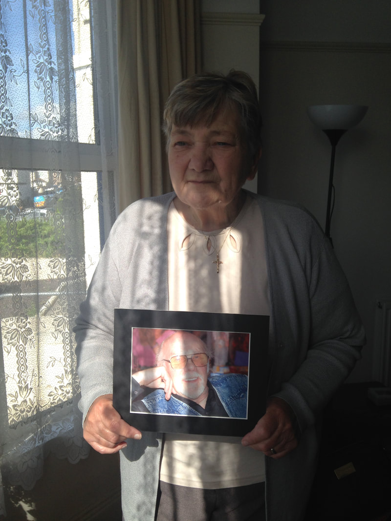
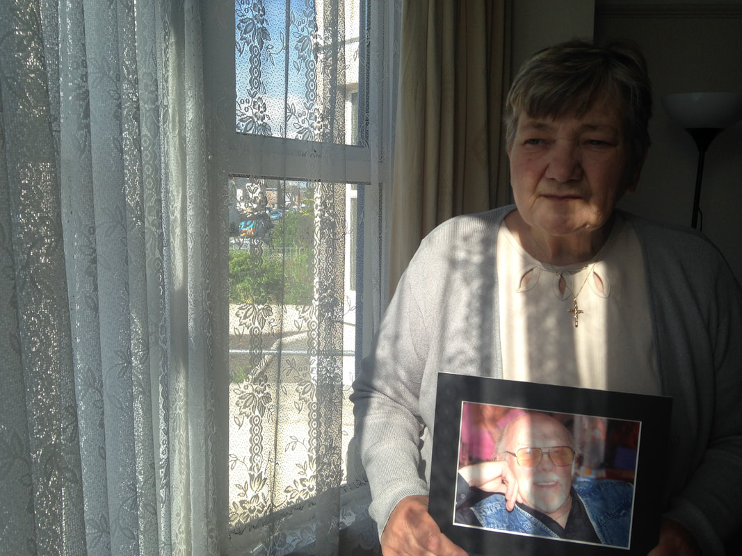
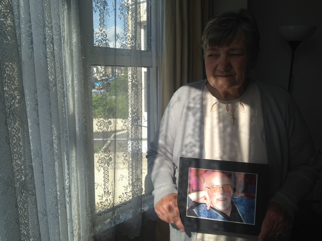
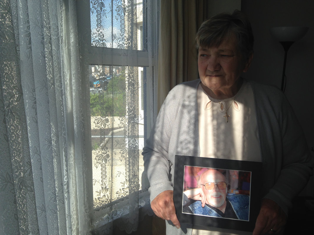
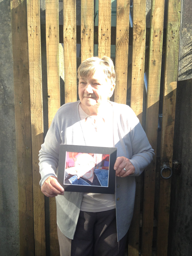
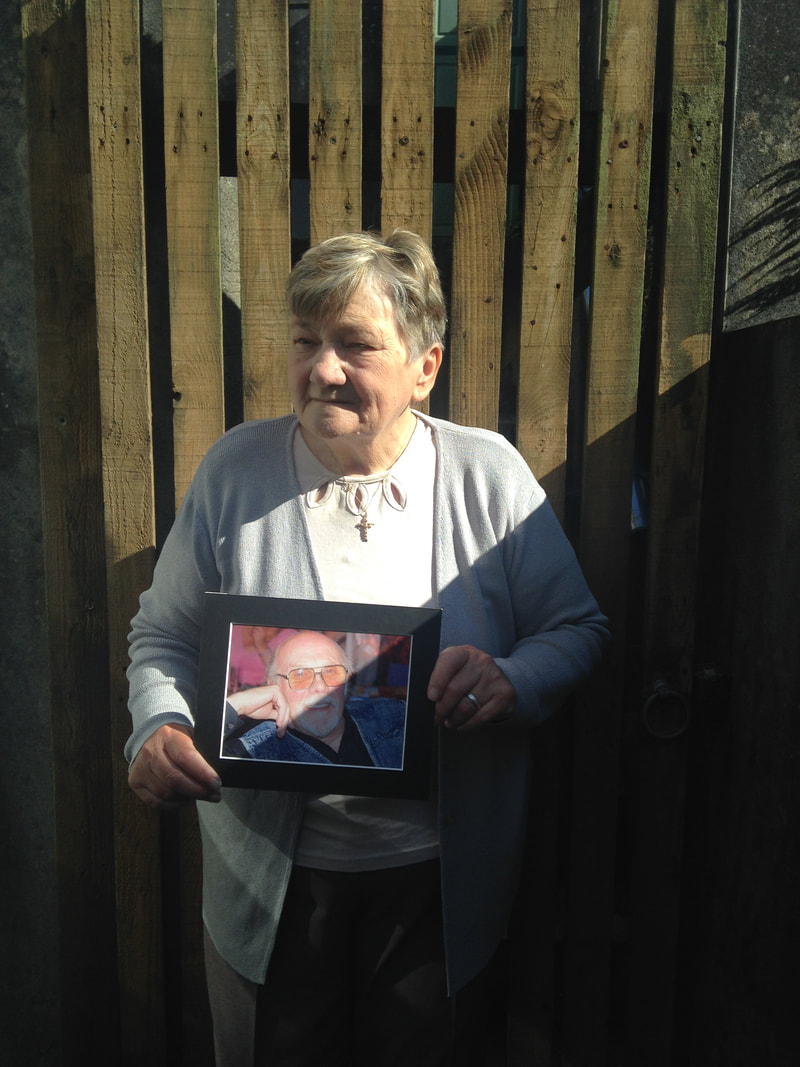
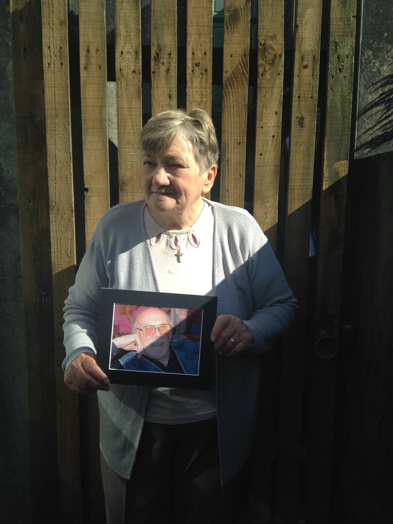
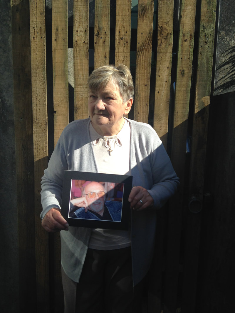
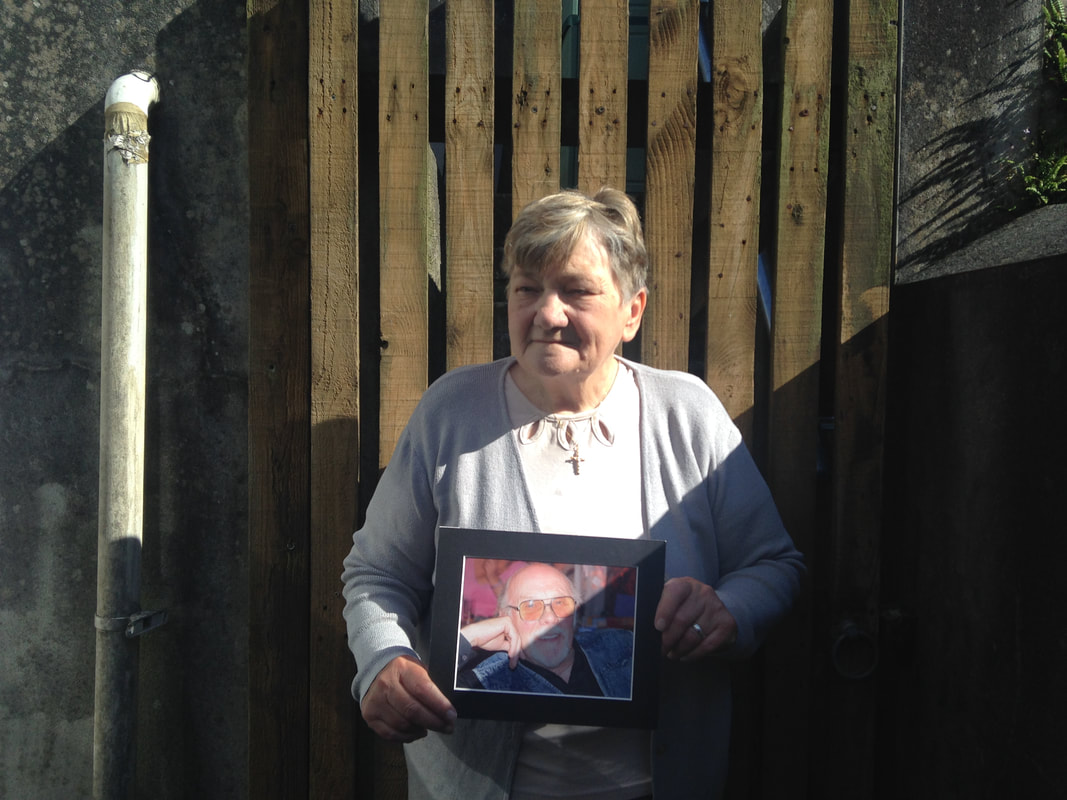
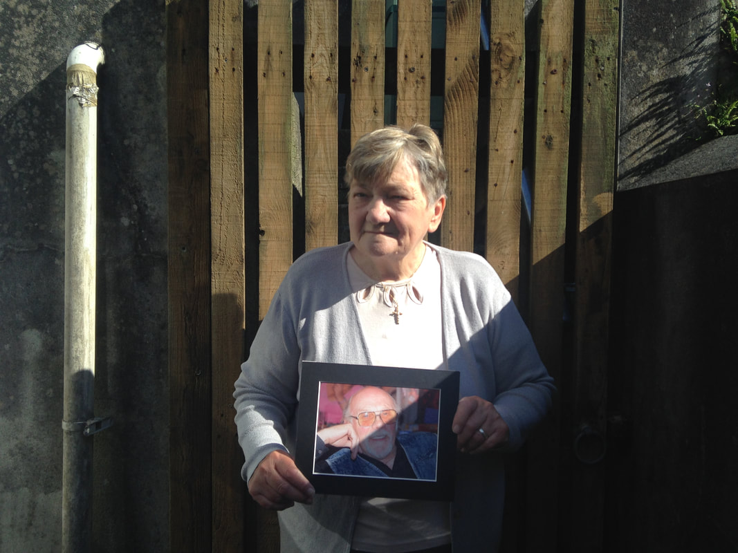
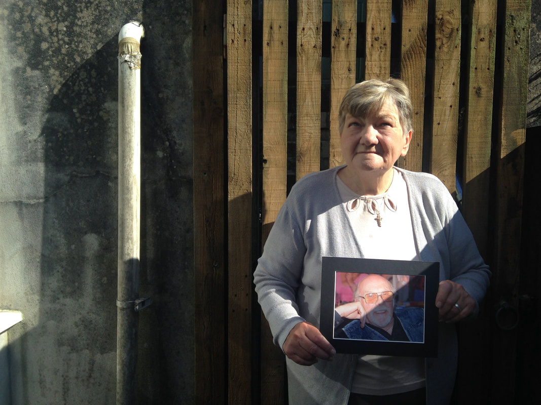
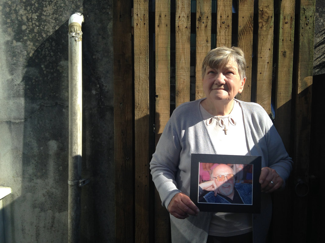
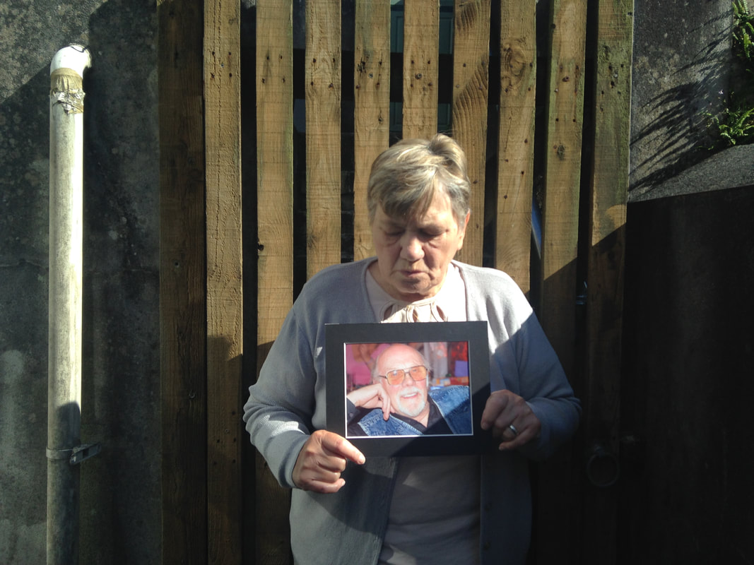
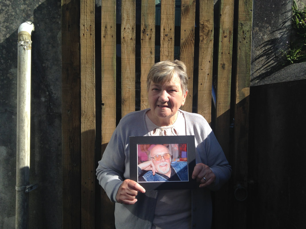
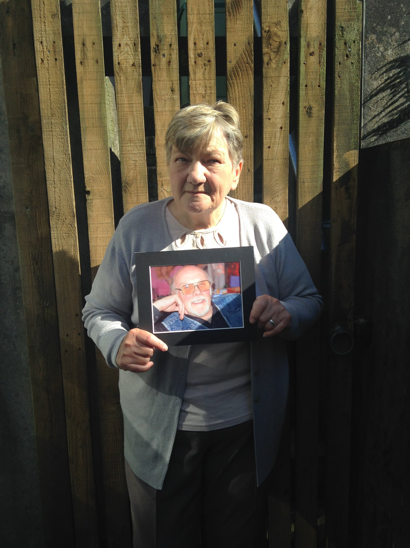
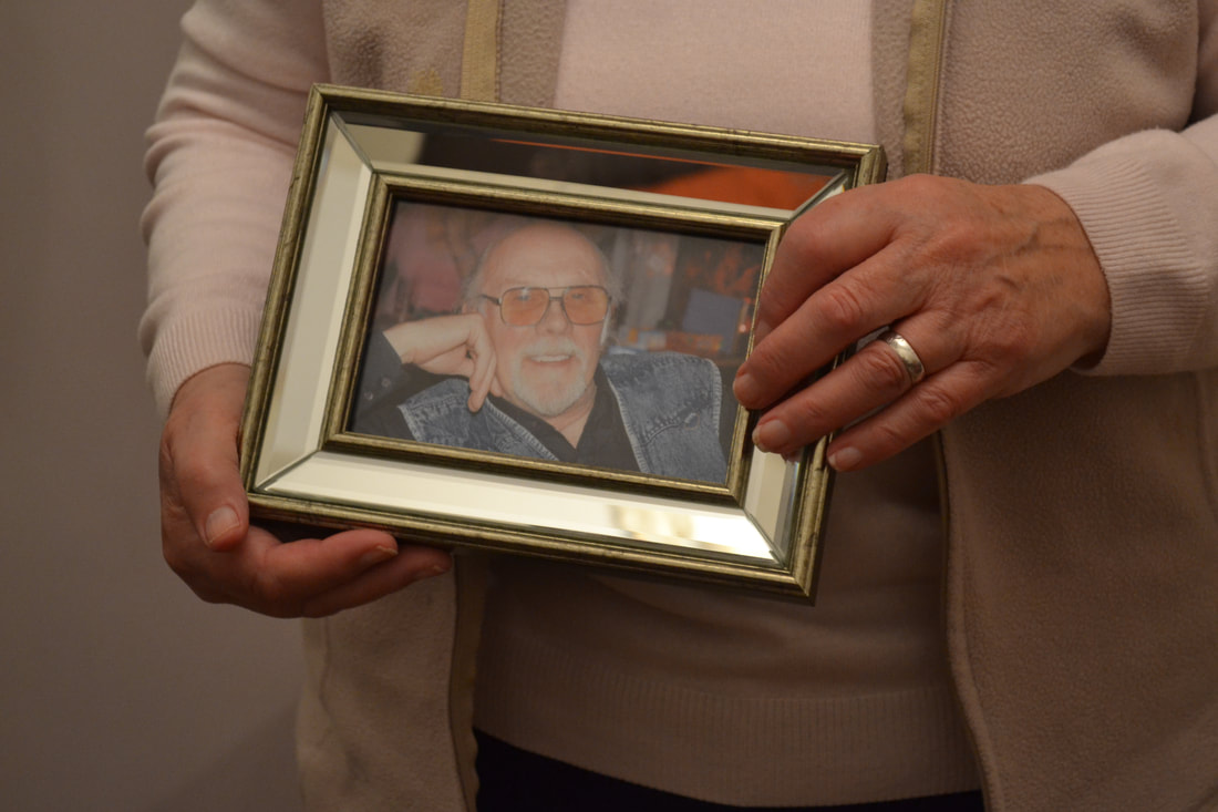
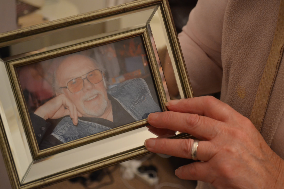
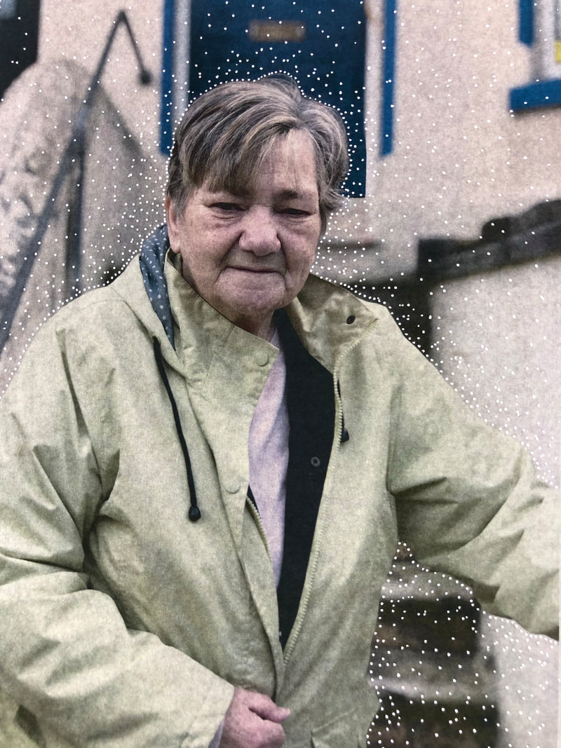
Above is my first shoot based around Glen Erler. I took inspiration from his concept of photographing his family and capturing memories and applied it to this shoot with my Nan. I used a photograph of my grandad in my shoots to present the memory of him as he passed away. In this shoot I was main focused on the shadows and ensuring the shadows were quite dark and the highlights were bright. I feel I achieved this successfully as I have shown depth in the majority of my images through ensuring shadows to a strong stance in the image. I also feel like I have experimented with three strong ideas in this shoot through the use of different backgrounds and different vantage points to create different shadows in the images. I really like the detail that was created in the shadows where the light broke through the net curtains and I feel that this detail was unique in my photography. I am happy with my outcomes overall as I feel the bland backgrounds of the images added a rustic aesthetic which was similar to what Glen Erler had captured in his images. I have also analysed singular images which can viewed by clicking through them.
As said previously, I want to enhance these shadows more to follow suit with the inconsistent lighting Erler used and to do this I will use the burn tool. I also want to portray a quality of nostalgic film where the shadows in the image are cool and the highlights are quite warm. I want to do this because Erler shoots film in his family tree project and I want to show a similar colour balance in my images.
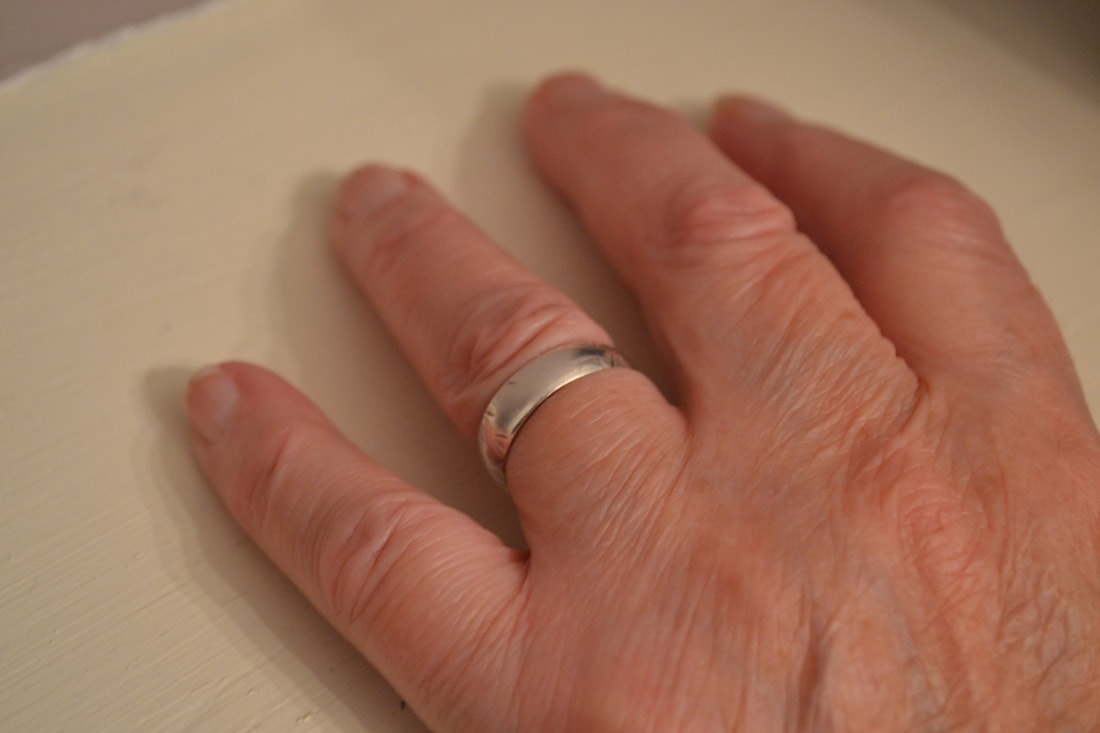
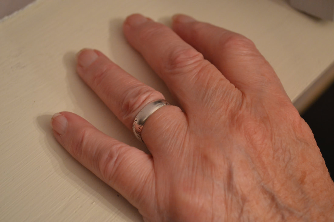
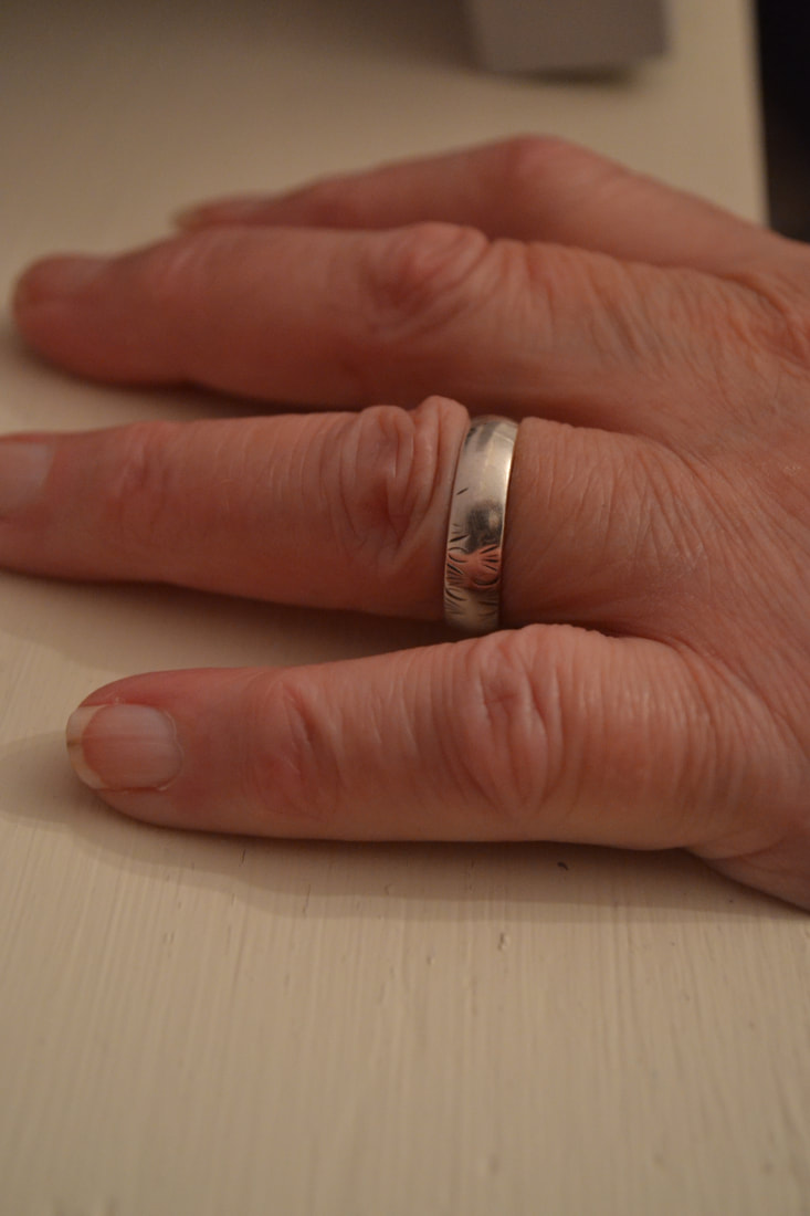
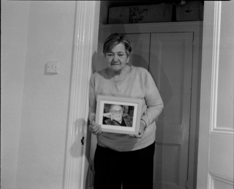
In my next shoot I want to capture the images in a way that enhances both the photograph my Nan was holding but also her wedding ring. I feel like the wedding ring was a small piece of detail that I missed in this shoot as it ties the two together and enhances the memory of my Grandad.
Some images have annotations on, click on them to read them.
As said previously, I want to enhance these shadows more to follow suit with the inconsistent lighting Erler used and to do this I will use the burn tool. I also want to portray a quality of nostalgic film where the shadows in the image are cool and the highlights are quite warm. I want to do this because Erler shoots film in his family tree project and I want to show a similar colour balance in my images.
In my next shoot I want to capture the images in a way that enhances both the photograph my Nan was holding but also her wedding ring. I feel like the wedding ring was a small piece of detail that I missed in this shoot as it ties the two together and enhances the memory of my Grandad.
Some images have annotations on, click on them to read them.
Bieke Depoorter
Bieke Depoorter's 'As It May Be' project, is an expression of capturing someone's private life along with a piece of writing that emphasises the story captured in the image. The idea originated on her travels around Egypt where she attempted to find trust during a time of suspicion. The idea of capturing someone's private life would have been a unique concept to the residents as their life is typically shielded. The people she stayed with shared their life with her, their food, their beds and in exchange she captured intimate moments of family settings. She revisited Egypt after finalising her images and got different people, ones who had never met the ones in the images, to write their opinions on the images. These words reflected views on their country, religion and the society they live in. I believe that these pieces portray a stronger and more understandable story about the image and allow the viewer to build a greater understanding of the people in the images and their life.
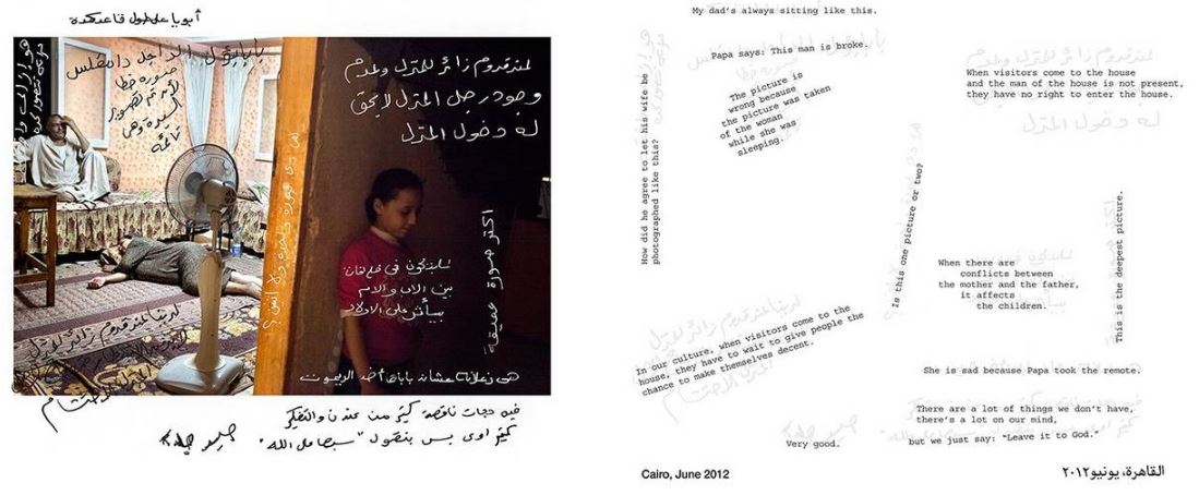
I am going to take inspiration from Depoorter's work and create a set of images that features a piece of text. I will speak to my Nan about any pieces of significant text that her and my Grandad shared in their relationship. In doing so, I will look at different ways I can embed the text into the image in more creative ways through my project. Depoorter, through her documentary approach, has the text incorporated in quite a messy and unplanned way. This enhances her concept of getting different opinions on her work. However, I want to take a tidier approach to my work when incorporating her style in my work. I have made this decision as I prefer a more structured element to my work.
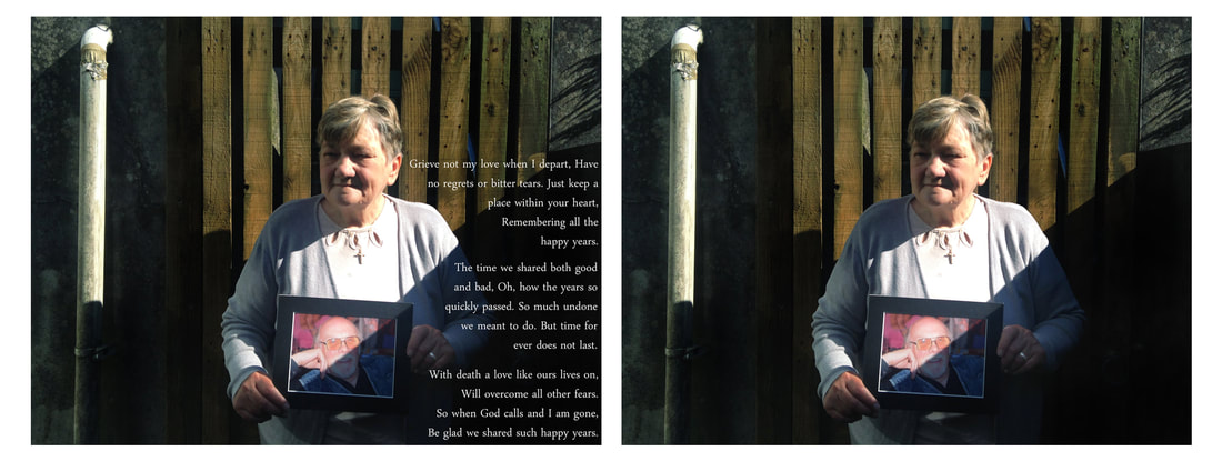
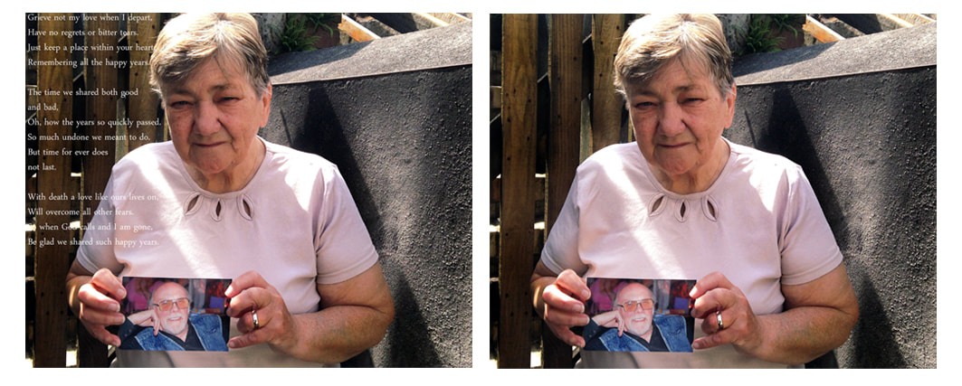
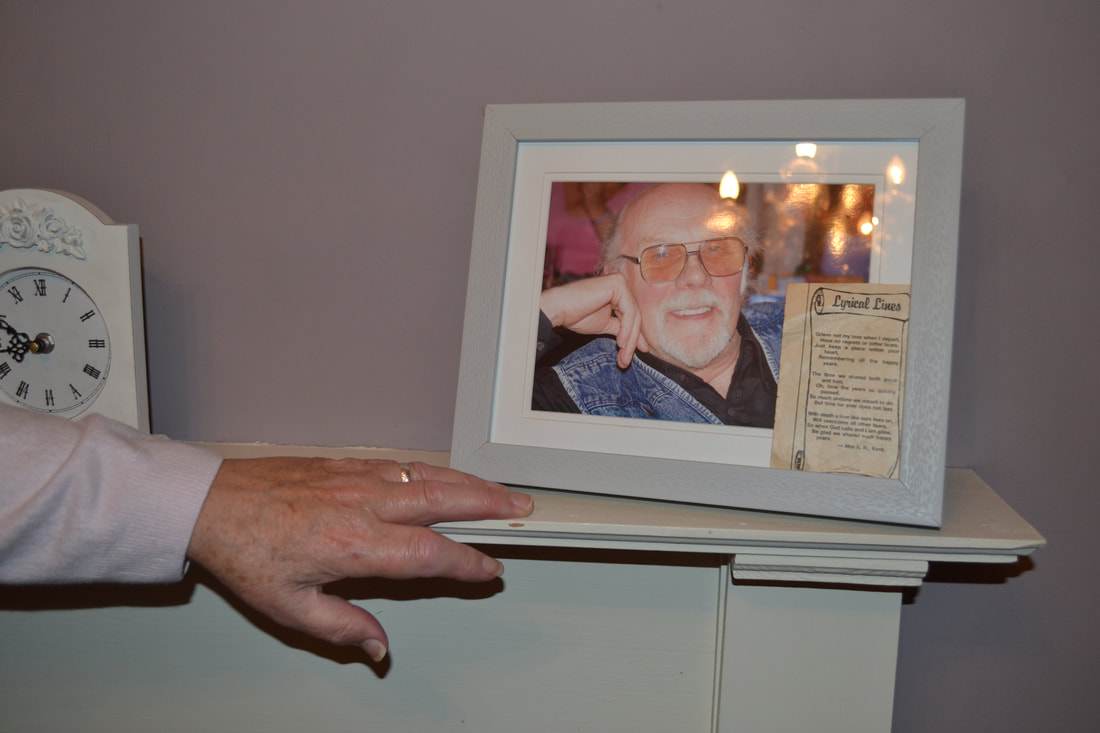
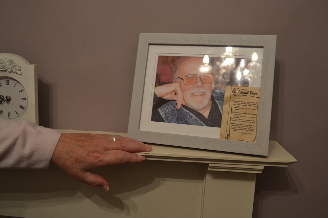
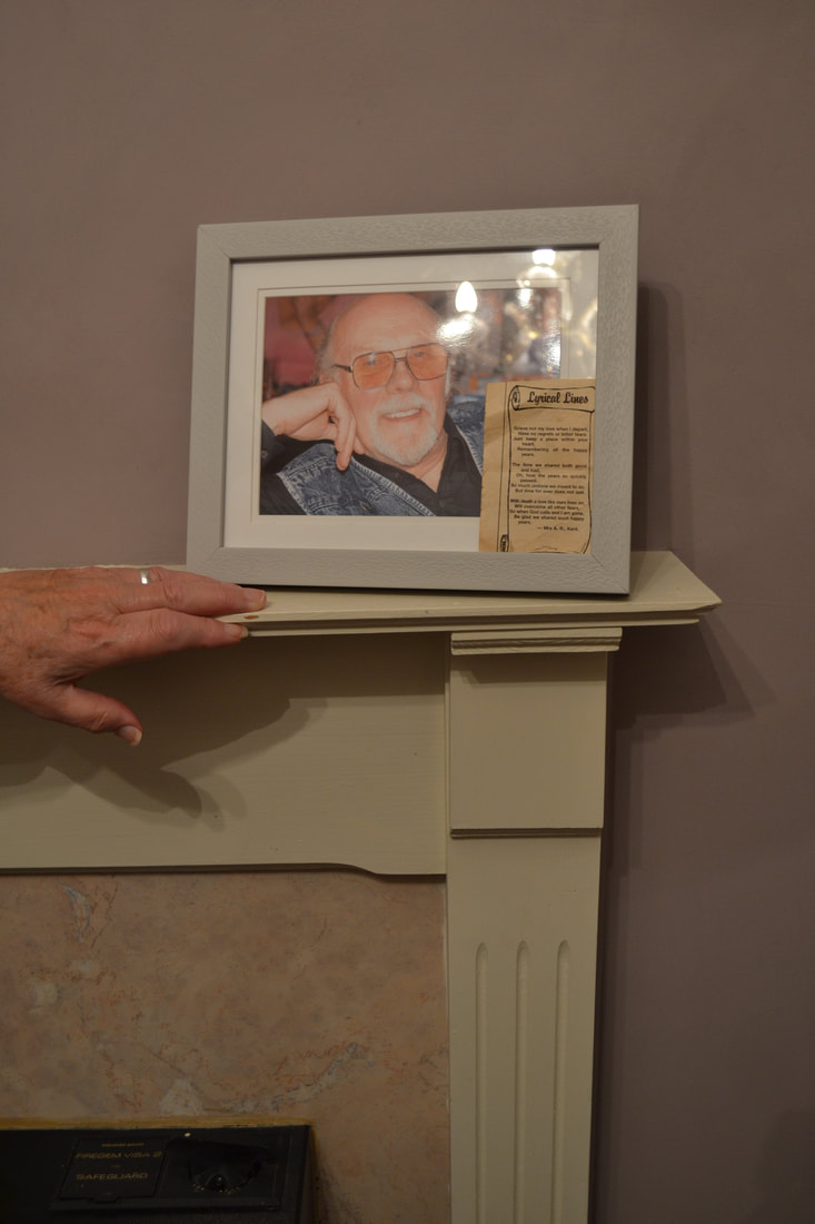
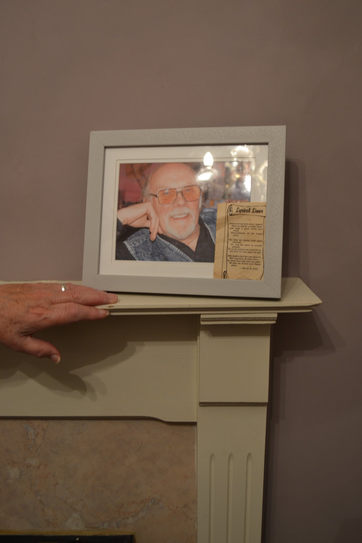
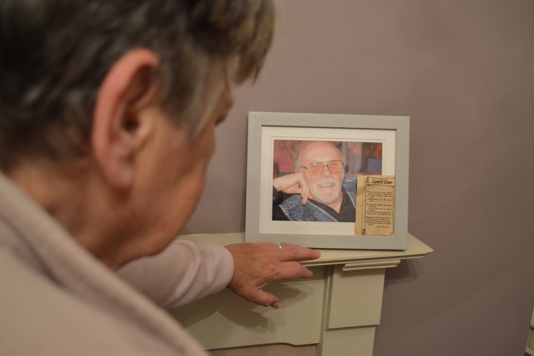
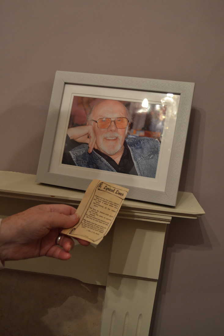
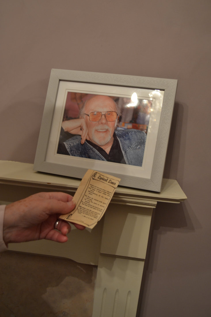
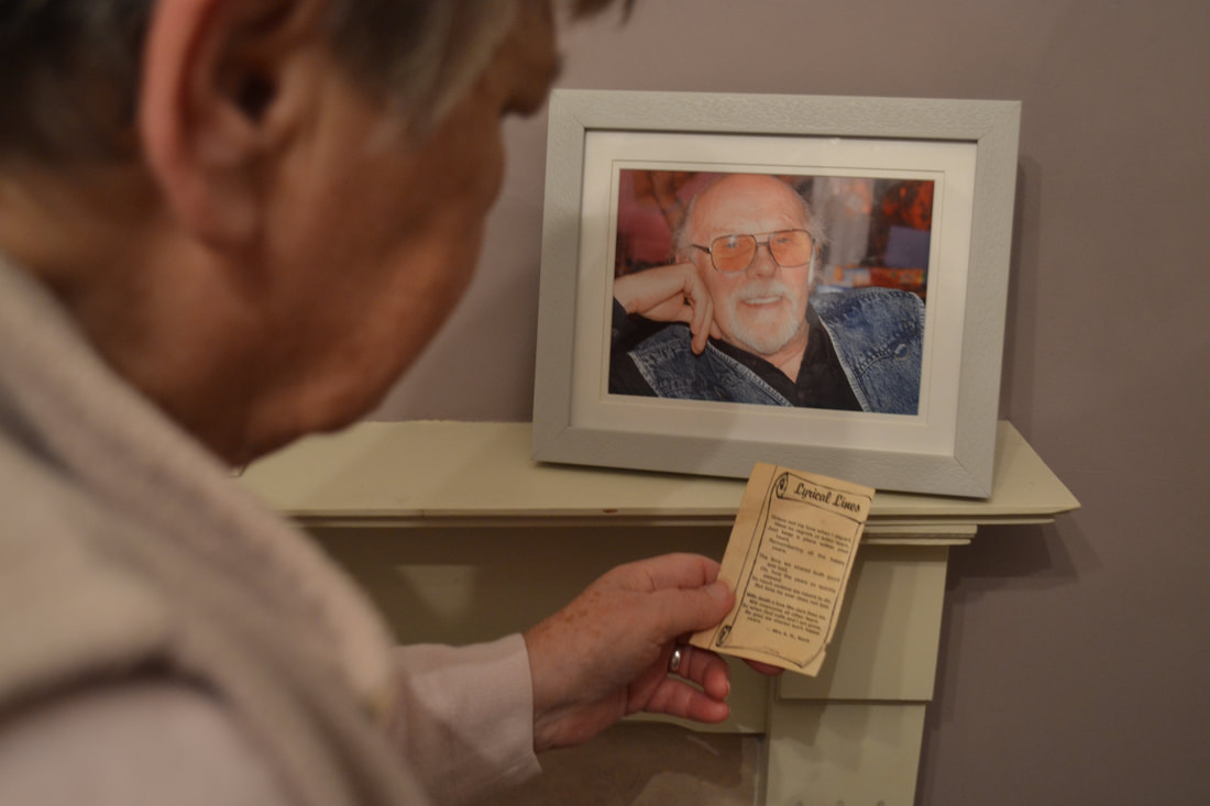
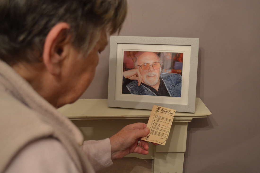
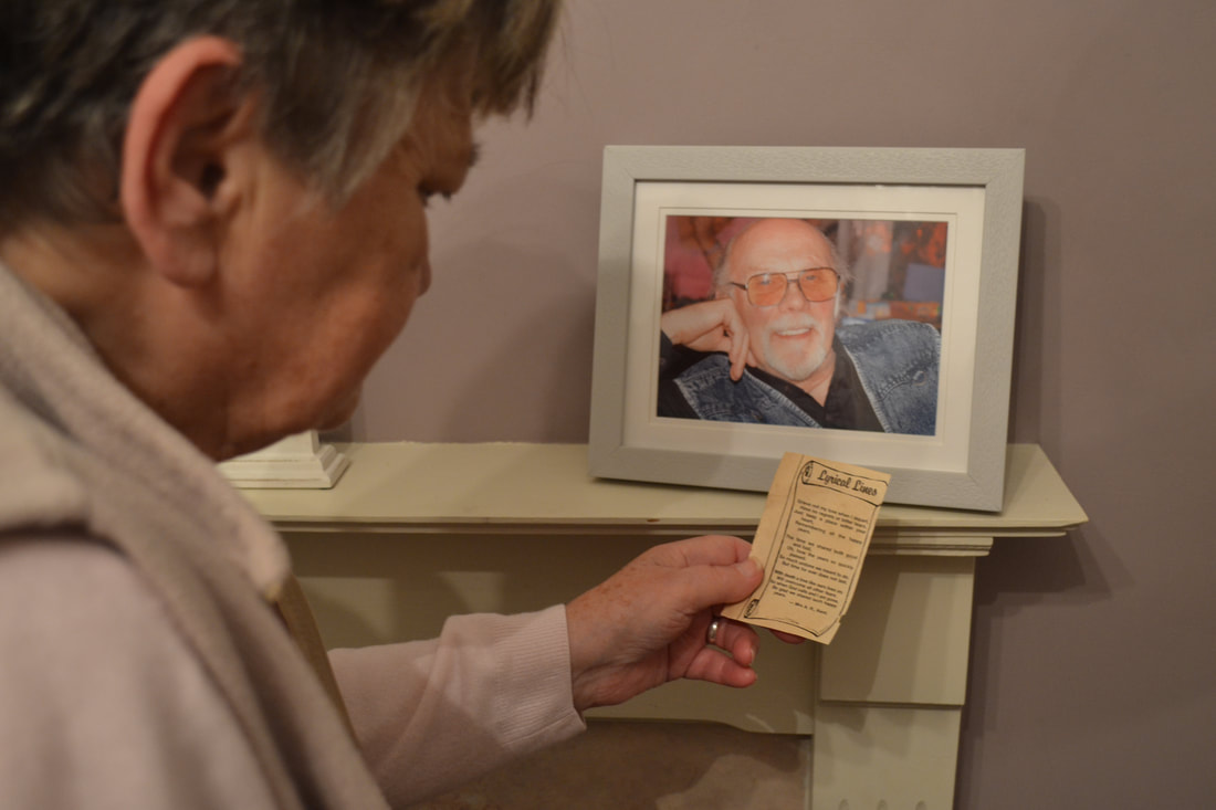
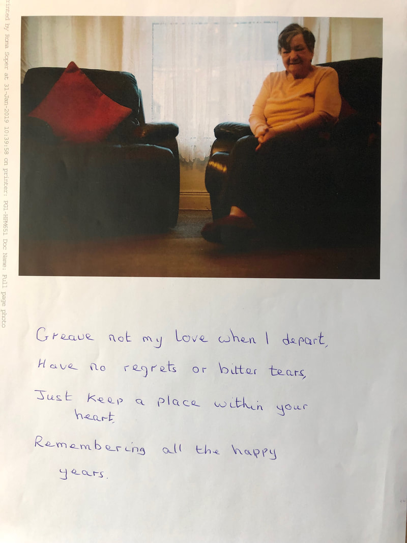
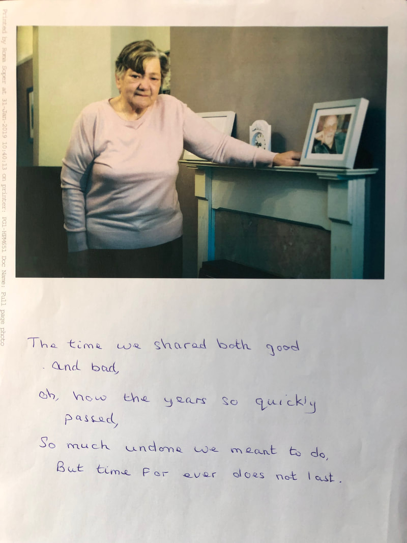
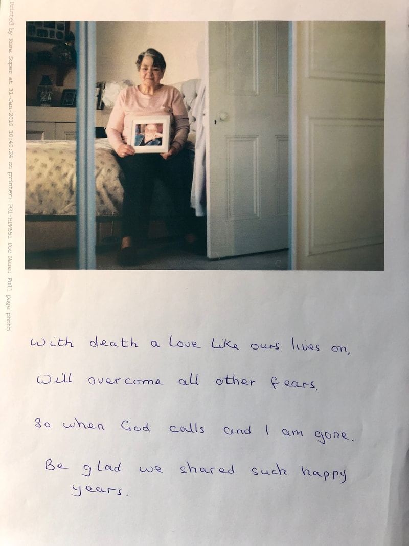
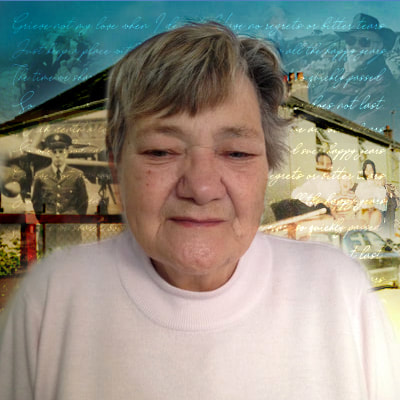
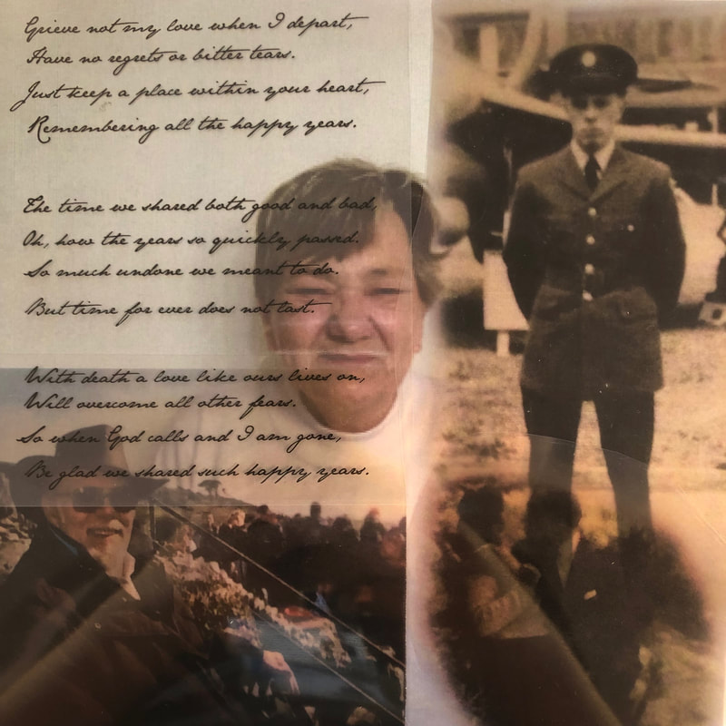
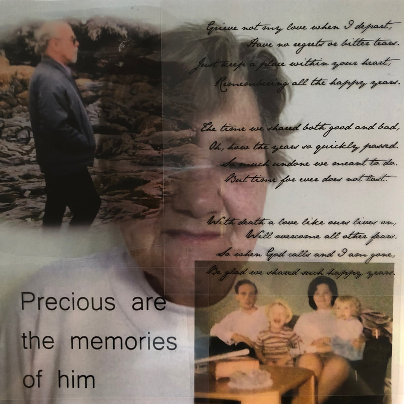
The Poem
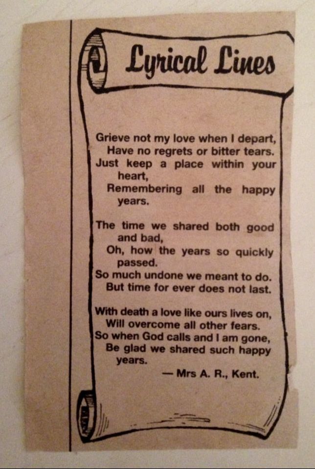
|
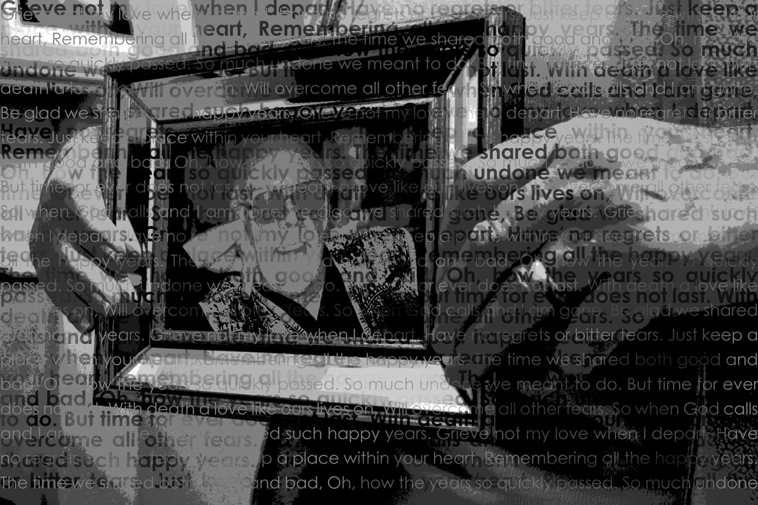
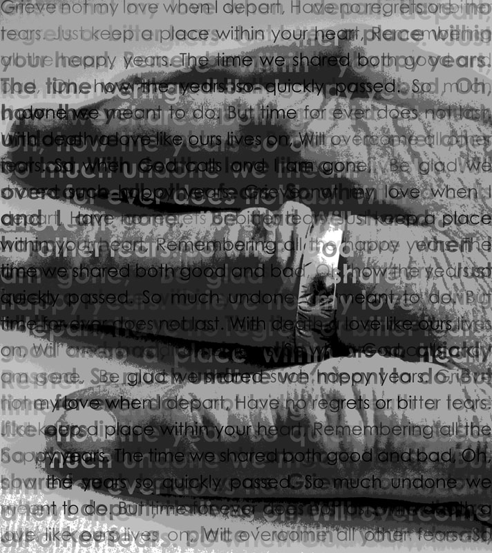
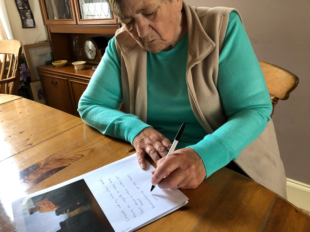
This poem is something my Nan holds very close to her heart. After my Grandad passed away she was clearing through his belongings and found this poem in his wallet. She felt that these words really spoke to her and summarised their life together. The poem is now something that she considers every time she thinks of my Grandad as the words are almost like his last words to her and keeps it on her mantel piece along with a photograph of my Grandad. The poem was a cut out from a newspaper and had been in his wallet for some time. The poem, witch is divided into three stanzas, tells a story of love and death. I feel this poem will compliment my project and will enhance the emotions presented in my images. I will use this poem in a similar way to how Bieke Depoorter has done in her 'As It May Be' project but as I have mentioned, I will apply it in a much more structural way. I will consider how each stanza can be positioned in my images and ensure it is done in a way that enhances the composition using negative space well.
|
|
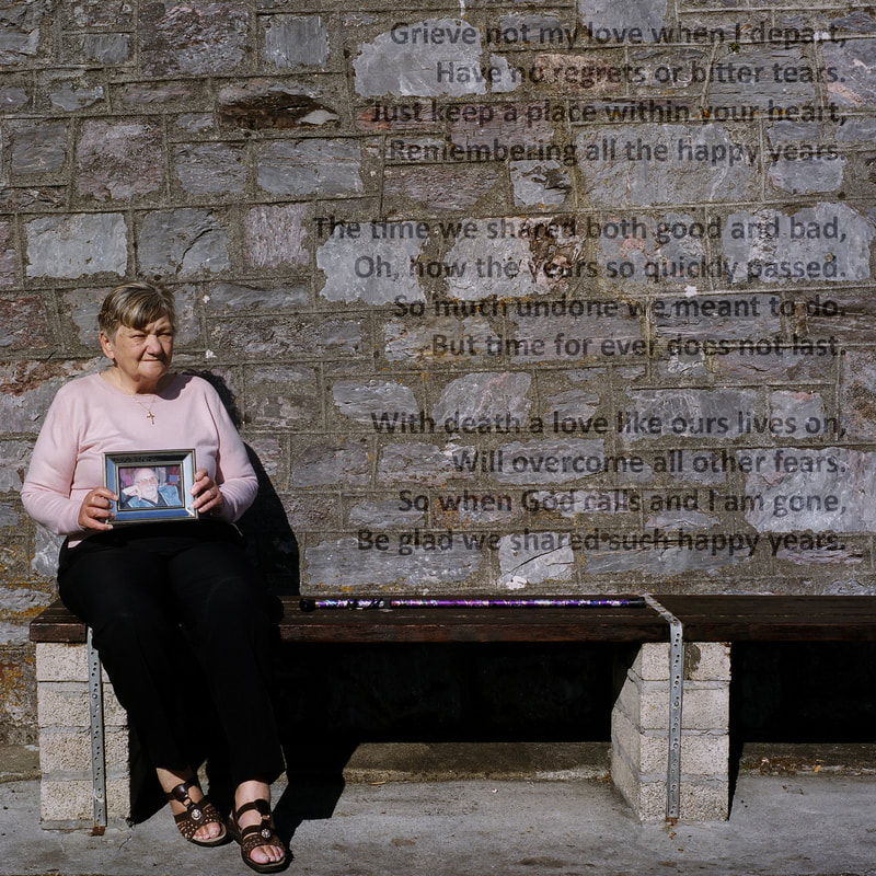
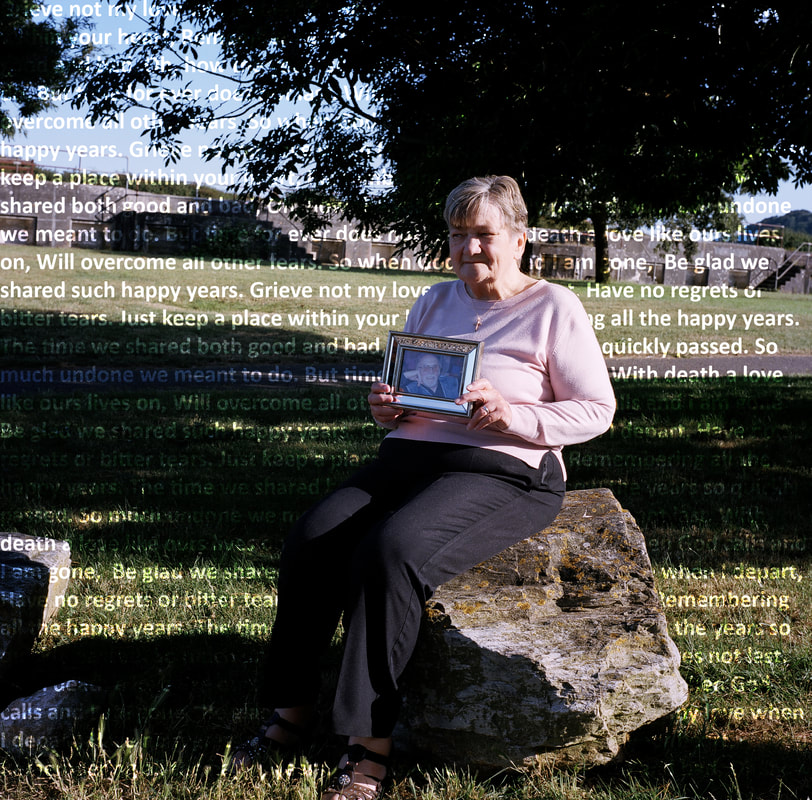
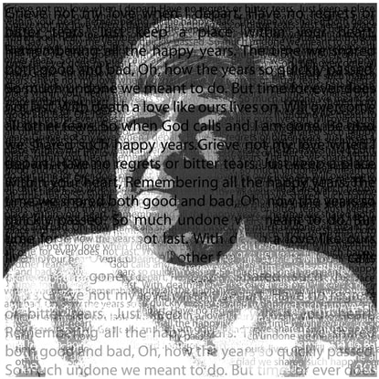
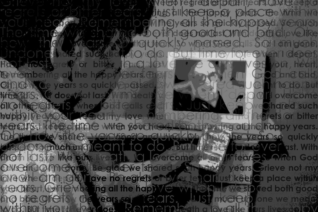
Grieve not my love when I depart,
Have no regrets or bitter tears. Just keep a place within your heart, Remembering all the happy years. The time we shared both good and bad, Oh, how the years so quickly passed. So much undone we meant to do. But time for ever does not last. With death a love like ours lives on, Will overcome all other fears. So when God calls and I am gone, Be glad we shared such happy years. |
To the left, the poem written out so it can be read clearly:
|
My Updated Artist Statement
I wish to develop my project through contesting the division between the realm of memory and the realm of experience. In doing so I want to absorb the tradition of remembrance art into my project. I want to produce a set of images that directly respond to my Nan's emotions towards the passing of my Grandad to present as much of my Grandad's personality I possibly can through my images. I believe this will be easier with the inclusion of the poem as that shows his thought process and consideration of my Nan. Often these are framed instances, of a widow showing sorrow, would go unnoticed in their original context of everyday however I want to present this in a new way that draws on their life together and my Nan's life now. By applying the poem to photographs I will amplify the astonishment of the spectator through placing the text in the photograph in a way that fits the composition.
My Editing Processes
Edit One:
Edit Two:
Edit Three:
Editing Outcomes
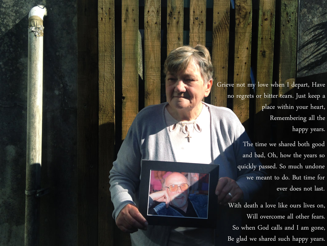
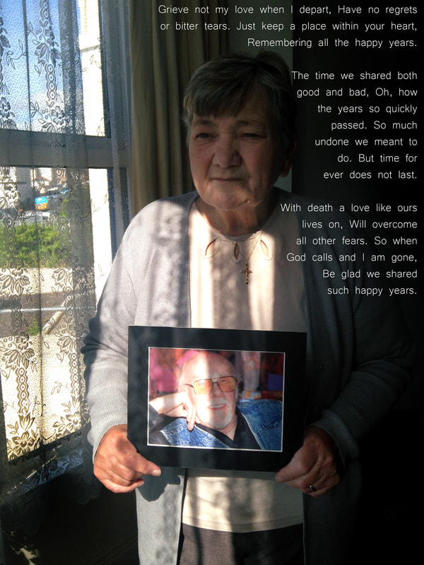
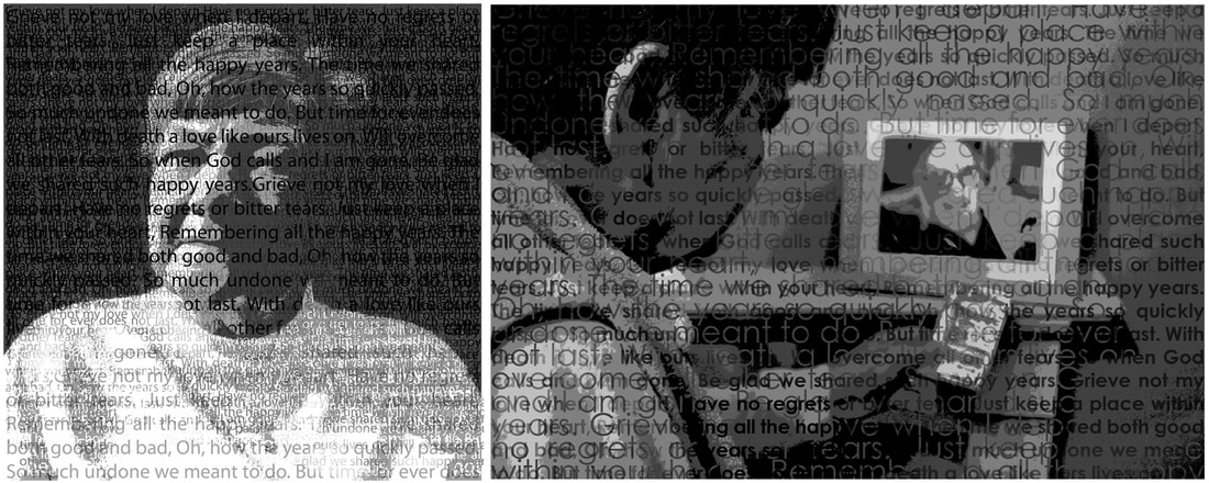
With The Poem :

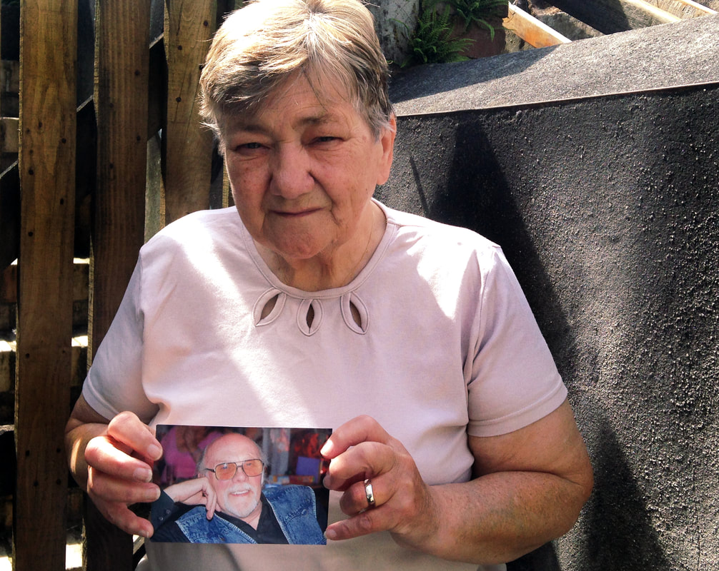
Without The Poem :
Evaluation of Outcomes
Personally I prefer the edits I have created with the text overlay. I believe these edits portray a stronger connection between my grandparents and communicate the personal message between them. I feel I have been successful in taking inspiration from Glen Erler and his Family Tree project. Similar to how the shadows represent memories in Erler's work, I feel I have interpreted this style to present a similar representation of memories. The use of a natural background is also common between mine and Erler's work as we have both photographed a single person in a setting natural to them. For mine and Erler's image this was their back gardens. As you can most probably tell I have focussed these images around one of Erler's pieces in particular (the second one I analysed) however from here I want to look more into creating darker shadows in my images and some distortion (like in the first and third images I analysed). I feel this will allow me to interpret a style even more similar to Erler and present my grandparents relationship and the memories of my Grandad as more of a focus point.
Creating A Series
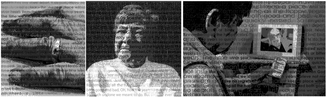
From here, I wanted to create an edit that incorporated both the edit with the poem and the edit without. Although I found the images with the text overlay much more successful, I still liked the ones without the incorporation of the poem. Most series I have looked at show movement, however I want my series to present the effect of the poem. I feel that exhibiting the two images side by side will truly portray the memory of my Grandad and how my Nan feels with him gone.
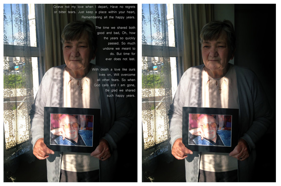
I believe that these series have turned turned out successful in the way they enhance the presence of the poem in the image. I chose to put the edit with the poem on the left in each of my series and the one without the poem overlay on the right. I chose this way as I believe with any series the viewer will look from left to right and I want them to read the poem first. I did consider mixing the photographs however I decided against this as I chose the series idea as I way to enhance the text and I felt that mixing the different edits together would just draw more focus to the different photographs rather than the poem. I find all of these outcomes to be equally successful as each series does draw more attention to the poem like I had originally wanted to achieve. I also feel that the style of my series has also enhanced the shadows in the images linking my work more to the style of Glen Erler.
Yashica Mat 124G
|
|
In an interview with Glen Erler, he said how he shot his Family Tree project with a medium format film camera. After doing some research into what camera Erler had used, I still could not find any other information other than the fact it was a medium format film camera. For these reasons I have selected one myself and have decided to choose a Yashica Mat 124G. This is a twin lens reflex (TLR) camera that was manufactured for 16
|
years between 1970 and 1986 and was the last TLR produced by Yashica. The fact that the camera has a mirrored view, will result in me having to work hard to achieve successful composition. The camera also has a built in meter, meaning I will not have to meter my photos externally; the camera takes 120 film so I will have twelve 6x6 square shots. When metering my shots I must get the red arrow within the yellow guide through raising my shutter speed or lowering my aperture. When taking the photograph you view your image through your top lens but the bottom lens takes the photograph. The film I will use will be Kodak Portra 400. This film in particular is daylight balanced hence why I plan on going out to take my images quite late in the day when the sun is low and setting.
Planning My Next Shoot
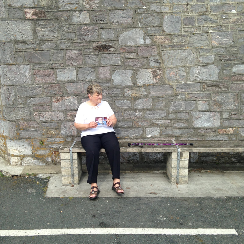
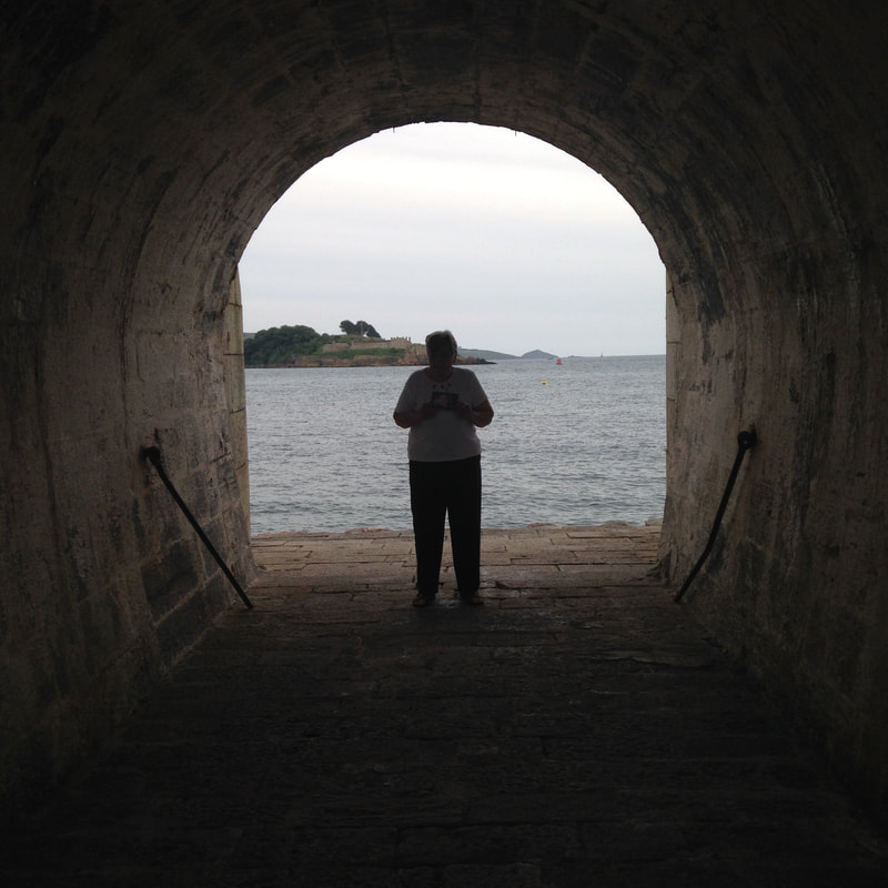
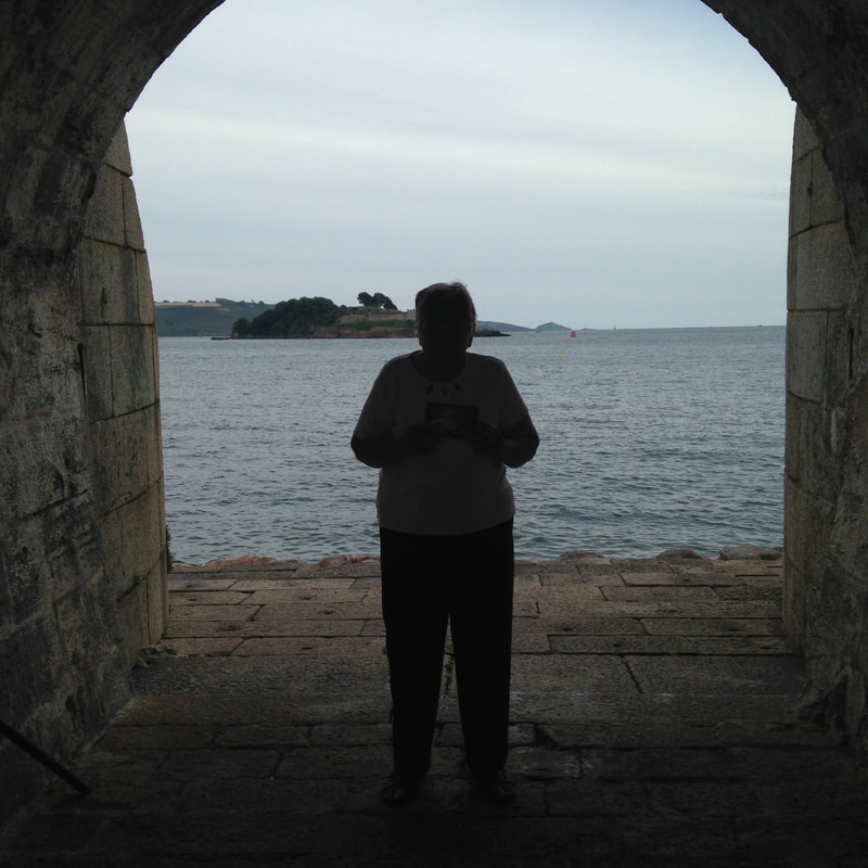
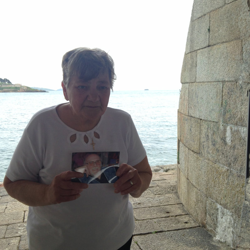
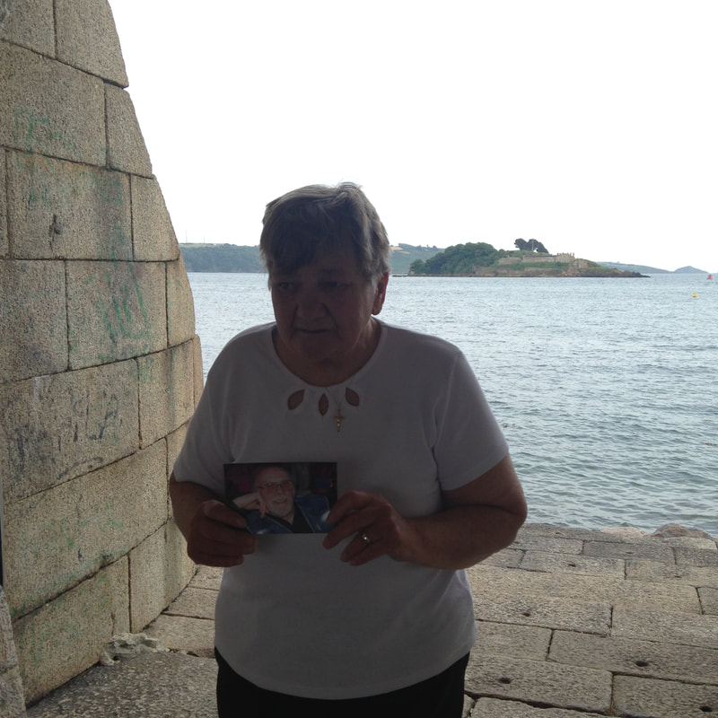
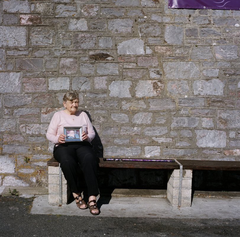
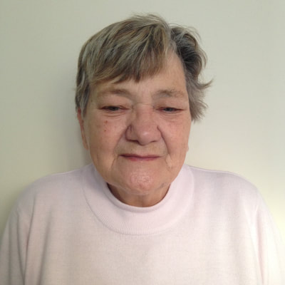
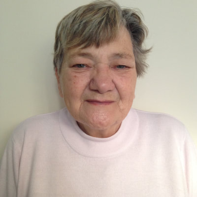
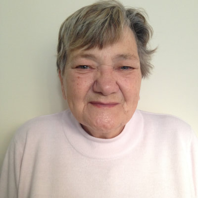
As I am intending on shooting the Yashica Mat 124G, I thought it best to plan my images more in depth. I did this as with film you have a limited number of photographs you can capture, however with digital it is a far greater number. Above are some photograph ideas I have experimented with on a digital camera to get a sense of what composition would be like with a square photo and the landscape. I also wanted to use this opportunity to see what shadows were around and how I could incorporate them into my images. In the images where I positioned my Nan in the left hand third of the image are the images I believe have the best composition. I feel these images show loneliness and where my Grandad is missing from the frame. The last four images, shoot in a tunnel, I feel were unsuccessful attempts. Although they were filled with shadow detailing and had the seascape in the background, I think they are too dark and therefore do not allow the viewer to see details like the photograph my Nan is holding or her wedding ring. My personal favourite from this shoot is where my Nan is sat on the bench. This is where she used to sit with my Grandad and the image now shows her sat there alone with a photograph of him. This is a style that I want to capture with the Yashica.
Some images have annotations on, click on them to read them.
Some images have annotations on, click on them to read them.
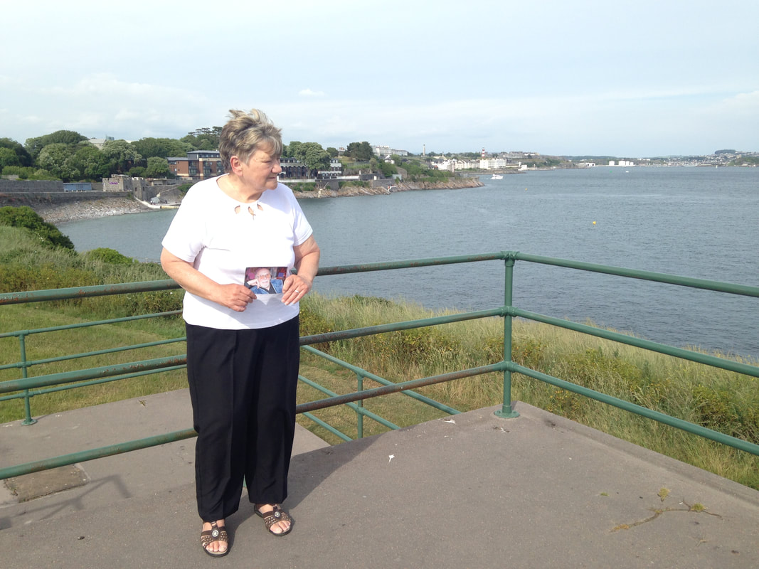
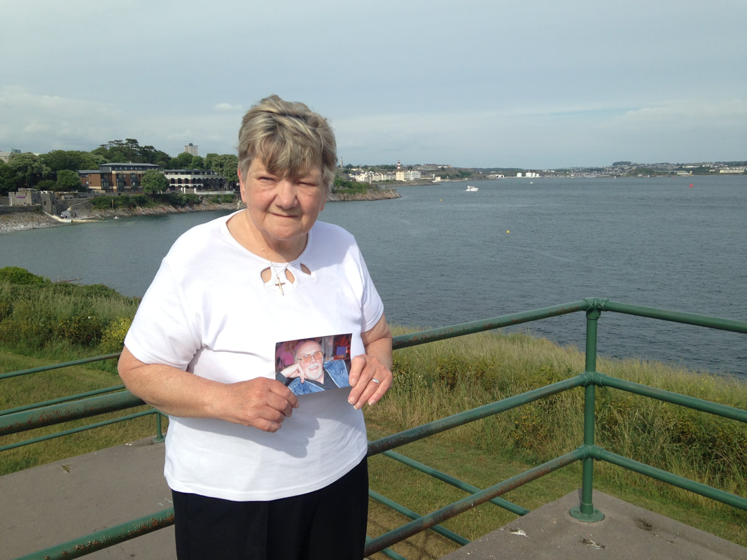
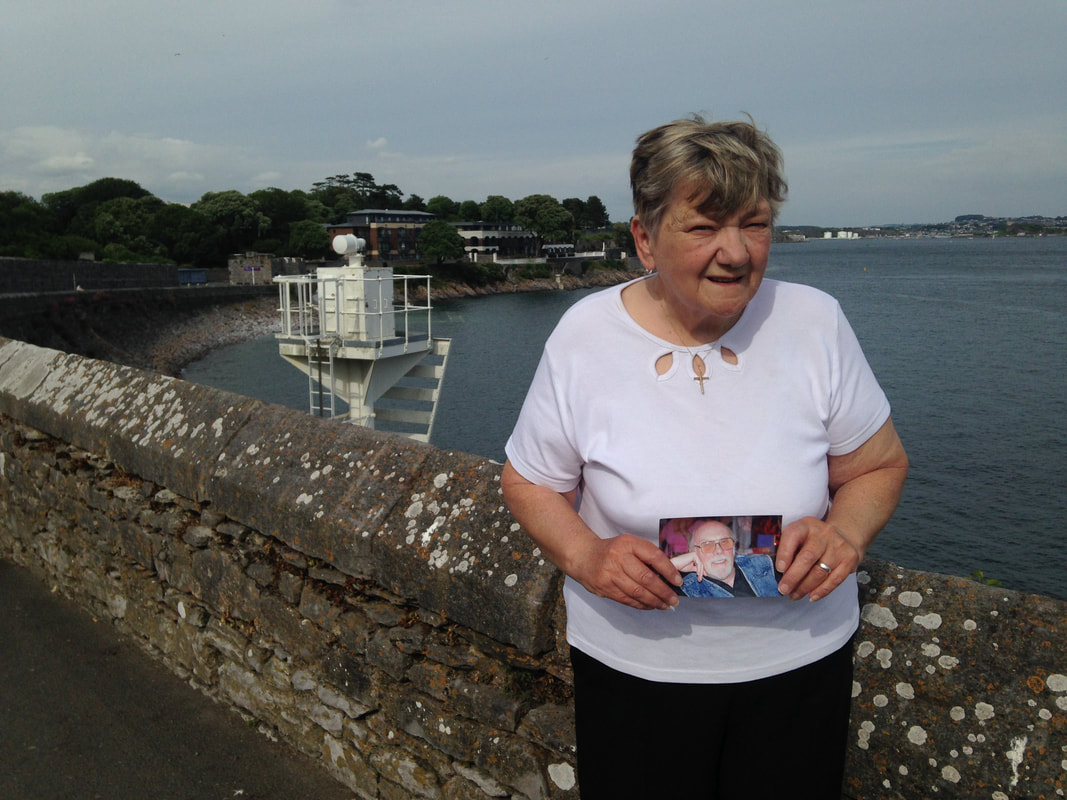
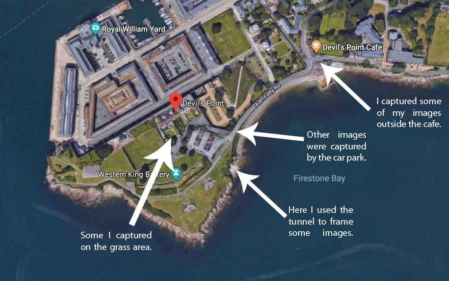
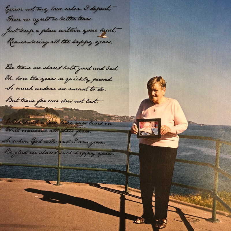
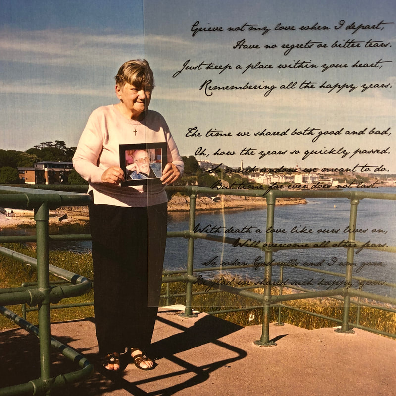
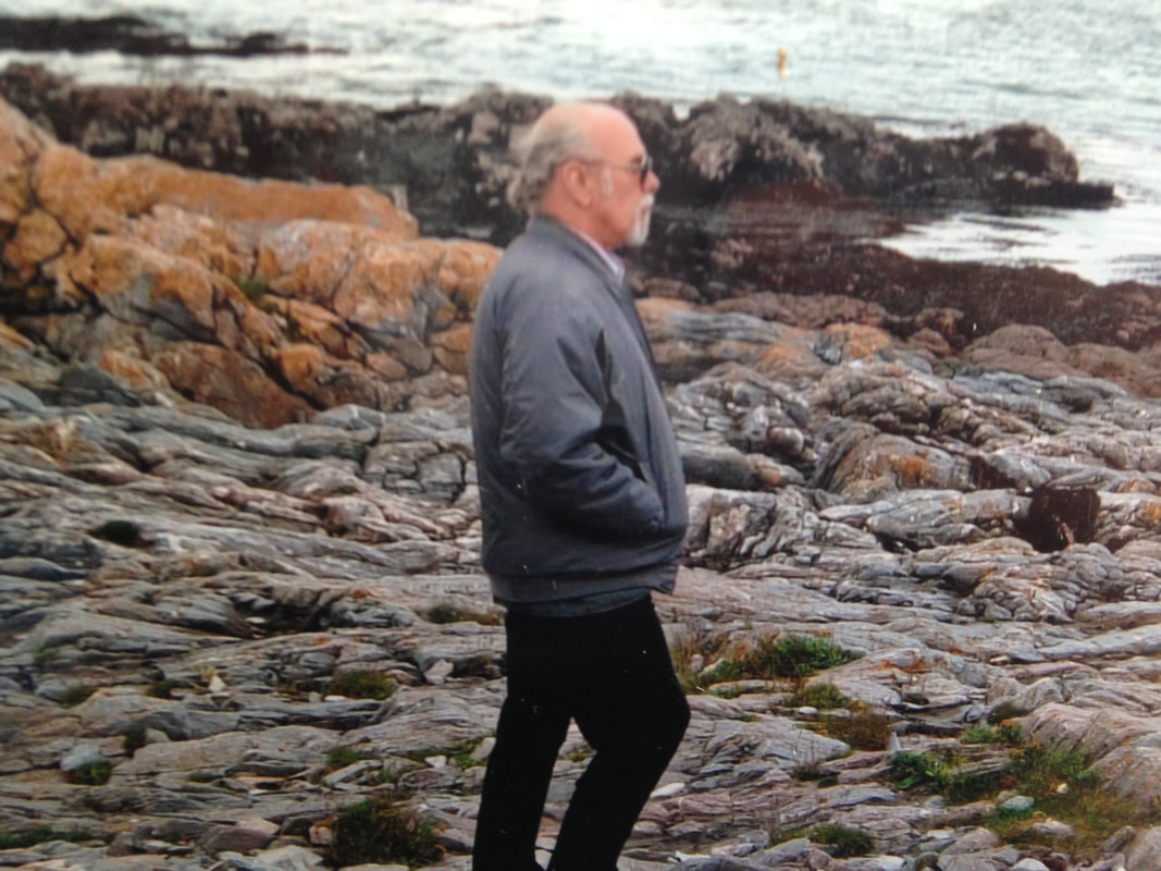
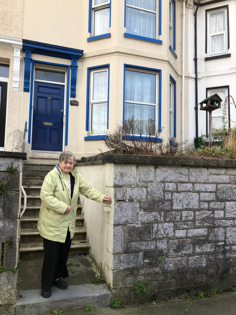
Shoot Location
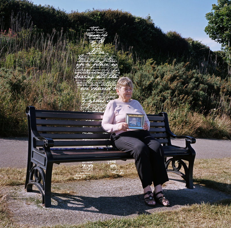
I chose to take my Nan to Devil’s Point. This is a place on the coastal line in Plymouth. Devil’s point is significant to the shoot as during my grandparents 48 years of marriage this is a place they often visited as they both enjoyed the view of the water. I have marked on the satellite image below where I went along Devil's Point to capture my images. I believe that this location was very successful as it represented a part of their relationship.
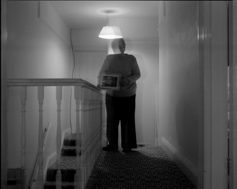
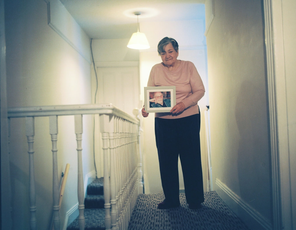
Shoot Two
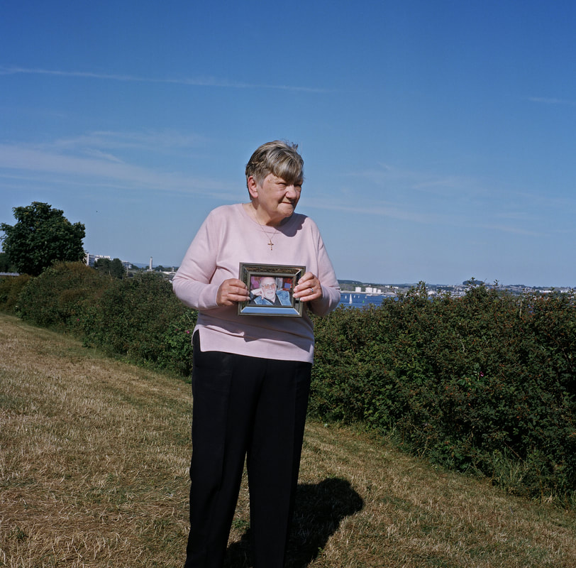
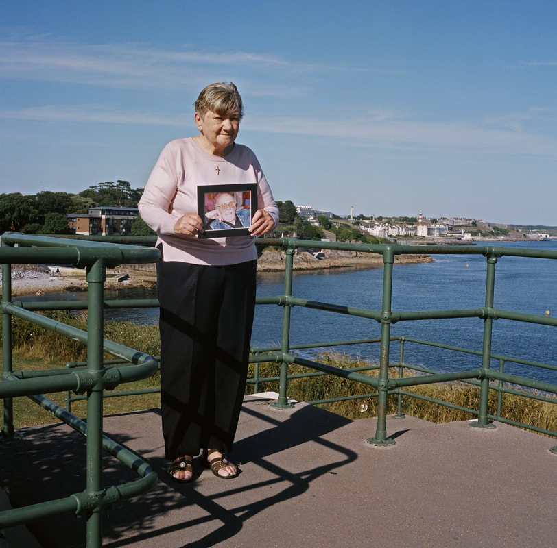
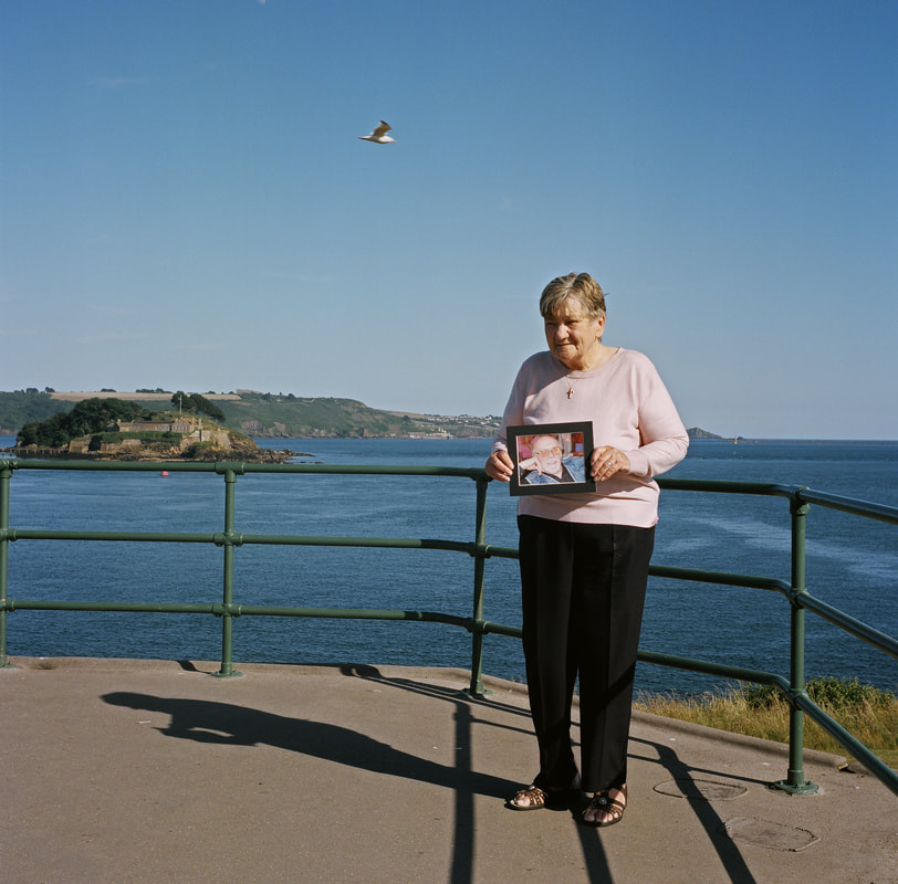
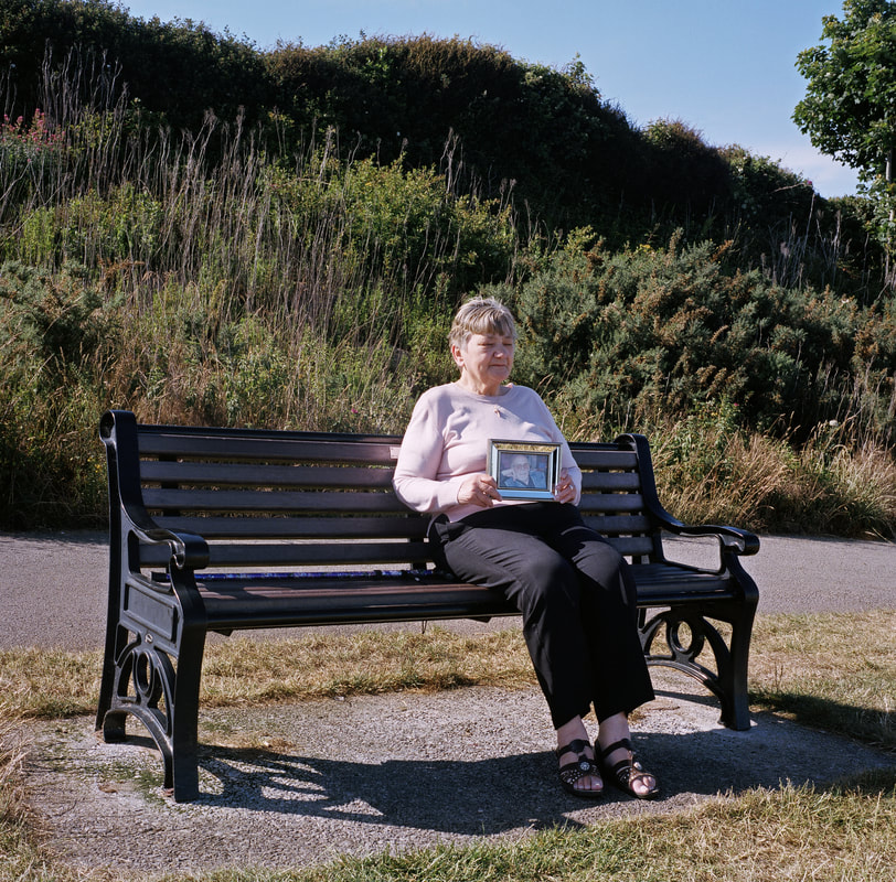
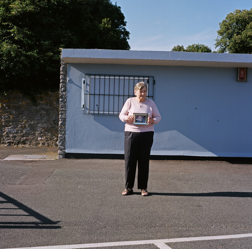
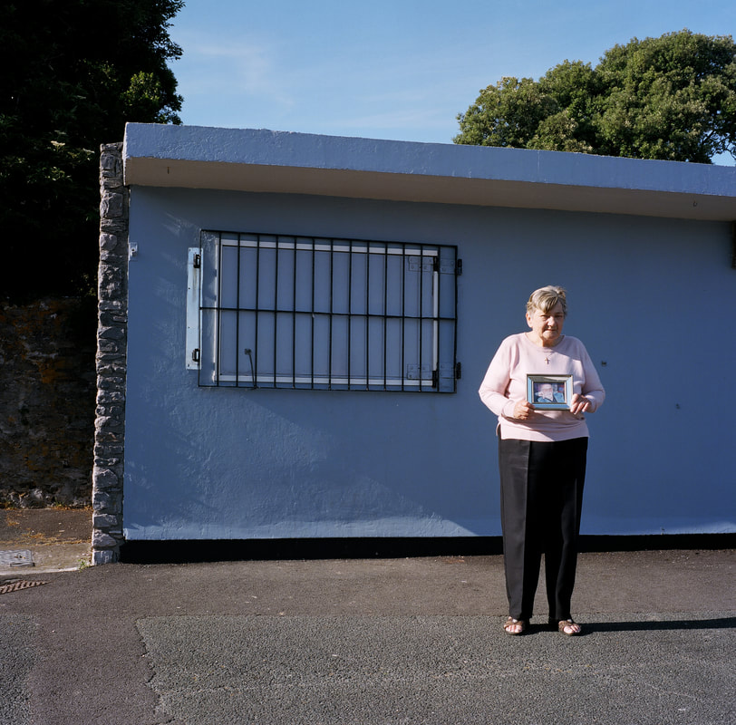
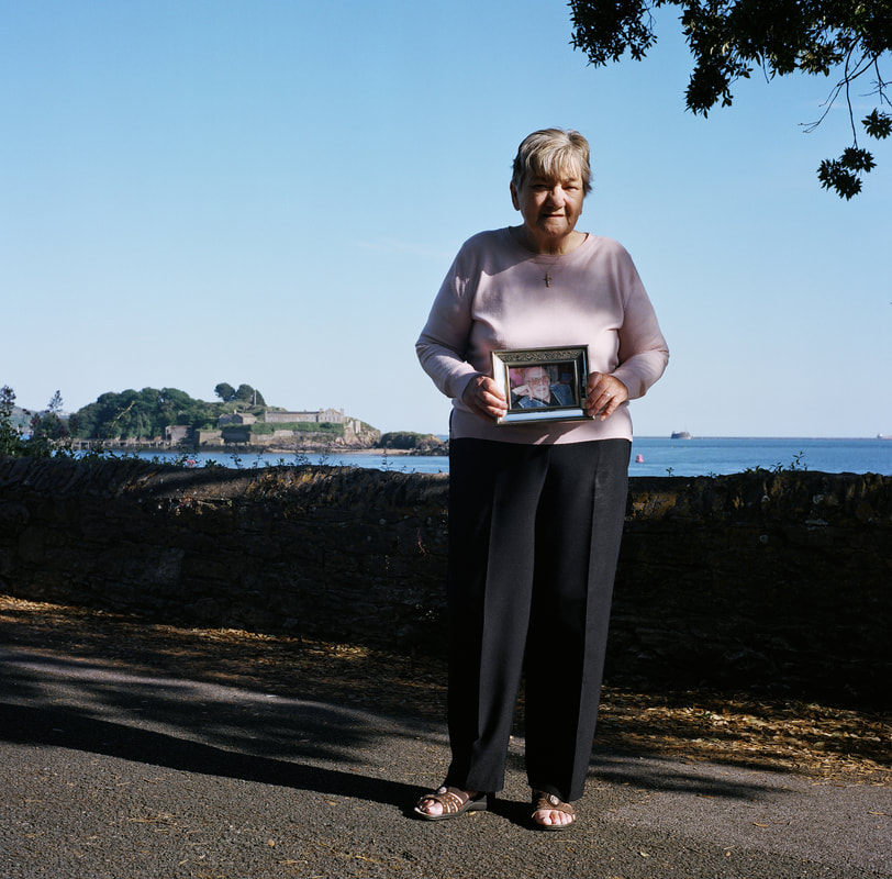
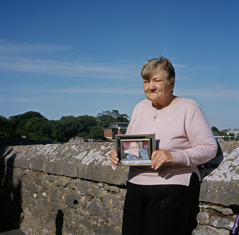
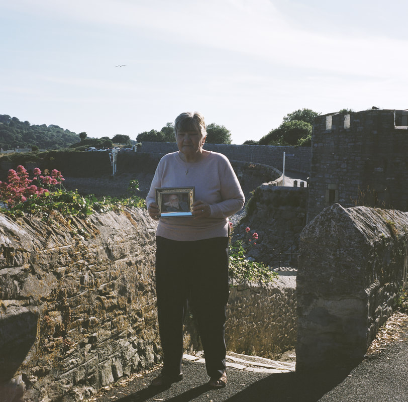
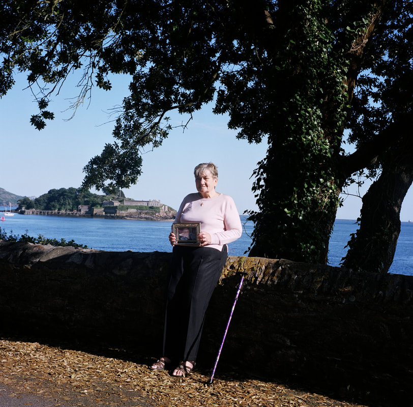
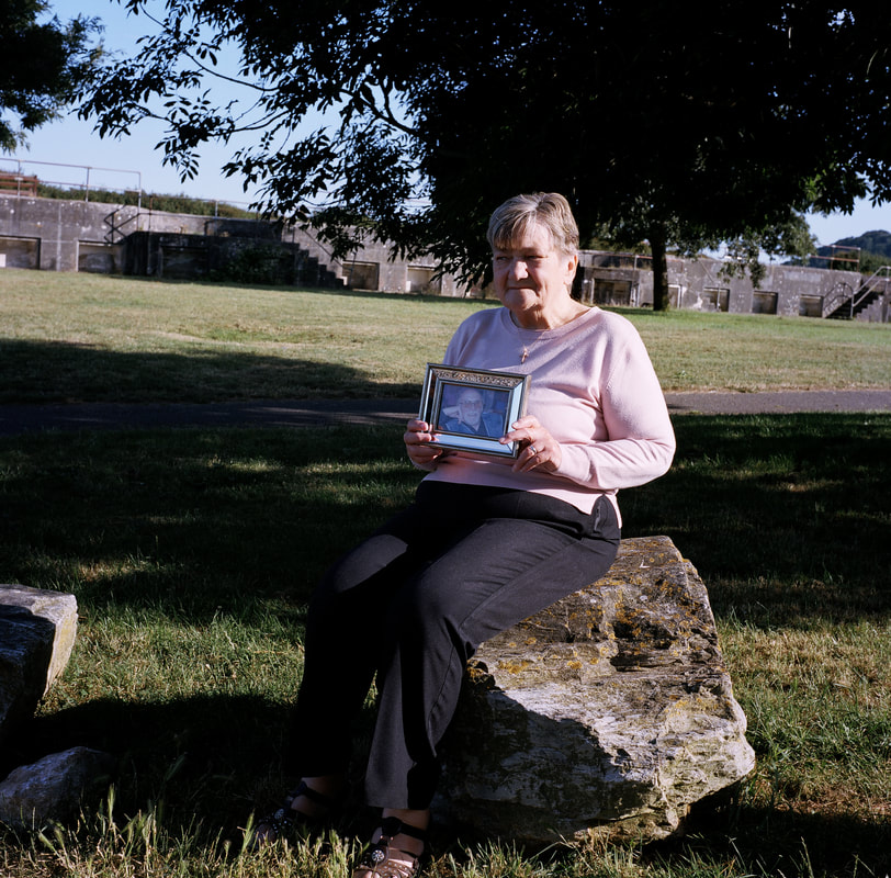
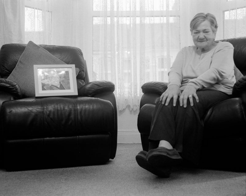
This is my second shoot regarding my Personal Project. I believe that this shoot has been very successful in portraying the absence of my Grandad. I feel the use of a framed image of him made my Grandad more important in the images and stick out a bit more. This is something I did not look into in my previous shoot or in my plan but felt it was fitting on the day of this shoot. In these images I did not want my Nan to make eye contact with the camera. I did this as I wanted to portray a sense of her longing after my Grandad and did this through making her look at spots that were out of the frame to create a sense of mystery. This was my first time shooting with a medium format film camera and I feel it was quite successful. I am overall really happy with this shoot as I like the composition used in each image, I feel the variation in the distance between the camera and my Nan throughout the shoot allows the viewer to focus on other points in the images like the sea scape in the background. In the captions on the images I have analysed each image individually. Throughout this shoot I ensured my Nan's wedding ring was clear in the photographs making she she was slightly pointing it at the camera in a discreet way. In these photographs I feel I have been more successful in capturing bigger and darker shadows as I was in a more open space. This will allow me in my editing to enhance the influences of Erler's work in my work.
All these images have annotations on, click on them to read them.
All these images have annotations on, click on them to read them.
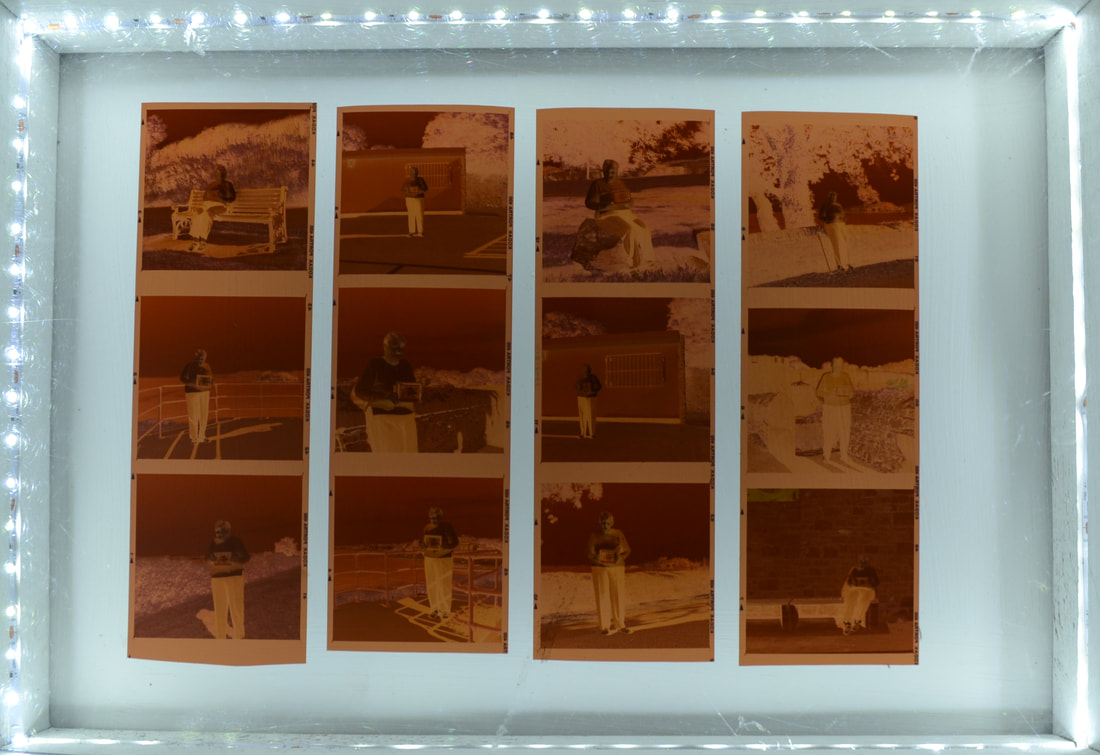
These are the negatives from my second shoot. I used a light box to enhance the images through back lighting them. Negatives are strips of transparent plastic film where the lightest areas of the photograph appear darkest and the darkest areas appear lightest. Negatives are then turned into photographic prints through one of two processes. The negatives can either be scanned for digital printing or alternatively they can be printed through an enlarger which will project the photographs onto photographic paper.
My Trip to Bristol
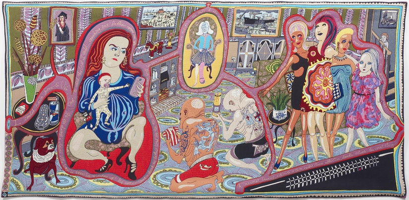
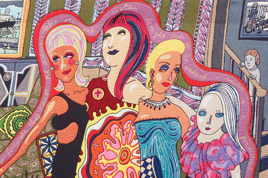
I visited Bristol with the sole purpose to gather some new inspiration for my project. Bristol is a diverse and cultural city and whilst there I visited Bristol museum and art gallery. In the museum and art gallery I visited the Grayson Perry exhibition, The Vanity of Small Differences. The artist who has created six large tapestries exploring the British fascination with taste and class uses various textiles and written embroidery to tell a story that the viewer can perceive. Seeing not only Perry’s final pieces but his creative process has allowed me to see how his ideas have developed. It allowed me to see that Perry has taken inspiration from William Hogarth and David Hockney and how their influences have helped to shape his work.
Taking a personal approach to Perry’s work, I want to use his style of writing the story he is portraying in his tapestries in my work. I believe that this not only portrays a story that the viewer can interpret visually through the use of composition and what has been captured in the tapestries but tells a story through the use of written embroidery that is embedded in the piece of work. I will use the lyrical lines, as used before in my project. I have chosen to include this poem compared to anything I could right myself as the poem is something that draws a strong connection between my grandparents. I will look at different ways of including this in my editing through digital and manual methods. I could do as I did in my last set of edits and add it in when editing in Photoshop as a text layer or I could look at more manual ways. Another way in Photoshop I could differ this style I could use typography in my portraits. The manual ways I want to explore are ideas such as hand writing the poem over the image and using typography in my portraits which could both work similarly. Another manual way I wish to explore is the use of acetate sheets to layer the writing over the image this way. I will print on the acetate sheets and layer these with an image from my shoot that has too been printed.
Taking a personal approach to Perry’s work, I want to use his style of writing the story he is portraying in his tapestries in my work. I believe that this not only portrays a story that the viewer can interpret visually through the use of composition and what has been captured in the tapestries but tells a story through the use of written embroidery that is embedded in the piece of work. I will use the lyrical lines, as used before in my project. I have chosen to include this poem compared to anything I could right myself as the poem is something that draws a strong connection between my grandparents. I will look at different ways of including this in my editing through digital and manual methods. I could do as I did in my last set of edits and add it in when editing in Photoshop as a text layer or I could look at more manual ways. Another way in Photoshop I could differ this style I could use typography in my portraits. The manual ways I want to explore are ideas such as hand writing the poem over the image and using typography in my portraits which could both work similarly. Another manual way I wish to explore is the use of acetate sheets to layer the writing over the image this way. I will print on the acetate sheets and layer these with an image from my shoot that has too been printed.
Researching Editing Techniques
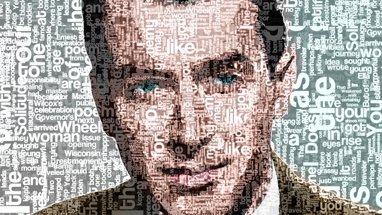
Typography :
|
This is a form of digital editing where words are positioned over a portrait in order to fit the frame. I plan on digitally manipulating the poem I have in order to fit in my images from my shoot and tell the story in a more creative way. The way in which I want the poem will be positioned in my photographs is to still read line by line in an organised manner. I feel this will be a successful way of including the poem in the photographs and embedding it into the image in a similar way that Perry's embroidery technique has inspired.
|
|
Acetate Sheets : |
I will print the poem onto the acetate sheets. This will act as a layer similar to when in Photoshop. I will be able to position the acetate sheet correctly and ensure perfect composition of the text over the image. I feel that this manual technique of combining the poem and the images together will be successful as the acetate sheets are clear and will still allow the viewer to see the image the writing is being layered with.
|
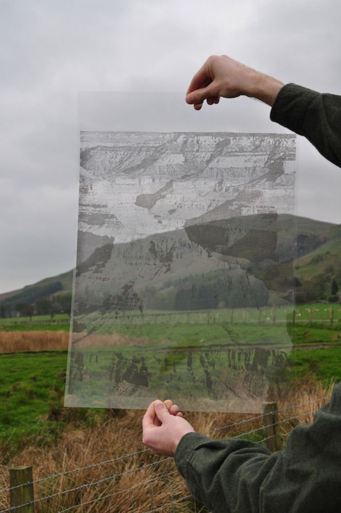
I believe that both of these editing techniques will cause some sort of distortion in my final outcomes as I intended to create from my influences from Glen Erler. Although his distortion layers were to do with reflections in glass and created from light sources, I want to keep the photographs fairly basic and use the different ideas of text overlay to create some distortion around the image.
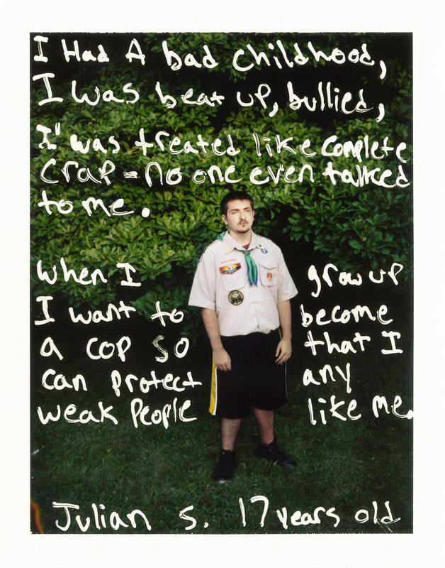
Jim Goldberg - specific analysis
|
In this photograph I can see a person surrounded by negative space. The boy in the photograph is alone with nature only. The words add so much meaning to the photograph as without them the viewer does not understand the boy. The writing provides the viewer with a greater insight into the boy and reveals the meaning of the image. I believe that the meaning of the image is to provide the viewer an understanding on the boy, without the information the viewer would be left clueless as to the purpose of this image. The use of getting Julian (the boy in the image) to write his story on the image not only furthers his presence in the image but gives it more of a personal touch. Not only does the viewer get to read what he wants you to know about him but also an insight as to what type of person he is through his handwriting. His handwriting, although legible, is sort of scruffy which implies he is
|
a very private person. From reading what he has written you can understand why he may be so private. This style originated from Goldberg looking at documentary photography however he wanted to interpret it with his own unique touch and he wanted the people he was photographing to have their own say and describe their situations in their own words. I want to take inspiration from Goldberg's work and his technique of layering text in an image to influence my way of manual editing. I am going to get my Nan to write the poem over the photographer of her holding a photograph of my Grandad from shoot two. I want my Nan to write it, as similar to Goldberg's work I want the viewer to get a greater insight about my Nan and her relationship with my Grandad.
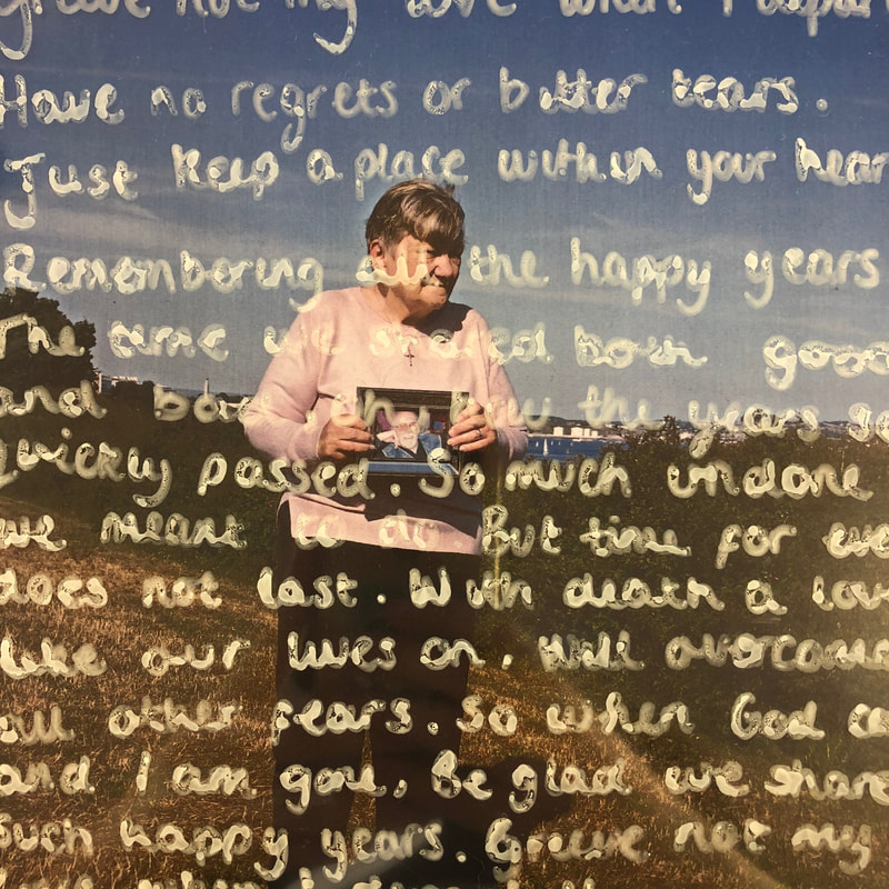
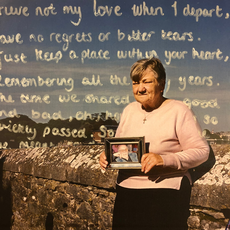
My Editing Processes
Digitally :
|
|
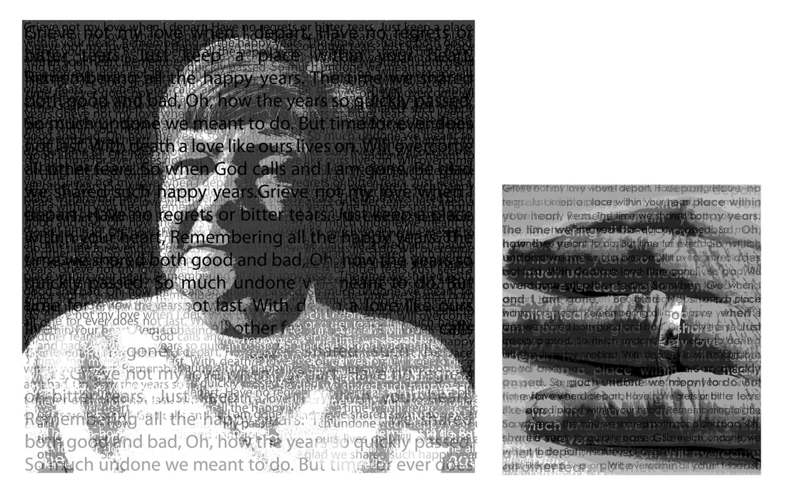
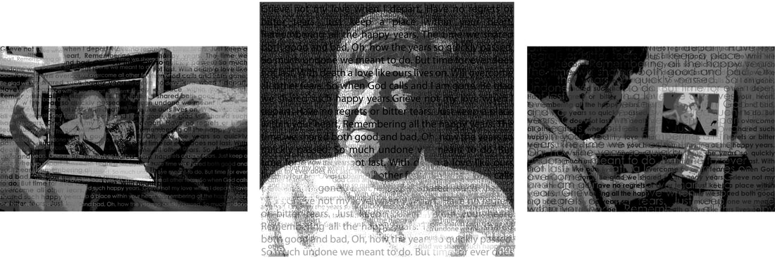
Above are my outcomes from digital editing and the processes I took in order to achieve these pieces. I am really happy with these outcomes and I feel I have been successful in portraying the memory of my Grandad through my Nan. Not only am I happy with the composition of my edits but I feel that I have used the negative space in the images and the poem to fill them with a purpose that tells a story of my Nan's loneliness. I feel that my interpretation of digital typography has been successful in portraying my inspiration from Perry's embroidery techniques in collaboration with Erler's use of deep shadows to express memories. My best outcome of the two is the second one. This one is better because the inclusion of the text is much more embedded in the photograph and from this it looks much more atmospheric. It makes the unnecessary background much more important to the image and intrigue the viewer to read the poem. Alternatively on my other edit the text does not stand out as much and has less of an impact on the viewer.
Manually :
I consider these manual edits to be relatively successful. The first two are ones where I was experimenting with printing on acetate. Although I like how they turned out, because of the text alignment and the font, I do not feel as though they evoke the inspiration I have taken from Goldberg's work. In shaded areas the black ink is difficult to interpret and can cause confusion for the viewer as they cannot make out what the poem is telling them. As for the third image (bottom left) , I experimented with handwriting the poem on acetate. I chose to write on acetate as I did not want to commit to writing on my images in case I made a mistake and I liked the final effect the acetate gave the image- a complimentary sheen over the image. This image shows that I have taken some inspiration from Goldberg however in his images he gets the person to write around themselves, not over themselves. This is something I went on to consider when creating my final piece (bottom right). My favourite of the four is the one in the bottom right. This image fits well Goldberg's handwritten in chunky white ink style and I have adapted it with the incorporation of acetate from what I had researched. I have taken Goldberg's style to only write around the person and adapted it as I proceeded to cut the acetate I had written on to give the impression the text was written behind her. I found this to be a successful technique when I was doing my digital edits and wanted to do something similar manually.
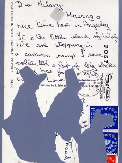
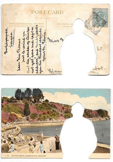
Tim Davies - Postcards
|
Tim Davies is an artist who took old postcards that showed a past landscape with someone stood in the scene and cut them out. The concept behind his pieces is to cut the heritage out of the postcards. One part in particular he looks at is the memories portrayed in the images on the postcards and the writings on the back of them from cutting them out it portrays the figures to be lonely and lost.
|
|
Davies ideas apply to mine as I am looking at presenting my Nan as lonely individual since my Grandad passed away. If I apply his technique of cutting figures out of images to my edits I could look at either cutting out my Nan's figure from the image or cutting out one that I make up implying that the figure that is empty is my Grandad. I will try both ways until I decide which one is more successful. In addition to this, the writing on the back of the postcards links to the poem I have edited over my images that links my Nan and Grandad together.
My Experimentation
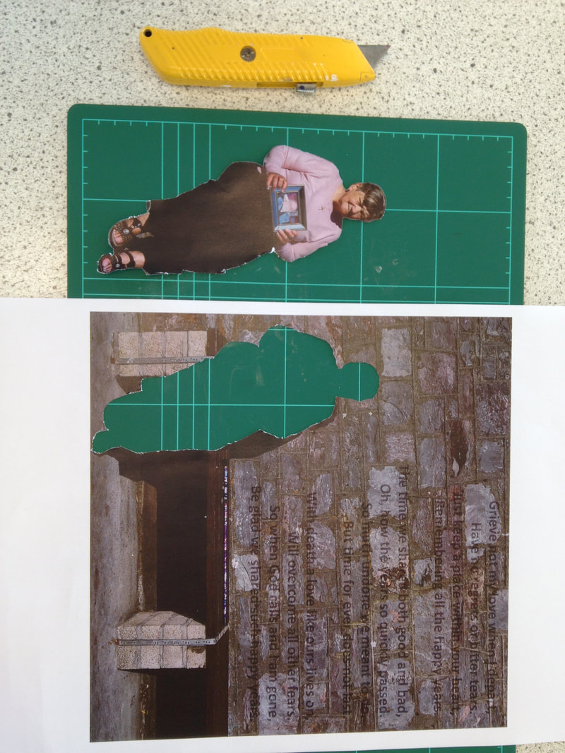
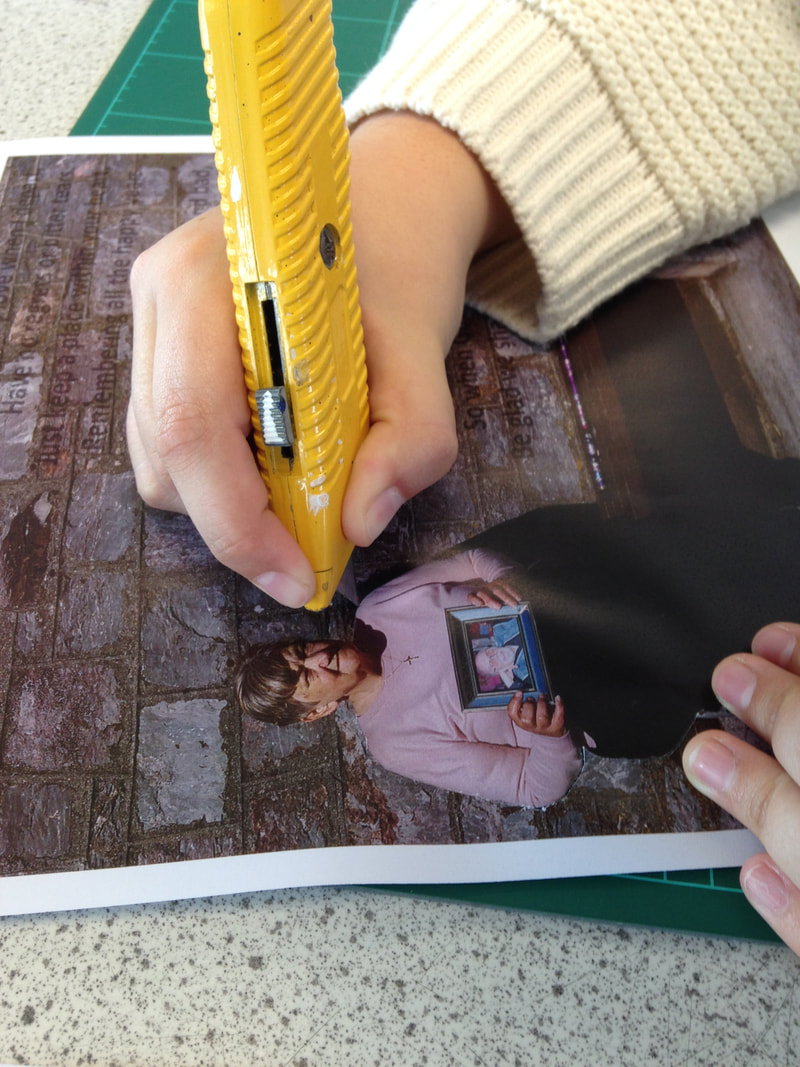
Using my outcomes from my digital editing, I interpreted Davies style. I used a cutting knife to cut out the shape of my Nan. The way in which I have cut her out emphasises on how she is alone and shows her cut out as an undistinguishable silhouette. The way in which I have done this implies that the cut out can be anyone and proves that all widows feel alone when their partner passes away. With my experimentation I decided to only cut out my Nan's figure. I made this decision as I found it fairly awkward to cut out tracing her and to make a figure that would fit the proportions of the image and cut it out would have been to difficult.
Tim Davies Inspired Outcomes
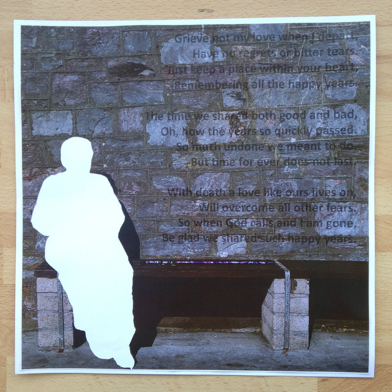
I am happy with these outcomes I have produced. I feel that putting the plain white paper behind my cut out piece gave it a finish that meant that the emptiness of the cut out was furthered and allowed the viewer to really focus on this part of the image. I gave my edits a white border, I feel that this gave them a finished look and bought the white negative from where I cut my Nan out together. I feel the right image is the best of the two as I prefer my technique of embedding the text in that edit. The use of the enhancement on the original edits to cut the figure of my Nan out was really successful and truly represented the inspiration I have taken from Tim Davies. This technique of cutting something / someone out of a photograph removes detail that the viewer then becomes more intrigued over. I wanted to incorporate Tim Davies style into my project as I found his work really fitting. Where he removes heritage from vintage postcards I have removed my Nan. I did this, not to take my personal aspect away, but to make the image more inclusive. The silhouette can now be anyone, anyone who associates with the words of the poem .
Another Interpretation of Tim Davies
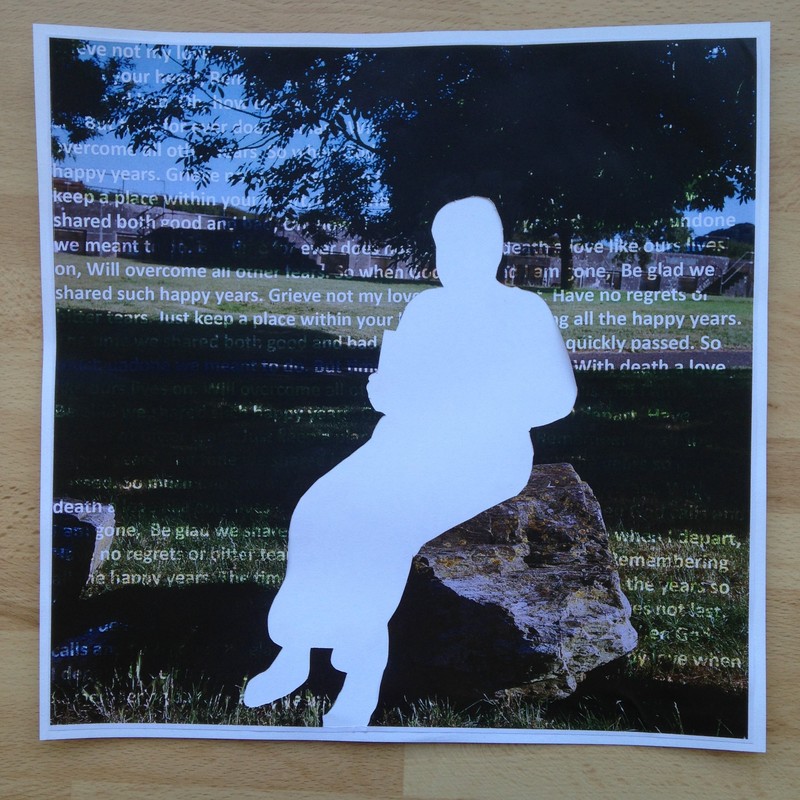
I considered how in my previous work I cut out the silhouette of my Nan from the image and although I found this successful in presenting her as single figure, it did not portray any element of my Grandad. Therefore I was thinking of what I could do to give my Grandad more of a presence in the image. This lead me to this idea:
Tim Davies Inspired Outcome
|
This is one of my favorite outcomes so far into this project. I am really happy with how my editing in Photoshop turned out. I find that where I positioned my Grandad when editing has given the illusion that he is still looking over her shoulder. I also like the composition of the outcome, first on my shoot I used rule of thirds to keep my Nan in the center third and second positioning the shape of my Grandad behind her. This kept all the focus points in the center of the image and maintained a symmetrical balance in the background which is aesthetically pleasing for the viewer. I like the contrast of the white text against the busy dark background as it stands out, originally
|
the text was in black but I found that it was confusing and it was difficult to see. Although I really like this outcome I feel like it could be edited slightly more. The original photo has really strong intense shadows and when editing this outcome i did not consider adding a shadow to the figure of my Grandad. Therefore I am going to add a shadow and update this outcome. This may be unsuccessful however I do not know and I want to see if I can make my outcome any stronger in presenting my Grandad with a stronger presence in the image.
Further Editing
Updated Outcome
|
After completing this outcome, I believe this image is more successful with the inclusion of the shadow in presenting the memory of my Grandad and the impression he had on my Nan's life. Although the effects of the shadow are minimal, I feel it really ties the original image and the edited elements together. The shadow I created is a perfect match to the original shadow in the image which ties the two together and makes the shadow I created much more realistic. The shadow definitely adds more contrast to the image through such a minimal and simple way. In addition to this, I think that the shadow adds more definition to the image making the shape of my
|
Grandad the main focus of the image as that area becomes the center of interest for the viewer. I feel if I could improve my technique with the shadow I would make the edges more crisp much like the edges of the bench. This is the only part which doesn't really correspond with the original shadows however the technique I followed gave a softer effect and I prefer that.
Shoot Three

The shoot was based around capturing a basic set of images where I really focused on the composition of the images. I wanted the achieve an even distance around my Nan in the images and chose this background to ensure it was fairly plain and simple. This shoot was captured on the basis of having a set of images that suits the typography style I have previously researched. After creating an alternative typography style with my previous set of images I realised that the composition of the images did not suit the close up typography style I had researched. I did consider cropping the images but I found this to be unsuccessful as the background of the images still remained busy. I believe this shoot was successful as the images are all sharply focused and the composition is proportional around my Nan who is in the foreground. Although I was not keen on the first six images as I was not happy with the background of the image, however once realising this I changed the location of my shoot to a more plain background. On the images from the shoot I have analysed what was successful and not successful about them.
Some images have annotations on, click on them to read them.
Some images have annotations on, click on them to read them.
My Editing Process
My Outcome
|
This is my first attempt at a digital editing process taking inspiration from the typography examples I looked at. Overall I am happy with this outcome, the use of layering text in the three colours proved successful to define shadows in the image. The use of focusing on only black, white and grey was successful as it reduced the image so that the focus was only on my Nan and the poem rather than the different colours that were in the image originally. I feel that the use of both warping the text and erasing parts of it were equally successful in covering the photograph and allowed me to vary my technique. Leading on
|
from this outcome, I want to produce another shoot where I focus on capturing the photographs at varying distances. I feel like a close up outcome in this style will be more expressive in portraying a more sentimental outlook.
Shoot Four


When capturing these images I had the intention of capturing close up shots. On the shoot I considered more elements like depth of field and which parts I wanted to take more of the focus. I also focused the images on bringing my Nan, a photograph of my Grandad, her wedding ring and the poem my Grandad left her. I felt that these four elements combined, present an ambiance of truly missing someone. Something that became apparent on the shoot was the incorporation of artificial light. When taking the photographs I found that the room lights were being reflected in the glass plane of the framed images. This made the images that had this glare of light unsuccessful as the light acted as distraction from what I actually intended to capture in the images. The images that were affected by light, in my opinion, have been annotated individually. As I am taking a typography editing approach to these images like my previous edit, I want to look specifically at more close up images that I could potentially present along side my previous edit. I want to take one or maybe two images forward to the editing process so I can look at presenting a diptych or triptych final piece where two or three images are presented alongside each other.
Some images have annotations on, click on them to read them.
Some images have annotations on, click on them to read them.
The Most Successful Images
These are the images I consider to be the most successful from my fourth shoot. Below is each image I consider to be successful and my reasons why I think this. These are also the images I believe have the most compatibility with my previous outcome in order to create a diptych or a triptych.

|
I consider this image to be one of the most successful from my shoot as I regard the depth of field as successful as it adds an element of focus to the image. Having the photograph of my Grandad in the foreground in focus and the background behind my Nan blurry oppose each other and draw more focus to the photograph of my Grandad. The composition of the image as a whole enhances my grandparents relationship through how her wedding ring is projected forward in the image.
|
|
The depth of field in this image enhances the viewers focus on my Nan yet still shows her considering my Grandad. The use of not having my Nan's face in it through capturing from behind her brings more of a focus on the blurred picture of my Grandad and the poem which she is holding in her hand. The hand which she is holding the poem in also displays a glimpse of her wedding band which is another symbol of her connection to my Grandad.
|
|
|
This image which focuses purely on my Nan's wedding band is a simple but effective image. It presents to the viewer many different interpretations like someone's wedding day, anniversary or a widow. Therefore this image alongside my other in a diptych or triptych would add further meaning to an image which may not display the wedding ring so intensely. The ring, which used to have a piece of engraving on it now shows its wear as the pattern which was chosen by my Grandparents has now worn off in some areas. When editing this image, I believe it needs to be cropped. I will use the rule of thirds composition to ensure my composition only enhances the display of the wedding band.
|
My Editing Processes
My Outcomes
When editing these images I did not add as many text layers as I did in my first typography style portrait. I did this as I wanted the first image to still be the main focus when I display them together and for these images just to compliment it alongside. Out of the three images I edited, I consider the first to be the most successful. This is due to the fact that this image ties together my Grandad's picture and my Nan's wedding ring which are both very strong symbols of their relationship. As for the other images, I like the middle one as it brings immediate focus to my Nans wedding ring. The wedding ring which appears white in the image stands out above the grey tones that are through out. In this image in particular I only layered darker layers of text in order to give the ring more of a prominent focus. The final image I like as it brings my grandparents together in one image with the inclusion of the poem he left her. This presents the poem twice in the image as it is also displayed in the text written over the image. I believe that this image in particular will work well with my first image of my Nan as it shows her figure in both. This would just further the presence of my Nan in the image and build a greater connection between her and the viewer.
Diptychs and Triptychs

I produced various style diptychs and triptychs using different variations of the four images I edited. When positioning them I considered the sizes and the order of layout, I considered these four outcomes to be the strongest of what I put together. Considering my diptychs and triptychs I believe the triptychs to be better. I am happy with my outcomes in the respect that all my images compliment each other and therefore present the memory of my Grandad through my Nan's eyes in a way that the viewer can interpret.
Typography Outcome
From all my outcomes compared above I believe that this one is the strongest. When creating this triptych I considered equal spacing and margins around the center image. I also decided that I wanted the singular image of my Nan to be the focus of this triptych and therefore made that image the center image and made it bigger than the other two. This triptych is also aesthetically pleasing as it is symmetrical. The images either side are the same size and are equally space from the center image.
Jim Goldberg
These images, produced by Jim Goldberg, were produced with the intention to capture an insight of both rich and poor lives. The use of a black and white colour pallet in the images really enhances the melancholy mood and is something I want to explore in my work. The use of the text, in the person's handwriting, is similar to another piece I looked at of Goldberg's, and like I said I believe the use of the person's individual unique handwriting truly gives a more personal touch to the image. The overall composition of this set of work is intriguing. The use of having the picture above a piece of text on a plain white page presents an element of simplicity that is not portrayed in the images. This simplicity allows the viewer to first focus on the image and then read the piece of text which gives a greater insight to the image. This image in particular ( on the left) has
|
more darker tones than lighter tones. The composition of the image has been enhanced by light, making the things and person in the foreground much lighter than those which are darker in the background. This dramatic use of lighting which reflects that of Glen Erler is something I want to achieve in my own set of images. This will present my original inspiration from Glen Erler and an interpretation that reflect elements of Goldberg's style. All his photographs are very casual and evoke the naturalness that Depoorter captures in her images as well. This neutral setting elicits a common ground between photographer and subject and ensures the photograph is easy to interpret for the viewer by providing them with a clear insight into the subjects life.
|
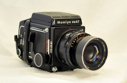
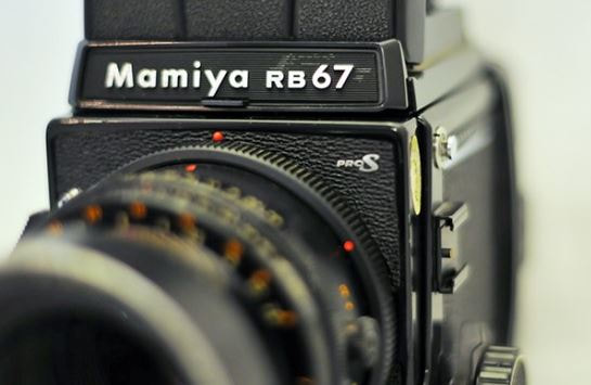
Mamiya RB67
|
Goldberg, who shoots with film cameras, uses both medium format and 35 mm. I am going to take inspiration from him and use a medium format camera on my next shoot. I decided on the Mamiya RB67 as it is a medium format camera which does not produce images in a square format as Goldberg's images are not square. I am going to shoot with black and white film similar to how Goldberg has done in his project. I feel this will portray the inspiration I have taken from Goldberg. The camera has the aperture and shutter controls around the lens. But no built in light meter, meaning I will have to manually meter the lighting of my images. Focussing is also manually done so I will have to draw on my experience with the Yashica I have used earlier on in the project. The 'RB' in its name means rotating back. This will mean that when I want to change from shooting portrait to landscape I only have to push a button and the film back rotates
|
90 degrees. This prevents turning the camera on its side to get the best image. In my opinion I do not think I will be needing the rotating back as I will be shooting all my photographs in the landscape format.
Shoot Five Plan
Similar to in Goldberg's pieces, I plan on capturing a set of images that express a distance between my Nan and the camera. The images which are captured in the subjects natural surroundings truly emphasises on their personal life and this is something I want to reflect in the images of my Nan. My shoot will therefore be located in her house, particularly in her front room where she would sit with my Grandad. I will also experiment with some images outside the front of her house to feature the specific style of their house which is the first house they moved in with each other. My images will be captured from a relatively far distance from my Nan. I will aim to get a lot of background in my images like Goldberg has done as this will draw a greater focus on my Nan as there will be a lot of negative space.
Loading the Camera
Developing My Images
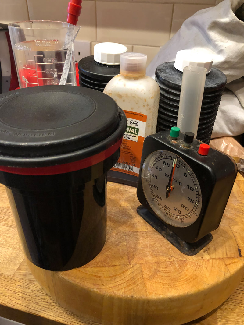
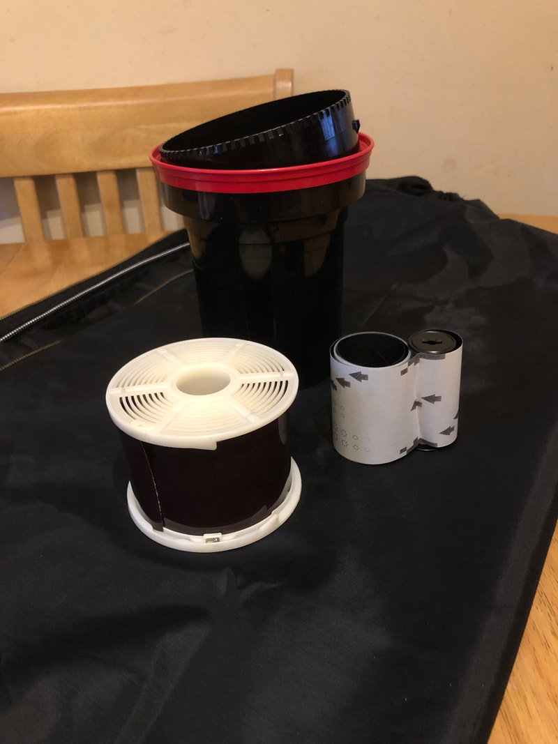
I began with putting a developing tank, film reel, my film, scissors in the light tight changing bag. From here everything is completed in the changing bag where I could not see what I was doing, only feel. I then cut the corners of the film off to prevent a kink in the film which may be caused when inserting the film onto the reel when getting it past the initial part. On the reel, where the film is inserted there are small balls which prevent the film from unravelling, getting the film past the balls can be tricky hence why I trimmed the corners of the film. Then I loaded the film onto the reel completely. I then reassembled the developing tank, putting the tube through the film reel and placing that into the developing tank and finally putting the lid on ensuring everything is tight.
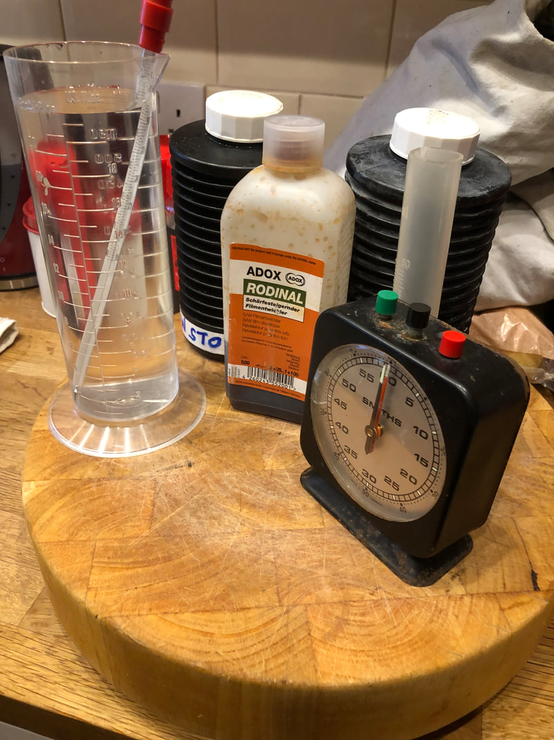
I developed my images for twelve minutes which was an N+1 development (roughly). NDev recommended 11 minutes but because it was dark when I took my pictures I felt I needed to develop my images for longer to ensure my highlights came out. My development was carried out at twenty degrees Celsius with one minute of strong agitation to start, 10 second agitation every minute there after in a Rodinal developer dilution of 1:50. After the twelve minutes I poured the Rodinal solution out and immediately poured in the stop bath for minute with agitations. I then rinsed the developing tank out with with clean water followed by two five minute baths with 1:9 fixer dilution, 10 second agitation every minute. I completed my developing process with an archival wash with a wetting agent and hung my images to dry in a safe place.
I developed my images for twelve minutes which was an N+1 development (roughly). NDev recommended 11 minutes but because it was dark when I took my pictures I felt I needed to develop my images for longer to ensure my highlights came out. My development was carried out at twenty degrees Celsius with one minute of strong agitation to start, 10 second agitation every minute there after in a Rodinal developer dilution of 1:50. After the twelve minutes I poured the Rodinal solution out and immediately poured in the stop bath for minute with agitations. I then rinsed the developing tank out with with clean water followed by two five minute baths with 1:9 fixer dilution, 10 second agitation every minute. I completed my developing process with an archival wash with a wetting agent and hung my images to dry in a safe place.
The Negatives
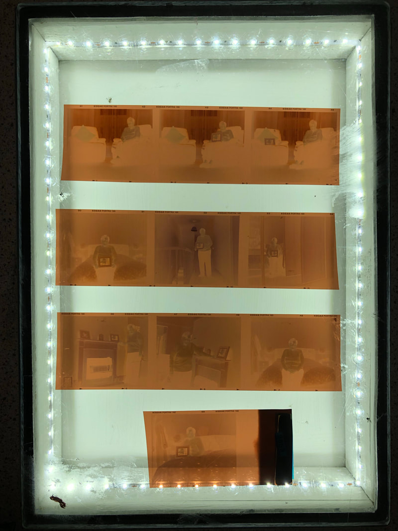
These are the negatives from one of my rolls of film. I displayed them over a light box so that the photographs could be viewed. The darker areas will be lighter in the photograph and the lighter areas will appear darker. As shown in the negatives the lighting was respectfully good. I was not sure if I would have an issue when I was shooting into the sunlight from the windows but in fact I have a relatively strong contrast between light and dark areas.
Shoot Five
Overall I am happy with this shoot. Although some of my images are blurry, I know that this is due to the slow shutter speed and I could have prevented it by using a tripod however I did not have one accessible to me. I am happy with the composition of my images as a whole. When using the camera I did not have an guidance from the ground glass screen in the viewfinder, unlike when I used the Yashica where there where guidance lines. In order to capture these images I shot with one roll of Ilford HP5 and one roll of Kodak Portra. I feel my colour images are more successful compared to my black and white ones as the Kodak Portra was the second roll I shot with the camera and at that point I was more comfortable with how to use the camera. On the other hand I prefer the aesthetic of the black and white images, they correspond better with the inspiration I have take from Jim Goldberg and I prefer the concept of using black and white film with a film camera as it seems more fitting with the age of the camera. Between the two rolls of film I tried to capture a similar set of images so I could compare them. I feel like I achieved a similar set of images and am happy with the composition and settings I used to capture my images.
Some images have annotations on, click on them to read them.
Some images have annotations on, click on them to read them.
My Editing Processes
|
|
|
|
Now that these pieces are all at the same point, I will next print them and get my Nan to write the poem on the bottom half of the page, under the image. This is similar to the work of Goldberg as he gets his subjects to write on the blank area under the image. I have chosen to take on Goldberg's style of getting the subject to scribe on the image as I believe it adds more of a personal touch to the image and allows the viewer to have a greater insight into who the person is and what they are like which can be interpreted through someone's handwriting. As the poem is made up of three stanzas I have decided to spread the poem across three pages. These three pieces will then be displayed alongside each other in order of how the poem will read. Although Goldberg produces pieces in black and white, as I shot a roll of film in colour I will produce one black and white piece and another colour piece.
Jim Goldberg Inspired Outcome
I am really happy with how these sets of images turned out. The inclusion of my Nan's handwriting gives that personal touch which is lacking from my other outcomes. I feel that my pieces really do evoke my inspiration I have taken from Goldberg and therefore I believe I have created a successful outcome. In comparison I prefer the black and white pieces rather than the colour ones as the tones in the colour pieces do not all compliment each other in union.
Michelle Caplan - Collages
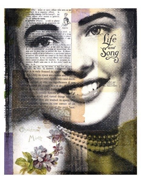
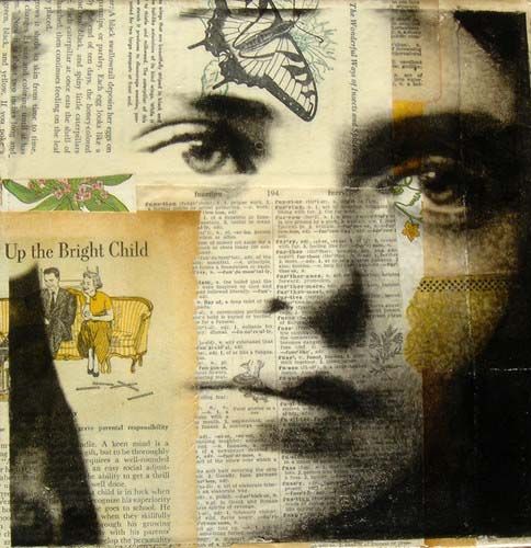
These are graphic art collages created by Michelle Caplan. In her biography, Caplan expresses that these collages are an expression of her passion for art and portraiture. Each portrait is a snippet of photographic history, the pieces look aged and all include a piece of layered narrative. The narrative tells the story of the person in the portrait and is furthered by the additional layered images. I really like this style of layering images and I believe it will strengthen the presentation of my grandparents relationship. I plan on basing a shoot around my Nan. I will capture close up portraits of my Nan and layer other images from her past. In another shoot I will look at old photographs of her and my Grandad when they were younger and visit places where they lived and places that are special to her.
Shoot Six
These photographs are going to be the base of my edits. Although this is not a big shoot I have captured what I needed to in order to carry on with my project. Looking at Michelle Caplan's work I decided that I wanted a subtle plain background that my Nan's clothes blended into. By choosing this location it will ensure I have good lighting and a smooth texture to build my collage on. In this shoot I varied the distance between the camera and my Nan as I was unsure how I was going to build the collage around her and how much space I would need. I used natural light for these photographs to ensure they were well lit and captured at eye line so the photographs did not seem like they were captured from above or below her as that would have altered how my Nan would be perceived by the viewer. If I had captured the images from a lower angle it would have given her a powerful role in the photograph. The cool and complementary colours in the background mean that the viewers focus is brought to the face of my Nan which will allow be to build my Caplan inspired collage around her.
Shoot Location
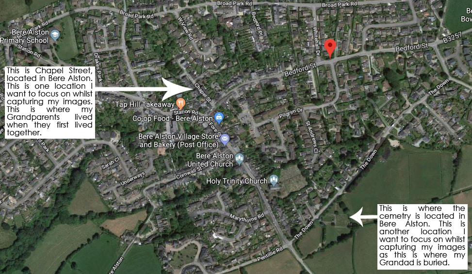
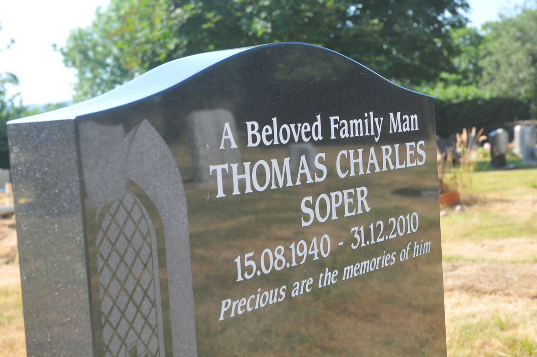
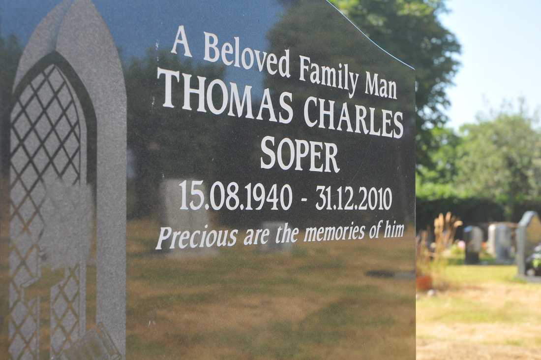
As labeled on the map above are the locations I plan on visiting for my seventh shoot. These places are significant to my grandparents relationship. One of the locations I plan on visiting is their first home together. The second location I plan on visiting is my Grandad's grave. This is somewhere my Nan visits frequently to see my Grandad and maintain his grave.
Shoot Seven

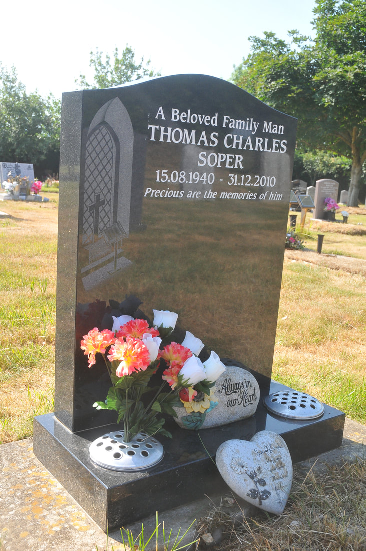
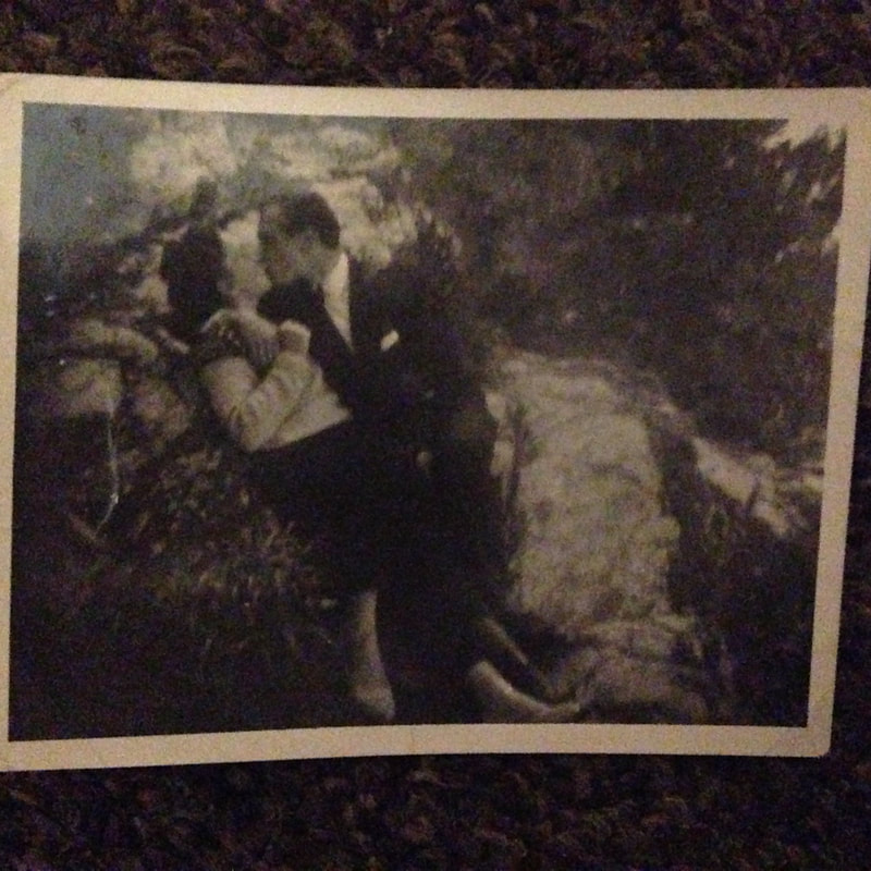
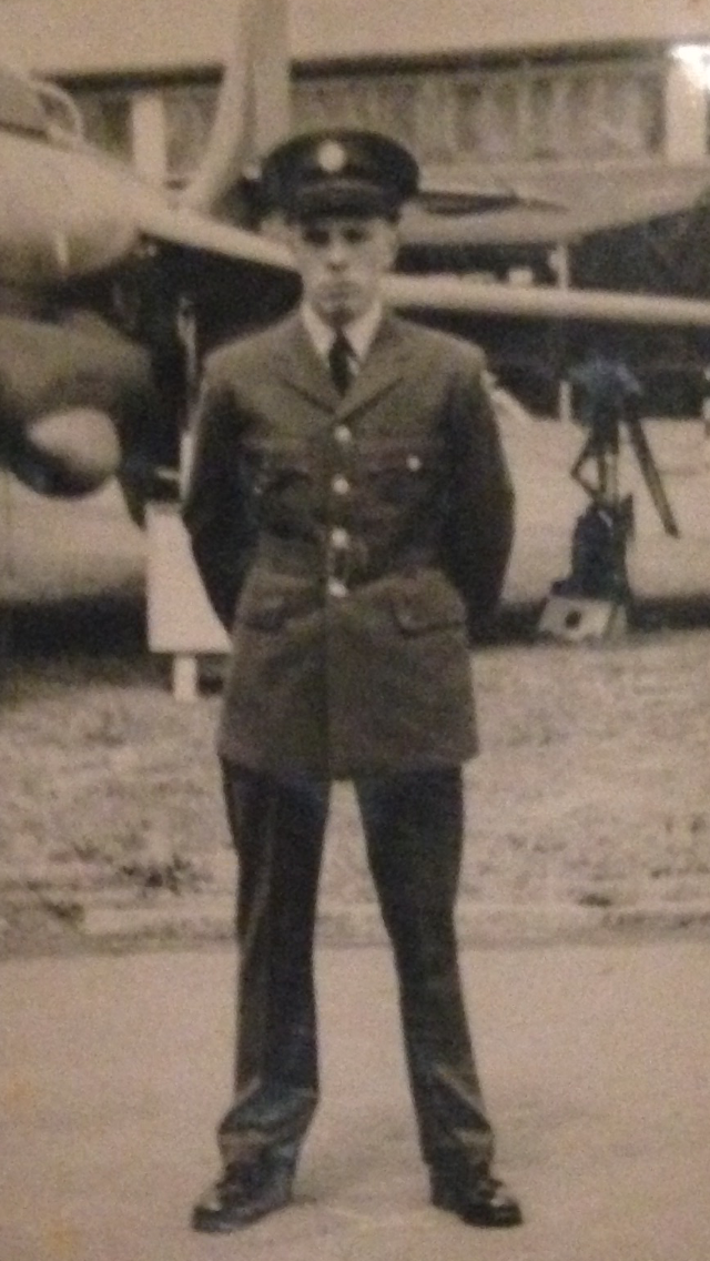
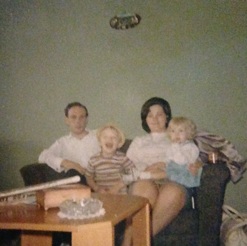
These photographs are ones that I am going to layer with my previous shoot. The first set of images are ones I have taken of where my Nan and Grandad lived when they first moved in together. I wanted to capture snippets of where they lived and what the location was like. I then captured photographs of my Grandad's headstone. I wanted to use these in my collage as the words on his headstone are words my Nan wrote and are words that sum up what he was like. The third part of my shoot is photographs that were taken when my Grandad was alive. These photographs show what he was like and include ones captured with my Nan and their family. I chose these photographs from the ones we had of my Grandad as I felt that these images really captured the essence of what he was like as a person, a family man, a soldier and a happy person. I will use these photographs in my Caplan inspired collage to portray an in depth insight into my Nan and Grandad's life and how she is now without him.
My Editing Processes
Michelle Caplan Inspired Outcome
|
I am happy with this outcome especially how I have positioned the images from shoot seven in the background. Although I took inspiration from Michelle Caplan, I wanted my outcome to be less busier hence why I did not edit collage style aspects in the foreground of the image. I wanted the focus point of my edit to be my Nan and I feel I successfully achieved this by keeping my Nan in the center of the image and only applying burning layers to the background. I think that my technique of warping the images around the background especially on the houses was successful as it created the illusion they
|
were originally in the image. The aspect of the edit I am most happy to is the embedding of the poem. The way that I used a font that illustrated the poem in a handwritten style gives the impression that the image is more personal and that my Grandad wrote the words himself. My technique which blended the text into the image gives the perception that it is almost burnt into the image, my ordering of layers put the text on top of all the background layers meaning that the text changed colour and tone depending on what layers where behind it.
Michelle Caplan Inspired Outcome Manually
I wanted to take more inspiration from Caplan as I liked my digital edit so much. Seen as Caplan produces all her pieces manually, I wanted to take her manual style and attempt something similar. I printed the photographs from my seventh shoot and the poem on acetate. I then positioned the different photographs around the portrait of my Nan until I was happy with how I had composed them. As a whole I am happy with these outcomes and feel that I have interpreted Caplan's messy collage style however I do prefer my digital edit. When editing my image digitally I had the ability to manipulate each image and make it fit areas specifically. When working with the images manually, I was only able to to place the images that fitted certain areas and I could not manipulate their size or warp them as they were already printed.
Amy Friend
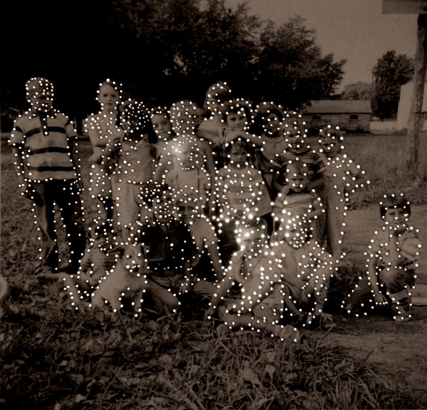
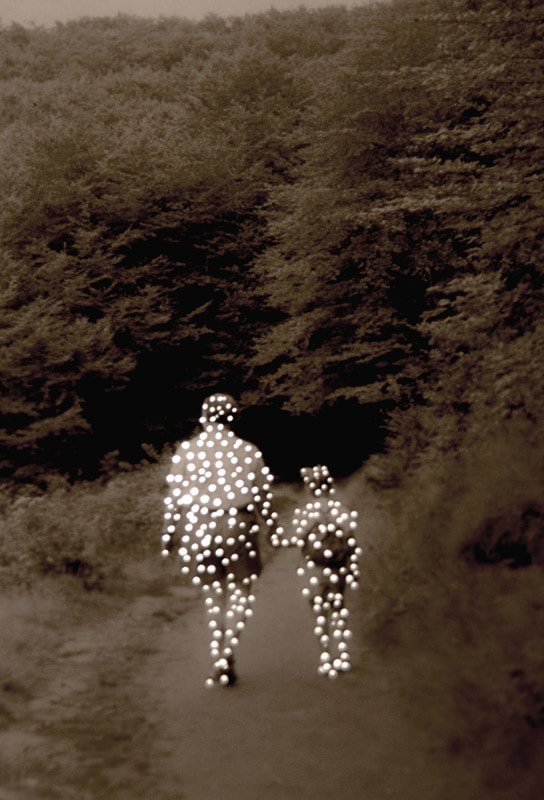

Amy Friend created a series, Dare alla Luce meaning “to bring to the light”, where she looked at capturing a reality that presented both visual and non visual items. The project began orientated around vintage portraits she had sourced and using a technique to create holes in the image and shine light through, Friend's aim was to present the fragile quality to the photograph but also to present the fragility of peoples lives and how so easily they can be lost or forgotten. The use of the light is used in her images to present death and how each person who is captured in these vintage photographs has passed. The light, therefore, is used to suggest that the images have some sort of heavenly context to them. Personally I find that Friend's work is fitting with my project as her use of light furthers Erler's techniques of using dramatic lighting and use of strong shadows.
|
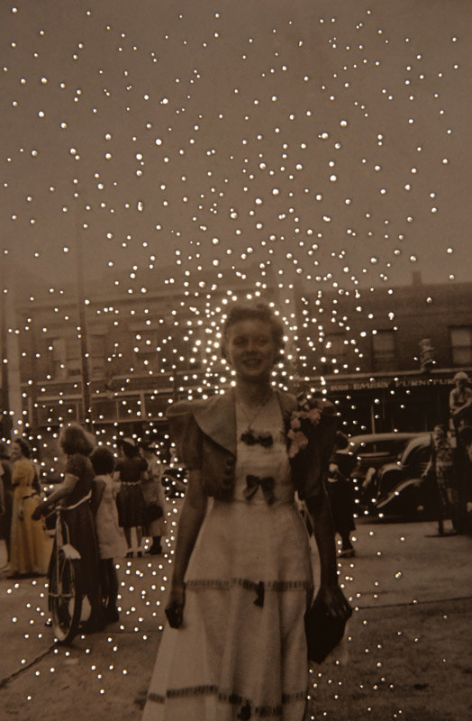
This image of Friend's is one of my favourites, the use of only removing detail from the background and leaving all the people draws more focus to the people in the images. This makes the viewer consider who the people are and why they are so relevant to the image. Personally, I believe that the main focus of the image is the lady in the middle of the foreground of the image. The way in which the light dots are clustered closer around her and fade away in a sort of gradient illustrates to the viewer that the woman has lost someone. An alternative interpretation could be that Friend was presenting to the viewer that the woman has passed away and that therefore the dots of light symbolise her sole rather than what she is losing. The way in which the holes have only been pierced in the background pushes the woman in the foreground forward and makes her the focus of the image. instantly the viewer is drawn to her face and to see her smiling happily evokes a positive yet sympathetic atmosphere about the image.
|
|
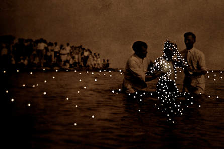
This piece, although it is created by the same artist, has a completely different ambience. On this image the dots of light are focused more around covering someone which, in my opinion, focuses more on presenting that the person in the middle has passed away. The dots of light suggest that the memory of that person is fading away through the use of focusing the light on the persons silhouette and spreading the light out through a gradient.
|
|
Taking inspiration from Amy Friend's work, I am going to use a pin or the point of a sharp pencil in order to pierce holes in my images in a style similar to the first image I analysed. I really like the concept of fading the light away from the focus of the image as this draws the focus more to subject of the image.
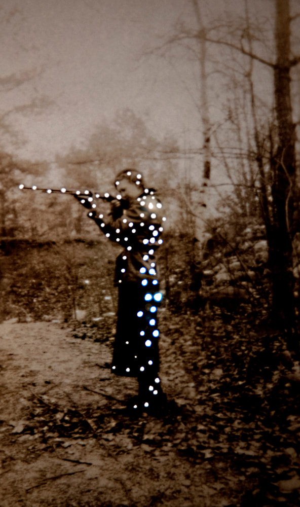
Experimentation In The Style of Amy Friend
For my experimentation I used my photographs from shoot two. I chose this image in particular as it was a portrait that included my Nan's whole body which is something that Amy Friend considers in her portraits as she uses the majority of the person in the image.
|
|
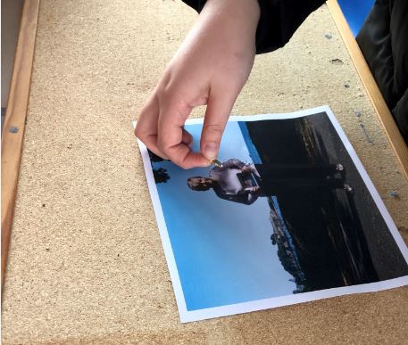
I believe that this editing process was very successful. I was able to follow Friend's technique easily and produce a plan that I could follow in the future. I used a cork board behind the image to give me something to push the pin into which provided me with a base so the pin went into the image securely. I was also able to use the light box to see what effect it would give to position the photograph over which I was very happy with. I feel this experimentation was successful and I am going to use this style with an image from shoot eight.
Shoot Eight Plan
My plan for this shoot is to explore more outdoor settings, similar to in Friend's pieces where she has street view photographs. Although Friend did not capture these images herself, the ones she selected were captured with an outdoor setting. My inspiration for this shoot is capture a set of images outside my Nan's house and on her street. This is the first home her and my Grandad got together and so her home is very important to her. The house itself symbolises another bond between my grandparents. I will reflect Friend's composition in capturing the whole figure of my Nan- if not the majority. Using this setting will allow me to capture an essence of my Nan's history in the images and show it as her history through Friend's technique of piercing holes in her images.
Shoot Eight
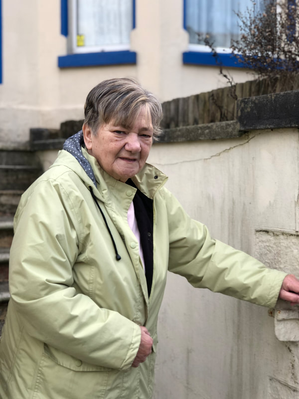

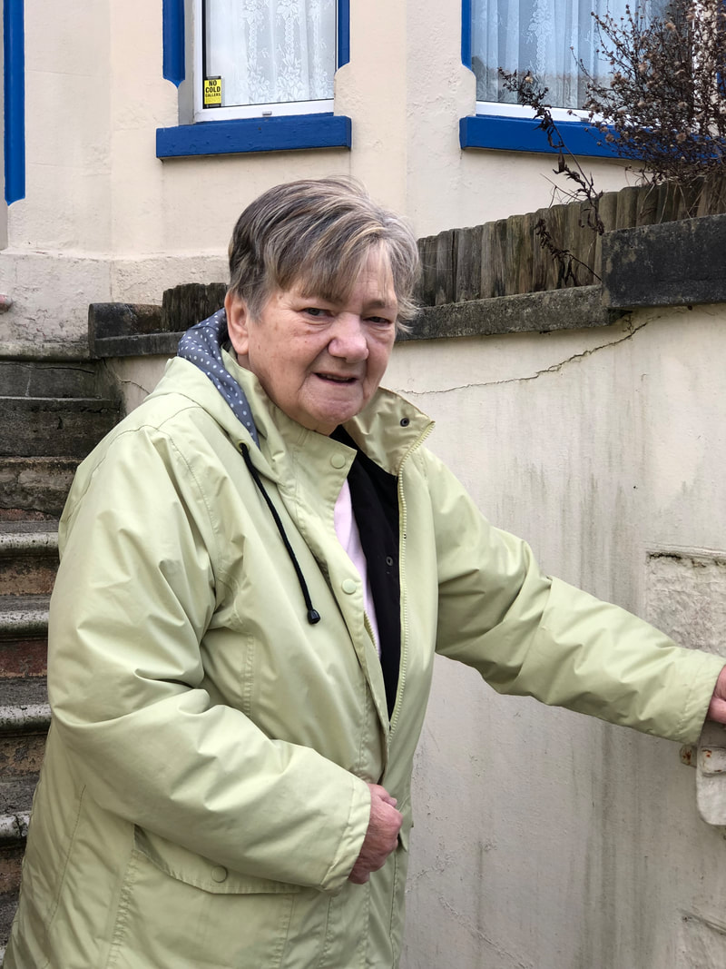
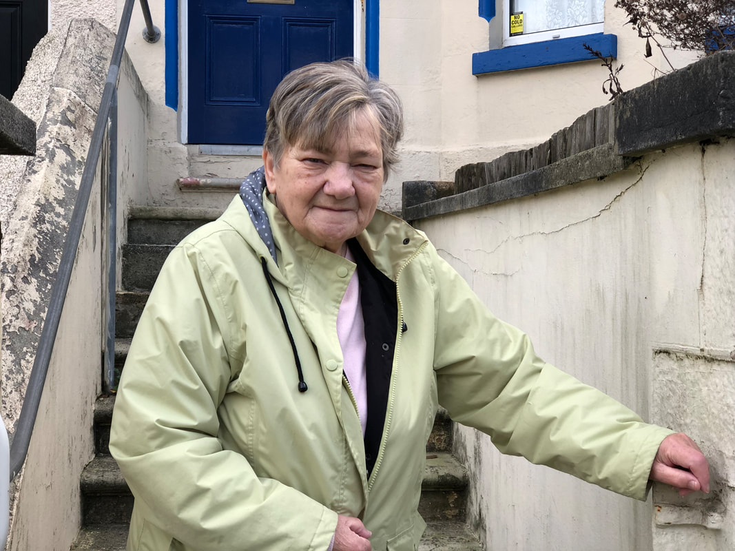

Overall I am happy with this shoot, I feel the levels and contrast between colours was successful and I captured a variety of images. I attempted both close up styles and long distance shots where I tried to get as much of the house in the image where I could. I believe that the images captured closer to my Nan are the most successful as the background blurred to add more focus to my Nan. This made her stand out in the image contrasts her from her house which is a similar colour to her coat. In all my images I ensured that my Nan maintained eye contact with the camera so that the viewers focus is on her solely and not where she is looking out of shot. The images that are shot closer up provide the viewer with a closer look at my Nan and the rustic background of the chipped paint on her wall which provides an aged and dated look to the image similar to in Friend's work.
Some images have annotations on, click on them to read them.
Some images have annotations on, click on them to read them.
My Outcomes From Amy Friend
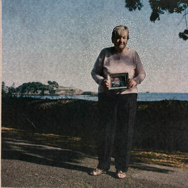
I am really happy with how this outcome turned out. I feel this looks better than I had planned as my image suits Friend's style much more. The holes in the image, which I focused more around my Nan's figure evoke how I have taken inspiration from Friend's work and show how I have adapted her technique to suit my image. the left image is my outcome as a whole and the right image shows a detailed close up of the pin holes. After editing the image to have pin holes in I positioned it on the light box and re-photographed it.
Letraset
|
In this example of how a letraset can be used by Lars Harmsen. Harmsen expresses the use of how text can enhance a story an image tells. Although this editing style combines the words with a portraits and so would be fitting with what I am trying to present, I find this style messy and so am not over keen on it. I prefer the style I have already been making, keeping the text aligned to the framing of the image. The letraset also would limit how much of the poem I can display over the image and so I will not be using this stye as it limits the amount of context I can give to the image.
|
New Ideas
From looking at Glen Erler and his use of shadows in portraits, I want to look at an alternative approach to the incorporation of shadows in another photographer's work. I will still consider the use of shadows in my work I just want to gain more of an understanding of the use of shadows and how different photographers use shadows to influence my work and make it stronger. The next photographer I will be looking at is Christopher Anderson.
Christopher Anderson
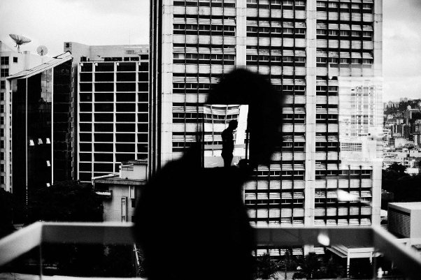
Canadian photographer, Christopher Anderson, is my next inspiration for my personal project. His use of shadows combined with portraits is very different to Erler’s work and is more of a contrast of light and dark rather than the portrayal of memories. “Emotion is really the only thing about pictures I find interesting”- a quote from Anderson in a recent interview tells me that when capturing his portraits he looks mainly for the emotions portrayed in the subjects face and through their body language. Personally, I find his images very powerful in presenting the subjects with a melancholy atmosphere and portraying a sense of distance between the viewer and the subject.
These are the images from Anderson’s work that had the greatest impression on me. The photographer has used shadows to his advantage to enhance his images and make them more intriguing for the viewer. I believe the mood of the images portrays an emotional and personal interpretation into Anderson’s life. The use of shadows in his work and the concept of silhouettes is definitely portrayed strongly in his work and I feel portrays the personal links to him. One link being of a connection to his family, a series of photographs are based around capturing his wife and young child in the midst of his father growing ill with cancer. The techniques Anderson has used to draw equal focus to both light and dark, whilst allowing the viewer to see some detail but also allow them to be curious as to what they cannot see due to the darkness. The way in which he has captured silhouettes, gives the viewer an outline and shape of someone but not allowing the viewer to see any other details such as the facial features or facial expression.
These are the images from Anderson’s work that had the greatest impression on me. The photographer has used shadows to his advantage to enhance his images and make them more intriguing for the viewer. I believe the mood of the images portrays an emotional and personal interpretation into Anderson’s life. The use of shadows in his work and the concept of silhouettes is definitely portrayed strongly in his work and I feel portrays the personal links to him. One link being of a connection to his family, a series of photographs are based around capturing his wife and young child in the midst of his father growing ill with cancer. The techniques Anderson has used to draw equal focus to both light and dark, whilst allowing the viewer to see some detail but also allow them to be curious as to what they cannot see due to the darkness. The way in which he has captured silhouettes, gives the viewer an outline and shape of someone but not allowing the viewer to see any other details such as the facial features or facial expression.
|
This is one of Anderson’s images I have chosen. I was drawn to this image most due to the strong contrast between light and dark. The overall focus of the image is the strip of light across the subjects face. Ultimately this focus is brought to the eye of the subject where the blue of the eye stands out against the black background.I believe that the lighting used in the image could be natural for example the person could be stood in a window and the photographer has framed the image to get the contrast of light and shadow. The light also seems too bright that either it could be a studio light rather than sunlight. The setting of the image being unknown to the viewer creates a sense of mystery and interests the viewer into looking further into this image and consider the subjects characteristics more so. The perspective of the image has allowed a proportional amount of
|
space around the subject and strengthens the composition as it draws more focus to the woman. The overall tone to the image is darkness apart from the vivid strip of bright light, I feel this contrast is very complimentary as the differences in the lighting work harmoniously. The harsh line of light is parallel to the side of the image, splitting the image up into three sections and bringing focus to the subjects eye. The expressionless look on the subjects face indicates feelings of sadness or loneliness. This idea is furthered by the connotations of the black background as the use of black symbolises the unknown and a sense of fear.
|
This is another of Anderson’s images that I was drawn to. I personally really like the idea of the image. The way that the shadows of people have been photographed in order to create a silhouette effect over a natural setting seems like it would have a contrast but the tones in the image come together and compliment each other in order to produce this successful image. I believe that this image was captured with natural light and of an evening time. I believe this because of the warm tones that seem to be projected on the face of the rock. The space used in the image seems fragmented due to the texture of the rock face being quite rigid and uneven. This has caused the image to portray a sense of brokenness through the disjointedness of the image. The subtle colour balance of the image allows the viewer to purely focus on the shadows of the people and
|
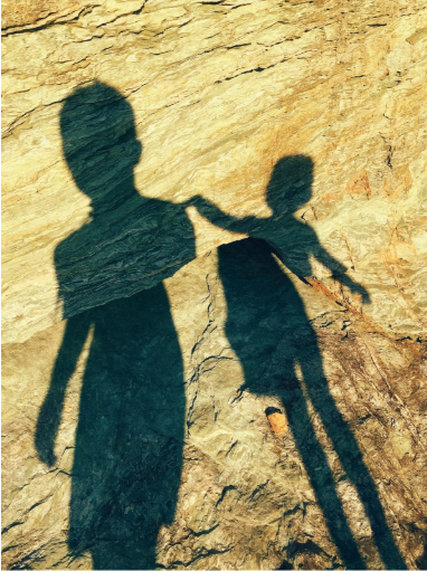
|
grasp an insight into who they may be or what they may be doing. The way in which the people are indistinguishable evokes a feeling of curiosity in the viewer and spurs them to question who they are and what they look like.
|
This is the final image of Andreson’s that had the greatest impression on me. The way in which Anderson has used editing techniques to layer the same image twice in different sizes has created an intertwined effect. The inclusion of the silhouette in the image not only makes the image a portrait but takes away any understanding that the viewer could gain about the person. The colours used in the image are monochromatic which portray alternative
|
meanings of hope and despair. The darkness in the image, mainly from the silhouettes, and the shadows in the background portray this sense of despair in the image as well as an overall melancholy mood. The inclusion of the busy city scape as a background draws attention to the image as a whole and only when you really look deeply into the image, the double exposure of the silhouette can be distinguished. I think that this layering of the silhouette twice in the image could have been achieved through editing the image and layering them in a software such as Photoshop or captured through natural reflections and enhanced in Photoshop. The background of the image seems to be lit with natural lighting but is inconsistent in lighting the whole background due to tall buildings creating shadows. The patterns created by the structures of the buildings are regularly repeated in the buildings and portray a harmonious ambience to the background of the image.
Looking at Anderson’s work I want to interpret the use of shadows in my photography. In his images the use of light and shadows has been used as an emotional tie and I plan on furthering this idea. For my next shoot I want to capture photographs of my sister and her child. I feel like the connection between my sister and my niece is one that suits the emotional side of Anderson’s work rather than work such as Erler’s where he presents memories. In Anderson’s work the shadows are really dark and as I am intending on using natural light I will need to carry out my shoot either early in the morning or in the evening as this is when the shadows will be greatest. Similar to the second image I analysed where the two people are holding hands, I would want to capture an intimate moment between my sister and her daughter. In the first image I analysed of Anderson's work, light is the main focus. I want to consider light as a strong element in my work based around Anderson and develop it further from how I considered the effects of lighting in Erler's work. When looking at Erler's work shadows were a large part but now I want to consider lighting more. Similar to how shadows were used in Erler's work to present memories, I want to use Anderson's style of incorporating light to present new life and sentimental connections. Looking at the third image of Anderson's work I have analysed, I want to consider this style later on in the project when it comes to editing my outcomes and how I can layer different images of different sizes.
Looking at Anderson’s work I want to interpret the use of shadows in my photography. In his images the use of light and shadows has been used as an emotional tie and I plan on furthering this idea. For my next shoot I want to capture photographs of my sister and her child. I feel like the connection between my sister and my niece is one that suits the emotional side of Anderson’s work rather than work such as Erler’s where he presents memories. In Anderson’s work the shadows are really dark and as I am intending on using natural light I will need to carry out my shoot either early in the morning or in the evening as this is when the shadows will be greatest. Similar to the second image I analysed where the two people are holding hands, I would want to capture an intimate moment between my sister and her daughter. In the first image I analysed of Anderson's work, light is the main focus. I want to consider light as a strong element in my work based around Anderson and develop it further from how I considered the effects of lighting in Erler's work. When looking at Erler's work shadows were a large part but now I want to consider lighting more. Similar to how shadows were used in Erler's work to present memories, I want to use Anderson's style of incorporating light to present new life and sentimental connections. Looking at the third image of Anderson's work I have analysed, I want to consider this style later on in the project when it comes to editing my outcomes and how I can layer different images of different sizes.
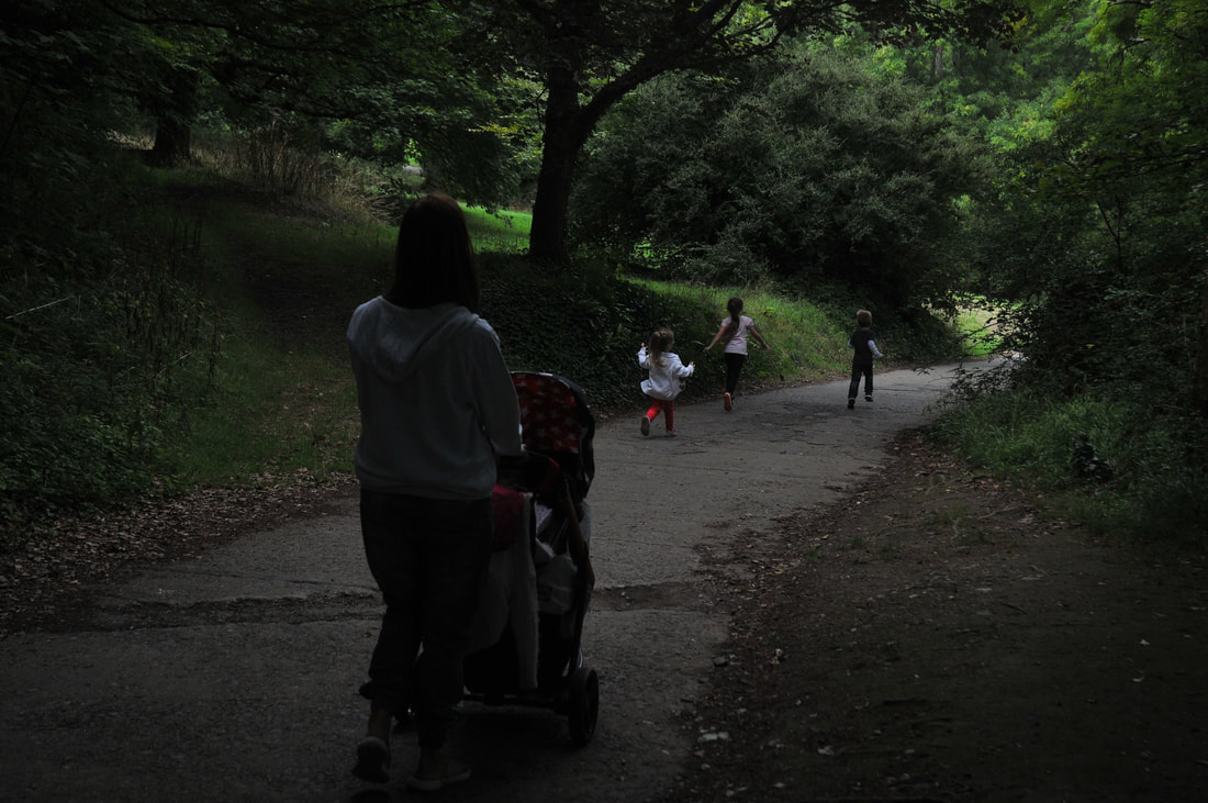
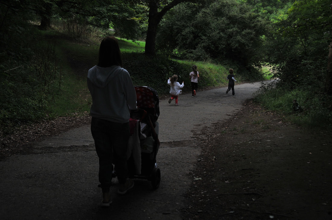
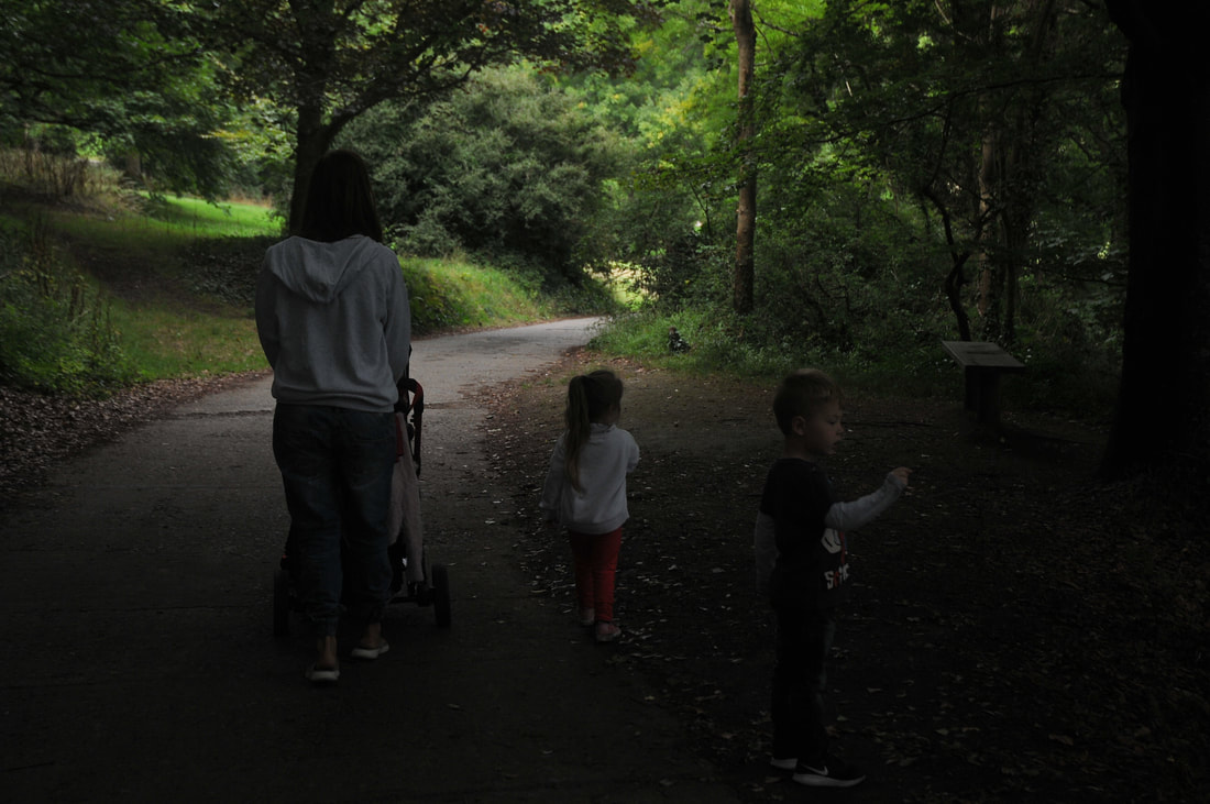
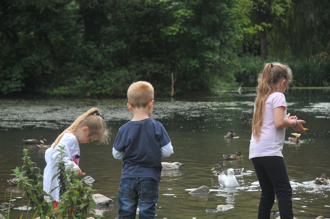
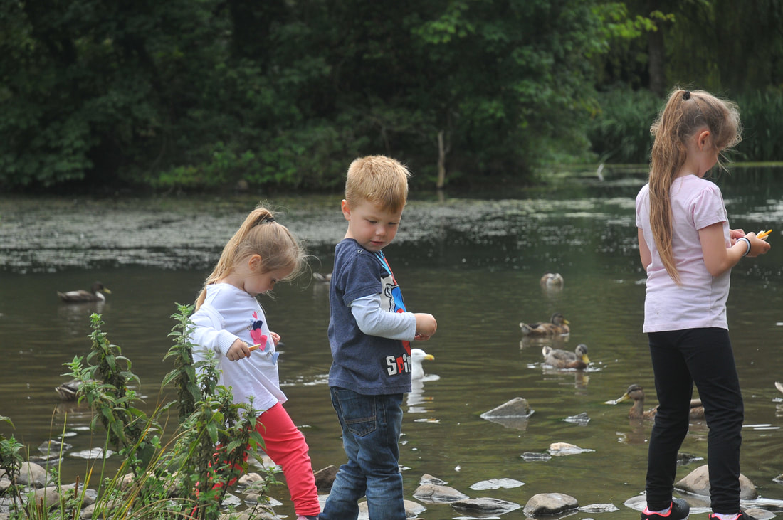
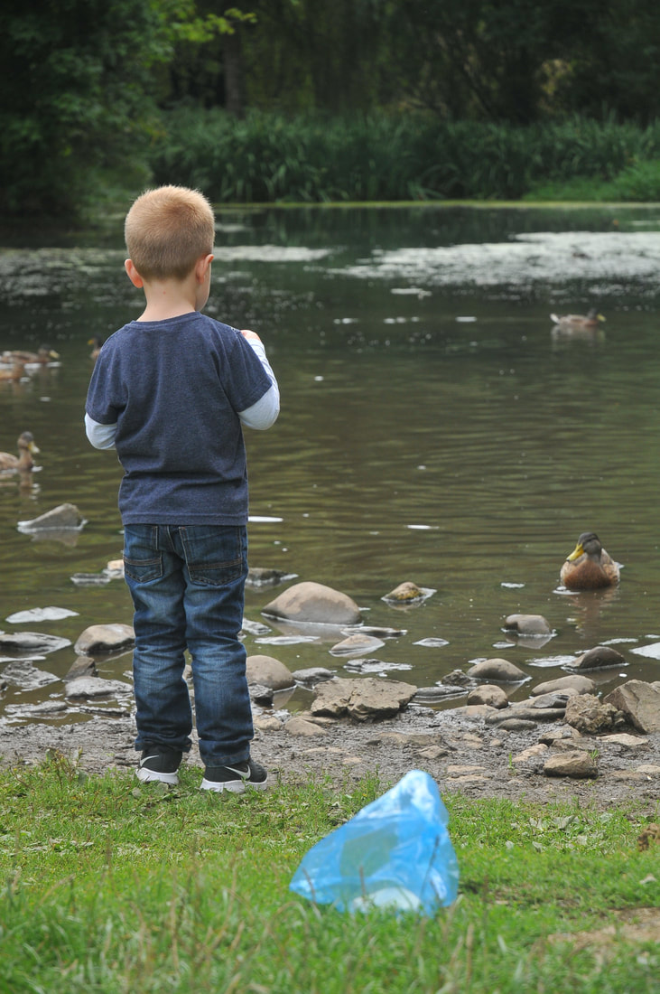
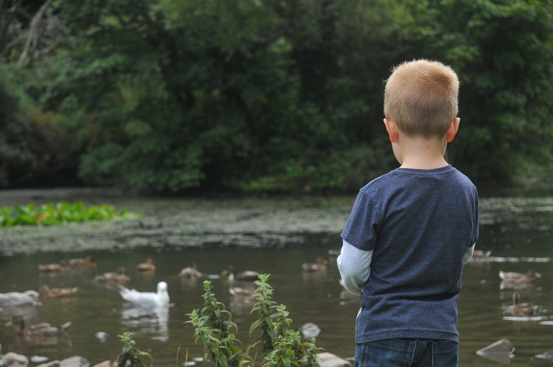
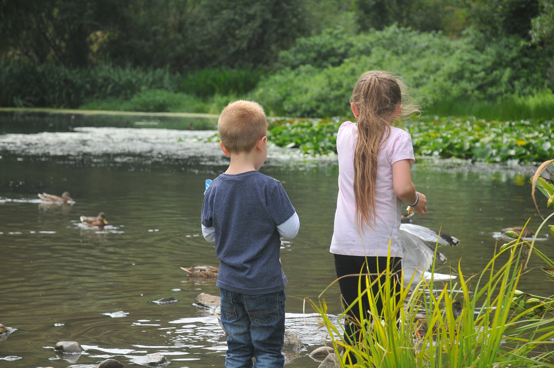
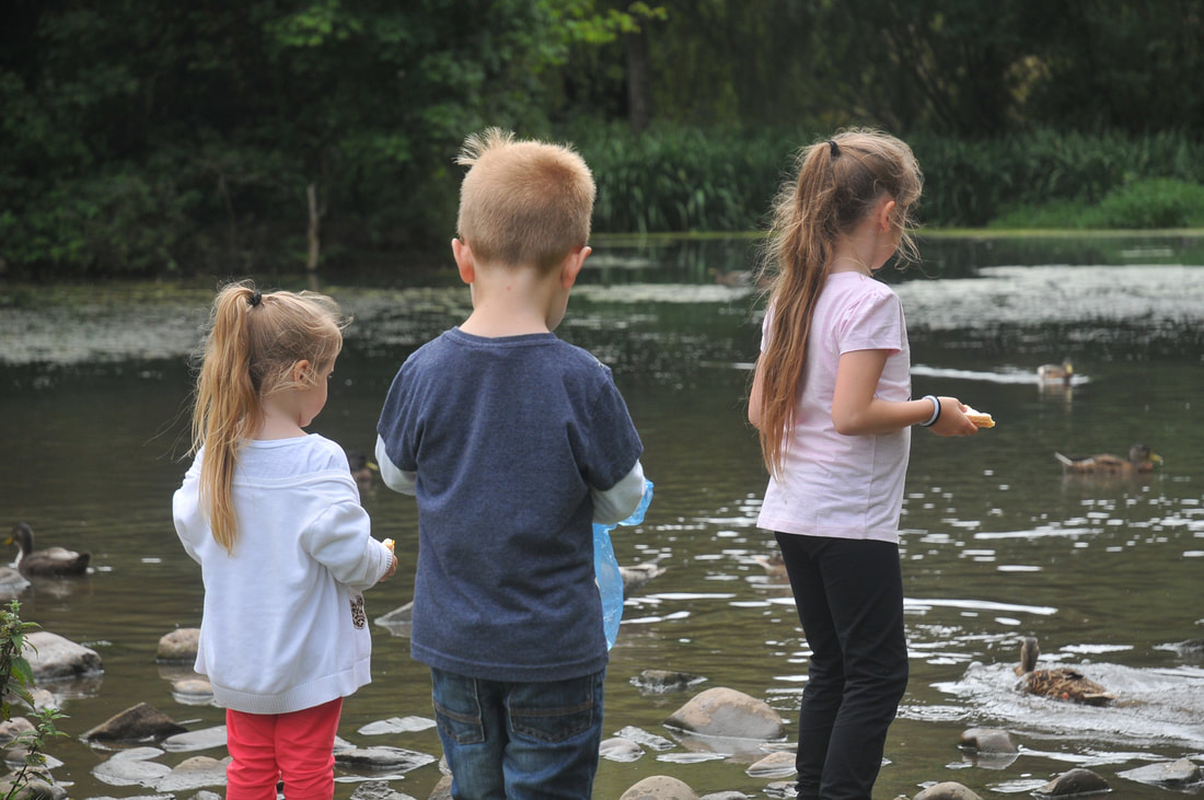
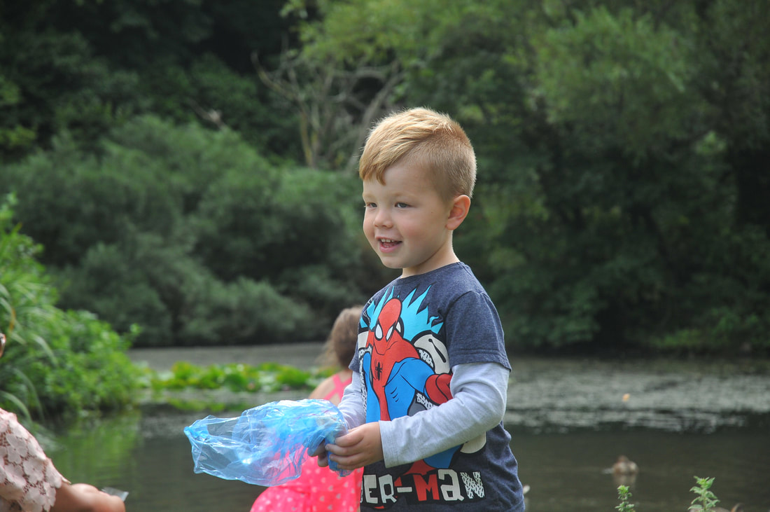
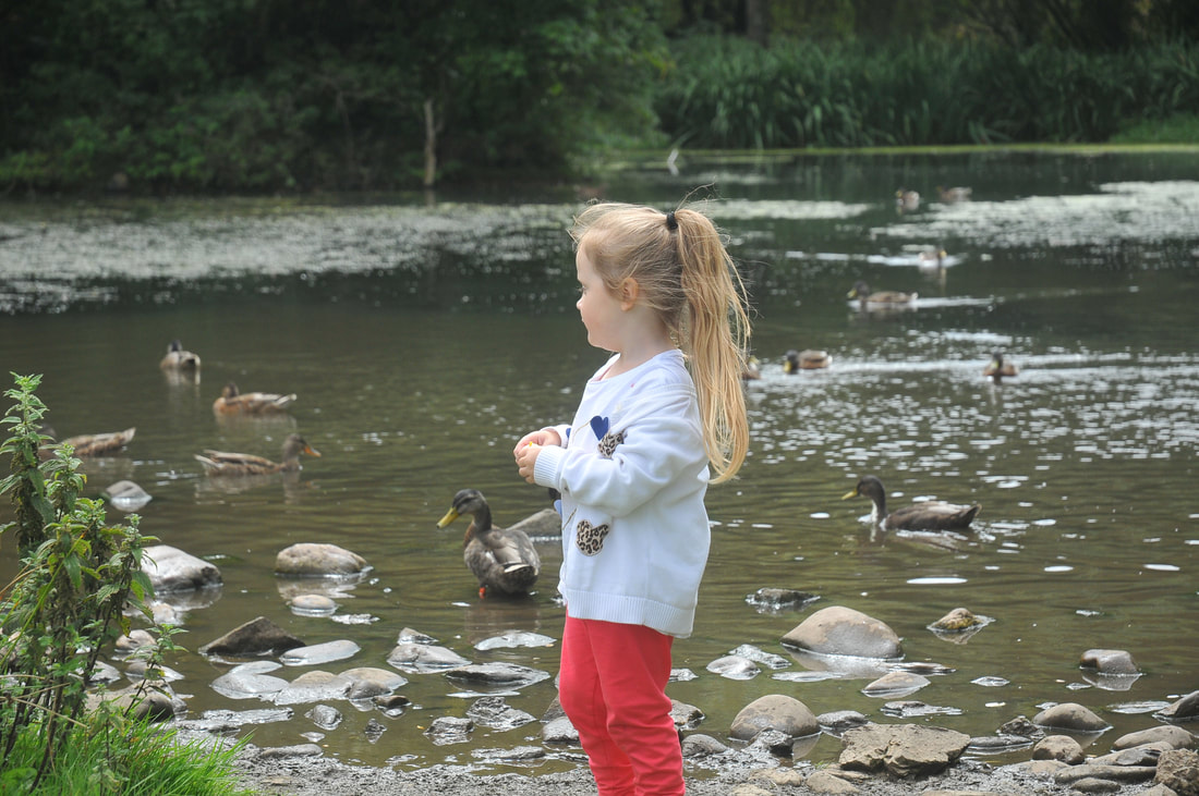
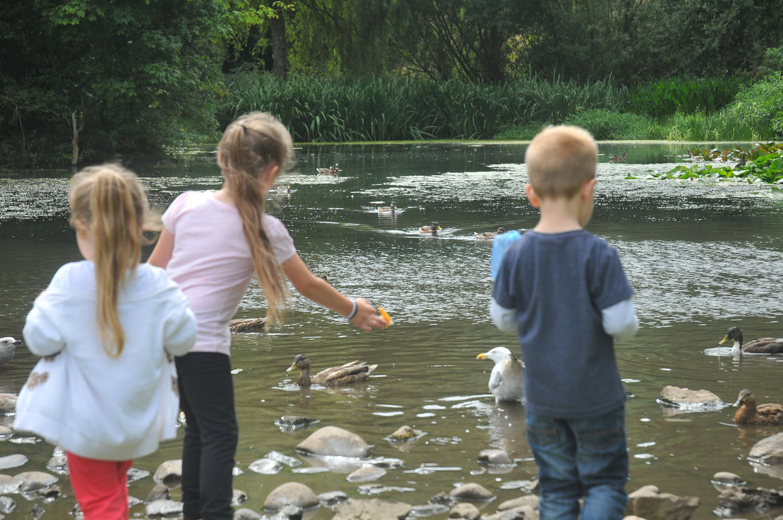
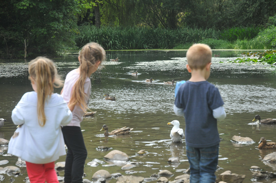
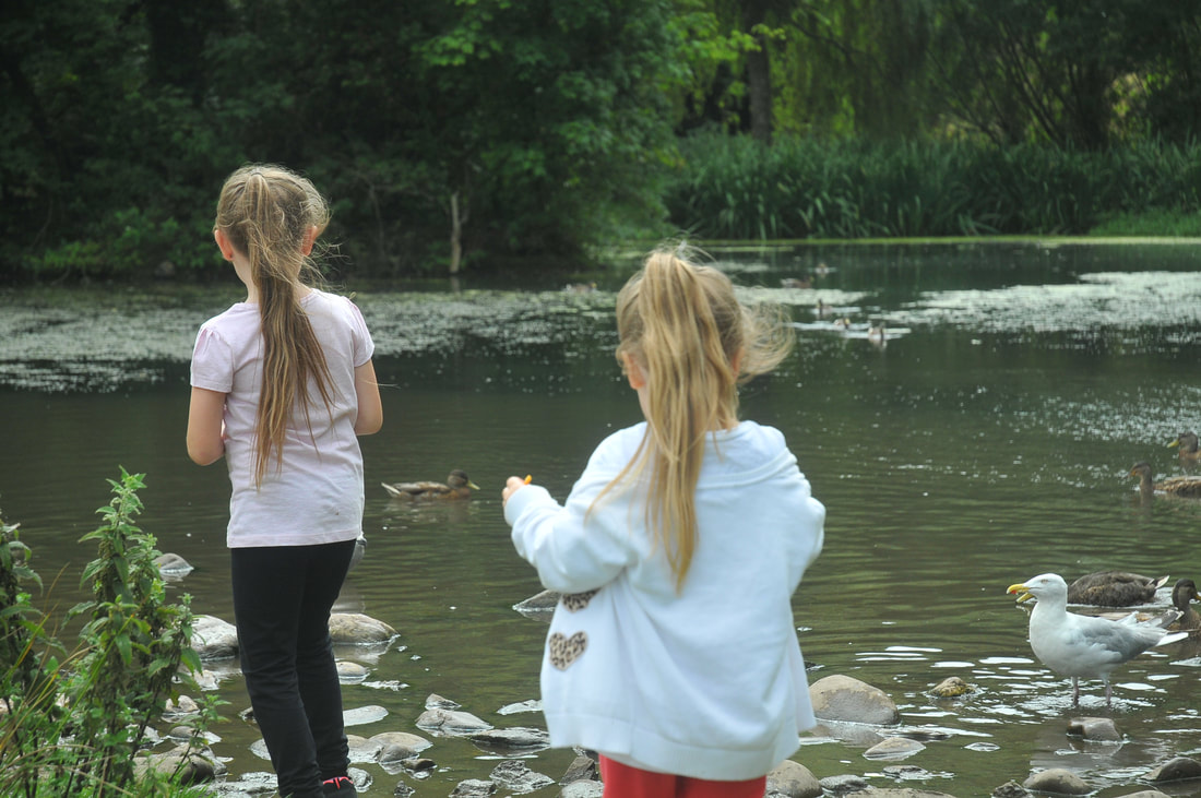
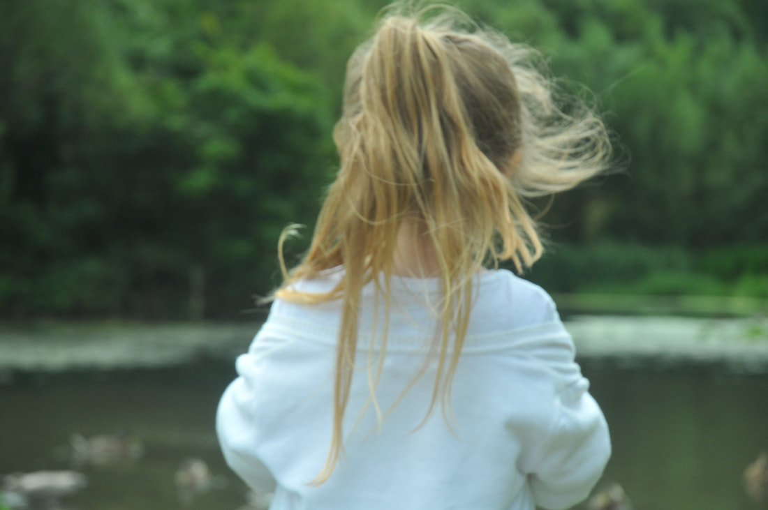
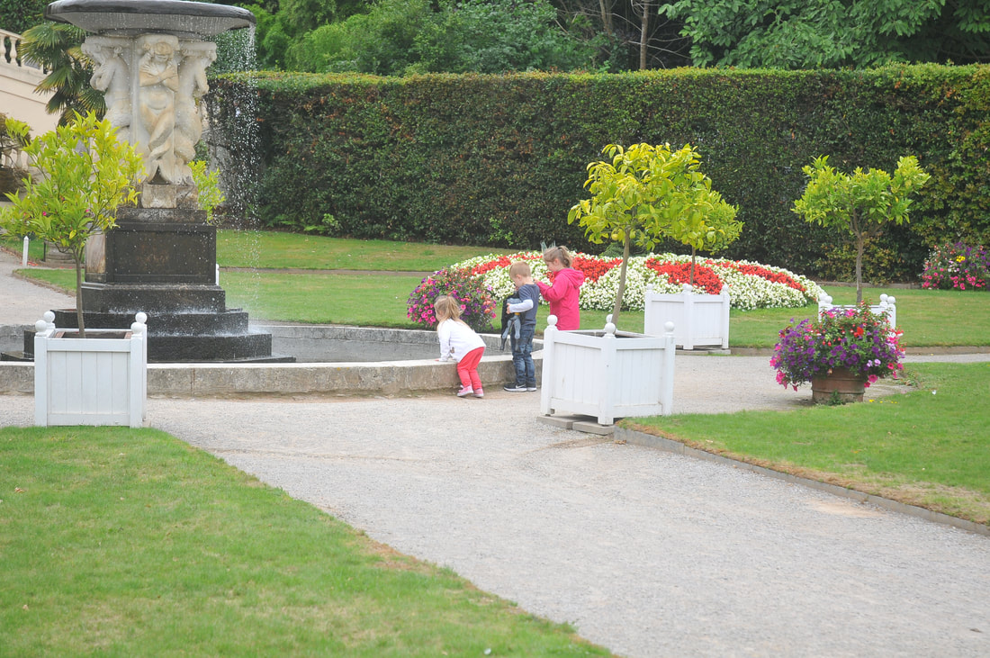
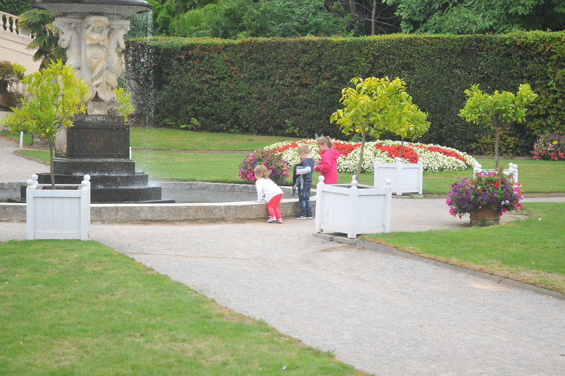
Shoot Nine
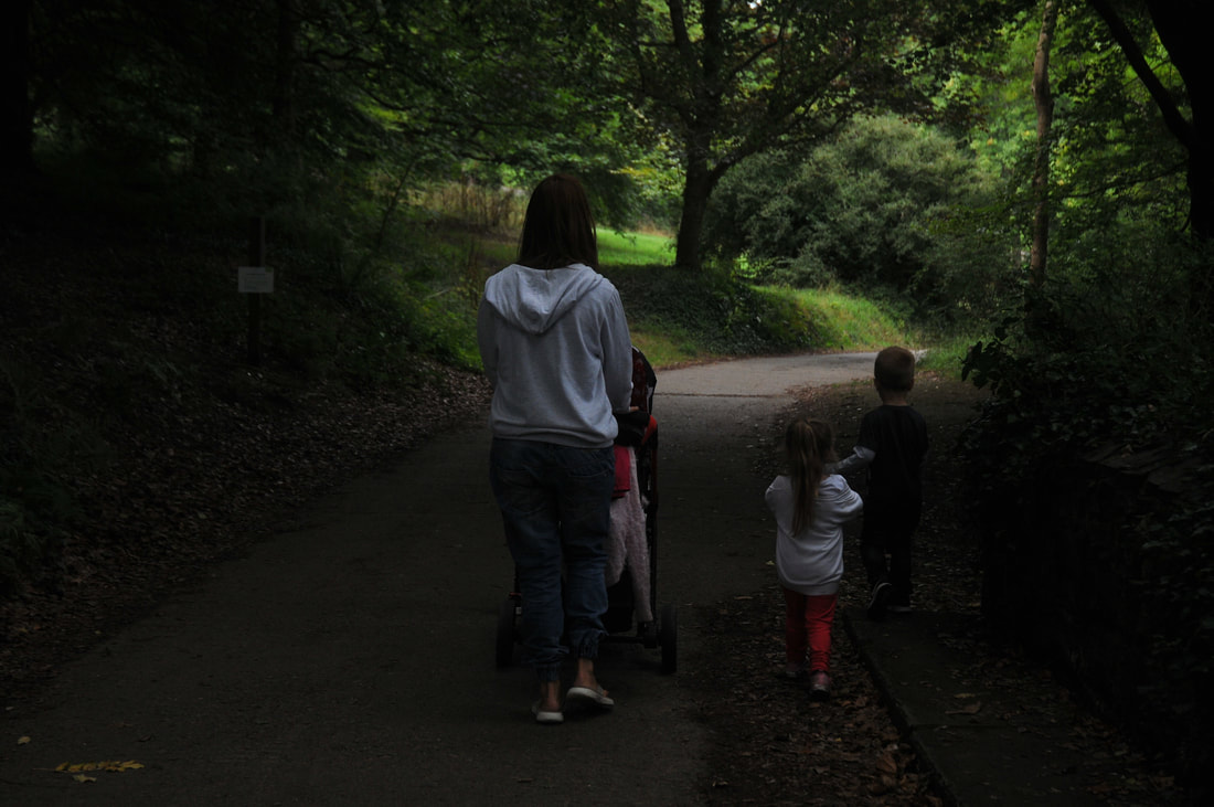
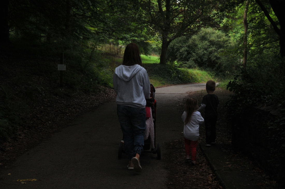
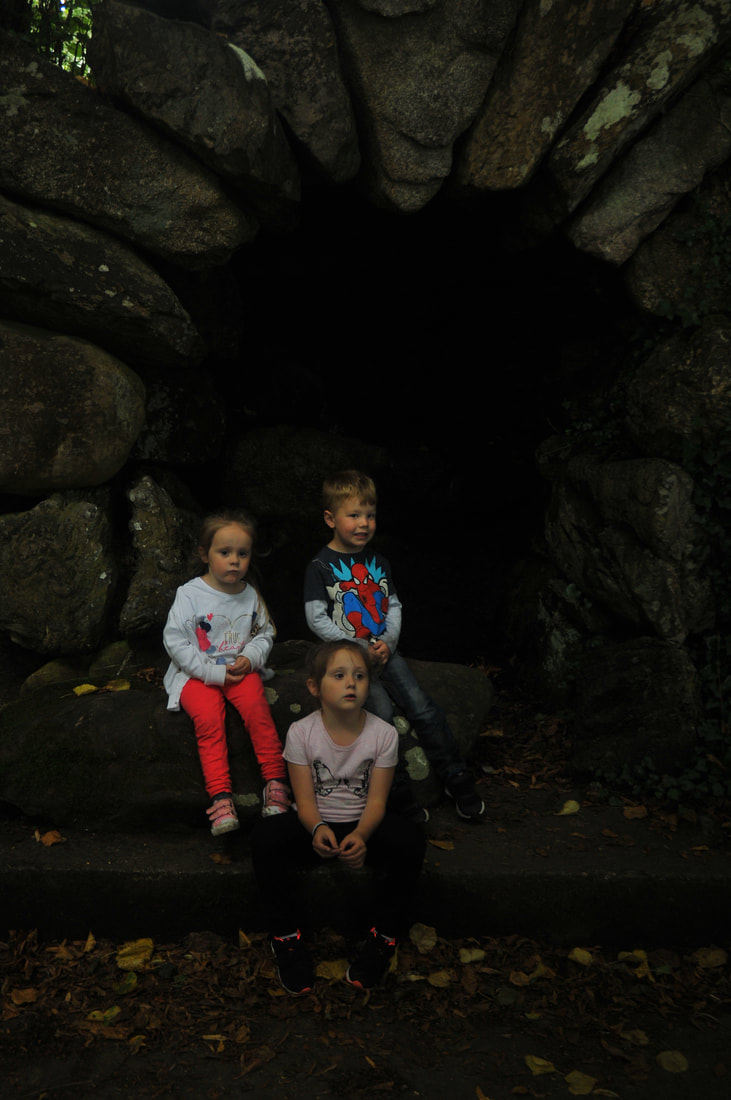

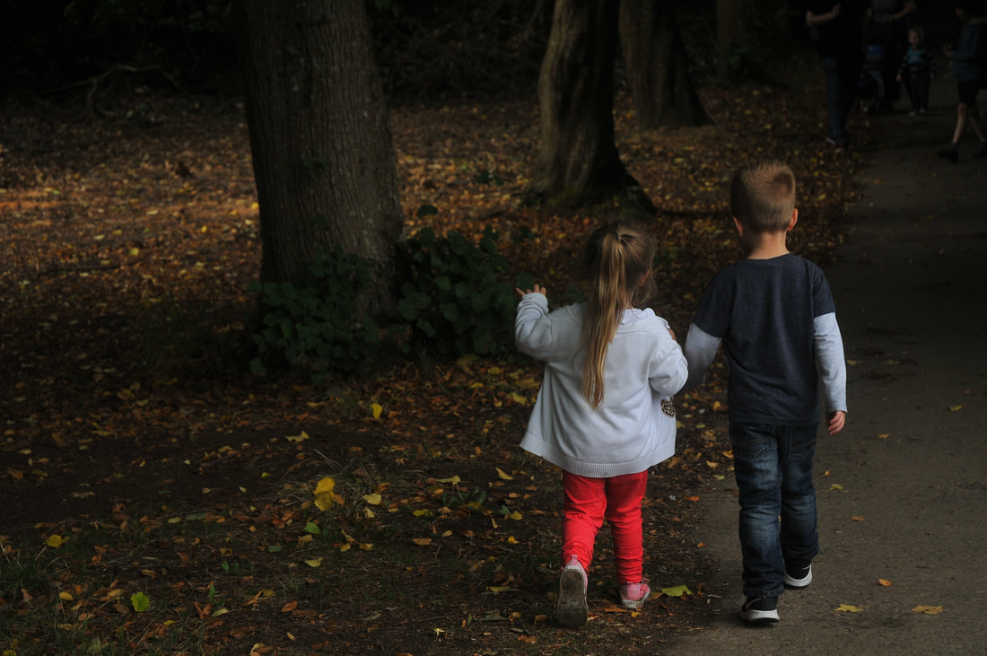
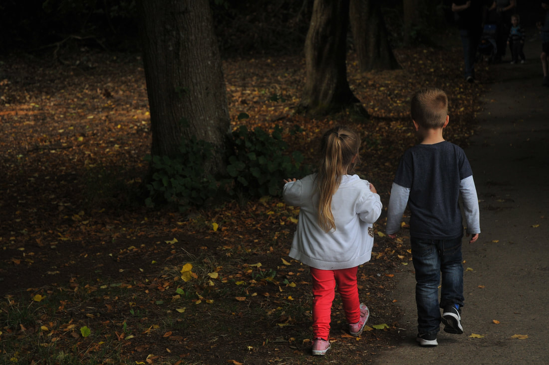
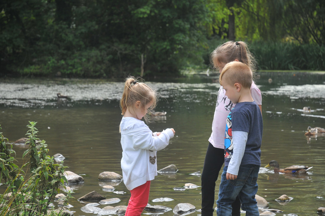
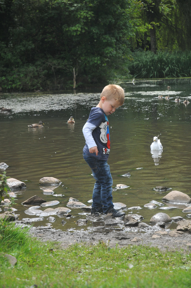

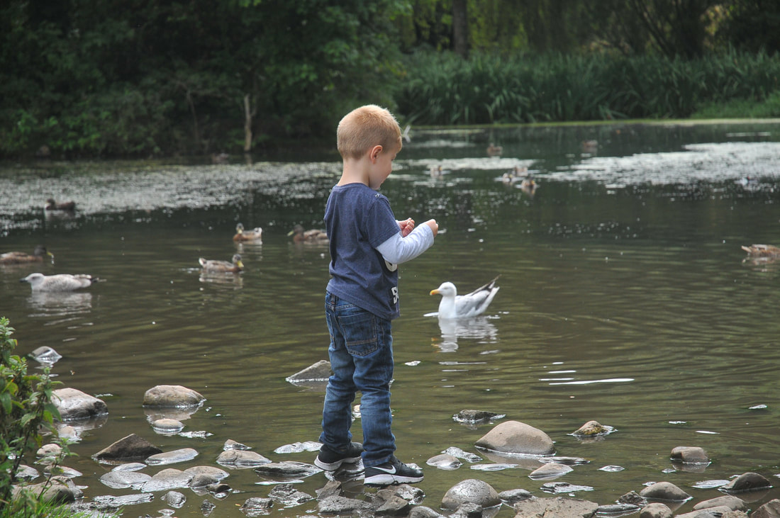

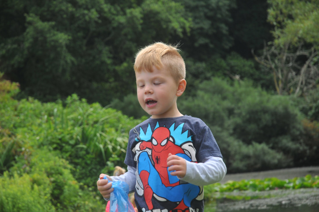
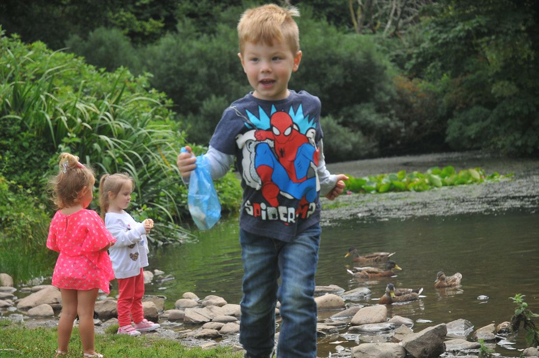
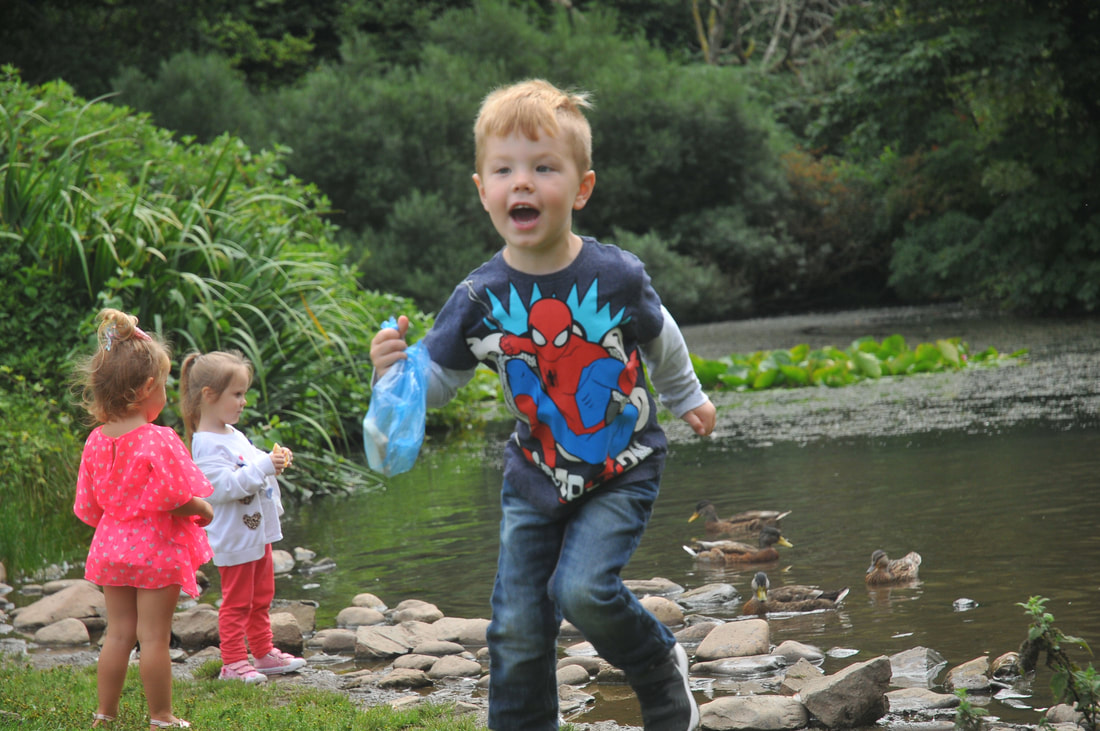

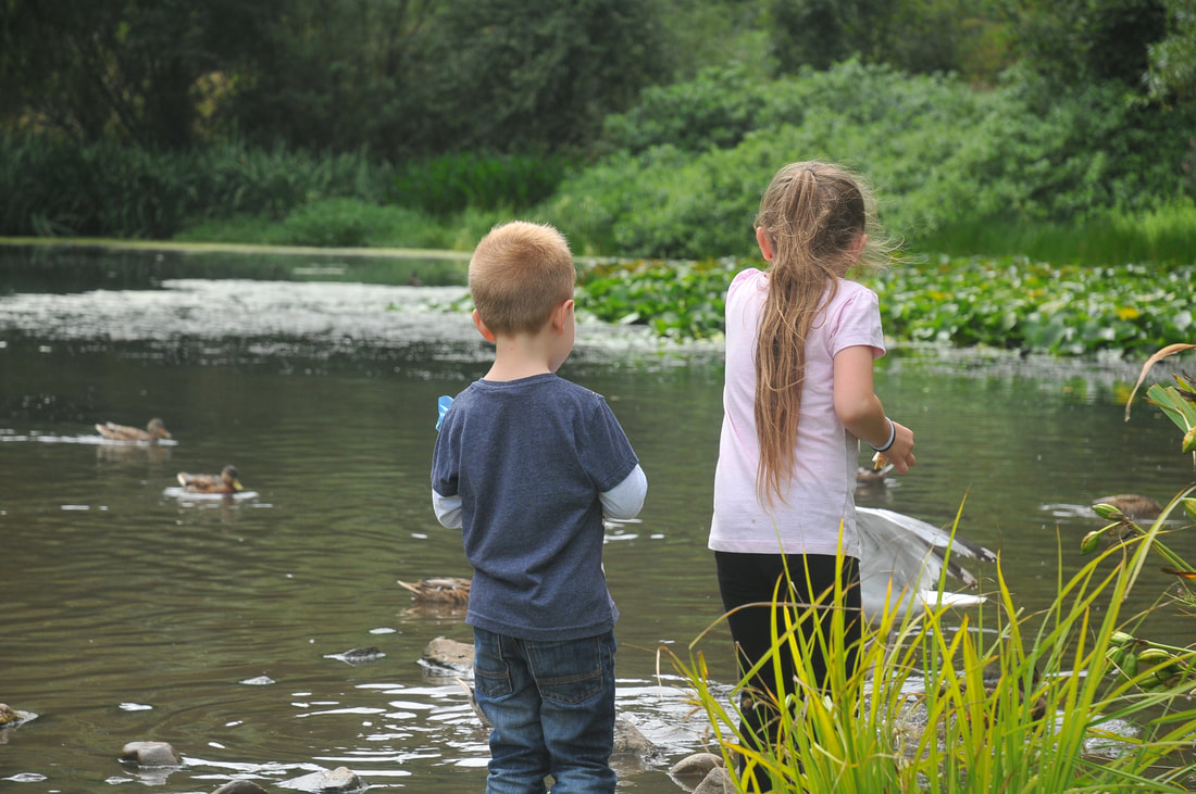
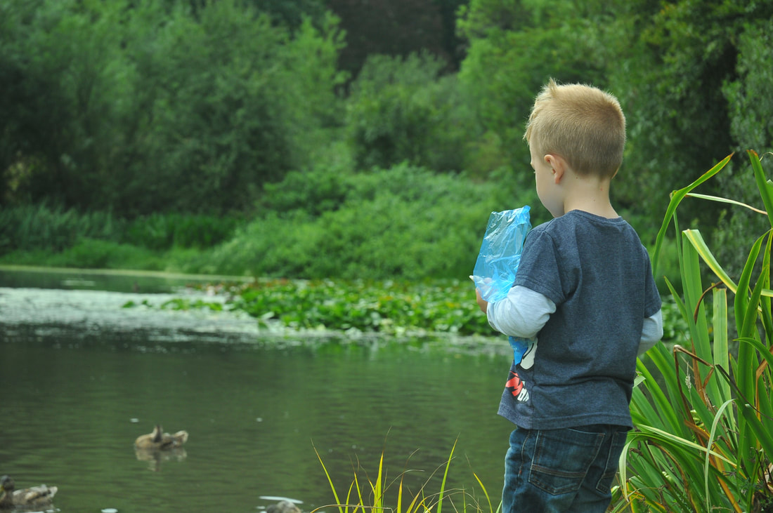
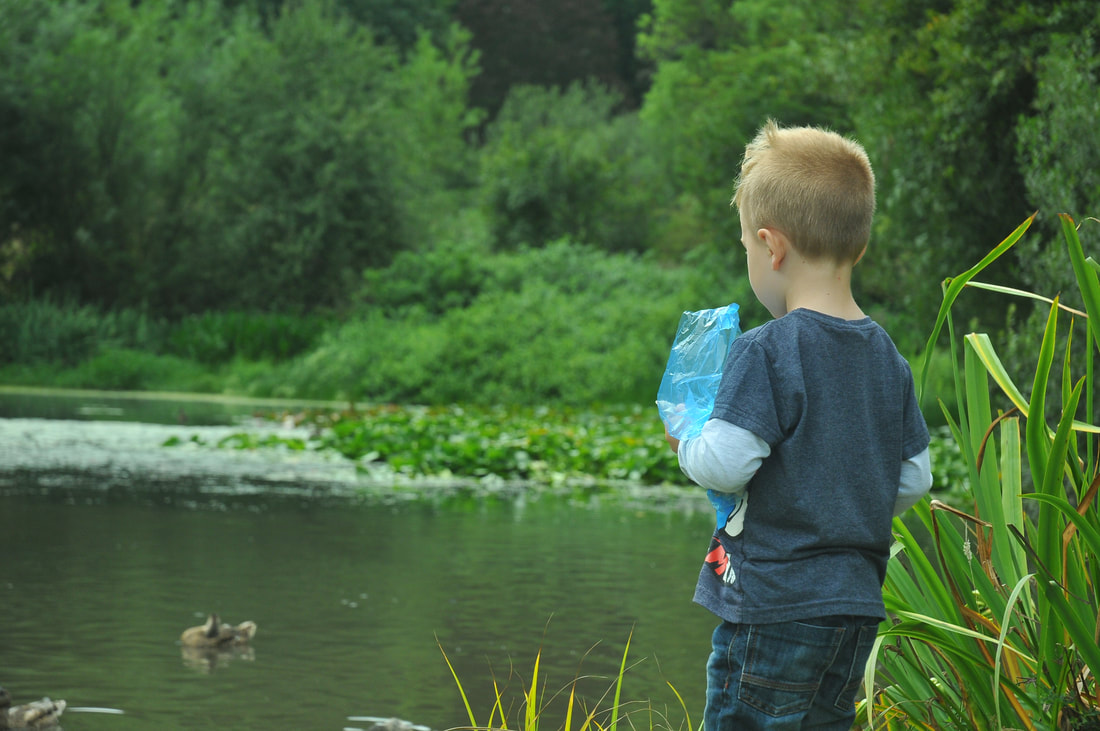
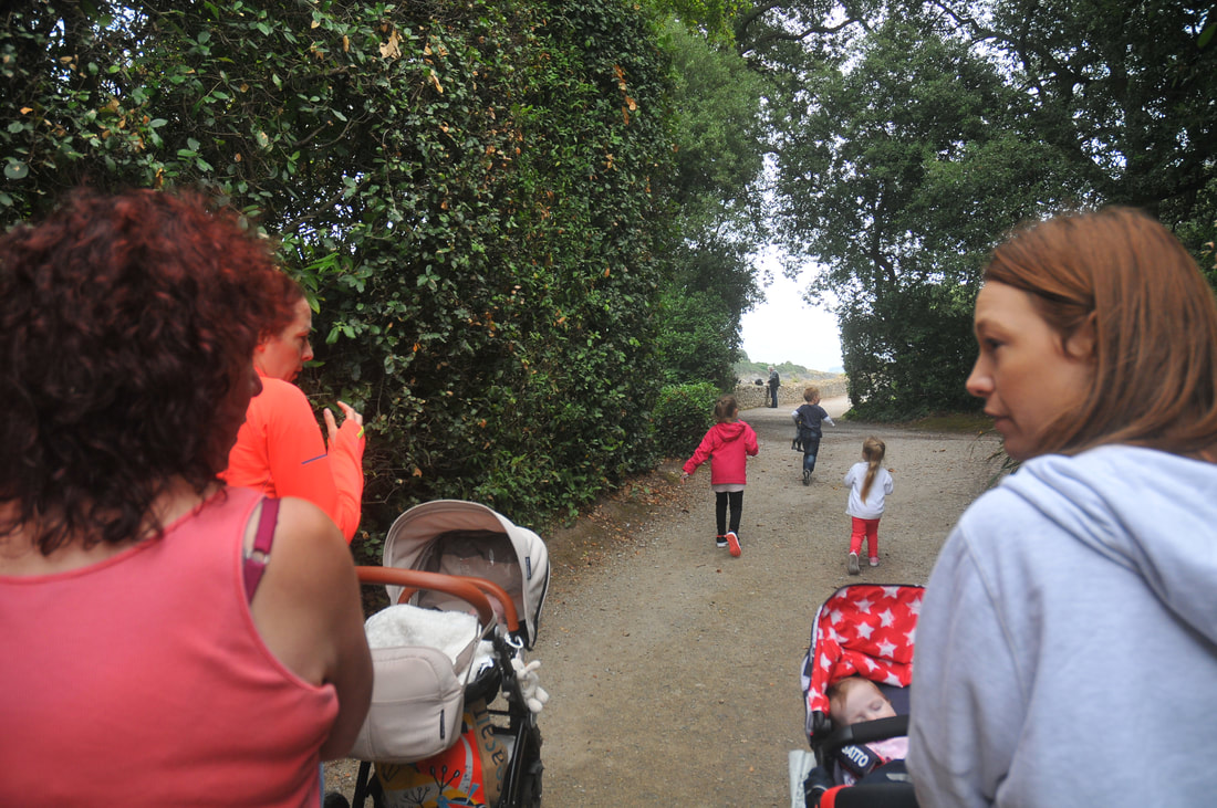
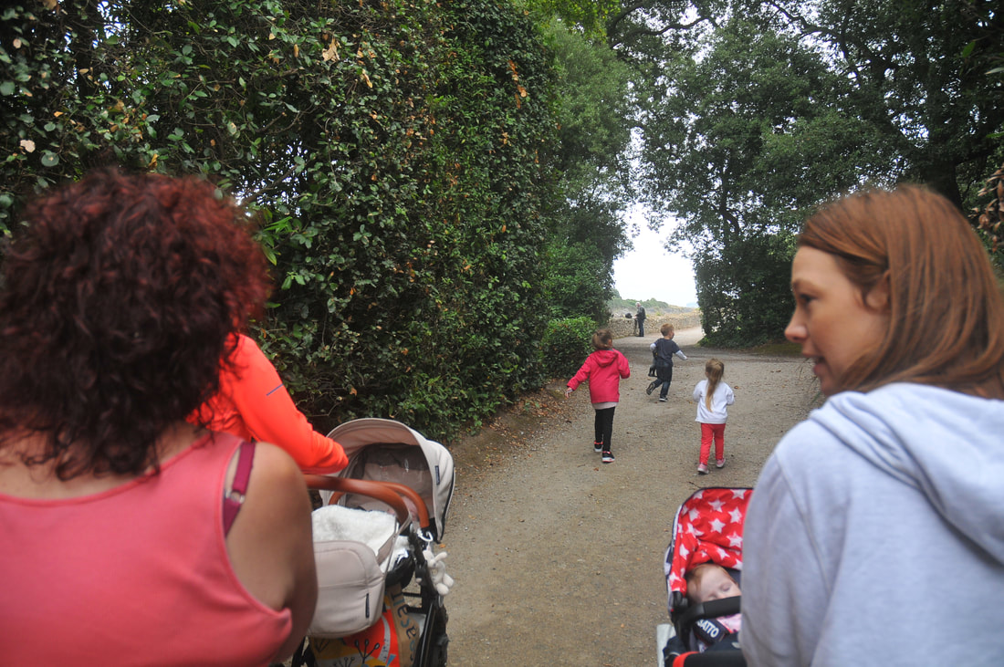

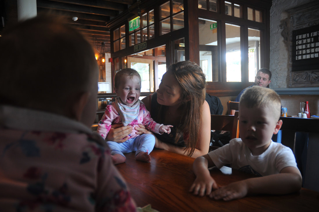
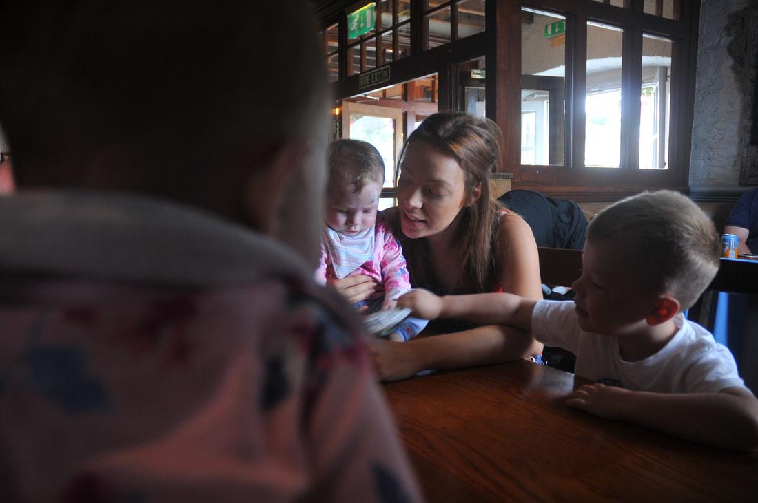
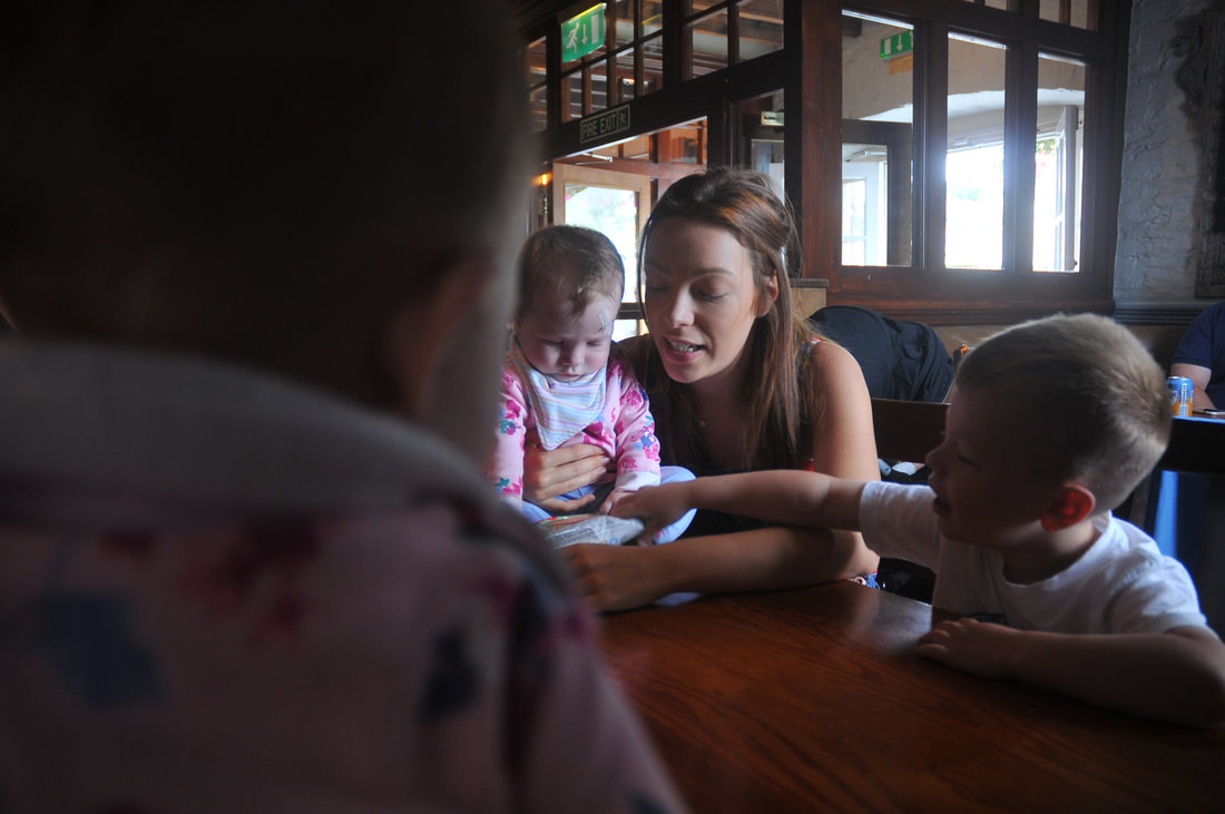
With this shoot, I took a more documentary approach. I captured mainly candid photographs where my sister and her children were not aware of the camera. I found this to be successful in capturing intimate family moments and capturing them in a natural way. These photographs were captured on a family trip to Mount Edgcumbe, in the images you can see we got some lunch and the children fed the ducks. I focused on the depth of field when I was capturing the images, bringing the focus to one point and blurring either the background or the foreground.
Some images have annotations on, click on them to read them.
Some images have annotations on, click on them to read them.
Larry Sultan
Larry Sultan in a photographer who based one of his projects on his family. The project named 'Pictures From Home', explores his parents life through photographs. Personally I really like the way he has explored light and colour in these images. His series, which takes a documentary approach, captures candid photographs of Sultan's parent's life. I want to take inspiration from Sultan's use of colour and Anderson's use of shadows and light in order to produce a set of images that link to Erler's. I feel colour images are very important in telling a story as they exhibit qualities that make them more like a painting. In Erler's and Anderson's work the colour is minimal and toned whereas with Sultan's there are pops of colour that capture the viewer's eye. As I have produced a set of images taking inspiration from Anderson, I will take inspiration from Sultan for post production. In Photoshop I will look at different techniques that will allow me to produce a set of images with a dramatic use of colour and lighting.
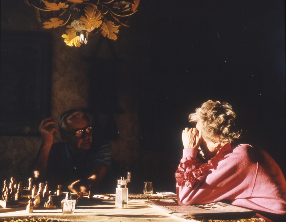
|
In this image I really like how light has been used to enhance what the viewer can see in the image. The way that bright light has been used in the foreground of the image draws focus onto the pinks the woman is wearing and injects that pop of colour into what would have been a dark photograph. Using the dodge and burn tools in Photoshop I will be able to manipulate the image to make certain areas brighter or darker than others. I will also look at lighting effects that I can do in Photoshop using filters.
|
|
Similar to the image above, this image presents a strong contrast between light and dark. To get such a big difference in my images, I could use the quick selection tool to highlight areas and make them separate layers. This will allow me to work on each part of the image individually without affecting the other parts. I will then use the levels and curves to adjust the brightness and darkness of the parts. I may look at the vibrancy tool as that will allow me to adjust the intensity of the colours. Taking inspiration from Sultan I will want to increase the intensity of the colours in my portraits.
|
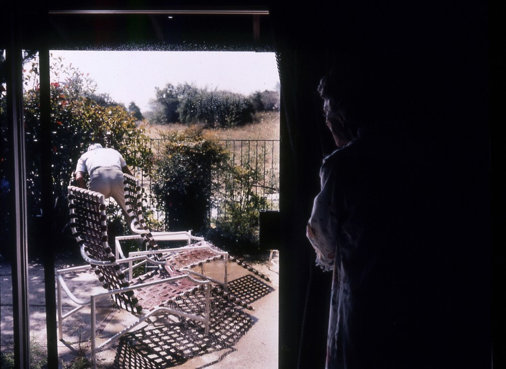
|
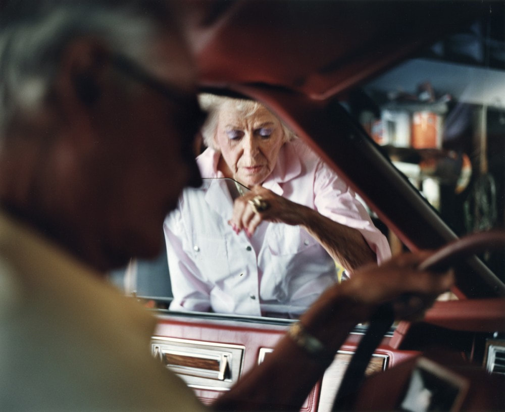
|
In this image, I really like the contrast of a dark blurred area and a bright focused area. I feel like this portrays a greater impact as it focuses on the woman. It makes the viewer question what is so important about the woman and consider why the person in the foreground is blurred out. Typically, the background is the area that is blurred as the foreground tends to hold the detail, however with this image it is the other way around. As I experimented with depth of field in my shoot I plan on enhancing my images so they have a greater impact. I will use tools when editing my
|
images digitally that will allow me to blur some areas and sharpen others allowing me to adjust the focus of my images this will allow me to bring the viewers attention to certain parts of the images. The blurred areas are also darker in Sultan's image, which is another thing I like, therefore I will use the burn tool to darken the blurred areas in my photographs. As for the areas in my photographs that are in focus, I will enhance the brightness using the levels and the dodge tool.
After editing my Anderson inspired shoot to have similarities to Sultan, I want to produce a set of images that brings the two photographers together. I want to take inspiration from Sultan's use of depth of field and Anderson's method of capturing an intimate moment to produce a set of images.
After editing my Anderson inspired shoot to have similarities to Sultan, I want to produce a set of images that brings the two photographers together. I want to take inspiration from Sultan's use of depth of field and Anderson's method of capturing an intimate moment to produce a set of images.
My Editing Processes & Outcomes
Outcome One:
I believe that the enhancements I made to this image make it connote a strong connection to Sultan's work. The way in which I have used the levels, burn tool and the blur to draw focus to the children in the image and darken the surrounding area follows suit with Sultan's use of shadows and contrast. The way in which I enhanced the brightness in the clothes of the children furthers the focus on them and connotes the bright tones both Sultan and Anderson incorporate in their pieces. By increasing the brightness and contrast of the whole image I was able to lighten it and allow the viewer to distinguish between the highlights and shadows easily. Overall I am happy with this outcome as I feel I have produced a piece that evokes the inspiration I have taken from Sultan and Anderson recently and Erler earlier on through the depth of shadows displayed and enhanced in this image.
Outcome Two:
When editing this image I increased the amount of blur that was presented to the viewer. By doing this the shadows became less of a focus for the viewer and so present the inspiration I have taken from Sultan well as this is a similar style he uses in his final pieces. The way in which I adjusted the levels made the shadows darker and so in turn added more focus to the children in the foreground. I enhanced the contrast between the bright colours in their clothes compared to the shadows in the background as this is something Sultan has achieved in his work. By cropping the image I pulled a tighter view over the image which brings the viewer closer to the focus of the children. I believe that the amount of negative space I left to remain in the image is effective as it adds more to the background which allows the sole focus to be on the children but also allows the viewer's eye to wonder and take in the setting of the image. Overall I am happy with this outcome as I feel that I have presented Sultan's shadowy style in my work.
Further Editing
I am going to edit these two outcomes further in order to incorporate the poem. I believe that by doing this I will be able to tie my images from a new generation of my family to the older generation of my family which will continue as a theme through my work. I will layer the text using the text box tool as I have already done throughout my project. Below follows my outcomes:
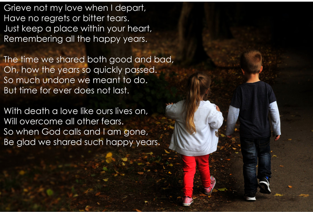
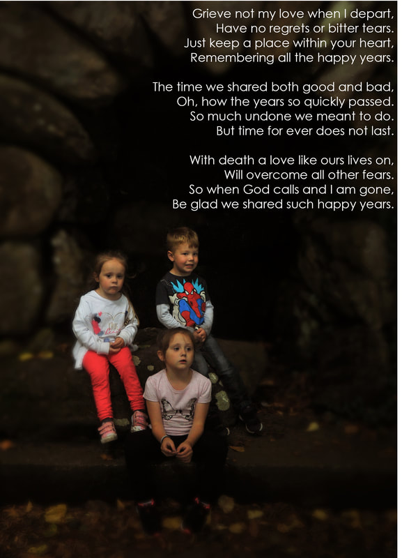
In my opinion the addition of the poem to these images has been successful. As both images already featured a significant amount of negative space it was easy for me to locate an area in the image for the text to go. I believe that these images are successful in the way they tie together all the inspiration I have gotten since the start of this project and and through how they tie the photographs of my Nan in to create an overall aesthetic of my family. When editing these images, I opted for a basic font for the text overlay of the poem. I chose this font as I did not want to choose a font that would have distracted the viewer from taking in the whole image but also presented the text clearly. I feel I could have developed the font to a more calligraphy style which would have given it a more personal touch, which is something I would change if I were to edit these images again.
Shoot Ten
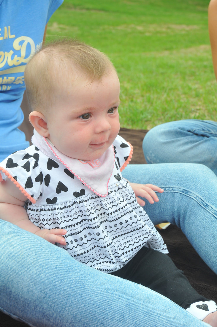
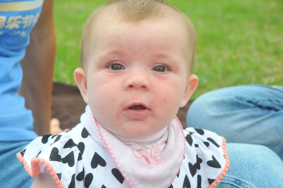
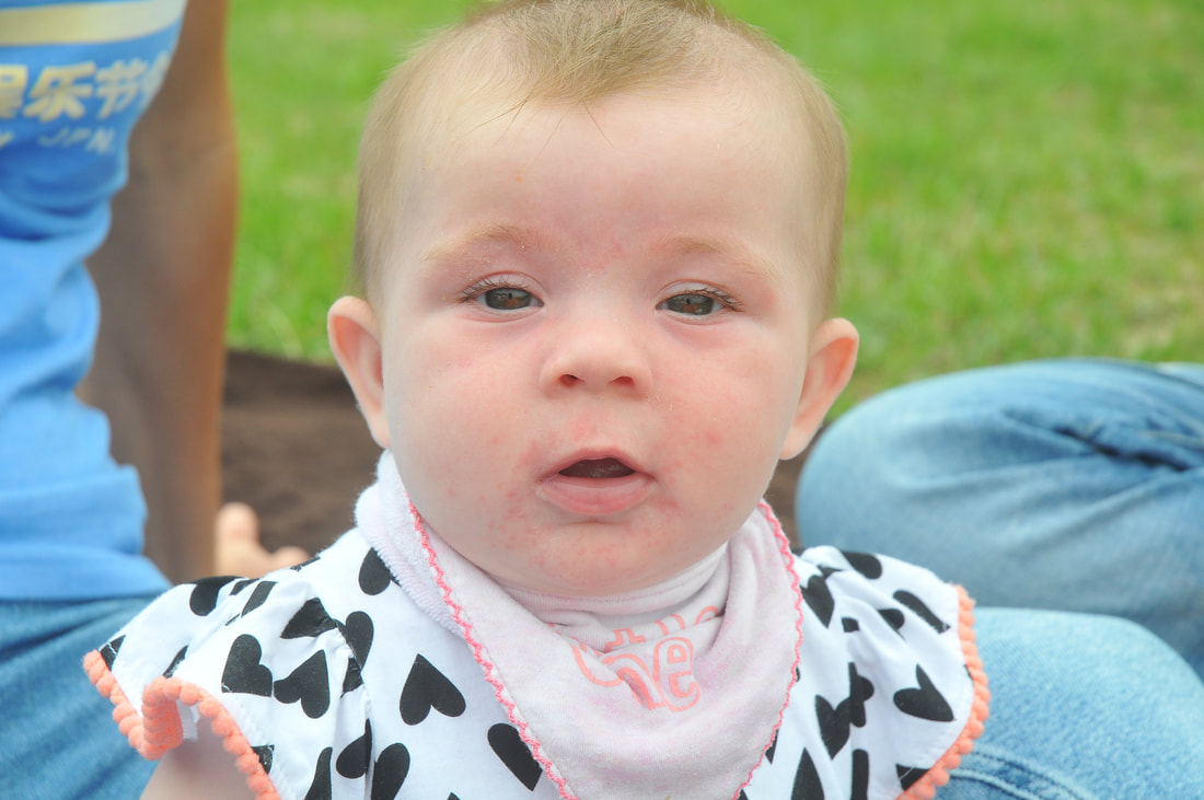
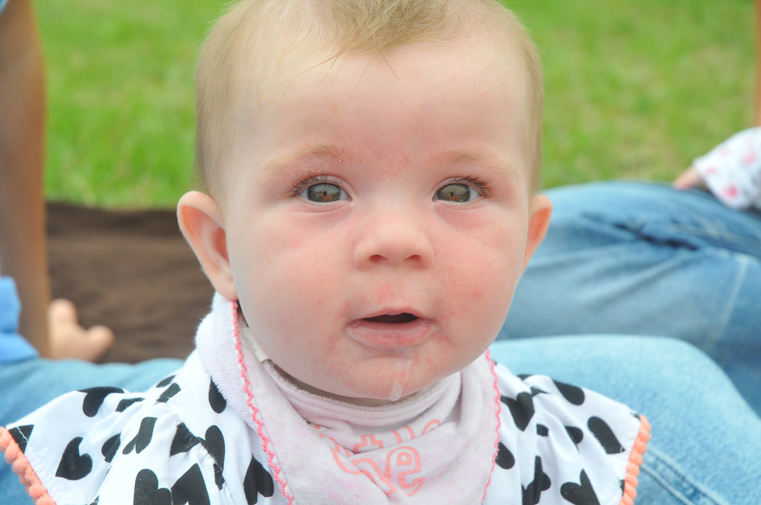
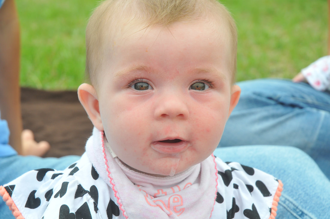
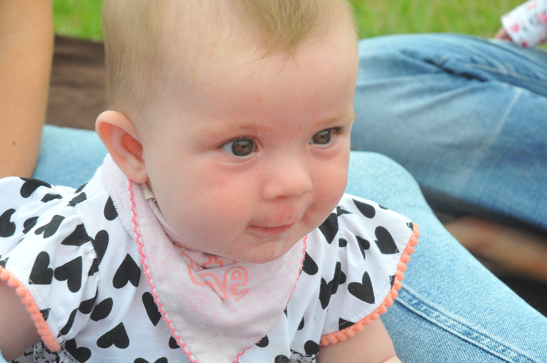
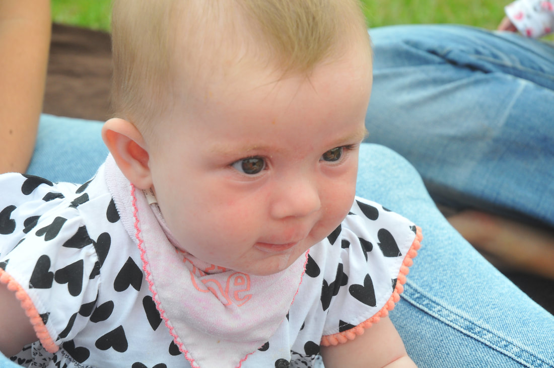
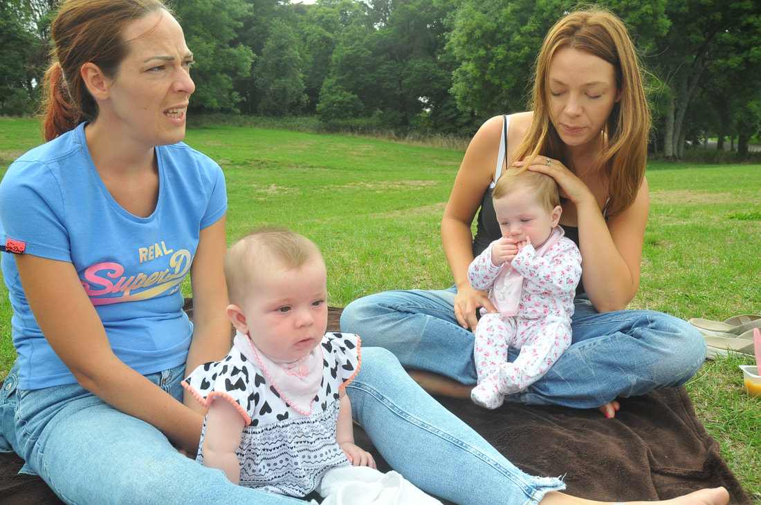
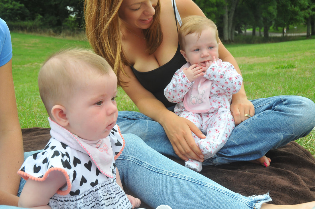
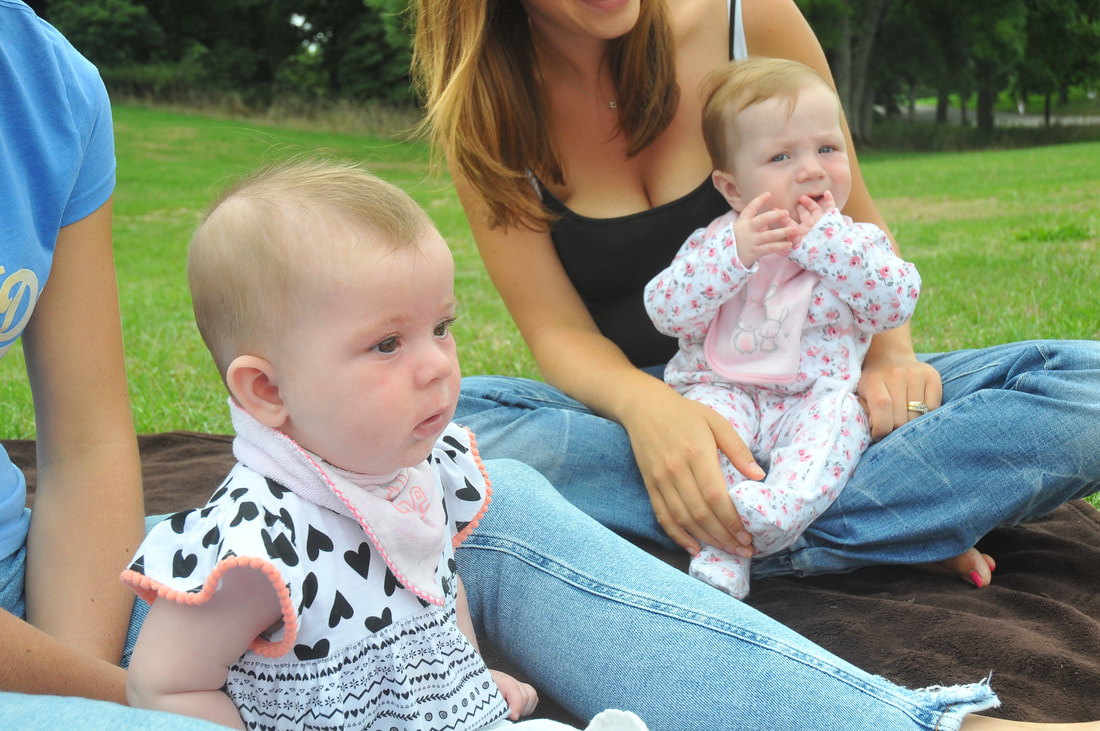
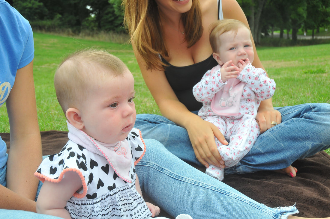

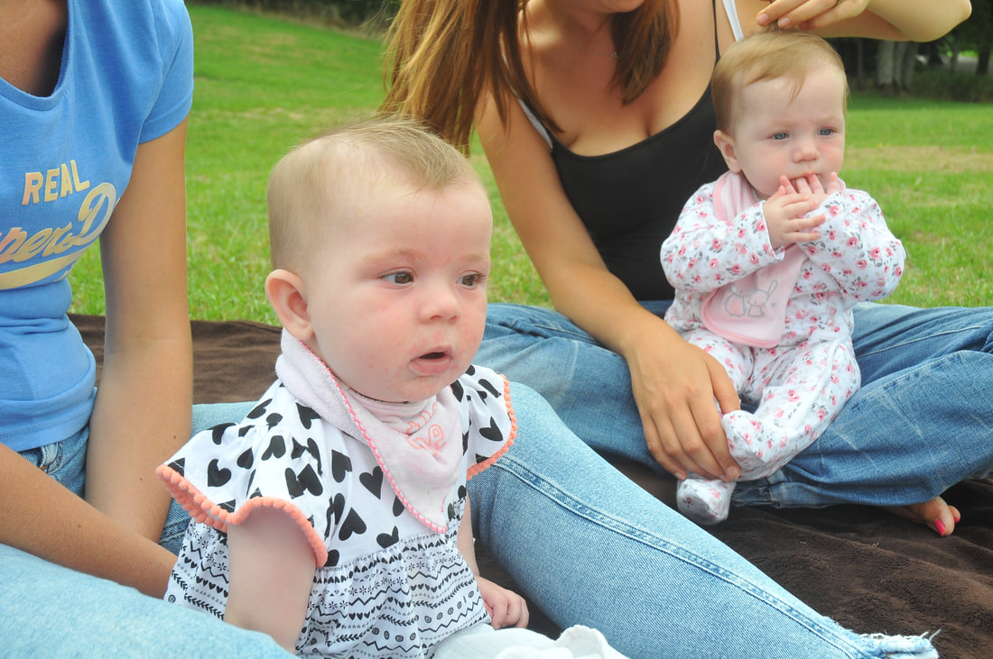
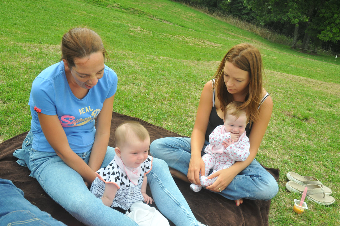
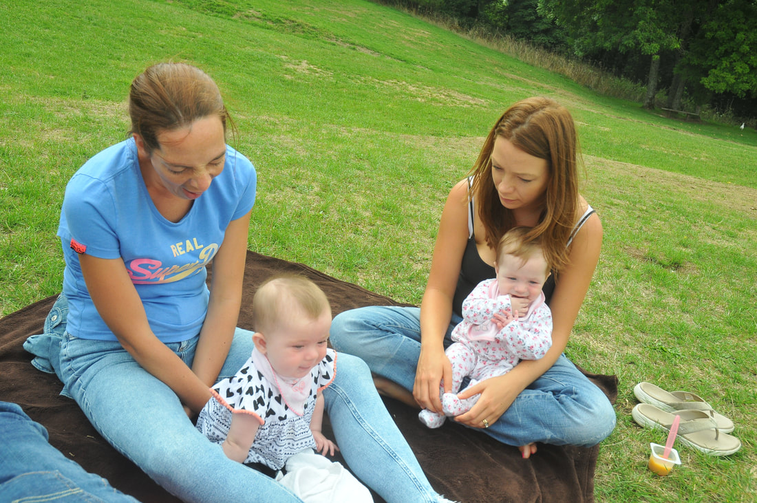
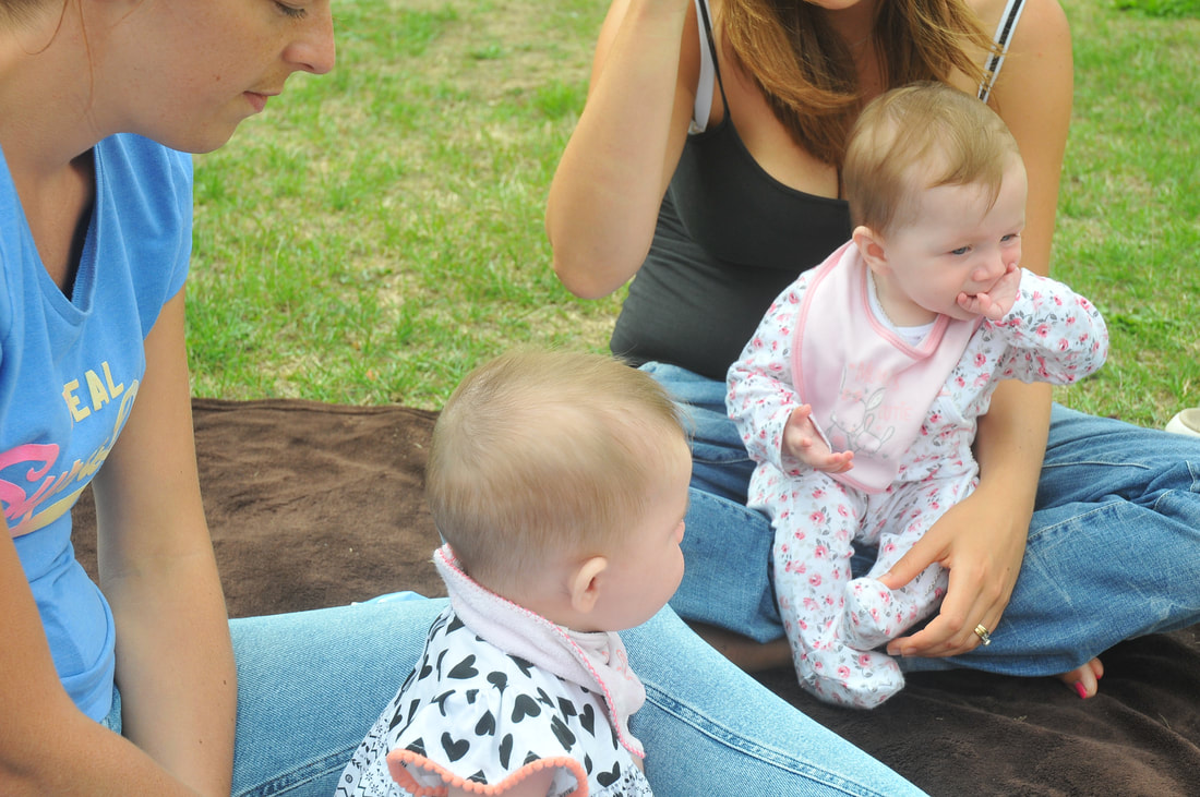
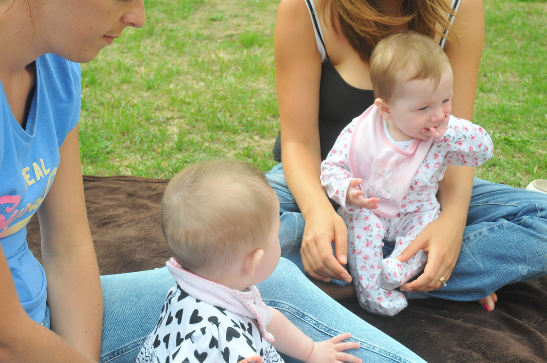
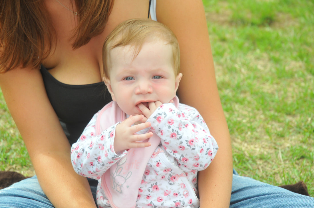
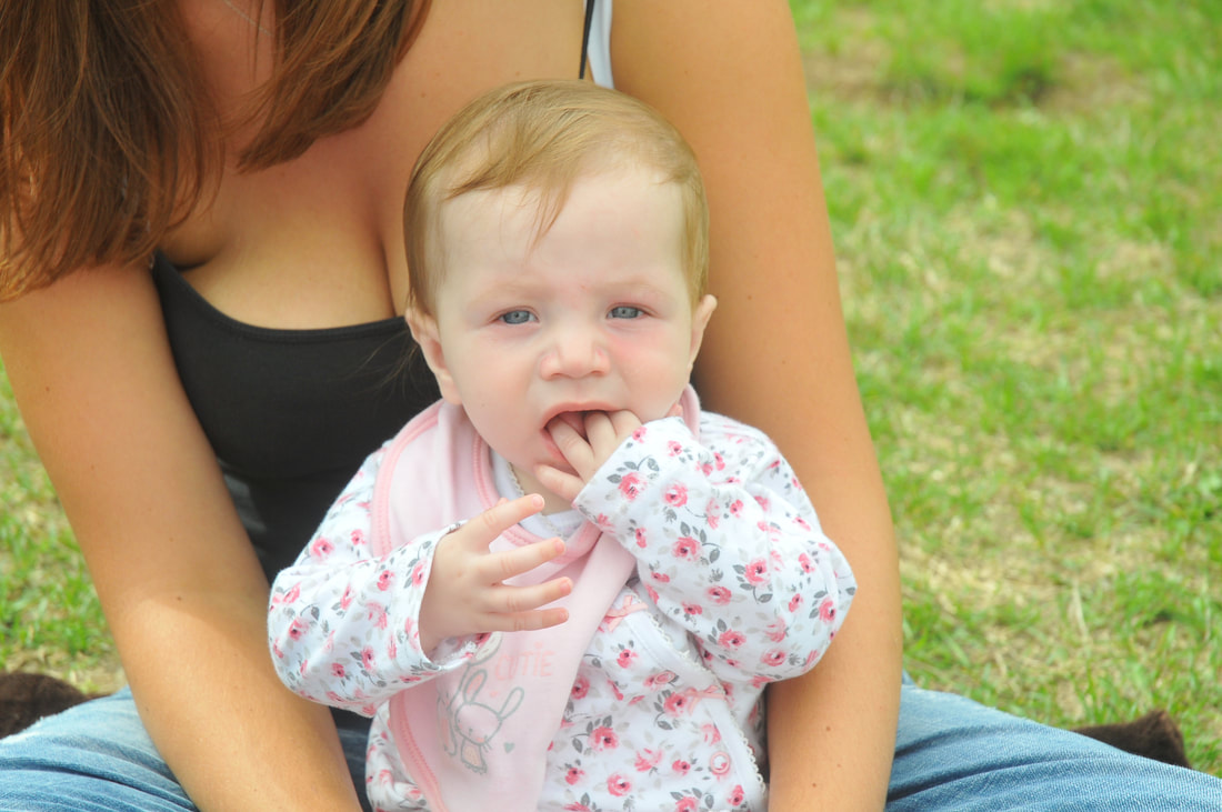
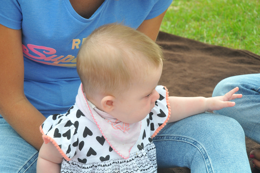
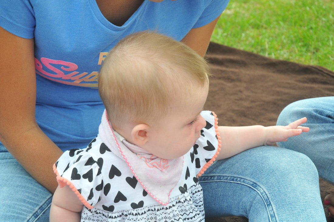
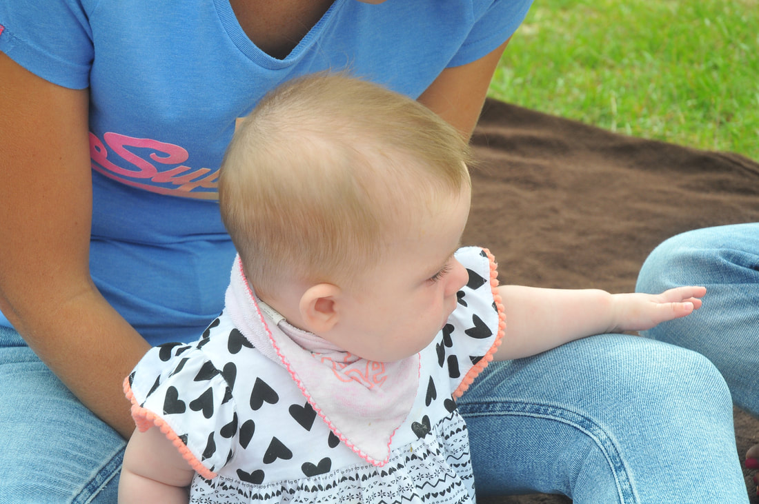
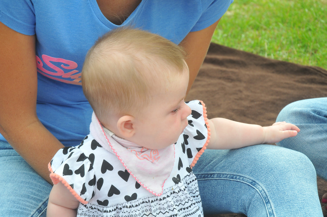
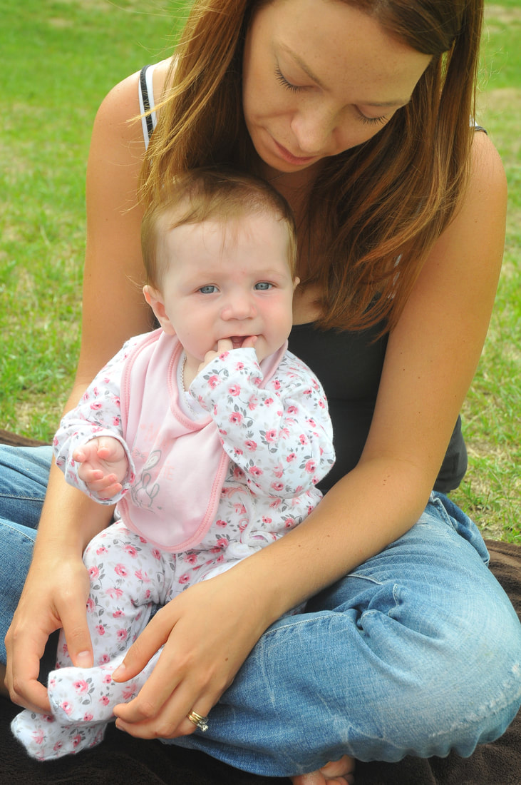
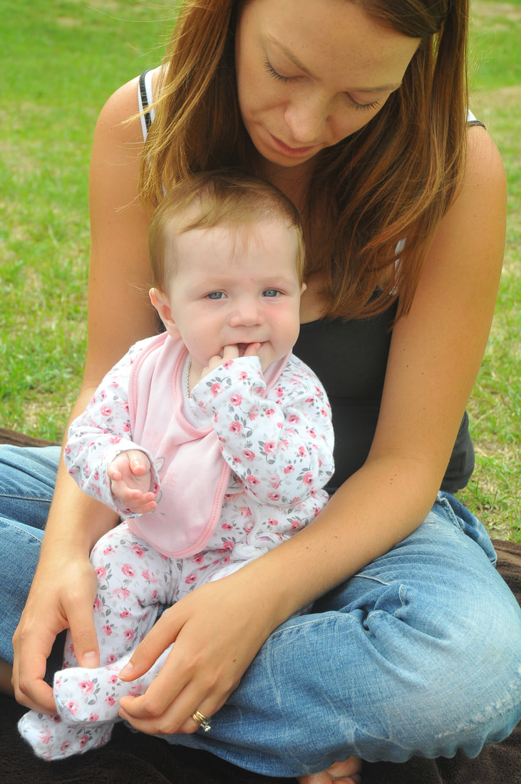
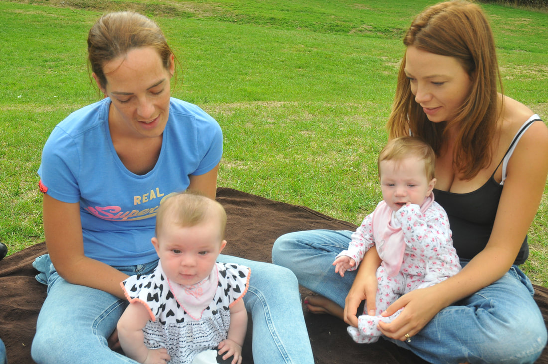
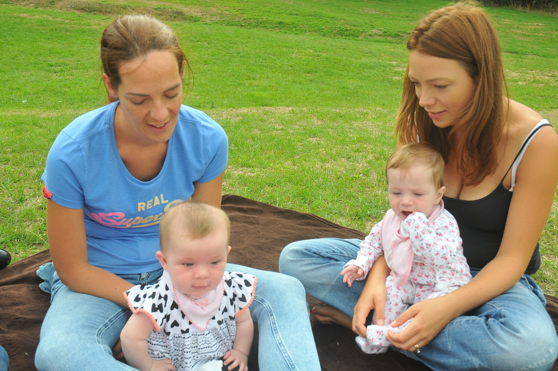
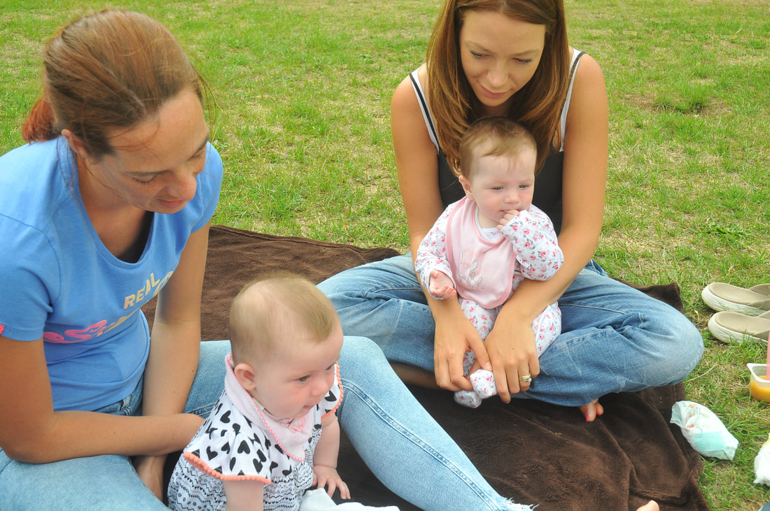

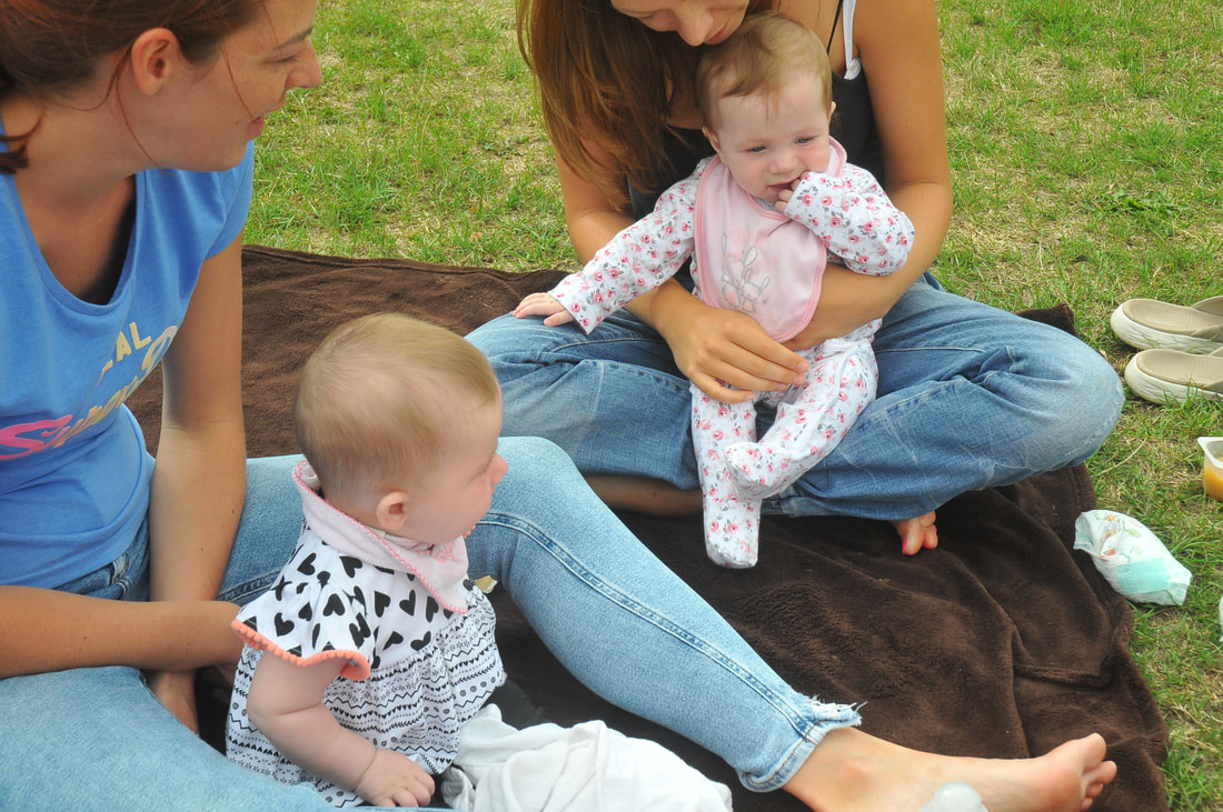
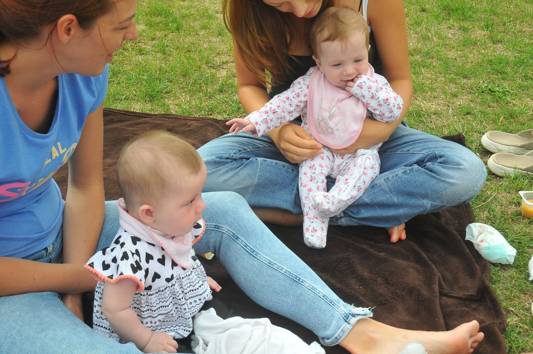
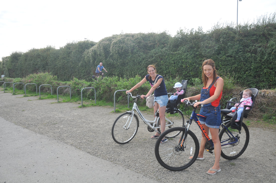
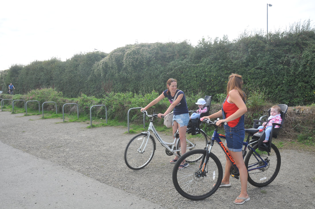
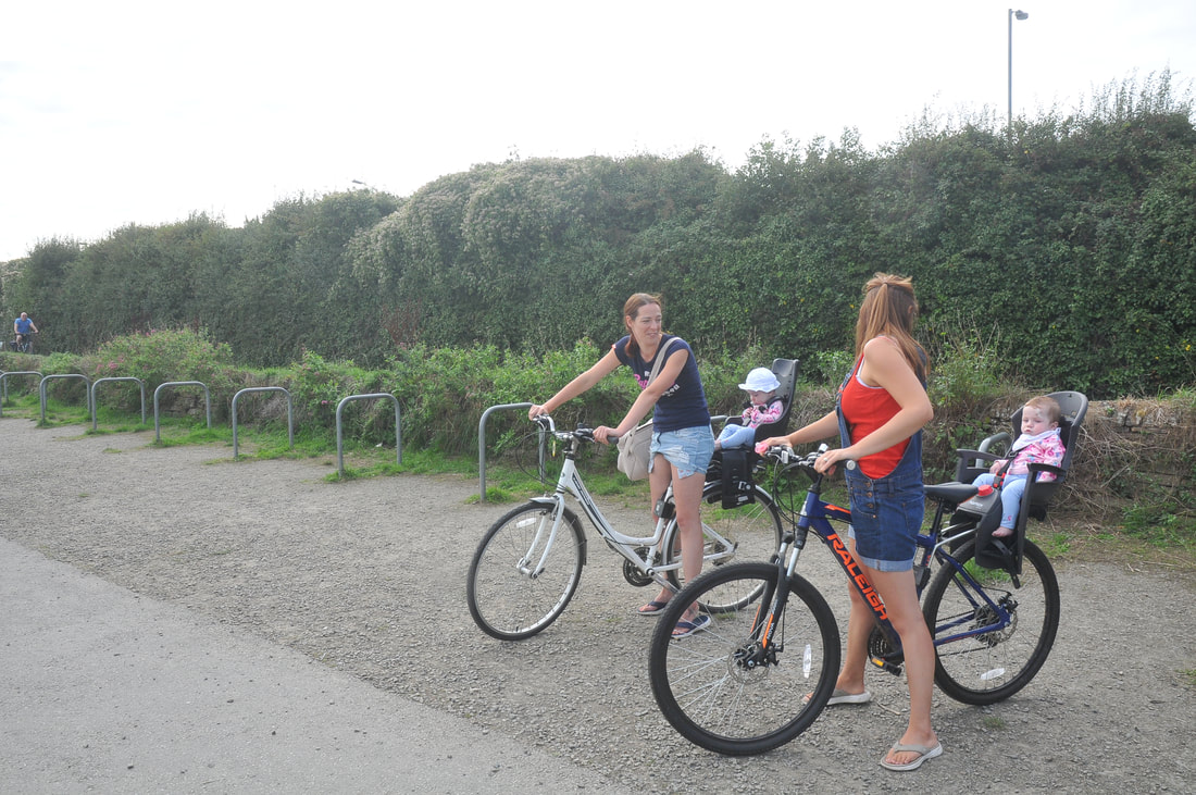
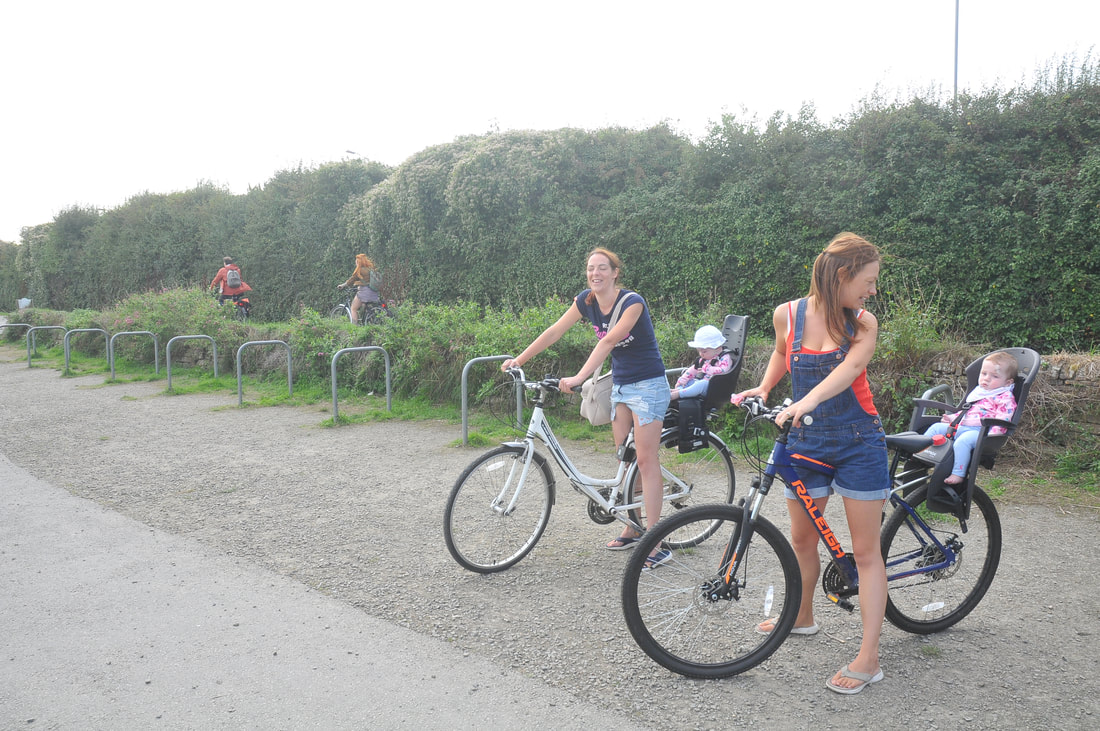
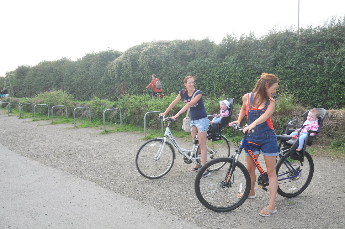
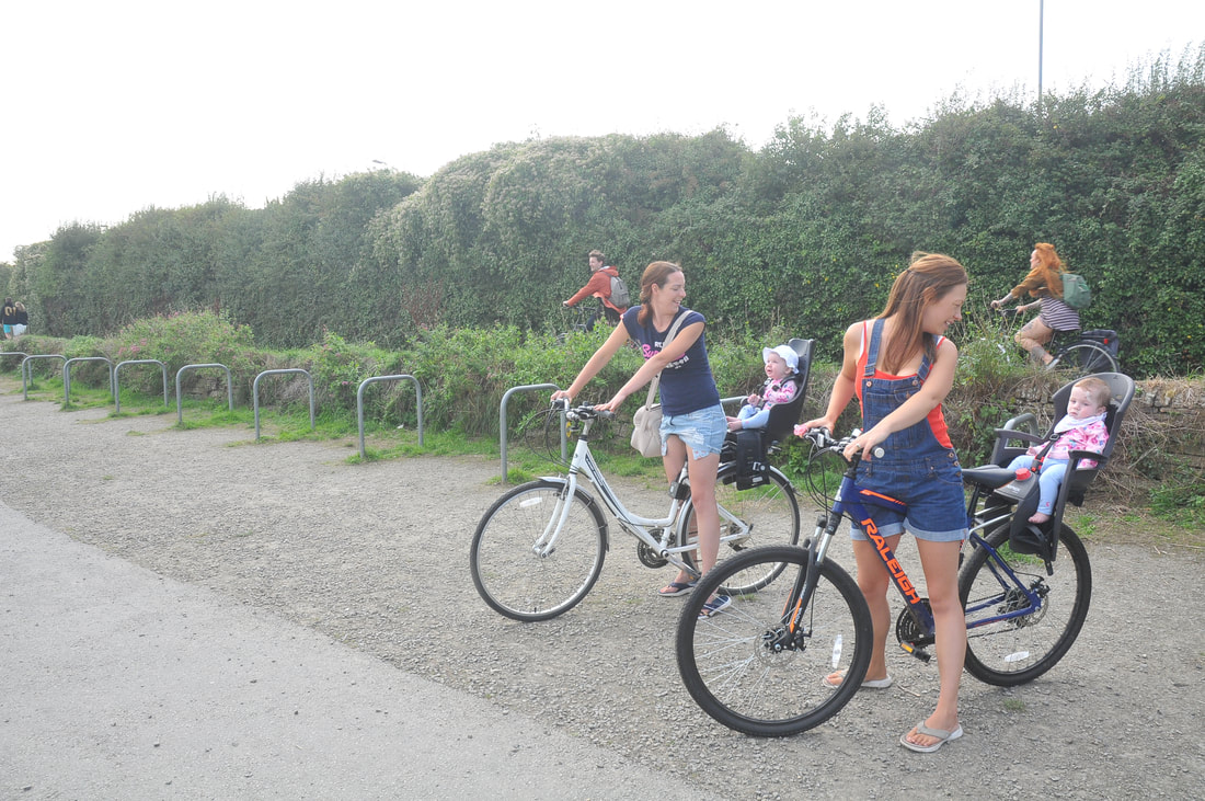
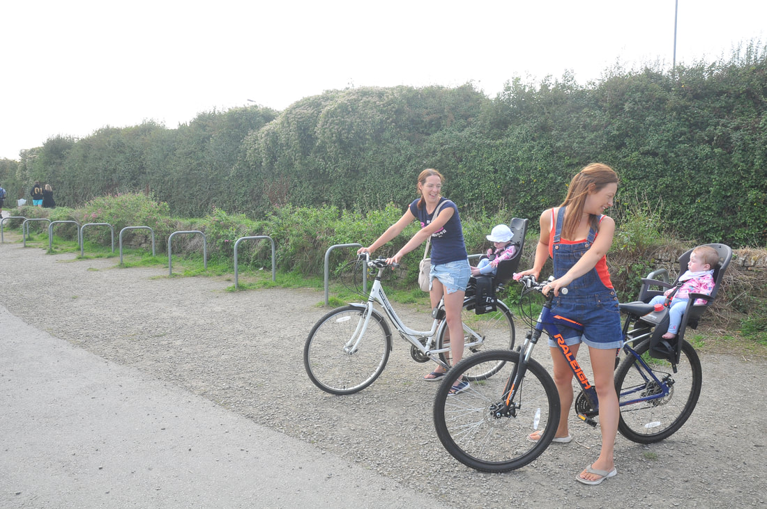
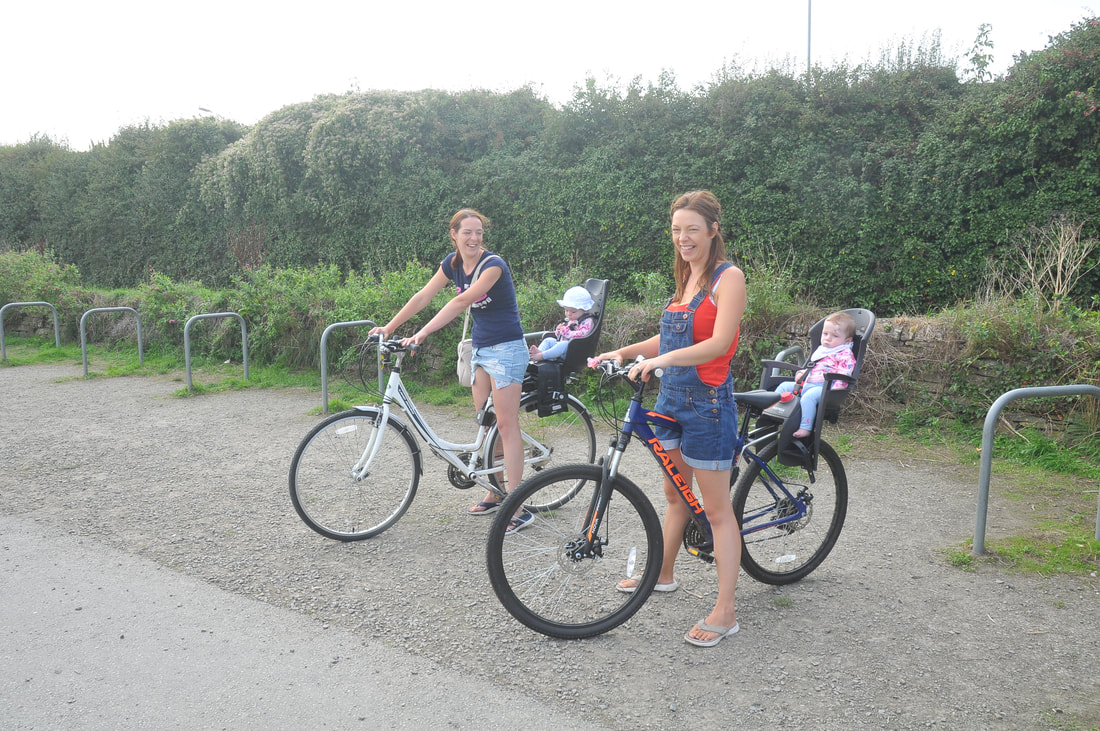
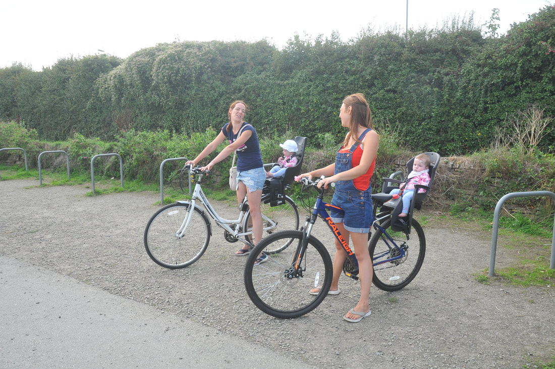

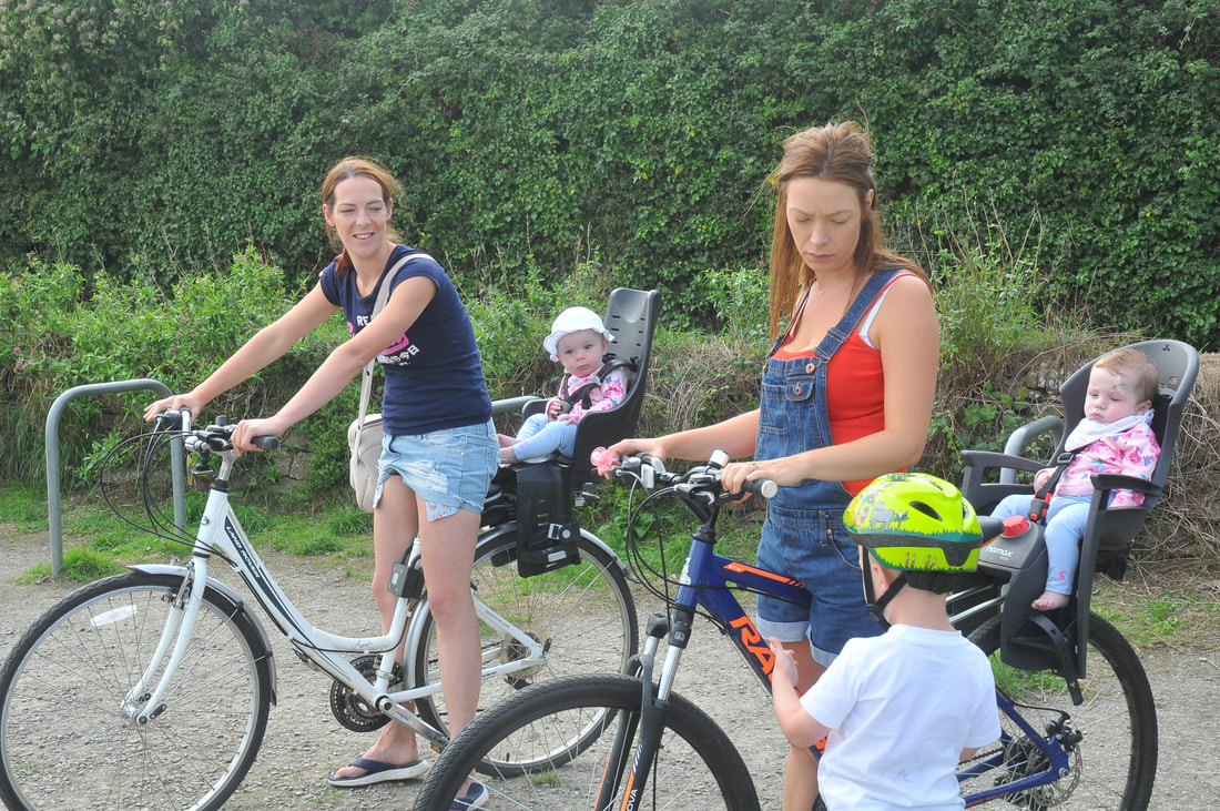
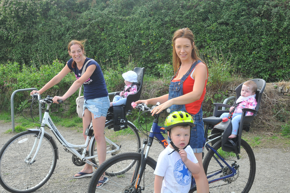
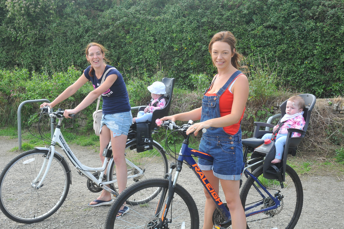
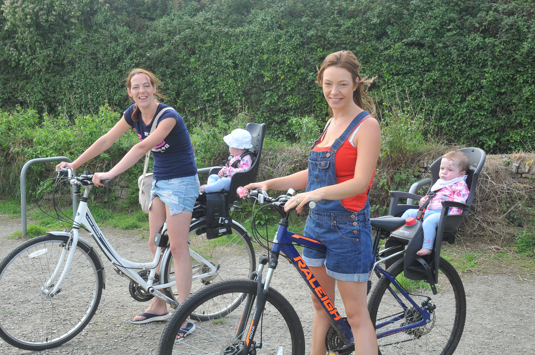
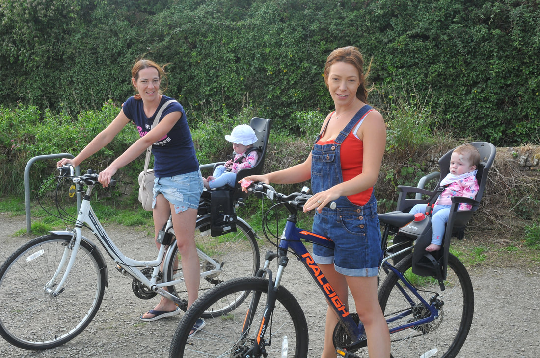
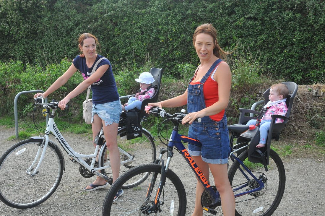
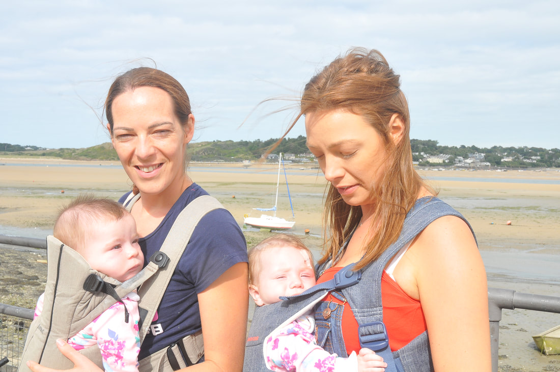
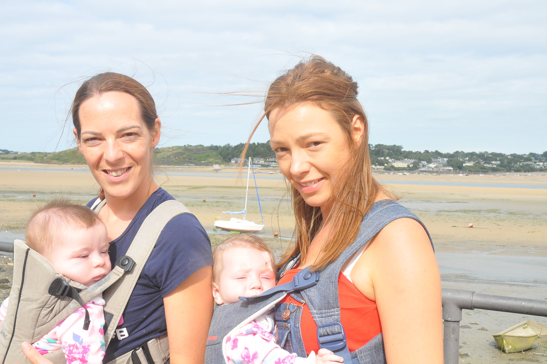
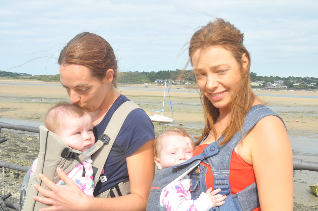
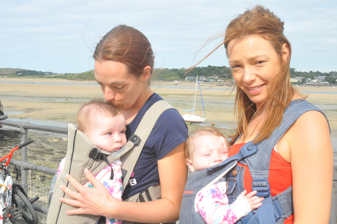
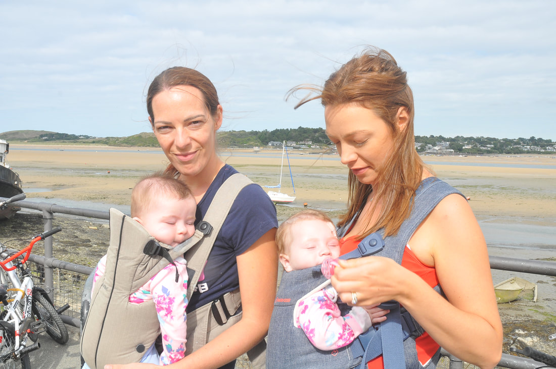
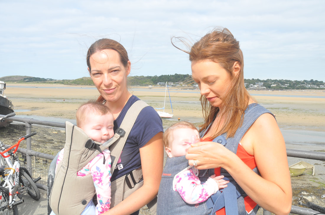
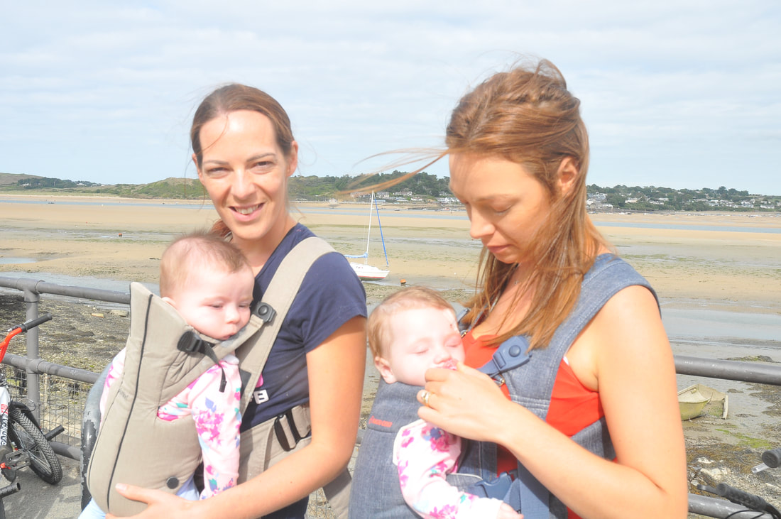
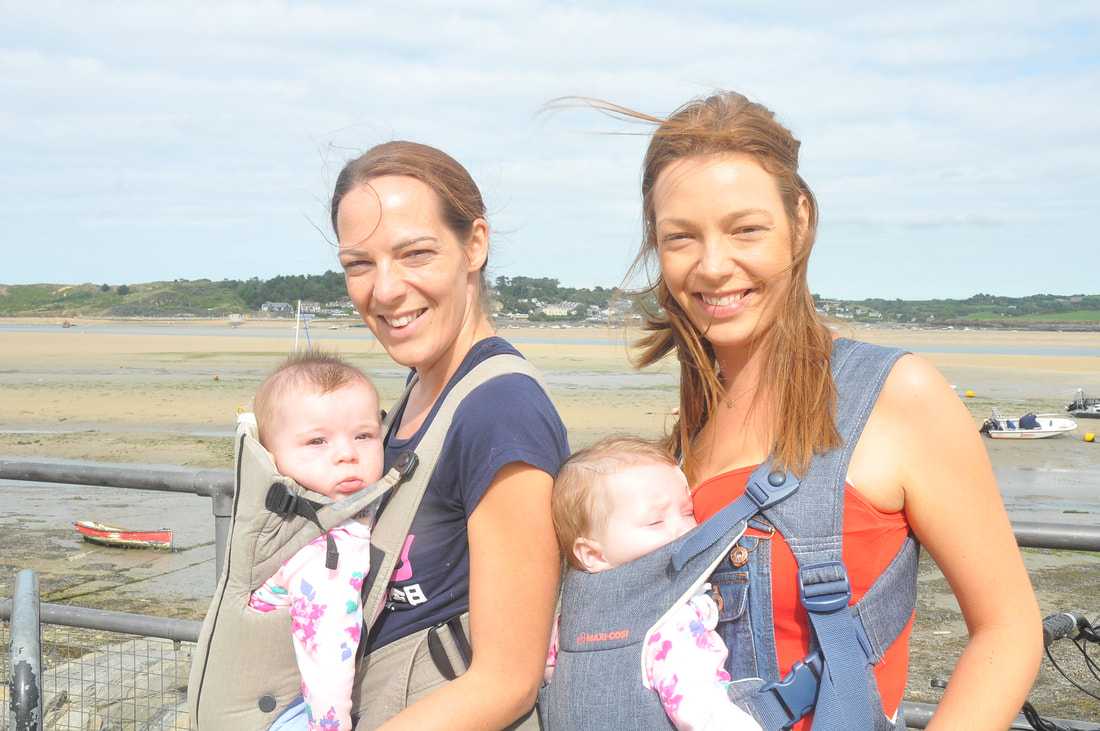
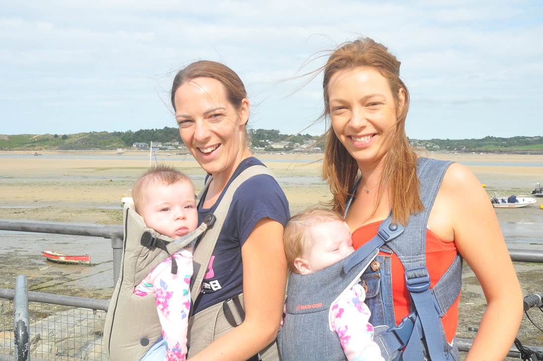
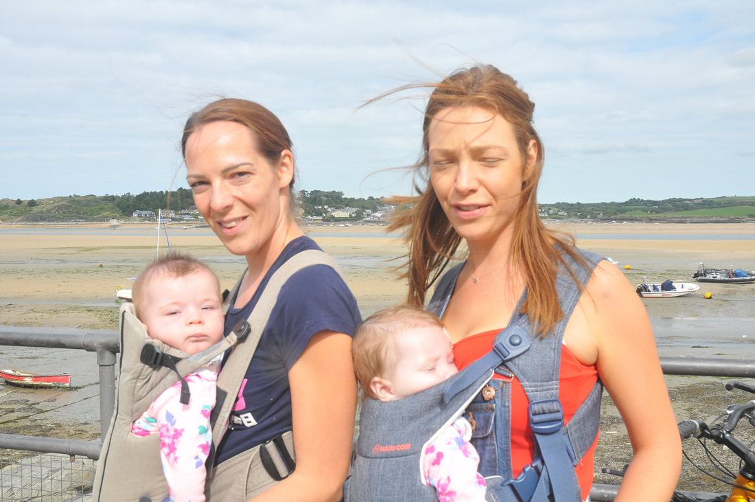
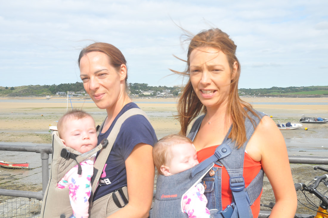
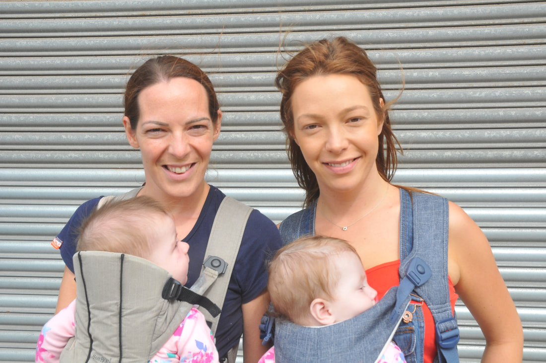
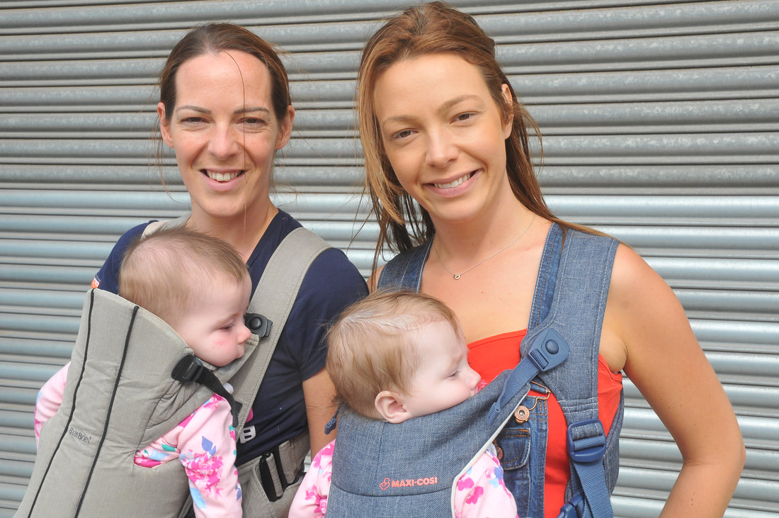
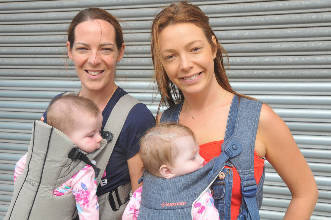
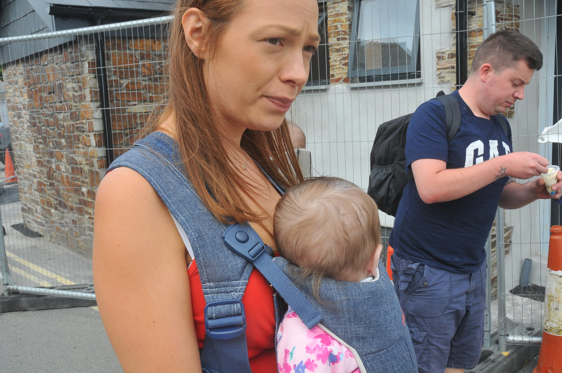
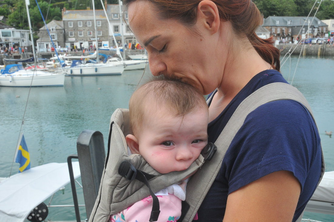
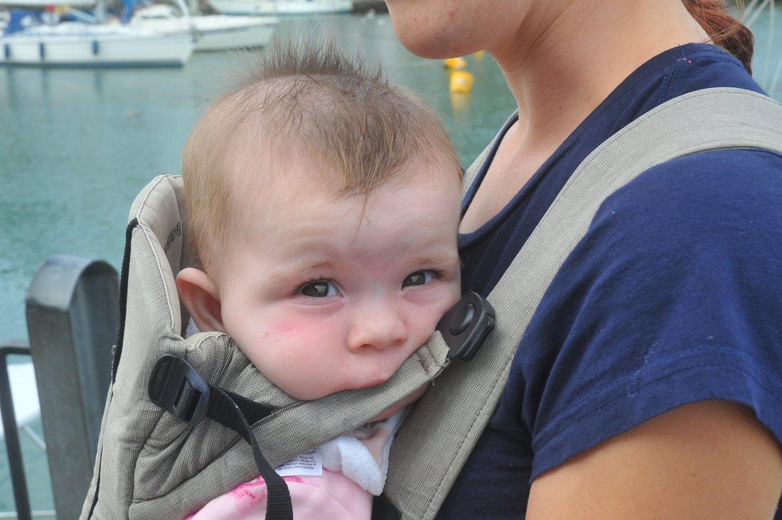
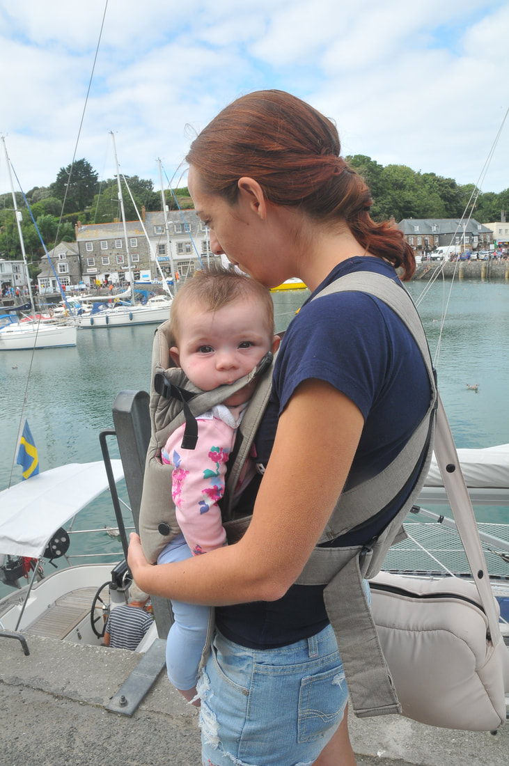
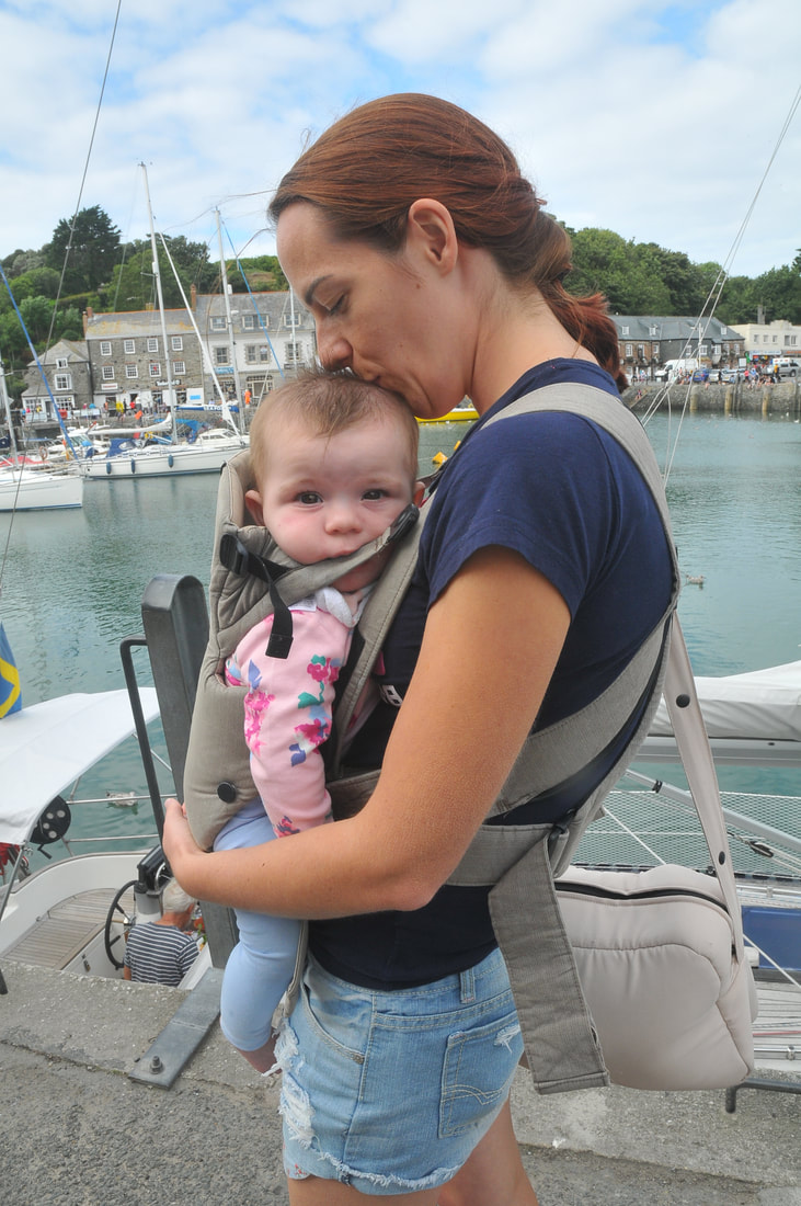
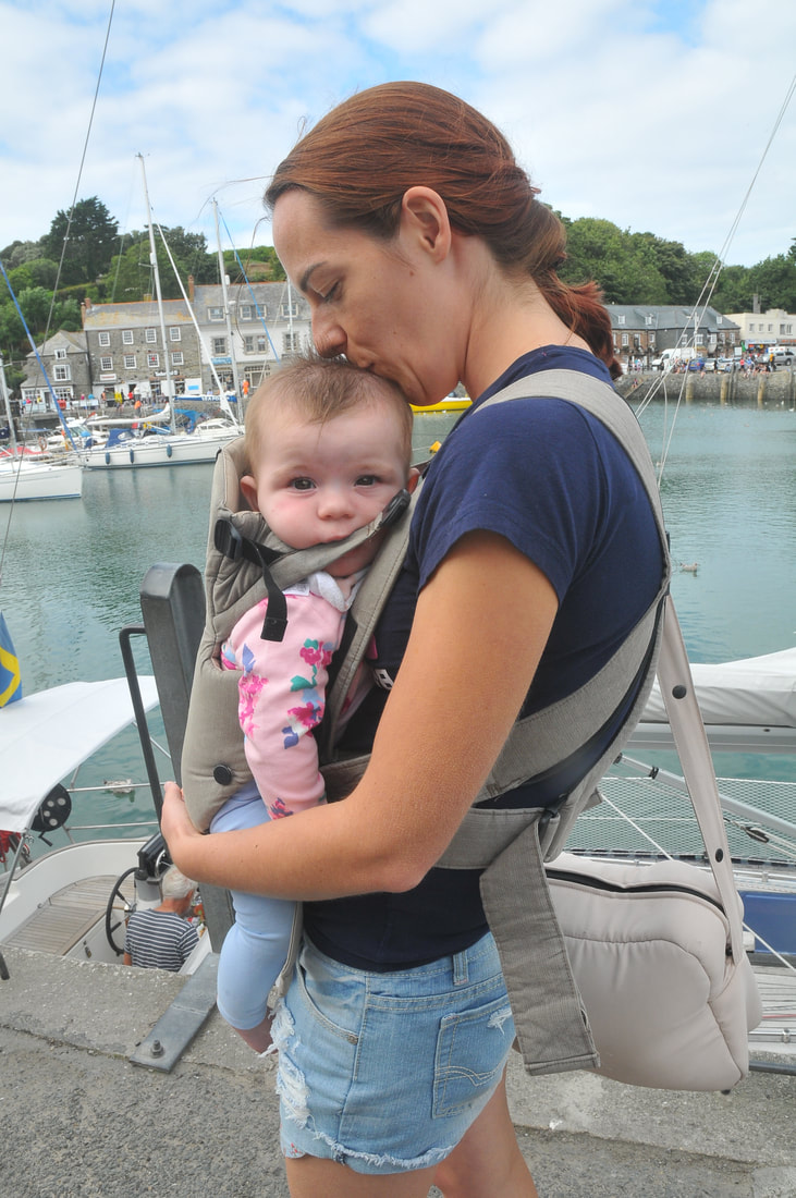
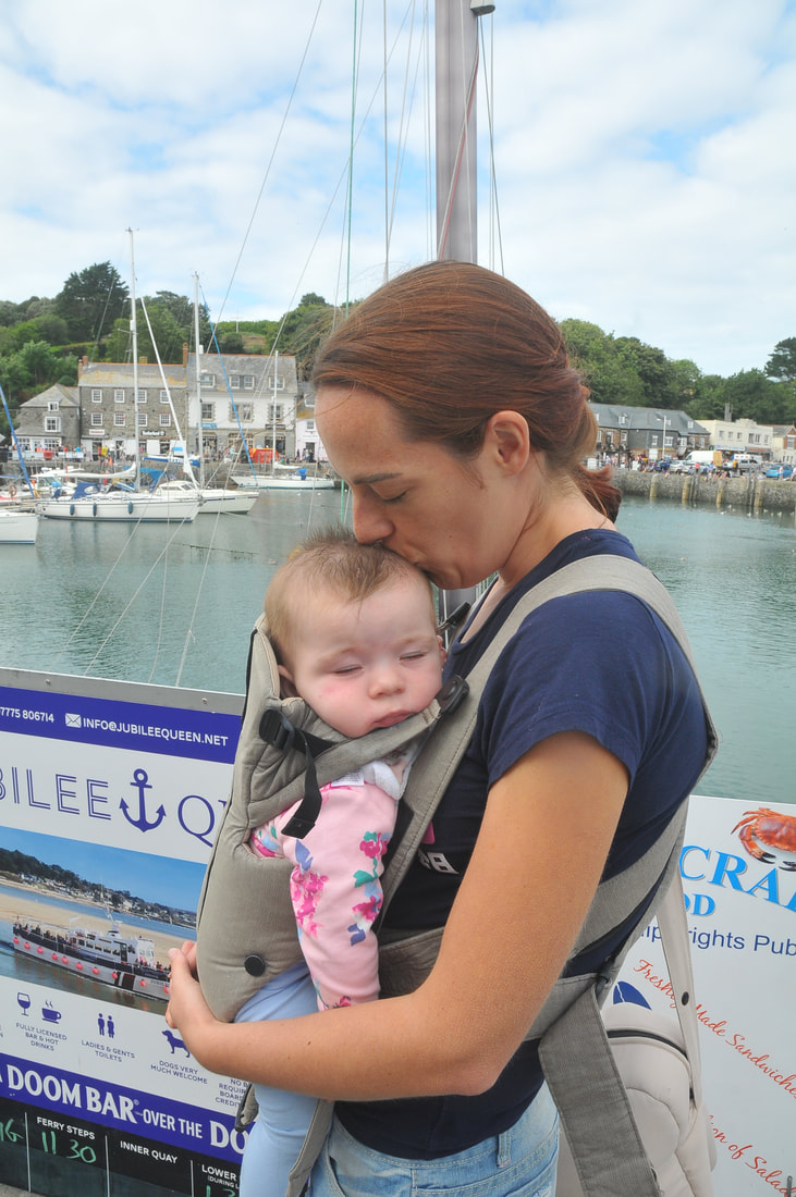
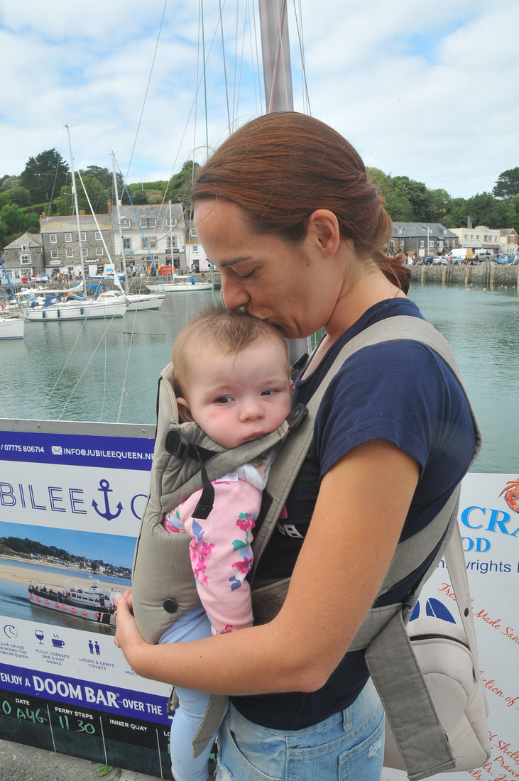
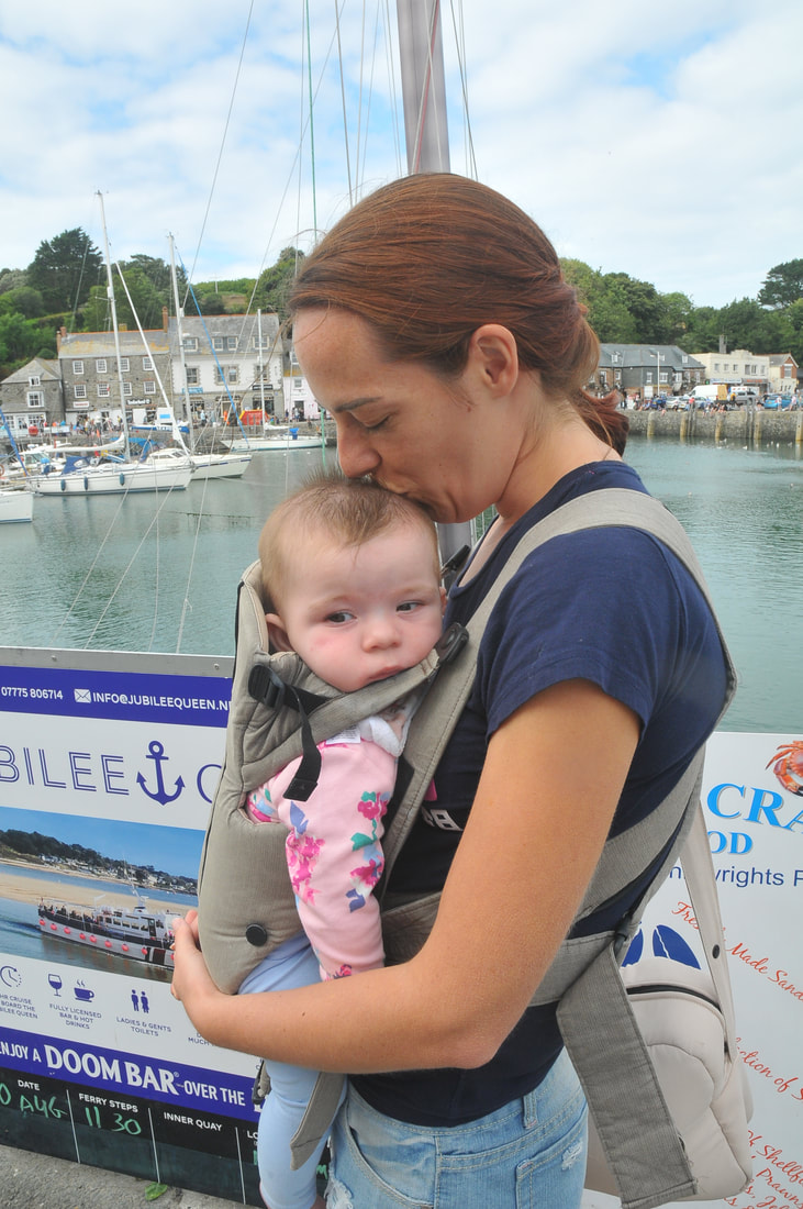
From my previous shoot where I had experimented mainly with taking very natural candid portraits, I wanted to experiment with framed portraits were I set up the shots. I wanted to take inspiration from Sultan's use of depth of field and Anderson's method of capturing an intimate moment to produce a set of images and I believe I have captured these elements in my work. Considering only these two elements, I did not take into account the dark lighting both my influences use. Despite not considering the lighting of my images, I feel these images are successful in drawing focus on my family rather than the background. I will continue to edit these images attempting to create a similar effect as in my images before. I will use the curves and burn tool to darken areas of the images to create an outcome that reflects my inspiration from Anderson and Sultan.
Some images have annotations on, click on them to read them.
Some images have annotations on, click on them to read them.
Editing Processes
My Outcomes
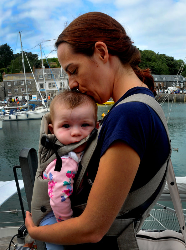
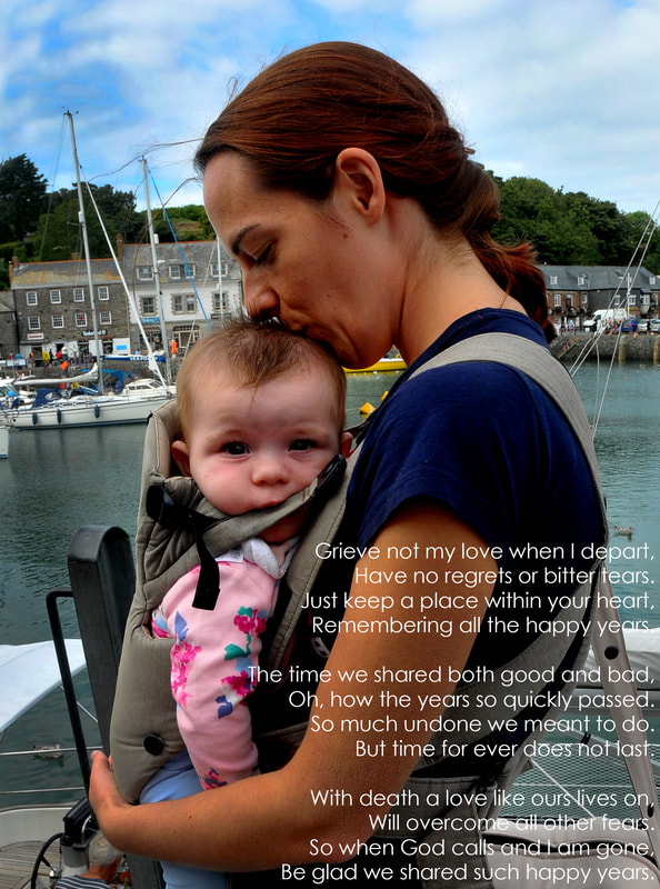
These are my outcomes from this shoot. I believe that I have successfully furthered the contrast of the image and in turn made the image evoke the connection to the inspiration I took from Sultan. Although the image still features brighter lighting than I would like, I feel I have produced an image that presents a bond between mother and child and provides the viewer with an insight into an alternative relationship in my family. I believe that how I positioned the text in the image, does not distract the viewer from taking in the focus on Cassie and Florence but instead enhances it as it is laid over the top. By increasing the contrast of the image, which made the shadows darker, the colours are brighter and so present how Sultan has incorporated bright colours in light areas of his images. Overall I am happy with this outcome but I feel it would connect better to my inspiration if the lighting was darker. This was something I should have considered technically on the however I feel the enhancements I have made to the image have improved it in the best way I could.
Enda Bowe - Clapton Blossom
Looking at Enda Bowe and his Clapton Blossom project, I am going to take inspiration from the composition and the intimate moments he captures. The lighting, which is similar to that used by Anderson, Erler and Sultan, enhances the emotions evoked from the image and makes the viewer have a greater connection with the subject. His work evokes his desire of storytelling through the use of capturing various lighting in reality. The middle image in particular expresses a bond between mother and child which is something I want to achieve in my images when it comes to me capturing the shoot. I will ensure than in my images my sister is trying to maintain eye contact with her daughter to enhance their bond in my images. I will use artificial light as a way to recreate the dramatic lighting I have looked at previously and will vary the location of my shoot around my sisters home to further a more homely and welcoming feel to my images.
Shoot Eleven
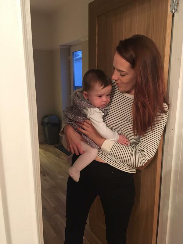
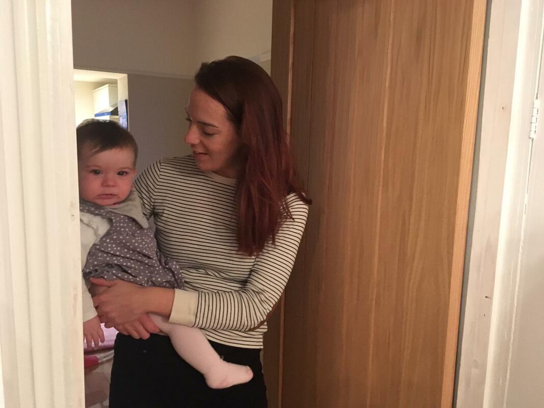
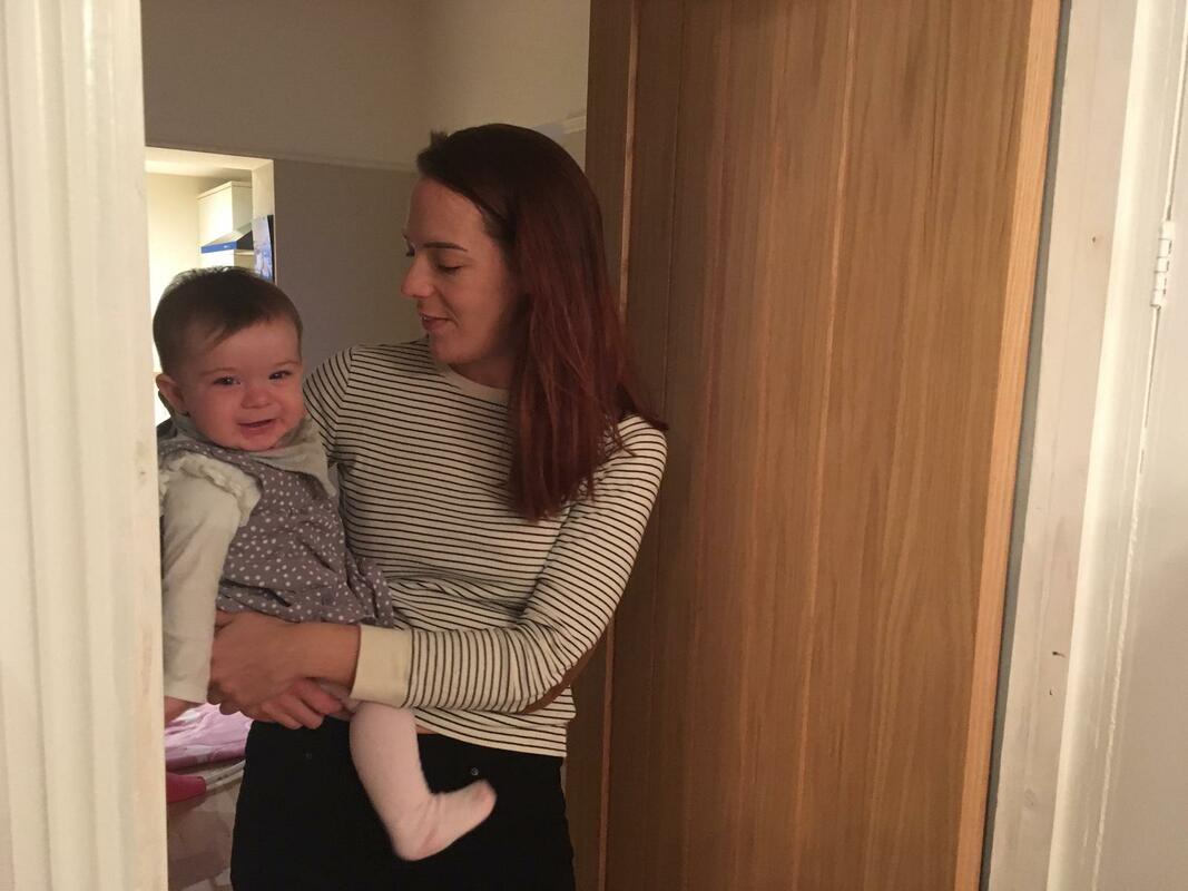
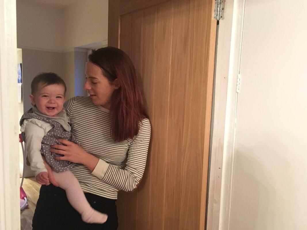
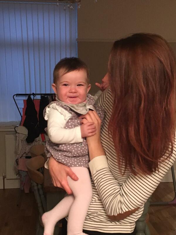
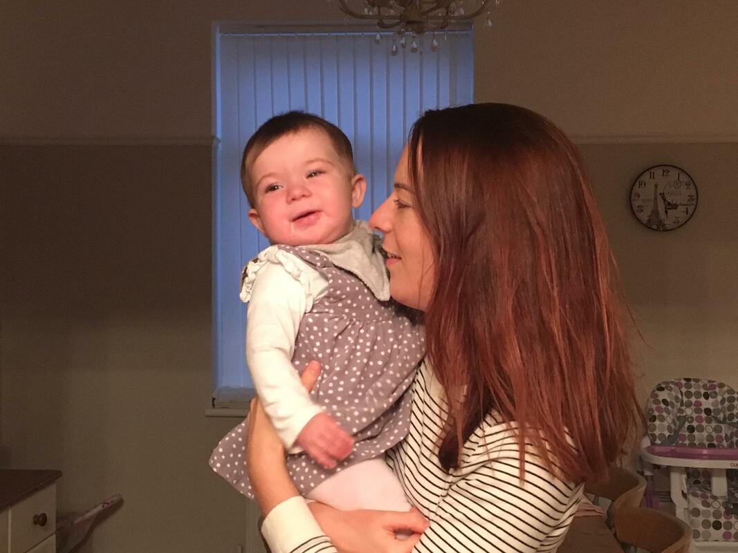

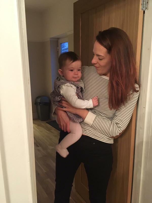
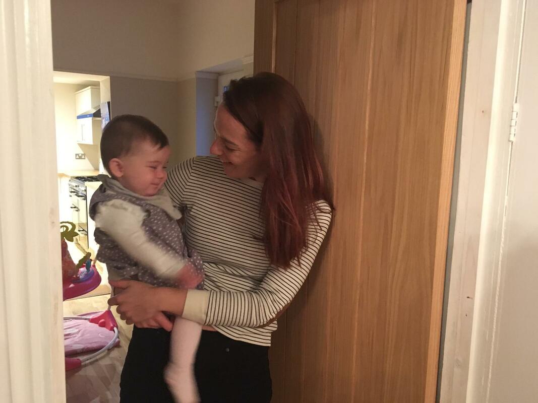
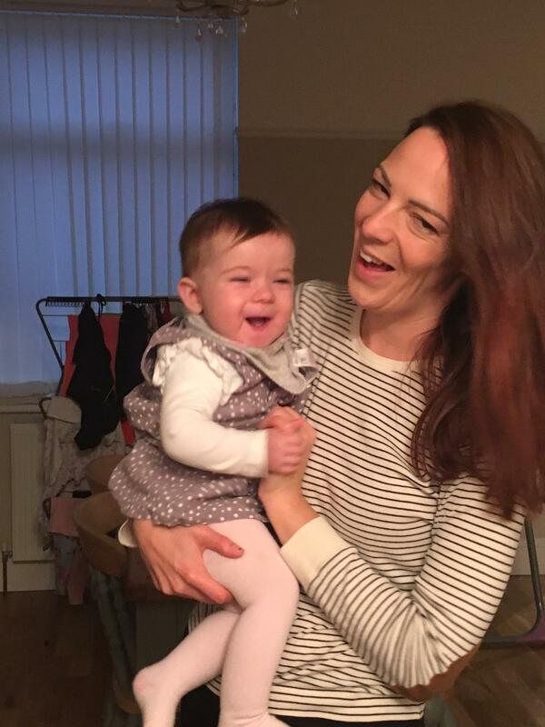
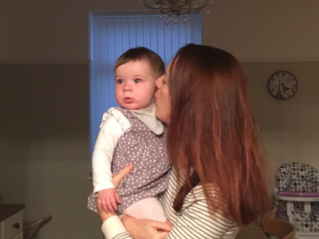
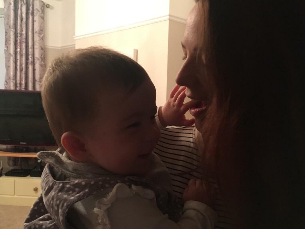
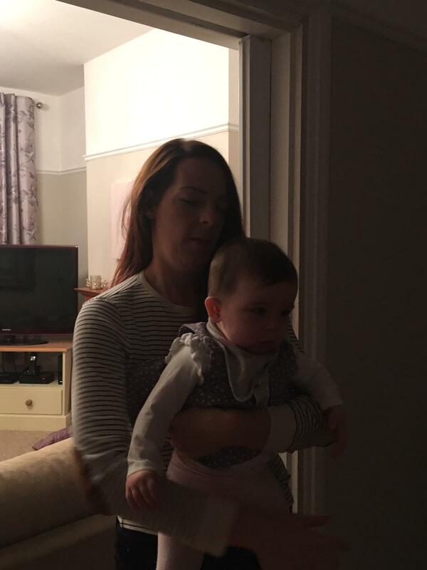
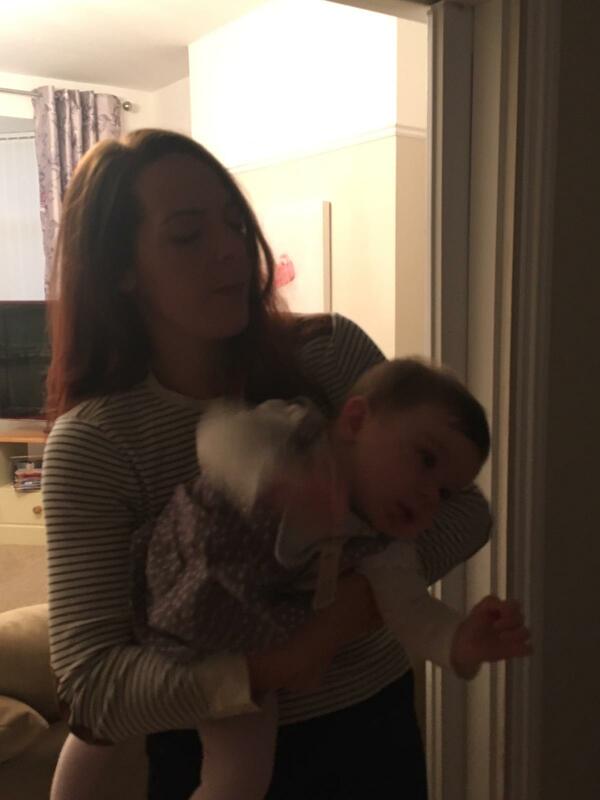
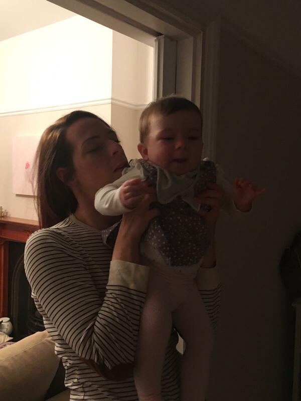
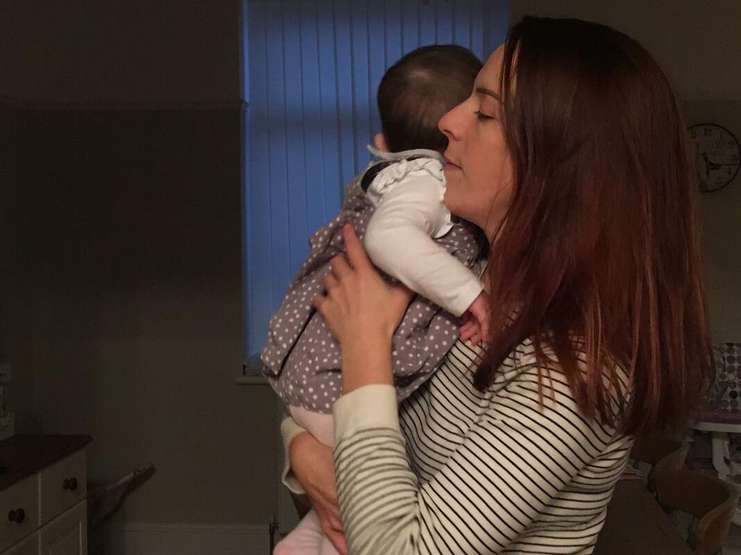
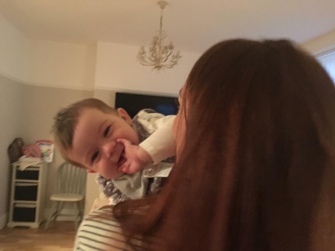
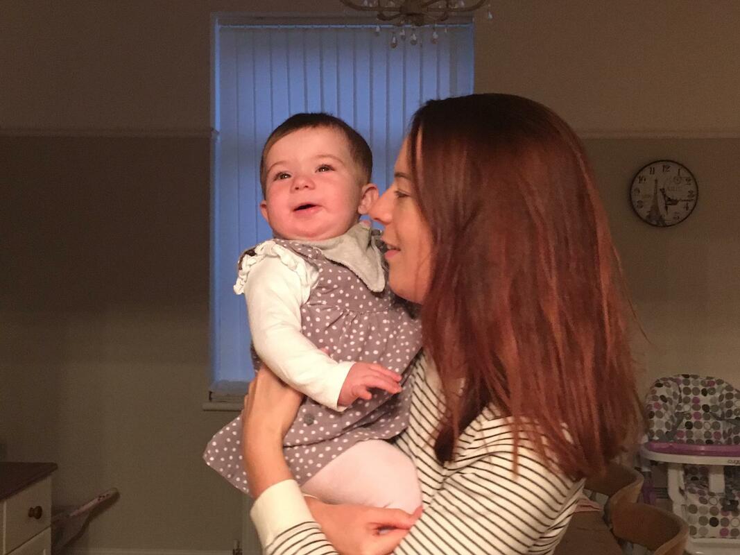
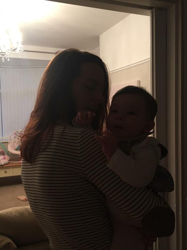
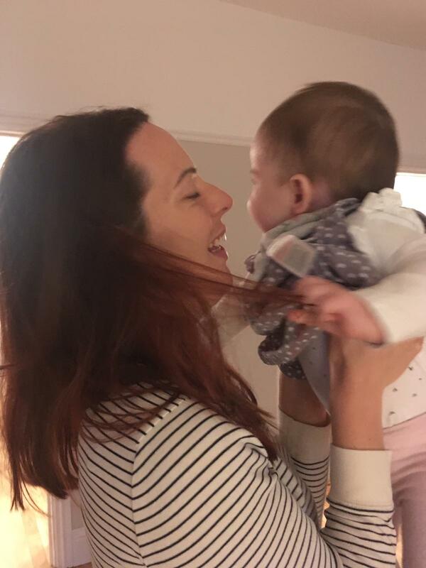

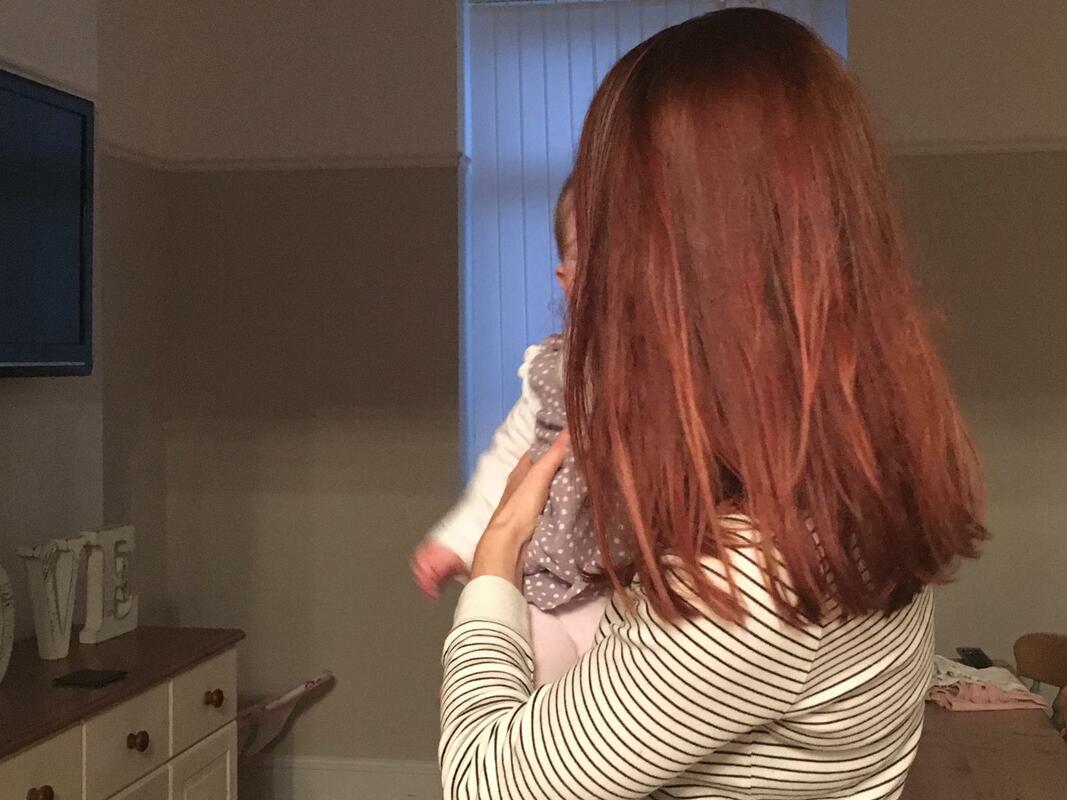

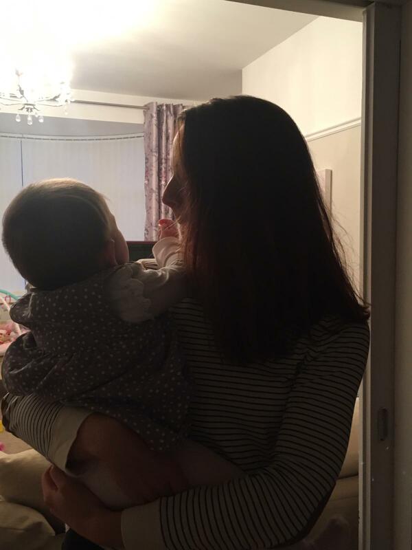
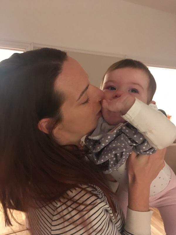
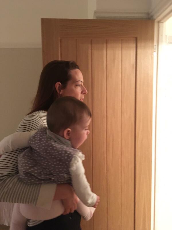
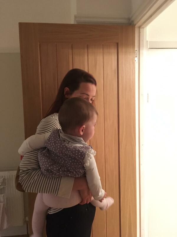
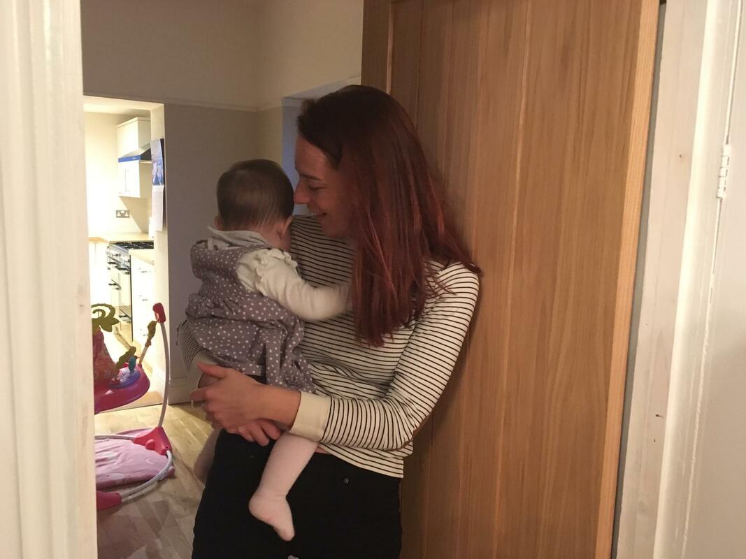
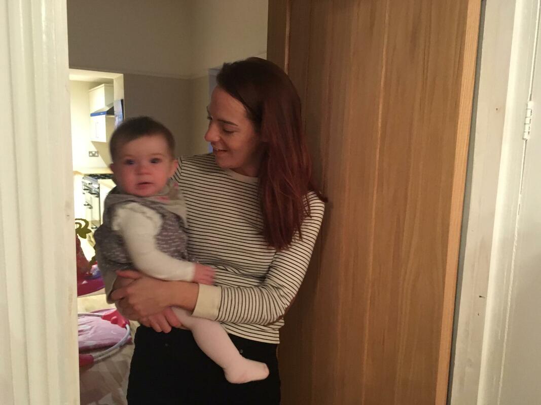
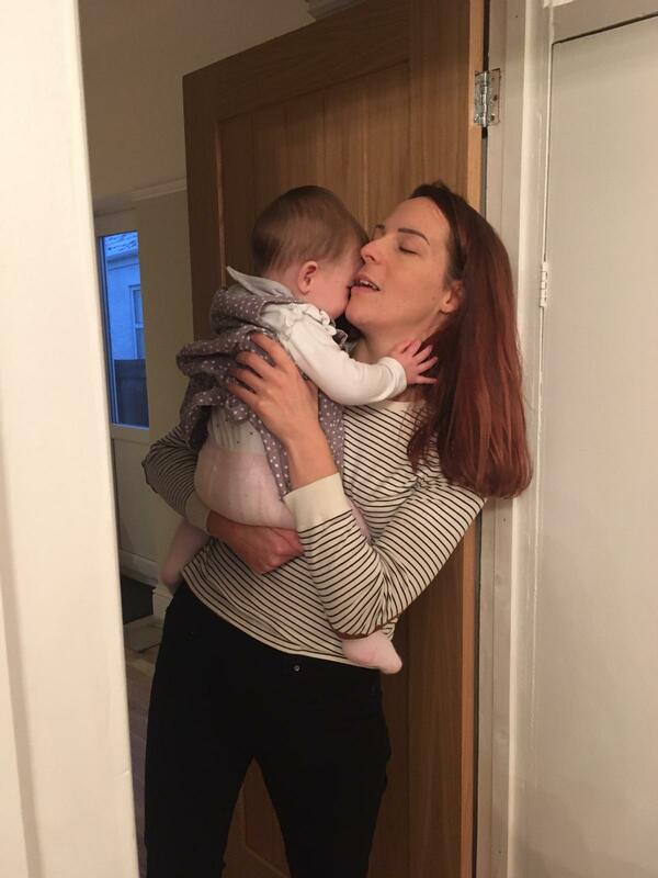
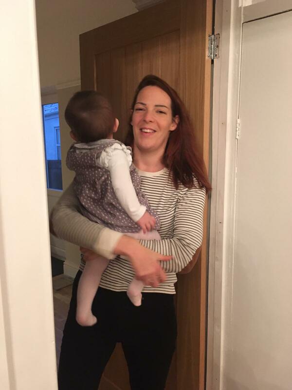
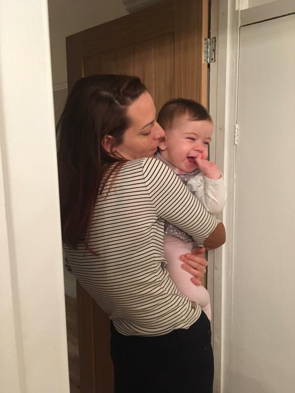
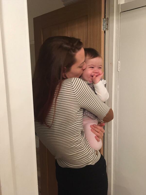
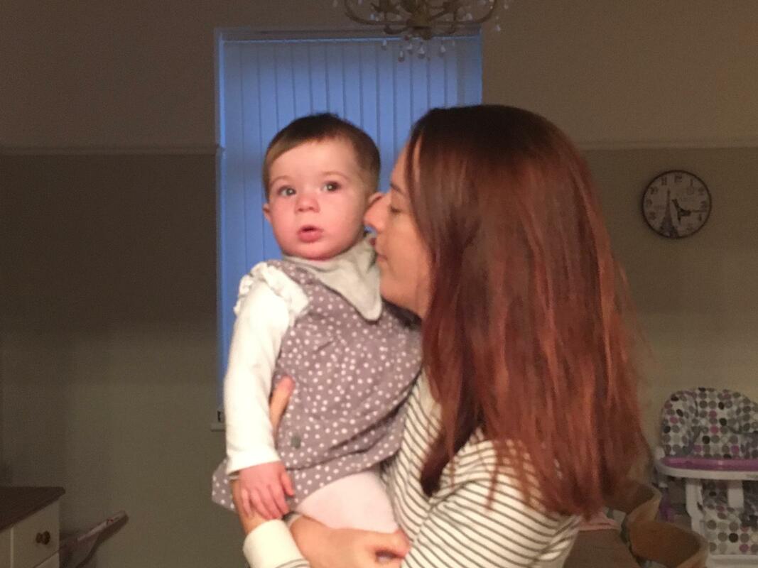
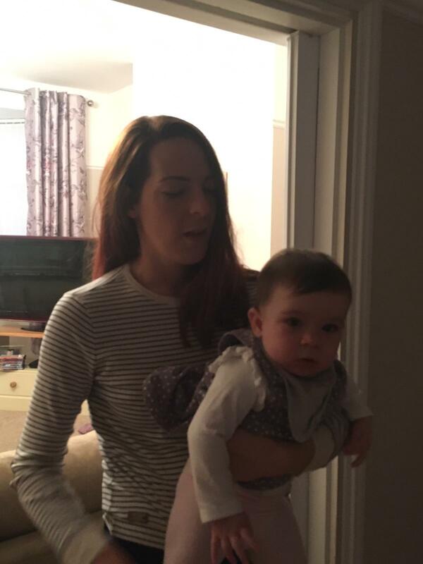
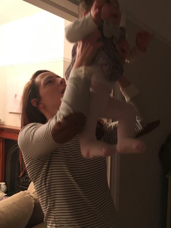
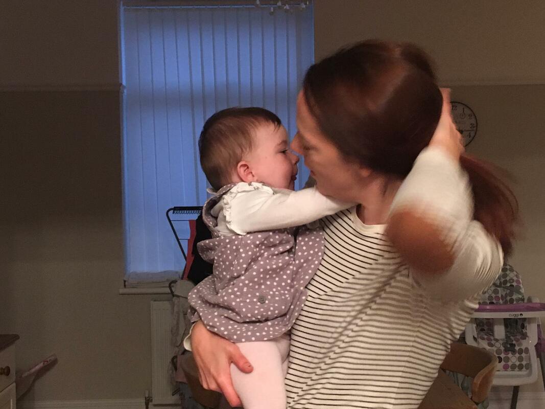
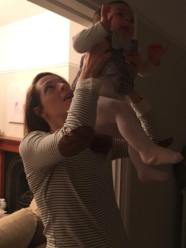
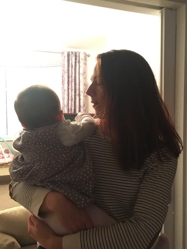
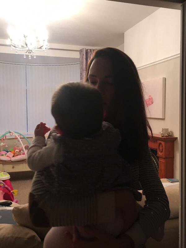
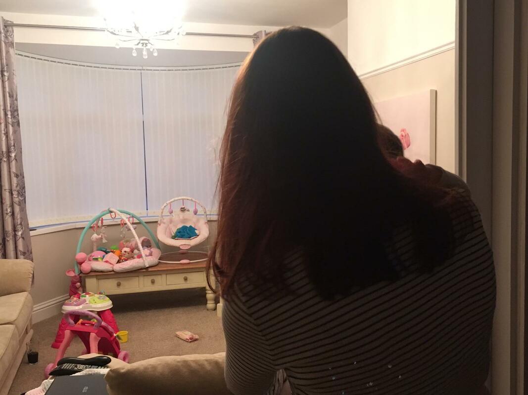
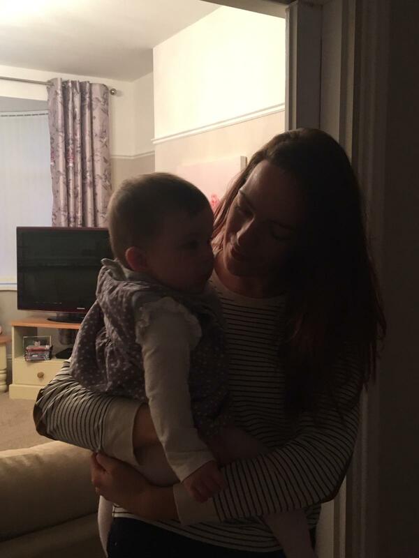
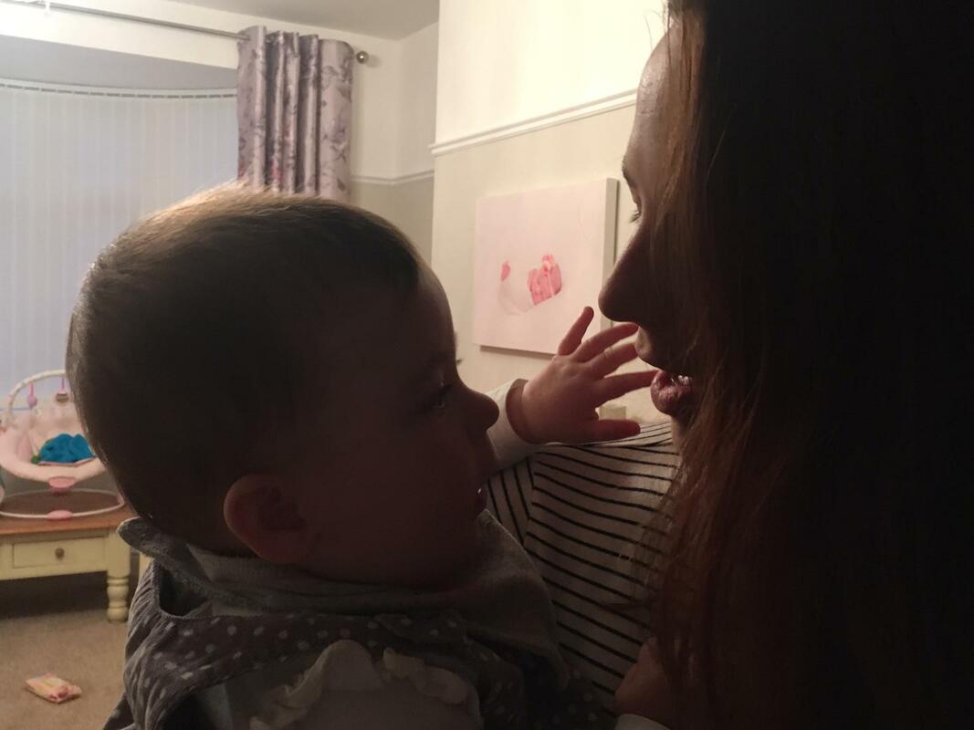
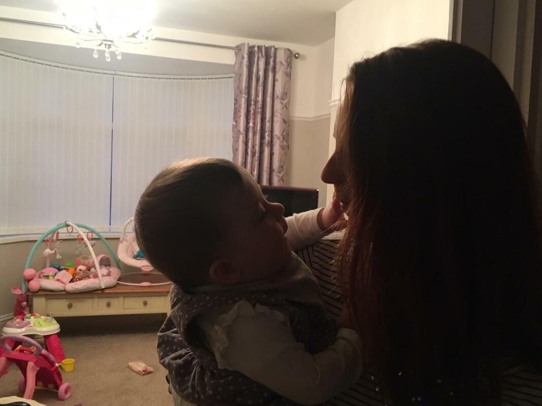
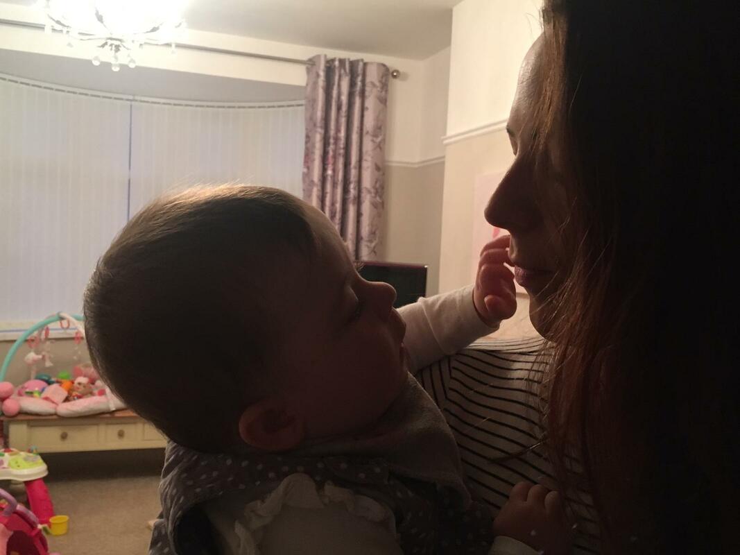
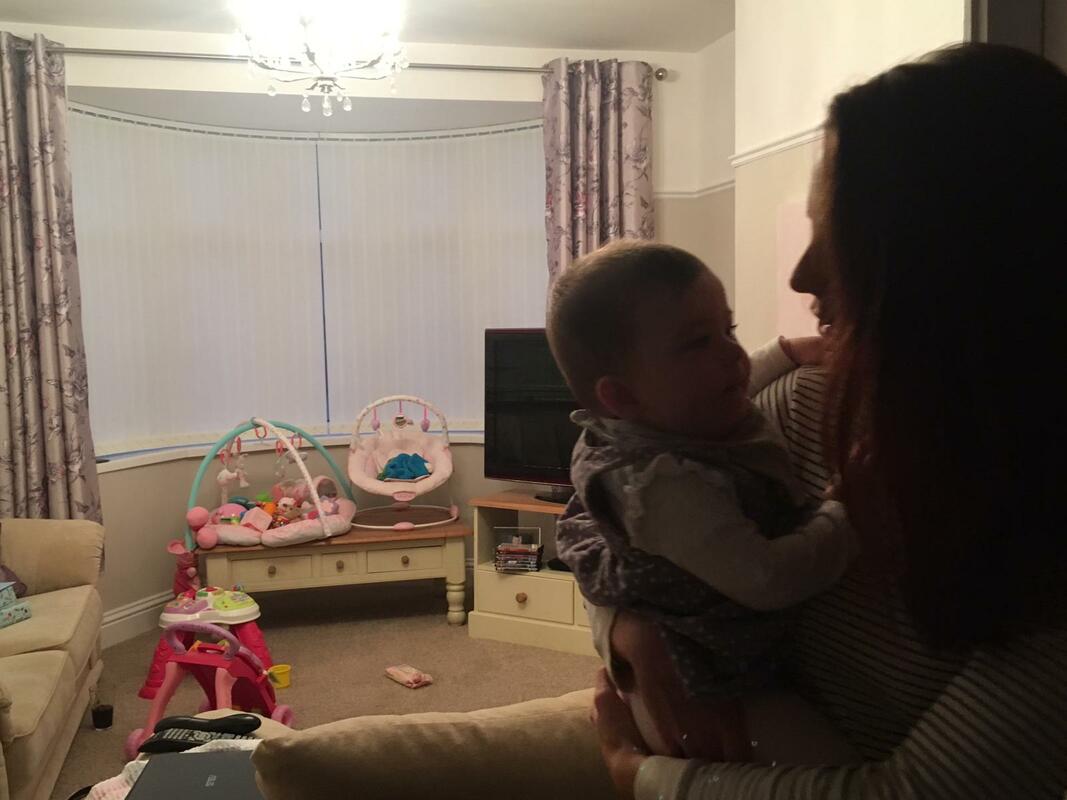
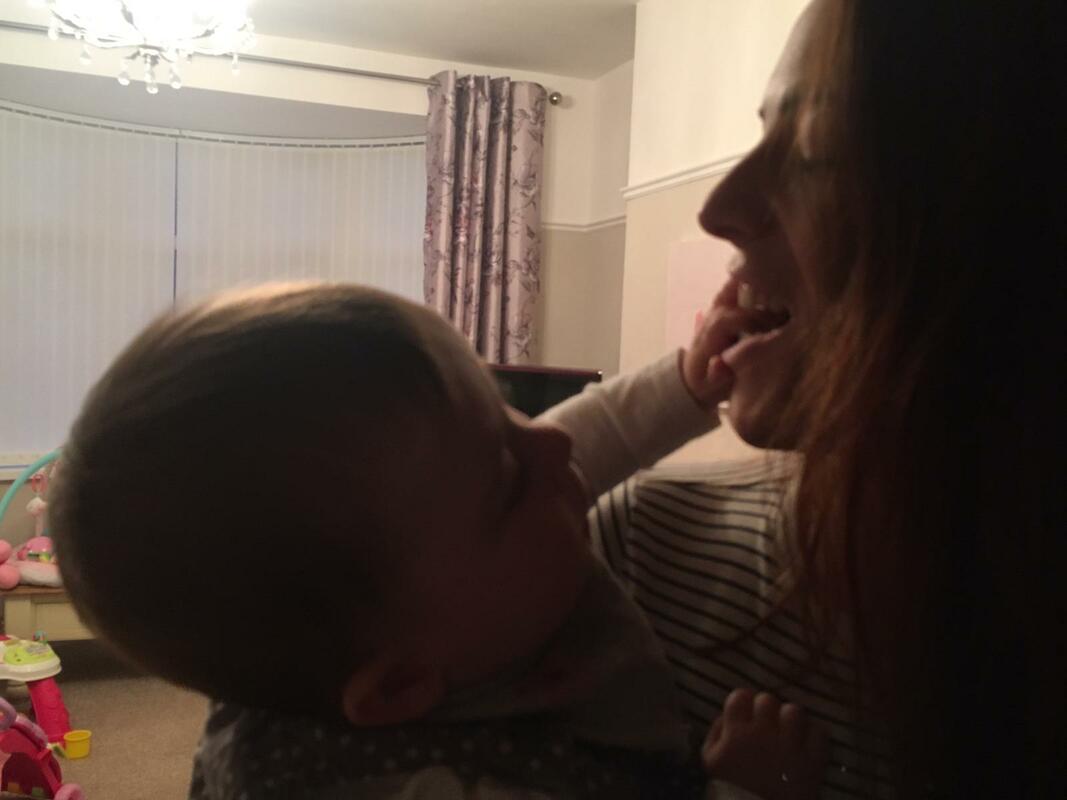
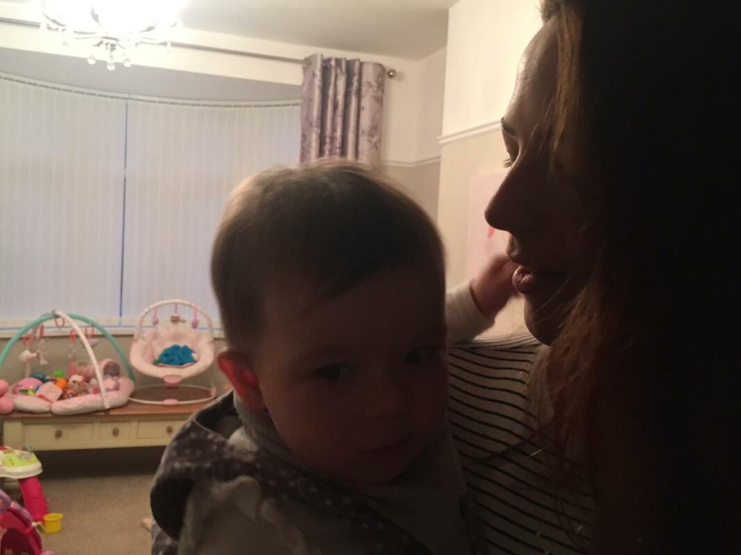
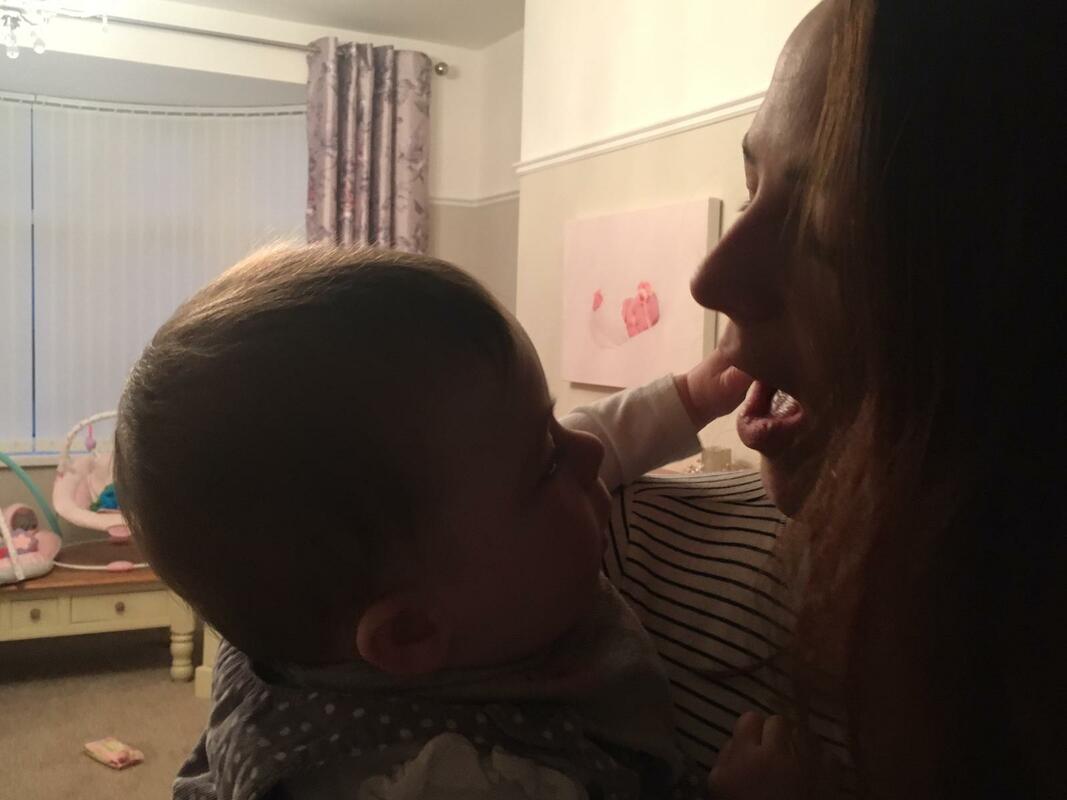
Overall I am happy with this shoot, I have some successful images which I plan on taking forth to edit. Trying to capture images of my sister with her child proved difficult as Florence was always moving and so I had to be quick in capturing the images. The images of them stood in the doorway proved more successful due to the lighting and compositional elements and the doorway both framed the image and enhanced that the shadows were solely in the background. These images also had little distraction in the background compared to other images where there were masses of toys and so allows the viewer to solely focus on the bond between mother and child. For the shoot I used artificial lighting that was already in the room. I used this as I wanted the portraits to be fairly natural and so studio lighting would have been too much. I believe that by doing this I captured a set of images that use inconsistent lighting well and evoke the inconsistent lighting from what I have seen in Sultan's work.
Some images have annotations on, click on them to read them.
Some images have annotations on, click on them to read them.
For this shoot I decided to display my images in the form of a video. I believe that this technique of displaying my images was very successful.
My Editing Processes
My Outcomes
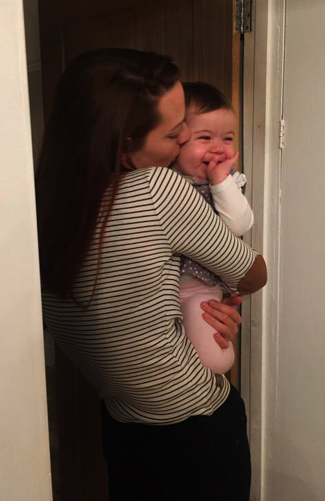
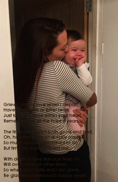
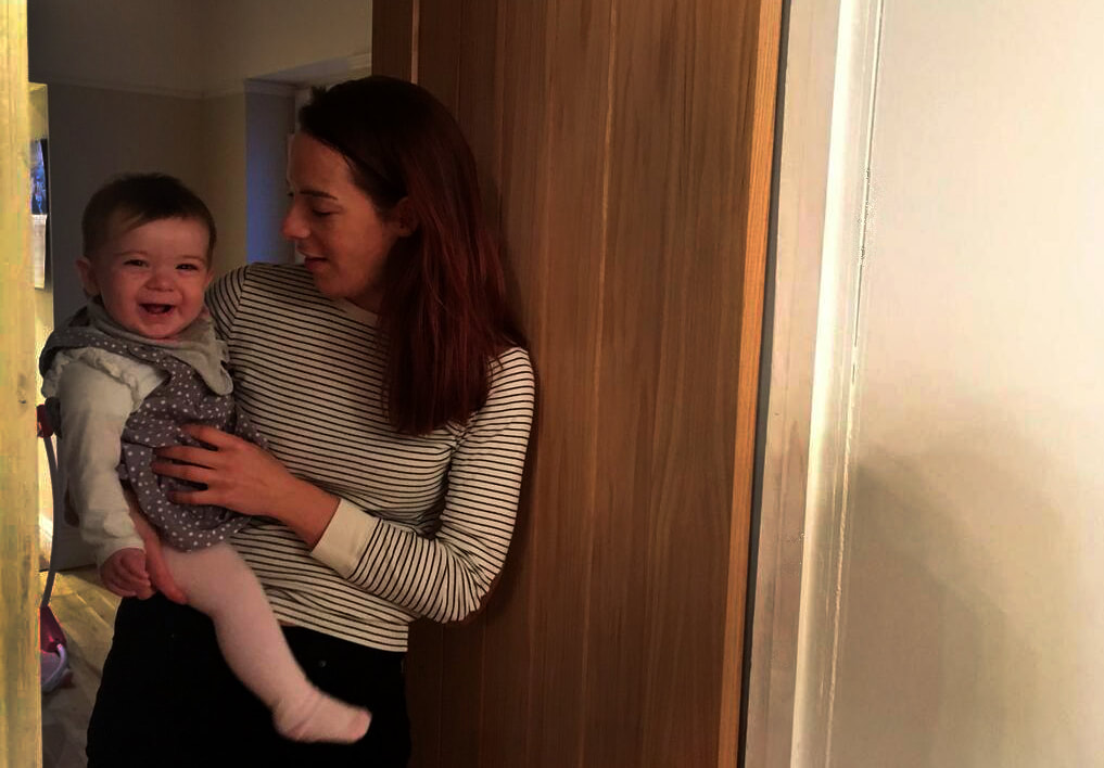
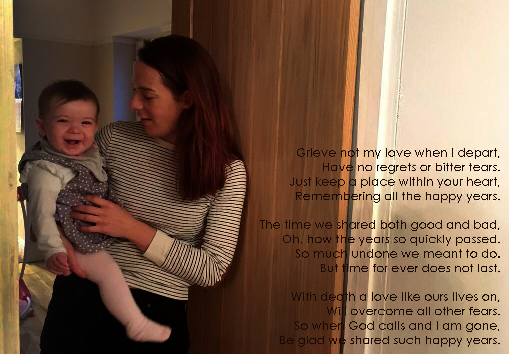
Through cropping and adjusting the levels of these images, I believe that I have enhanced the shadows which in turn connote the inspiration I have taken from Erler, Anderson and Sultan. Adding depth to the shadows has created the illusion that the image is darker and where the highlights are over my sister and her daughter draws more focus on them. The way I have cropped the image has enhanced the framing of the image as it has bought a tighter view point to the door frame and has created negative space on the right hand side of the image. Again, like wth my previous edits, I have also overlaid the poem in a standard font. I feel this brings a connection between all previous edits and ties the photographs of my Nan to the photographs of the younger generations of my family.
Shoot Twelve Plan
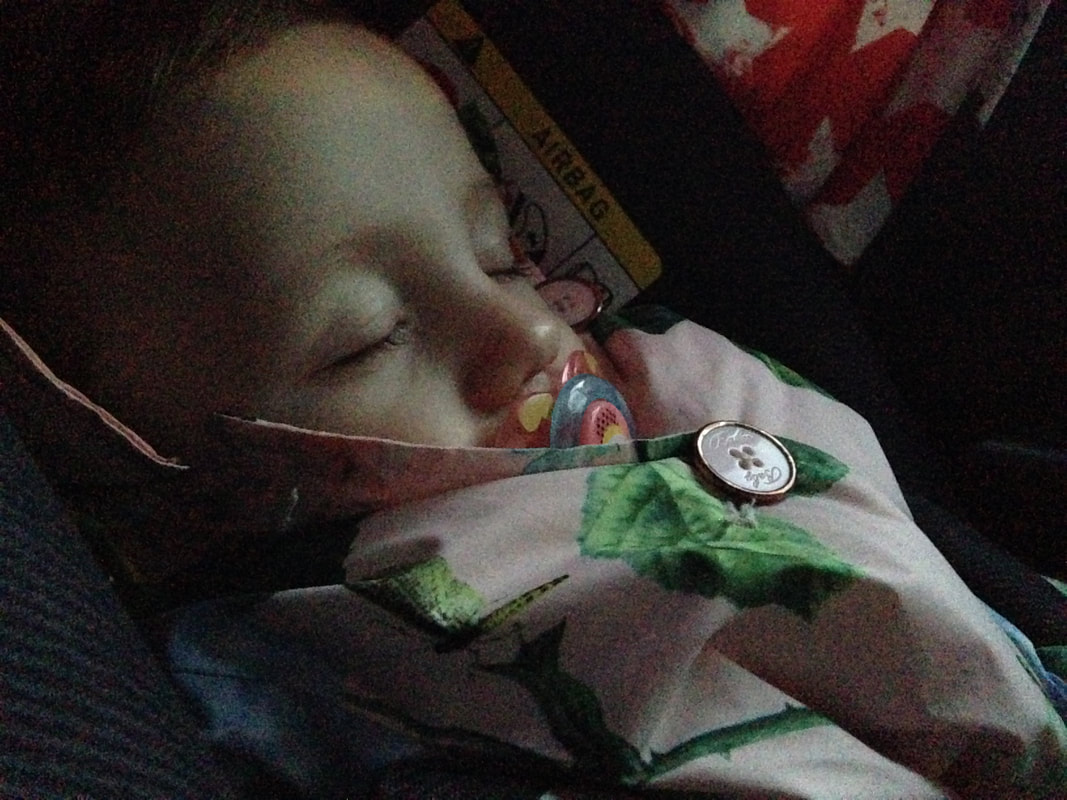
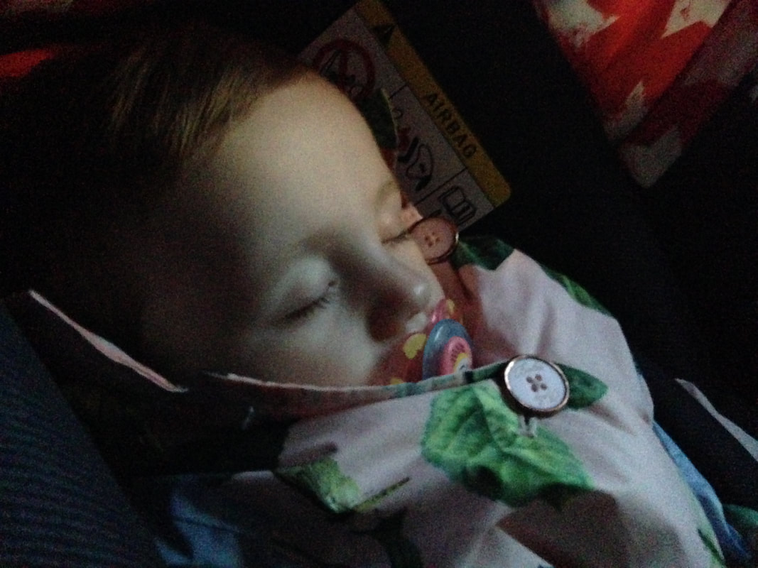
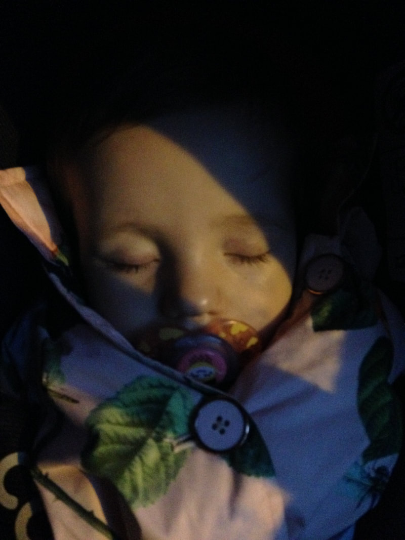
This is my plan for shoot eleven. I did not capture these images intentionally, it was a spontaneous moment where I noticed the lighting was similar to that shown in Larry Sultan's and Christopher Anderson's work. I believe that capturing the images with Lowenna asleep also furthered the intimacy that Anderson achieves in his images, however with her awake may bring more focus to her identity. From this point, I understand the lighting I want to achieve in better detail and so now I am able to plan my lighting techniques. I will use soft light in the image in order to create a small intimate glow that the photographers I have taken inspiration from use.
Shoot Twelve
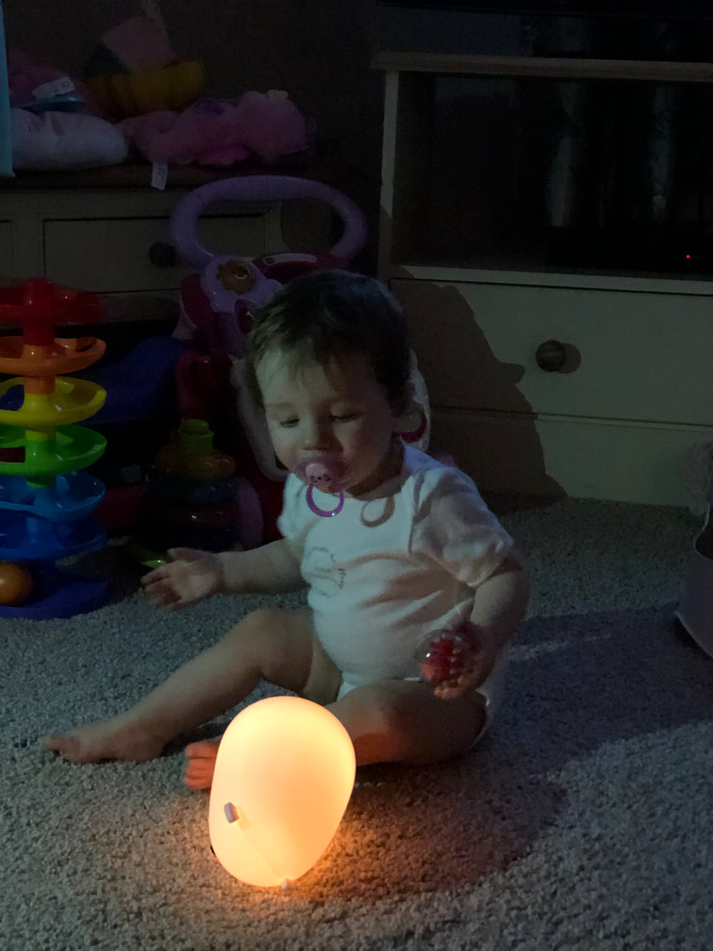
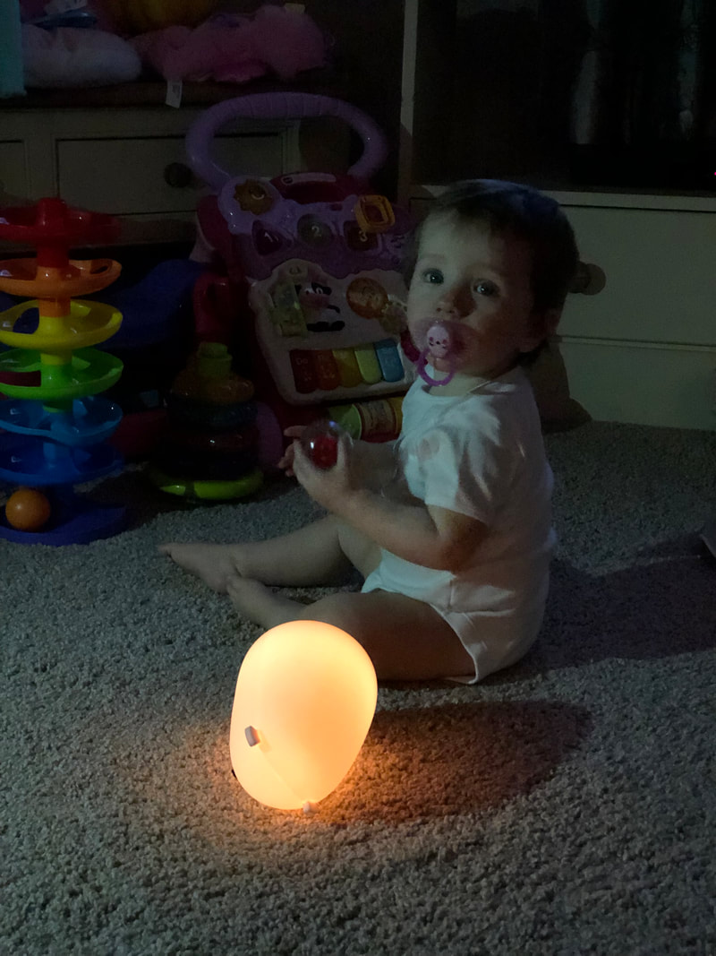
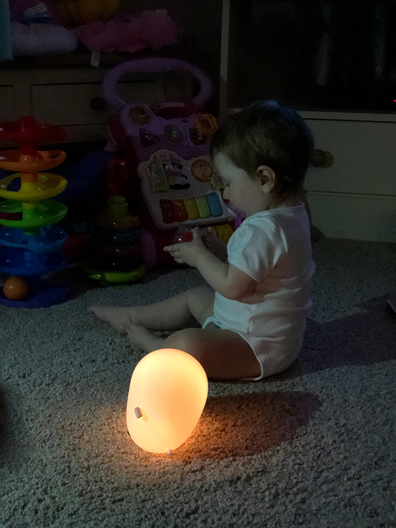
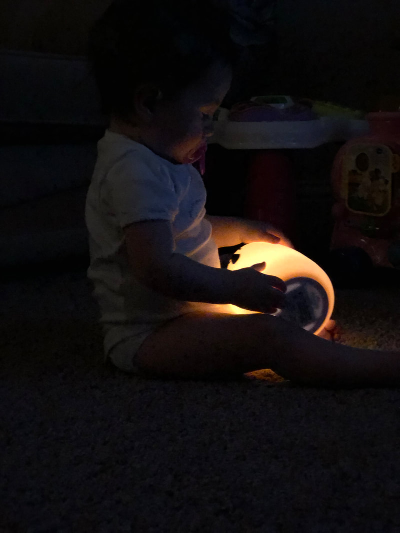
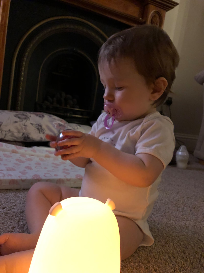

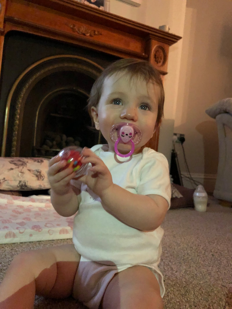
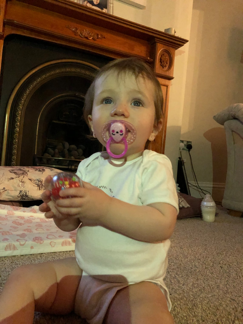
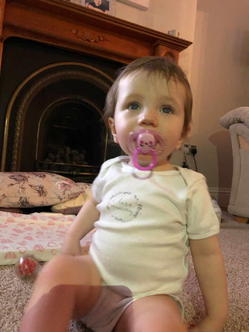
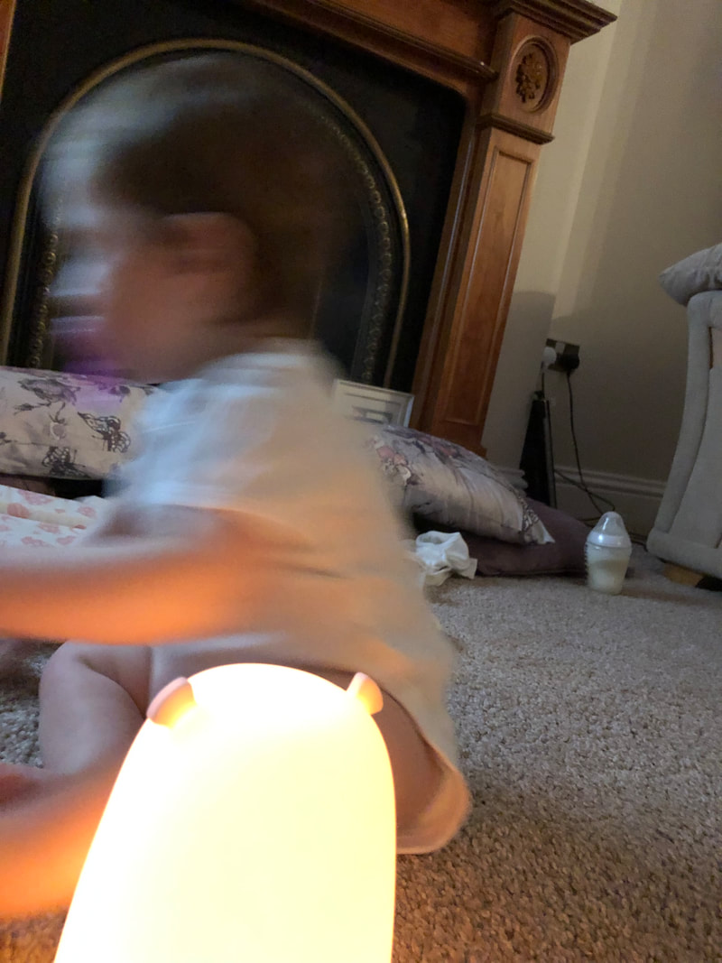
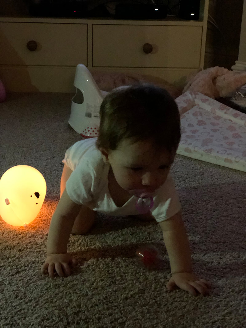
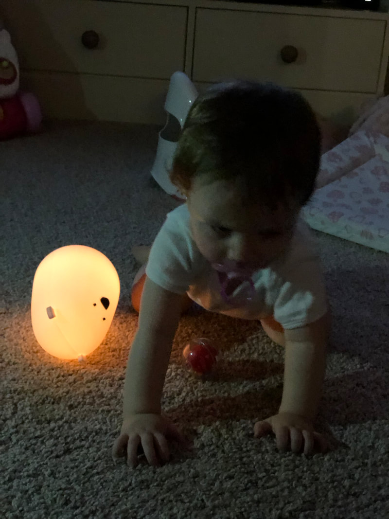
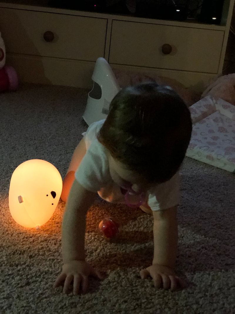
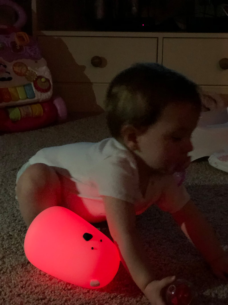
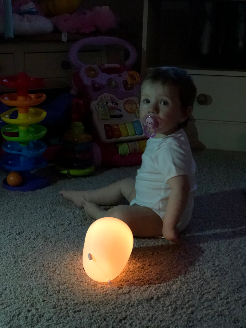
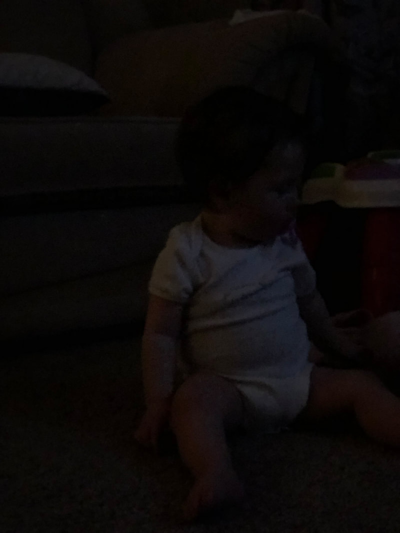


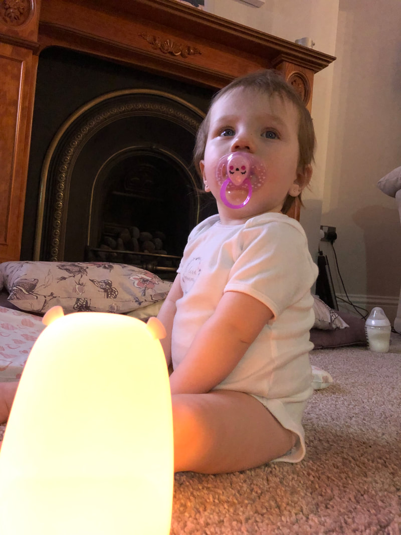
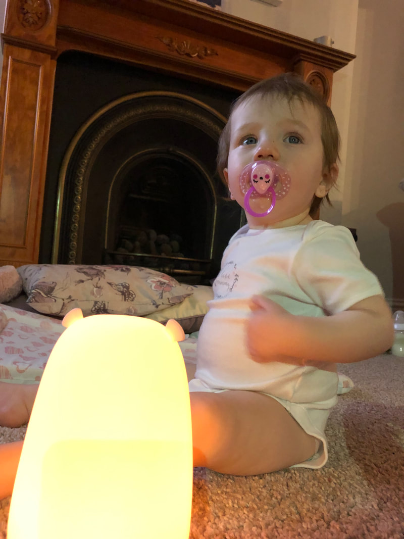
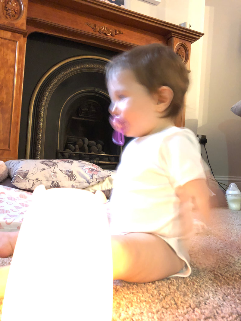
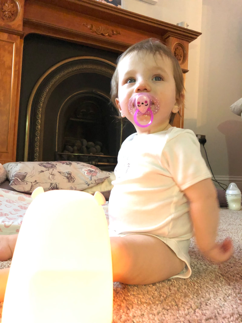
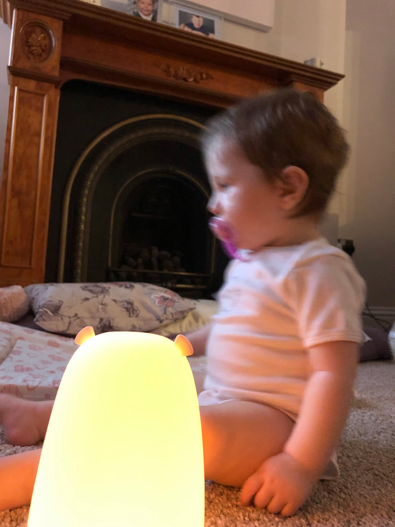
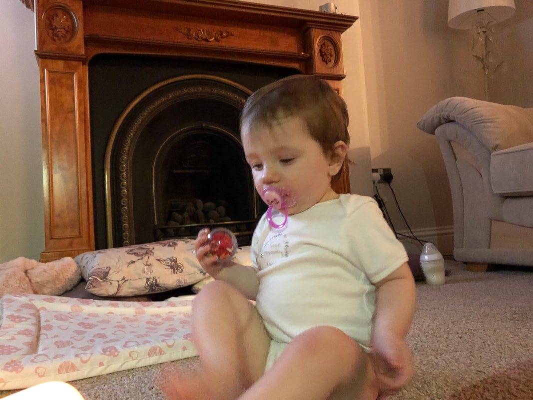
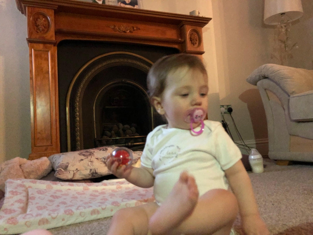
This shoot as a whole is a set of images where I have incorporated different forms of lighting to display a similar dramatic feel to that Anderson and Sultan have achieved in their images. I believe that the darker images are more successful compared to those where I used additional lighting, this is because the darker lighting evokes the inspiration I have taken from Erler, Anderson and Sultan in a much more powerful way. From this shoot I learnt the difficulties of capturing candid portraits of a child. Some of my images are blurry and so therefore I consider them to be unsuccessful as the focus on Lowenna is unclear. I will take one image forth from this shoot to edit and that is the one I have annotated on. Please click through the images to read my personal thoughts on them.
Some images have annotations on, click on them to read them.
Some images have annotations on, click on them to read them.
My Editing Process
My Outcomes
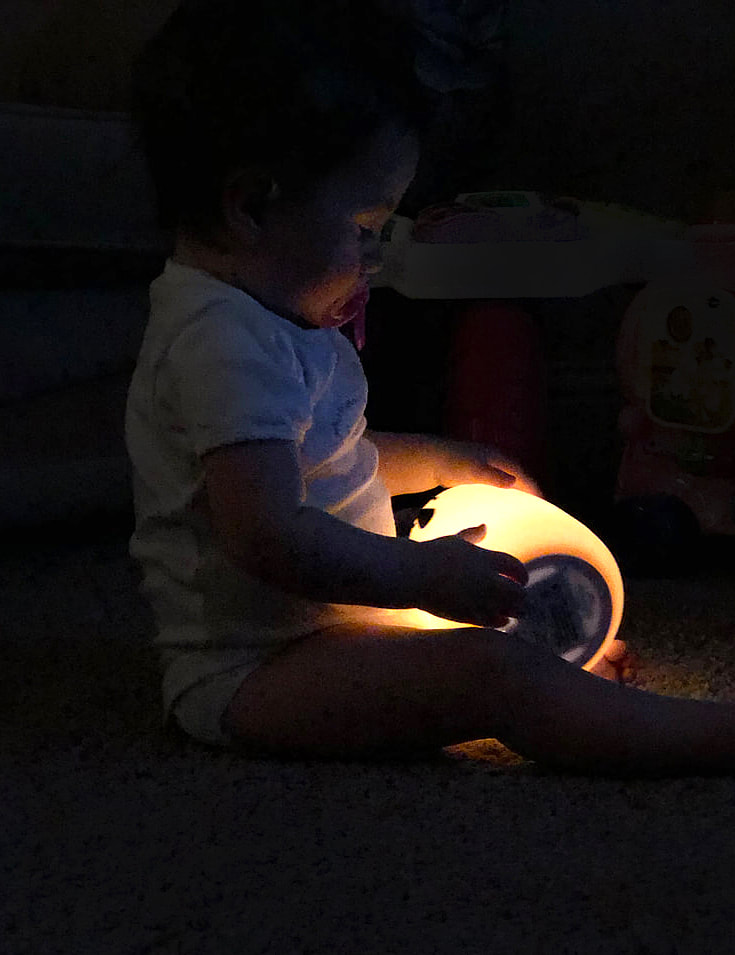
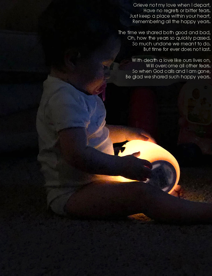
Overall I am very happy with the enhancements I made to this image. By deepening the shadows and brightening the highlights I was able to further the tonal contrast between the brighter and darker areas in the images. This makes the connection my images have to the inspiration I took from several photographers like Sultan now more prominent from how I have enhanced the soft lighting. Where I unsharpened the mask of the image, I have added a more detailed grain which has in turn focused the viewpoint of the viewer as they are now able to see Lowenna in greater detail. In the second edit where I have incorporated the text overlay, I feel I positioned it in a place whereby it did not distract the viewer from the focus of the image but enhanced it by the text shaping around her. Having the text in the same colour as the highlights ties the two elements together which in turn adds a complimentary colour balance to the image.
Final Piece Plan
Above shows the inspiration I have taken for my final piece. I have decided that I want to produce something tangible the viewer can interact with. The concept of a scrap book will allow me to display my images in an order alongside the older photographs I have to tie them together in a harmonic way. The idea of a dated scrapbook draws on the significance the past has and how my grandparents relationship developed over the course of their lives together. I plan on taking some of the techniques shown here and also incorporating some of my own. I will look at different textures I can add including things like picture corners, ribbon and scrabble letters. I plan on writing the poem through my scrapbook as that shows my initial inspiration taken from Depoorter and will enhance my images in providing the viewer with an insight to my family.
Carrying Out My Final Piece
Planning:

These are some of the materials I am considering in using in creating my album. I did consider purchasing an antique album and changing it to suit my project however this would have meant me destroying the already published memories in the album and so I was not keen on this idea. Looking at new albums I prefer the square format to rectangular designs as my edits are all of a rectangular shape and so having a square format book will provide me with space around the images to add extra elements. The photo corners are sticky tabs which will allow me to add my images in a seamless way that will not show where they have been stuck in, creating a more professional design.
Making:
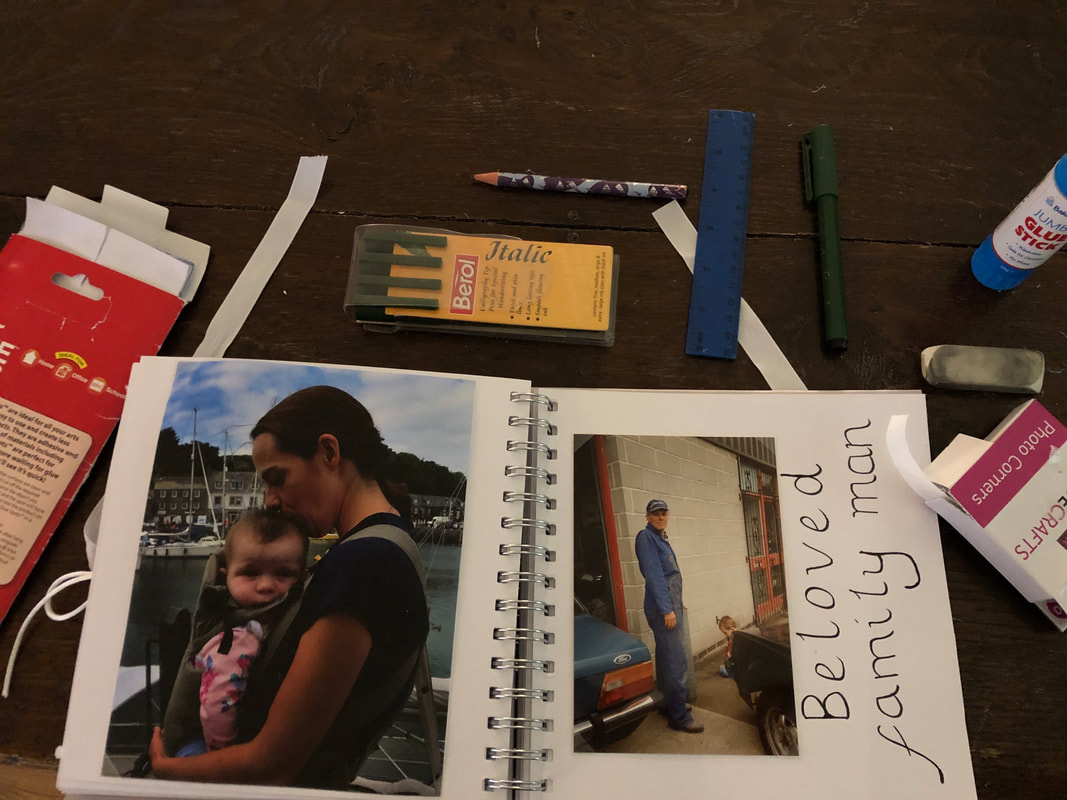
This was my set up when making my book. I used various photographs both old and new and various stationary to enhance my pages. I used various materials such as ribbons and strings to add various textures when inserting different pictures and used the negatives from when I shot a roll of film as part of this project. I used glue dots and picture corners to insert the images into the book in a seamless and professional way. Using the Berol pens, I was able to interpret various calligraphy styles page by page and develop a font style that I liked. When designing each of the pages I selected images with similar colour tones and similar focuses to present alongside each other. I did this as I wanted each page to compliment the previous one and for the viewer to see how my edits developed over the course of the project. I broke the poem up into shorter lines and separated it in a way that broke it down into smaller sections that were easy to read and fitted on the page better alongside the images. I also wanted the poem to follow on through the book and entice the reader to keep reading and turning the pages.
My Book:
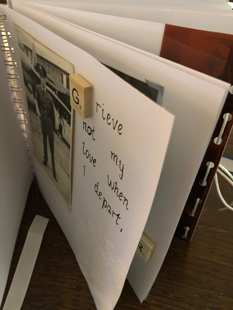
Above shows a small insight into my book. It is here that the different materials and textures that I used are evident and presented is my incorporation of old images, new images and film roll. As explained at my planning and making stages is why I have chosen this layout and various takes to each pages.
Evaluation
I believe that, considering my whole project, I have produced a set of outcomes alongside a final piece that clearly presents my intentions with portraiture that I set out in the beginning and evokes the personal aspect which is what the personal project is about. I said that I wanted to look specifically at shadows and how they influence the interest of the viewer. I feel I have produced a successful set of images that look at shadows and have enhanced the portrayal of shadows through also looking at the incorporation of text. Regarding my final piece specifically, I feel that I have connected both the older and younger generations of my family through incorporating both old and new photographs. This is not something I originally intended to develop into my project but over time where I was looking more into the history of my grandparents relationship it seemed fitting to include. I believe that by showing this past in with my work furthers the effect each of images has on the viewer and allows them to have a true and more detailed insight to my grandparents relationship and how that influenced my project development.
If I were to complete this project again I would look into using different font styles that will in turn create more successful outcomes as the viewer will have more of a connection with a more designed font rather than a basic font. Where I looked into Caplan, I experimented briefly with different font styles and did so again in the last stages of making my final piece. However I feel if I had done this more consistently my outcomes would have been more successful.
If I were to complete this project again I would look into using different font styles that will in turn create more successful outcomes as the viewer will have more of a connection with a more designed font rather than a basic font. Where I looked into Caplan, I experimented briefly with different font styles and did so again in the last stages of making my final piece. However I feel if I had done this more consistently my outcomes would have been more successful.
